Saturday, June 26, 2010

State Fair - Cinema Saturday Creative Challenge #85

NOTE: I have two posts today - if you are looking for my Oh, Alice! post, please scroll down.

Photobucket


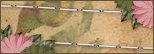
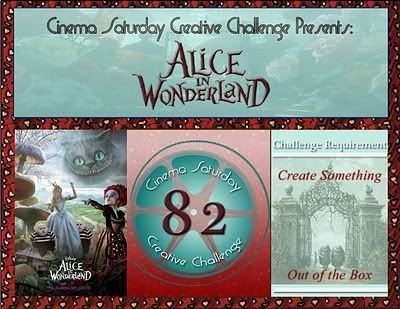
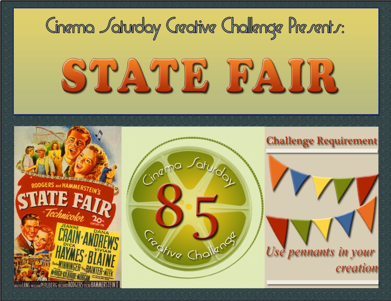
Can you believe that we are up to week 85 of movie-inspired challenges?  It seems like just yesterday I heard about this blog featuring a Jane Austen movie as inspiration. . . . and this week I have the privilege of being the Cinema Satuday Guest Designer! Our movie this week is the 1945 musical, State Fair, about a family who comes from the farm for the big event! Dad has his prize hog, Blue Boy, entered and Mom has been perfecting her mincemeat pie and pickle recipes (separately, not together!) and the two kids, a young lady and her brother, are ready for romance! It is a charming bit of Americana, no depth at all but loads of sweet charm and humor.

Photobucket

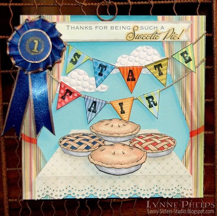
This week the challenge, other than a creation inspired by some aspect of the movie, is to use pennants! You see them everywhere at a fair!  I created mine on the computer. I drew a triangle, copied and pasted it until I had nine of them, and then put a letter into each one. Then I printed out the page on color laser printer paper (great for Copics) and had great fun coloring each triangle with a different color and pattern using Copic Sketch markers.  I trimmed them out and glued each word to a piece of hemp twine using a Zig 2-way Glue paint pen.

Photobucket
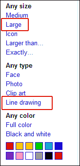
Then I needed some pies! I did not have any pie stamps so I did a Google image search for pie.
  • TIP #1: Once the Google Image Search results came back, did you ever notice that you can narrow down the results by image type? It is in the left column - just check "Line Art" and you will find drawings perfect for coloring! You should also select "Large" because you need them to have enough pixels to be able to print them at 300 dpi.  You can see the settings in this screen dump I made for you at right. >>>
  • TIP #2: There are a lot of sites that offer free images to print - they are designed for children to color! I think we all love Copics so much because they are grown-up crayons! You can use these images without infringing on anyone's copyright because they are designed for this very purpose - to print and enjoy yourself coloring it in!!! Just search for "free drawings for kids to color" and you will find a ton of sites with great images. That is where I found my various pies!
I copied my pies into one file, sized and arranged them, then colored them in with Copics. I did the front pie separately as I knew I was going to want it popped up on dimensionals.  Then I found a lovely piece of paper from a K&Co mat stack which was perfect to put my pies on. I trimmed the bottom edge with a border punch, drew a light pencil line across and shaded below it with warm gray Copics to make it look like the drape of a table cloth. Then I trimmed from my pencil line to about an inch in from the top corner on each side to give it some perspective.

Of course it's all about winning with the best pie, right? So I made a mini blue ribbon and edged it with a gold paint pen. I did not have the right color ribbon, so I colored it with Copics to the perfect shade. Love that!

I wanted it to look like you were in a tent looking out. I trimmed two pieces of striped paper from in the shape of tent flaps pulled back. I shaded again with warm gray Copics to indicate the folds of the fabric and added a red tie-back.

Photobucket

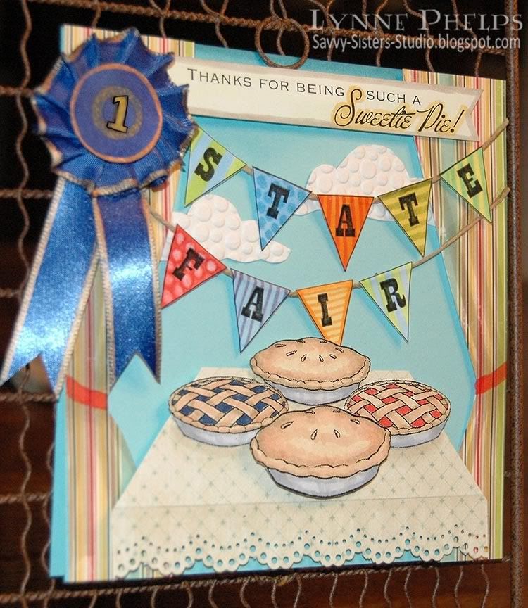
Now for assembly. You can see all the dimension in the angled shot above!  The top of the card base was sponged with blue. I used 1/16th inch thick foam mounting tape for the tent flaps and 1/8th inch thick pop-dots for the table. I draped my pennants across to see how they would fit and it was missing something. I cut out a couple clouds from leftover embossed white packaging from THIS and THIS project. I put a tiny piece of foam mounting tape behind each pennant so I could control where each letter was placed, then I glued the ends of the string down with Zig glue.

I now had a good idea about the amount of space left for my sentiment - "Thanks for being such a Sweetie Pie!" seemed perfect! I generated it on the computer, cut it out and colored it with palest yellow, edged with warm gray, and highlighted Sweetie Pie in pale gold. Then I stuck it on (more foam mounting tape) and plunked the mini blue ribbon over the left end!

I hope you enjoyed my State Fair card! I live in Perry, home of the annual Georgia National Fair, which is absolutely amazing!!!  My favorite part is the exhibit halls where you can see quilts, artwork, knitting, spinning, photography, flowers, the creative 4-H pumpkin head scarecrows, it's great! The livestock barns, not so much for me, LOL! And of course there is the fair food - did you know you can get any kind of food you can think of mounted on a stick at the fair???  I decided to go for Melissa's mincemeat pies as my inspiration instead of Abel's gigantic hog, Blue Boy!!!

Go to the Cinema Saturday Creative Challenge blog and play along with us this week!  It is such fun and the winner receives the prestigeous Audrey Award blog badge! You can see mine in the left sidebar, and of course you can read my "acceptance speech" HERE!

Paper: Stampin' Up! - Caribbean Blue; October Afternoon - Thrift Shop (stripes); K&Co - Mat Stack (tablecloth); HP - Bright White Color Laser Printer Paper (pies, sentiment, pennants).
Ink: B&W laser printing (pies, sentiment, pennants); Copic Sketch markers.
Embellishments: Hemp twine; double-faced satin ribbon.
Tools: Cuttlebug - Tiny Bubbles embossing folder

Chapter 19: Twinkle, Twinkle LIttle Bat. . . Oh, Alice Challenge

"Twinkle, twinkle, little bat!
How I wonder what you're at!"

You know the song, perhaps?'

`I've heard something like it,' said Alice.

`It goes on, you know,' the Hatter continued, `in this way:--

"Up above the world you fly,
Like a tea-tray in the sky.

Twinkle, twinkle--"'

Here the Dormouse shook itself, and began singing in its sleep `Twinkle, twinkle, twinkle, twinkle--' and went on so long that they had to pinch it to make it stop."
Hello out there! It's a beautiful day here in Wonderland and a twinkling one at that! We are wrapping up one FABULOUS month with a super fun, no-pressure challenge! We are going to ring out the month of June with a Twinkle! That's right, just use something Twinkling, Glittery, or Sparkly on your card or creation this week and we'll put on our shades :D

This is my last post as the Oh, Alice! June Guest Design Team Member. Next week they will announce the new July Guest Designer they'll have more tricks and treats up their sleeves....'til then, there's no time limit to play this week, so get your twinkle on and be sure to come back and let us know when you did!


And you will need shades for my card, LOL, as it is literally twinkling with GLITTER! I am WAY out of my comfort zone here, but my twinkle is not only on, it is incandescent! Unfortunately the photos only hint at the true glittering sparkle:

Photobucket

I decided my beloved Tenniel illustratons and twinkle were not the best fit;  glitter and Disney's Alice seemed like a much more harmonious pairing! This image of Alice and the club cards painting the white roses red is from the online Disney Coloring Book.  I brought it into photoshop and knocked out the background, so the characters and trees were still solid white, but the area around the image was clear. Then I coped the text of this scene from the book and put it on a layer behind the knocked out image. Perfect! It is as though the characters have sprung to life from the written word! I printed it on color laser printer paper and colored it in with Copic markers.  What fun, to be an adult with sophisticated markers still having fun with a coloring book! I love it!

Photobucket

Then I sponged the bright white paper all around the drawing with Old Paper Distress Ink, followed by Vintage Photo Distress Ink.  I don't know about you, but I usually don't think of Distressing and Disney in the same sentence!  Somehow that made it all the more interesting when I added RED GLITTER to the paint areas - now they are painting those roses RUBY red.  I used a Quicky Glue Pen to put glitter on the red roses and the paint brushes and buckets. Fun! I wish you could see how interesting this looks in real life, as though they are painting with fragments of sparkling rubies! I mounted the text and drawing panel and stuck four rhinestones in the corners that I colored with a Copic to match my ruby paint.

Photobucket

I used an oversized kraft card base and scored several pairs of lines so I could add glitter in between. I laid down a strip of 1/8th inch Scor-Tape and the glitter stuck like a dream. I got this idea from Nichole Heady's blog (Papertrey, Ink. part owner and main designer) and created a ribbon channel using the same method.  I printed out the Disney Alice logo, sponged it with green, then ran over it with the glue pen and added pale blue translucent glitter.

Remember to get your sparkling, twinkling, shimmering creation entered at the Oh, Alice! blog, where you can also enjoy all the other design team members' creations! Thanks so much for visiting me during my June Guest Designer gig, it has been such fun for a true blue Alice fan like myself. Please leave me a comment, and have a very twinkling week! 

Stamps: Digital image from DisneyKid's Stationary coloring pages
Paper: Papertrey Ink - kraft card stock; HP - bright white color laser printer paper.
Ink: Ranger Distress Ink - Old Paper, Vintage Photo, Peeled Paint; Copic - Sketch Markers.
Embellishments: The Paper Studio - rhinestone stickers; Stampendous - glitter; satin ribbon.
Tools: Score-Pal, Sakura - Quickie Glue Pen.
     

Friday, June 18, 2010

CHAPTER 18: Crazy for Daisy Chains.... Oh, Alice! Sketch with a Twist Challenge

"Alice was beginning to get very tired of sitting by her sister on the bank, and of having nothing to do: once or twice she had peeped into the book her sister was reading, but it had no pictures or conversations in it, and where is the use of a book, thought Alice, without pictures or conversations? So she was considering in her own mind, (as well as she could, for the hot day made her feel very sleepy and stupid,) whether the pleasure of making a daisy-chain was worth the trouble of getting up and picking the daisies, when a white rabbit with pink eyes ran close by her. "

We have a fun new sketch with a twist from our very own Tasha. The Twist? Use a DAISY or some sort of similar flower and incorporate it on your card! Nothin' like a little FLOWER POWER to kick start your mojo, Alice always says!

Our friend and fellow Tea Party Member, "TWISTY KRISTY" has organized a wonderful prize from Tickled Pink Stamps! One lucky winner from this week's entries will receive one rubber Lil' Lolita stamp of their choice! Many of the design team members will be showing off their Tickled Pink Lil' Lolita Stamps today.


Photobucket

I took a few liberties with the sketch - I thought I had completely flipped it upside-down, but now that the sketch and my card are right next to each other, I see that I forgot to flip my coral "swoosh" across the middle of the card. Well you can still see the sketch in this card so I don't think Tasha is going to come gunning for me, LOL!!

I started by printing (on color laser printer paper) a digi of this original illustration from "Through The Looking Glass" of Alice in the garden of live flowers, which seemed perfect for our theme this week! I colored it in with Copic markers and then cut it out with a classic oval Nestability die.  From white card stock, I cut a Lattice Pendant die and slipped the oval illustration into the pendant. I used two of the cut out pieces at the top and bottom to "clip" it to the pendant more securely.

Then I cut out the coral "swoosh" shape. I had a hard time with this as it is an unusual shape. Knowing that the middle would be covered up by the lattice pendant, I cut the two sides separately by tracing around the curve at the end of an oval nestie.  Mine have more curve than the sketch but it keeps the same feeling! I sponged around the edges with orange ink to make it blend rather than clash with the tiger lily. I also die cut two leafy branch shapes out of olive card stock and punched some small gold flowers. I took two white silk flowers, stacked the little punched flower and secured it with an antique gold mini-brad.

I die-cut a Fancy Tag from white card stock, cut off the two curly pieces at the ends, colored around the edge with a pale blue Copic and stamped the sentiment in black. I thought "If friends were flowers I'd pick you" was the absolutely perfect sentiment to go with this picture full of live flowers!!!  Now it was time to assemble everything.

Photobucket

I had so much color in the garden scene, so I went with a base of Ocean Tides as it was just a little darker than the sky color and sponged all around the edges with white pigment ink to soften it up a little. I used a new border embossing folder at the top and bottom, then I scored a line to cover up where the edge of the folder left a mark on the card stock. I swiped over it with a Versamark Dazzle pad to highlight the raised areas and give it some shimmer. I think Dazzle pads were created for this technique!

I adhered all the elements but it still needed something. Ribbon to the rescue! I folded the ribbon through the looped ends of the fancy tag, secured it with double-sided tape and then added a brad. I tried it first with just the brad but it pulled too much on the one point, so I added the tape.  What a fun look, I'll be doing this again! I added another piece of ribbon at the bottom and a bow tied on my Bow-Easy. TIP: I always tie the base ribbon with a tiny piece of button twine where the bow is going to go, as this really makes it look like a tied bow instead of a flat piece with a separate bow stuck on top!

Want to play along and get Crazy for Daisies and get sketchy too? Hooray! We'd love to have you! Just upload your card or creation to the InLinkz system on the Oh, Alice! challenge blog and use the keyword OAC18 if you're using a public gallery such as SCS. You have until FRIDAY, JUNE 25th at 8pm CST to enter to WIN this fabulous prize from Tickled Pink! Can't wait to see how you get twisty this week! HAVE FUN!

I hope you enjoyed my crazy for daisies Alice card!  Please leave me a comment, I really love to hear from you!  Also, check out Lenny's Alice in Wonderland site for all kinds of Alice resources, facts and trivia! It is a WONDERful site!

Please go to Oh, Alice! to see more creations from the other members of our twisted tea party! I am sure you will enjoy the design team's various interpretations of the Tasha's sketch!

Stamps: Alice - digi stamp; Sentiment - Taylored Expressions "A Year of Sweet Sentiments"
Paper: Papertrey Ink - Ocean Tides card stock; HP - bright white color laser printer paper; Georgia Pacific - white card stock.
Ink: Tsukeniko - Memento Tuxedo Black, Versamark Dazzle Frost; Copic Sketch markers.
Embellishments: The Paper Studios - antique gold mini-brads; Hobby Lobby - double-faced satin ribbon.
Tools: Spellbinders - Fancy Tag die, Lattice Pendant die; Stampin' Up! (Sizzix) - Little Leaves die; Scor-Pal; Cuttlebug - "Measure for Measure" embossing folder borders; Bow Easy.

Thursday, June 17, 2010

Waltzingmouse June Customer Blog Waltz!


Welcome to the June Waltzingmouse customer blog waltz! Instead of hopping from blog to blog, we WMS fans waltz our way through! This month's theme is masculine cards.  I have also entered this in the brand new Waltzingmouse Sketch Blog competition for their second week's sketch! Have you visited this brand new WMS sketch blog? Sketches are card layouts, and everyone makes a card from the same layout and submits them. WMS stamps are not required for their new sketch blog challenges, but you get a bit extra if you win and have used Waltzingmouse stamps.  Last, I am submitting this card for Stamping Sisters in Christ Challenge #43, to create a masculine card.

Photobucket

Nothing says masculine to me like chrome diamond plate! I taped a piece of aluminum HVAC tape to a piece of cardstock, burnishing it down smooth. Then I ran the aluminum covered cardstock through my Cuttlebug in the diamond plate embossing folder. Doesn't it look real? I love it, but it was very difficult to photograph, hence all the angled photos! The background was created with several of Waltzingmouse's plaid building stamps in various widths, stamped on a light taupe card stock. I used nice manly shades of brown, olive, tan, and rust. Not a bright or pastel anywhere! The diamond plate was adhered to the plaid panel after the plaid had been sponged round the edges with Walnut Stain.

The center medallion started with a Label Three die cut, sponged with Walnut while still in the die. It was fastened to the plaid panel with antiqued copper brads. Then I stamped the grid background stamp in tan on light taupe card stock, sponged it with Corduroy and Peeled Paint along the very edge, grunging it up a good bit! Last, I cut one of the Ribbon Tag Trio from ivory card stock, sponging it with Peeled Paint while still in the die, edging it with Walnut Stain, and stamped in Copper with the sentiment.

I attached the screw head brads and the buttons tied with jute string to the grid circle, which I mounted with pop-dots to the label. Then I threaded twine and jute string through the ribbon tag, and attached it at an angle to the circle with a pop-dot. I fanned out the ends of the string for fun and to emphasize the angle!

Photobucket

When I made the background plaid, I had some strips I trimmed away. I attached one of the strips to the inside right margin of the card to carry the theme inside!

To see more of the Blog Waltz entries, go to the Waltzingmouse House Forum, where the links list thread will open at 10 a.m. Eastern time!  You need to go through a one-time simple free registration with no awkward questions, then you can see everyone's links to their projects. Please join us, it is so much fun!

Stamps: Waltzingmouse Stamps - Off Beat Backgrounds, Pic-Nic Patterns, Fancy Phrases.
Paper: Georgia Pacific - light taupe card stock; Stampin' Up! - Really Rust card stock.
Ink: Ranger Distress Ink - Walnut Stain, Corduroy, Peeled Paint, Scattered Straw; Memento - Rich Cocoa, Bamboo Leaves; Palette - Haystack; Marvy Matchables - Copper.
Embellishments: Jute string; hemp twine; The Paper Studio - buttons, antique copper mini-brads; Karen Foster - screw head brads.
Tools: Spellbinders - Labels Three, Ribbon Tag Trio; EK Success - 2¾ inch circle punch; Cuttlebug - Diamond Plate embossing folder.
   

Wednesday, June 16, 2010

Cinema Saturday #82: Golf - The Greatest Game Ever Played

Have you tried the Cinema Saturday Creative Challenges? Each week they pick a new movie - sneak peeks start Friday and the new movie is announced each Saturday. You create something inspired by the movie and submit it on their blog! It is good fun, and it is always a good movie - NO horror!  I can't deal with horror movies, they give me bad dreams! This week the movie is The Greatest Game Ever Played, a Walt Disney movie from 2005.

Photobucket

We vacation on Captiva Island every summer, and our condo is in the middle of a golf course overlooking the ocean. When I think of fun in the sun for summer I think of ocean-side golf courses, so I am submitting this to the Shabby Tea Room Week #14 Fun in the Sun Challenge. I am also submitting this card for Stamping Sisters in Christ Challenge #43, to create a masculine card. So here is my fun-in-the-sun masculine card, inspired by the movie, with argyle!

Photobucket

Inside it says "Go confidently in the direction of your dreams; Live the life you've imagined."  I thought this quote by Thoreau truly captured the Francis Oimet's desire to play golf despite the class barriers that were holding him back.  This is a wonderful movie that always reminds me of Bagger Vance - golf is the vehicle, but it is really a story about life and the human spirit. Francis is told by everyone that he can't play, he is not a gentleman, he is just a caddy. He can't even be a member in the clubs where the championships were played! It is based on the true story of the 1913 U.S. Open Golf Tournament.

I knew right away what stamp set I wanted to use: "The Back Nine" by Stampin' Up!. I stamped the two sketchy images from "The Back Nine" stamp set with black on color laser printer paper, and had a wonderful time coloring them in with Copic markers. The large collage image really reminds me of the movie, back in the days when you had clubs called mashies and niblicks.  The man is also wearing the same kind of snap brimmed hat that Francis wore - perfect!!  And there was an lovely upper-class young lady in the movie, and the lady golfer in the collage made me think of her.

Photobucket

I stamped the golf swing steps image with brown on color laser paper and sponged it with distress inks. Love this image! All three images were trimmed out and mounted on a brown panel that was zig-zagged on the bottom with a border punch. The zig-zags and holes of this punch remind me of the diagram maps of golf courses that shows the layout of the holes.

Photobucket

I stamped a panel of kraft card stock with a background building argyle set; I was thrilled to have a reason to use this new set!  My green diamonds weren't showing up enough, so I edged the diamonds with YG91 Copic marker.

The kraft card base is a bit oversized to allow for all my images, 5 x 6.5 inches folded. I sponged the edges with green distress ink and cut a slit in the fold of the card for ribbon. I adhered my argyle panel then I edged a double-faced satin ribbon with YG03 to brighten it up a bit and knotted it around the card front and argyle panel.  The brown panel with the three images was adhered with dimensional pop-dots. I stamped the word "Golf" on a die-cut panel that had been sponged with lighter green ink. This was mounted on lower dimensionals, tucking in behind the brown panel.

My Dad says golf is a game that was invented to keep you humble. You are always striving to surpass your own past performances and struggling to do better. That is a pretty good metaphor for life, isn't it, always striving to become a better, wiser, and hopefully kinder person?

I hope you enjoyed my interpretation of  The Greatest Game Ever Played, and I hope it will encourage you to watch this movie yourself. I am not a huge golf fan but I love this movie - it is worth watching just to see his sidekick ten-year-old caddy! If you liked Bagger Vance you will probably like this movie - the main character reminds me so much of the little boy in Bagger Vance, only grown up a bit more but still golfing-mad!
Stamps: Stampin' Up! - The Back Nine set; Papertrey Ink - A Little Argyle; River City Rubber Works - Golf.
Paper: Papertrey Ink - kraft card stock; Stampin' Up! - Chocolate Chip card stock; HP - bright white color laser printer paper.
Ink: Memento - Tuxedo Black, New Sprout, Bamboo Leaves; Palette - Burnt Umber; Ranger Distress - Peeled Paint, Old Paper, Vintage Photo; Copic Sketch markers.
Miscellaneous: Double-faced satin ribbon; EK Success - slimline border punch.

Tuesday, June 15, 2010

Embellish Color Challenge with Labels: Yellow, Coral & Brown

Embellish Challenge
Waltzingmouse Stamps is sponsoring the current Embellish Magazine color challenge. We are to use yellow, coral, and brown, and include labels.  I love all the Spellbinders label shaped dies, so it was easy to reach for one of my favorites, Labels Four, and the corresponding stamp set from Waltzingmouse.

Photobucket

I started with a pale yellow card base, sponged round the edges with Distress Ink in Scattered Straw. Next, I took a flowered Spellbinders Impressibility and brayered it with white pigment ink. I empressed the inked stencil into a piece of brown card stock with my Cuttlebug.  I need to work on this; it was my first time using an impressibility and the impression was not as deep as I would have liked on this 80 pound card stock. I think a lighter weight card stock would have made a better impression.  I wish the letterpress effect showed better in the photo!

Then I stamped the dotted border and fun triangular tag-end stamps on coral card stock, and cut it and embossed with with the Label Four Nestability. I used a Copic Sketch marker to add a gold edge to pale gold satin ribbon. I punched holes in the label and ran the ribbon through, then attached the coral label with dimensional pop-dots.  I cut and embossed the pale yellow with a Fancy Tag die, and sponged it with Scattered Straw while it was still in the die.  On this, I stamped the frame and Bonjour.  This is actually attached at both ends to the brown card base, and then arches up and over the coral label. From the top view it curves out quite a bit. Buttons were added with mini glue dots.

One person will win their choice of a Waltzingmouse stamp set! You know I'll do anything for a WMS stamp set, they are my favorites and my wish list is a mile long, LOL! Be sure to check back on the 17th for their monthly customer blog hop.

Stamps: Waltzingmouse Stamps - Vintage Labels Four, Fancy Phrases.
Paper: Stampin' Up! - brown and coral 80 lb. card stock; Unknown - pale yellow card stock.
Ink: Palette - Burnt Umber (brown hybrid); Color Box - Frost White (pigment); Ranger Distress - Scattered Straw; Copic Sketch Marker Y26.
Embellishments: The Paper Studio - buttons; Double-faced Satin Ribbon (Hobby Lobby).
Tools: Spellbinders - Labels Four Nestability die, Fancy Tags Shapability die, Flowers Impressibility stencil; We R Memory Keepers - Corner Chomper; Standard hole punch.

Monday, June 14, 2010

Happy Birthday Hannah: Reverse Paper-Piecing with Digi-Stamps

My neice Hannah just had her 19th birthday, and I thought this fun digi image from Amber Ink suited her perfectly! Hannah is very a very smart, stylish, funny young lady with loads of personality and I love her dearly!
 
Amber Ink Digi Stamp

Have you heard about Amber Ink?  The artist, Amber, and her mother have started up a new company. In the "Amber Girls" line, she is offering Digi sets - just like you might find in a clear stamp set. I only used the main image, but there are also shoes, purse, tote, etc. plus a sentiment: "But I need it. . . ." And for a limited time, several of the Amber Girl sets are FREE! They are just darling, and I can't wait to use the other sets. I also LOVE her Love Bunny stamps, they are so cute and expressive! She also has coordinating digi-paper, and clear stamps will be coming.  Plus Amber Ink is perfect for me, because I'm brilliant, not patient!!!! ;-)

Back to my card. I knew I wanted to paper-piece her dress.  In the normal way when you paper-piece with a rubber stamp, you stamp once on your base paper and color as usual, then you ink up just the part of the stamp with the item you want to paper-piece and stamp it on the patterned paper, then you cut it out and glue it over the corresponding spot on the base image.

There are some issues when you try to do this with a digital image:
  • I was using Basic Gray "Indian Summer" paper which comes on 6 x 6 inch sheets, which would have been an awkward size to try and run through my printer.
  • I did not want to print the whole image again which would have wasted the whole sheet of patterend paper.
  • I would have to do some image editing to print only the area with her dress.
  • It was too much of a hassle!
My solution was reverse paper-piecing! I used a craft knife to cut out her dress from my printed and colored image.  Basically there was now a dress shaped hole in the middle of the image. I put glue stick on the back of the image around the opening, making sure every edge around the cut-out dress was covered. Then I put a snippet of patterned paper behind the opening and made sure all the edges were pressed down firmly. I drew the hem lines back on with a black Copic Multiliner.

Unless you run your finger over the image, it is very difficult to tell that the patterned paper is behind instead of in front!

Photobucket

TIP: Try the new Fiskars Fingertip Craft Knife. The handle is a ring which goes around your index finger and the knife becomes an extension of your finger. I was very pleased at how much more dexterity and control I had when making intricut cuts - it was easy!  Here is a short product demo I found on YouTube:


I hope you will go check out Amber Ink, and also consider getting the fingertip knife. They also have a version with the tiny swivel blade.

Stamps: Amber Ink - But I Need It digi set; Waltzingmouse Stamps - Fancy Phrases.
Paper: ValuePack - 5 x 6.5 inch white card & envelope; Basice Gray - Indian Summer 6 x 6 inch pad; Stampin' Up! - Bravo Burgundy card stock.
Ink: Copic - alcohol Sketch markers, 0.5 MultilinerSP; Ranger Distress - Worn Lipstick, Scattered Straw; Memento - Rich Cocoa.
Miscellaneous: Spellbinders - Fancy Tags die, Petite Ovals and Scalloped Petite Ovals; Ribbon; Fiskars Fingertip Craft Knife; Glue Stick; PopDots.

Sunday, June 13, 2010

Audrey Award - Happy Happy Joy Joy!

Audrey Award

I am THRILLED to announce that my Alice Dream Sign
won the Audrey Award
for Cinema Saturday Creative Challenge #82: Alice in Wonderland!

CSCC82

And now for my acceptance speech: I would like to thank my high school art teacher, my parents, and my dear sister Janet who got me into this obsession....! 

The Audrey Award is Cinema Saturday's version of the Oscar, and quite an honor it is to receive it! Not to mention the lovely blog candy prize of a $35 gift certificate from Taylored Expressions - so very generous of them, thank you Taylor!  Each week they pick a different movie, and you can submit a creation based on that challenge. In addition, winners have the option to be a guest designer for the following movie!  Check them out and give it a try, it is loads of fun!

You can read about the project I submitted on this post, and here is a look at the winning entry:

Alice Dream Sign
   

Saturday, June 12, 2010

CHAPTER 17: Mad Watch.... Oh, Alice! Inspiration Challenge

March Hare: It's going mad!
Alice: Oh, my goodness!
White Rabbit: Oh dear!
March Hare: It is going mad! Mad watch!
Mad Hatter: I don't understand, it's the best butter.
March Hare: Mad watch! Mad watch! Mad watch!
Mad Hatter: Oh, look! Oh my goodness!
March hare: There's only one way to stop a mad watch!
Mad Hatter: Two days slow, that's what it is.

Greetings, everyone! A VERY Merry Unbirthday to ALL! Well, at least, that's the scene this excerpt from Disney's 1951 adaptation of Alice in Wonderland was taken from! It's ALWAYS your unbirthday here in WONDERLAND (also known as Oh, Alice!, a curious little challenge blog!) We are thrilled BEYOND WONDERLAND today to announce our sponsor this week, a company that we just adore: MY FAVORITE THINGS! We are so grateful to Kim and Jody for offering to sponsor our little challenge blog and with a HUGE prize, I might add! It really WILL be someone's un-birthday! MFT is offering a $25 Gift Certificate to the store PLUS a scalloped scallop die from their new Dienamics line! HOW exciting is THAT?!?

So, how can you enter to win? For this week's challenge, we have a beautiful inspiration piece, found on the CraftStylish blog. Your mission this week? Show us YOUR take on this "Mad" watch. You can use the colors, play off the time piece, blue flower, color combos, steampunk theme...the possibilities are ENDLESS, just like the deadline for this week's challenge, HA! To enter to WIN this awesome prize from MFT, just have your entry to the Oh, Alice! Challenge Blog using In Linkz by Friday, June 18th at 8pm CST! Have a VERY MERRY time creating!

The Inspiration Piece:

Photobucket

My Inspired Card:

Photobucket
I really loved the Steampunk aspect of the necklace with all the watch gears, so I started by embossing the background with a clockworks embossing folder.  A few of you are nodding right now, and I can see the rest of you saying "Steampunk? What is steampunk?" It is a sub-genre of science fiction and fantasy, usually set during the steam-powered late Victorian period.  The sci-fi/fantasy aspect often comes in by moving later inventions back into this period. For example, what if some mechanical version of a computer had been invented in Victorian England? There are lots of movies that could be labeled steampunk. In art (and paper crafting!) is it usually involves the juxtaposition of Victorian and/or vintage elements with more techie metal elements such as gears and springs.

Back to the card! I rounded the corners, then sponged the embossed clockworks with distress ink and brushed a Versamark Dazzle pad across all the raised areas, which gave it a subtle shimmer.  I die-cut, embossed, and sponged a fancy tag shape from gold card stock, and taped the back to prevent the small cutouts from coming out.  I wanted this to be the escutcheon plate of a keyhole, which I created with a circle punch and a craft knife.

I stamped the key, pocket watch, Alice, and the white rabbit with brown ink on white cardstock. I colored them all with Copic markers and cut them out.  I used the same colors on all of them to keep to a very limited, unified color palette.

I had some checked ribbon that went perfectly with my color palette. I wrapped the checked ribbon around the card base, cutting a slit in the fold of the card to allow the ribbon to pass through.  I made a double-looped bow, and tied some fine ribbon into the back of the knot which had been colored with a gold Copic to make it match the pocket watch. The other end of the fine ribbon was knotted around the loop of the pocket watch.

Photobucket

I brushed the Dazzle pad across the keyhole plate to make it shimmer also. You can see the effect in the photo above; it is really neat in real life, as though the high points only had been sprayed with Glimmer Mist! I adhered all the elements to the card base using ⅛ inch thick pop-dots for dimension.

Please go to Oh, Alice! to see more "inspired" creations from the other members of our twisted tea party! I am sure you will enjoy the design team's various interpretations of the inspiration piece.

I have also added this card to the Gingersnapper's Mad Hatter's Day Blog Hop!  The date for Mad Hatter Day is from the 10/6 price tag in the Mad Hatter's hatband. In England, they put day-month-year so 10/6 is June 10th, and in America, where we put month-day-year, Mad Hatter day is October 6th. Within the blogosphere, that means we get to celebrate twice!

I hope you enjoyed my "inspired" steampunk Alice card as much as I enjoyed making it for you! Please leave me a comment, I love hearing from you!

Stamps: Stamp Francisco - Alice; Nature's Blessings - white rabbit;  Another Stamp Co. - pocket watch;  Judikins - key.
Paper: Stampin' Up! - Soft Suede card stock; Beckett - Expressions Radience (white).
Ink: Memento - Rich Cocoa (brown); Ranger Distress Ink - Tea Dye, Corduroy; Tsukeniko - Versamark Dazzle Pad (Champagne); Copic - alcohol sketch markers.
Miscellaneous: Ribbon
Tools: Cuttlebug - Clockworks embossing folder; We R Memory Keepers - Corner Chomper; Spellbinders - Fancy Tags dies; Fiskars - Fingertip Craft Knife; Bow-Easy.
  

Thursday, June 10, 2010

For My Favorite Dad - A Tri-Shutter Card!

This card has been in the making for quite a while. I had all my bits and pieces stamped and cut out, but needed a piece of 12x12 inch cardstock because I wanted to make a Tri-Shutter card, so it had to wait on a run to Hobby Lobby. I found a wonderful pad of Bazill pearlized cardstock which included this beautiful dark blue that makes me think of light sparkling on the ocean and starry night skies! You can click on any of the photos to "embiggan!"

Photobucket

I create a lot of my sentiments on the computer, and I just print them out on my B&W laser and cut them up. Did you know that Scrapbook.com has an amazing Resources section, which includes Quotes & Phrases organized by topic, and even lets you send email with the ones you like? In the section called Father I found a wonderful verse that inspired this card, plus many more for future years!
A father is neither an anchor to hold you back,
Nor a sail to take you there,
But always a guiding light
Whose love shows you the way

This was my first card of this type. Dad, I don't know why it is called a Tri-Shutter card. There is an awesome tutorial on Splitcoast Stampers that even includes a video for visual learners like myself.  It was so easy to make - you cut the sheet of 12 x 12 in half, then you score the long side at 2, 4, 8, and 10 inches. You cut twice down the length from the first score mark to the last. The trick is that you alternate your valley and mountain folds on each tier. Here is my card flattened out so you can see how simple the structure is.

Photobucket

Then I went to town decorating it with all the bits I had stamped and colored previously. Of course the verse demanded nautical elements, so I started with a sailboat stamped in blue, colored with Copic markers (gray on the sailboat and colors around the edge), textured with an embossing folder, then sponged with Distress ink. The small compass rose just above it was stamped with Versamark and heat embossed with Zing Brown Sugar embossing powder - the closest I have found to a cream or vanilla colored embossing powder so far.

Photobucket

The rest of the elements were stamped with brown ink on white cardstock and colored with Copics. The verses, which started on white printer paper, were colored with and edged with Distress Inks. Buttons were added for fun and for ballast - they make the card very steady when standing on a table. Tip - I had placed the first button high on the front, but it made the card topple. I added two more buttons to stabilize it, both placed low on the card, especially the one in the section that bends back!

I filled in with Sailors Knots on the small panels where none of my elements fit.  I love the look of this knot, but had to find a web resource to learn how to do it. Once you know it is so simple - just weaving over and under. I used two strands held as one for a more showy knot.  I found this page with an animated gif that made it easy to understand! Here is what they have to say about this knot: "The Sailor's Knot, also called The Anchor Bend, Carrick Bend and Full Carrick Bend. It's easy to tie, does not slip easily in the wet, and is among the strongest of knots - it can't jam and is readily untied."

I am submitting this card for Stamping Sisters in Christ Challenge #43, to create a masculine card.

Happy Father's Day to the most wonderful father in the whole world!  He is my very favorite Dad! (He is my ONLY Dad, but he always says I am his very favorite Lynne so I thought I would return the favor!) 
I hope you enjoyed my first Tri-Shutter card! It was such fun to make. It would be fun to make more - they are sort of like little tiny stand-up scrapbooks. I can see this one sitting on my Dad's desk for a little while - it might even rate the fireplace mantle for the first week! ;-)  Please leave a comment, they are so much fun to receive!!

Stamps: Stampin' Up! - Thinking of Father, Wonderful Woodcuts;  PSX -  sailboat, anchor;  Impression Obsession - ship's wheel;  Stampabilities - small compass rose.
Paper: Bazill - dark blue pearlized card stock; Beckett - Expressions Radience (white); Laser printer paper.
Ink: Memento - Rich Cocoa (brown); Ranger Distress Ink: Old Paper, Tea Dye; Tsukeniko - Versamark; Copic - alcohol Sketch markers.
Miscellaneous: Buttons; hemp twine; cotton twine; thin jute string; gingham ribbon; Zing - Brown Sugar (color) embossing powder.
Tools: Ranger - Ink Blending Tool; Stampin' Up! - Square Lattice embossing folder.

Sunday, June 6, 2010

Six Impossible Things Before Breakfast. . . to show Jess!

I have always loved this old PSX stamp with the passage from Alice about believing six impossible things before breakfast! This is for three different challenges, but mainly it is to show this stamp to Jessica who is longing for a "Six Impossible Things" stamp of her very own. I think she is looking for a sentiment stamp, while mine is more of a focal point stamp, but I thought I would make a card with it so she could see what this old PSX stamp looks like. Click photo to enlarge.

Photobucket

This is also for Jessica's Diedrich Daredevils June challenge, which was to use this beautiful image shown at left as an inspiration piece. I loved the half sun at the top, and the beautiful Caribbean blue, and the touches of red in the flowers.  I may make several cards inspired by this painting - I just love it, don't you?  Not to mention that there is a prize - you might want to accept the dare yourself, KWIM? (Dad, that means "know what I mean?")

Flourishes is also having a challenge: The Sunshine & Blue Skies (FLLCJUN10) color challenge! You have to use a combination of any shades you like of blue and yellow.  Not only does my card include these two colors, but I also have the sunshine and a blue dawn sky!  It had to be a DAWN sky because we are believing six impossible things BEFORE breakfast, LOL!

Last, although I am too late to submit it, this card follows Card Positioning Systems CPS-169 Sketch!

Photobucket

I colored the stamp with water-based markers, as I wanted different areas of the stamp in different colors. I hit a snag here, as my markers were halfway dried out. It makes me mad; I have hardly used these markers but they have no shelf-life at all. This is what makes the investement in Copic alcohol markers so worthwhile (except that they do not work well for this technique - I would have had to mist the stamp with rubbing alcohol which would have blurred the words.) Anyway, some of the fine print is not as clear as it should be as the markers were not juicy enough to ink up the stamp well enough. I sponged the panel with some yellow-gold and edged it with aqua to coordinate with my sun and background.


I stamped the polka dots in white on the red panel, and the graph pattern in light blue on the aqua card base.  I learned that I can't line the patterns up properly if I don't put reading glasses on!!!  My crazy, crooked sun and rays were sponged in yellow, yellow-orange, and ochre, by moving a large post-it note around as I sponged. This is not an original idea; I saw a video or photo tutorial on someone's blog and I cannot find it now to give proper credit. If the author of the tutorial (or someone who saw and it knows where it is) will contact me I will happily edit to add the credit.

The clouds are from a white cardboard package, probably a pasta box! I save chipboard boxes and some of them are lined with white, perfect for my fluffy clouds! I ran a piece through an embossing folder, drew cloud shapes on the printed package side and cut out the clouds.  Then I sponged the bottom of each cloud with pink because it's before breakfast on this card!

Photobucket

Everything was put together with dimensional pop-dots, so it has a lot of dimension; this angled shot shows the shadows and how each layer is elevated above the one below. The center of the sun is raised above the rays. The cards are floating above the surface. The sentiment is raised above the red panel, which is raised above the card base and sun rays.

I hope you enjoyed my "Sunshine & Blue Skies 169 Wild Air Dare Card!"  Especially you, Jess!  Please leave a comment, I'd love to hear from you!

Stamps: PSX - Sentiment; Waltzingmouse Stamps - Off Beat Backgrounds.
Paper: Papertrey Ink - Pure Poppy cardstock; Stampin' Up! - Cool Caribbean cardstock; Georgia Pacific - white cardstock.
Ink: Palette - New Canvas (white); Memento: Summer Sky, Angel Pink; Marvey - yellow, yellow-orange, ochre, Carribean blue ink pads and ALMOST DRIED OUT navy, red and black water-based markers.  :-(
Miscellaneous: Cuttlebug - Tiny Bubbles embossing folder; Post-it Notes; Ranger Ink Blending Tool and foam.

Saturday, June 5, 2010

CHAPTER 16: What's YOUR Muchness?


Audrey Award for CSCC82


Edited to add: I am THRILLED to announce that this project won the Audrey for Cinema Saturday Challenge #82: Alice in Wonderland!

The Mad Hatter said to Alice: "You used to be much muchier before! Yes, you were much more Alice the last time we met. You've lost your muchness..."

Alice replied:"My MUCHNESS?"

The Mad Hatter pointed to her heart and repeated "Yes, your muchness..."
We have MUCH MUCHNESS to be excited about today! Our sponsor this week is the sweet Prairie Fairy Designs and we have a fabulous prize: the winner's choice of 5 digital images from Prairie Fairy Designs!

So, what's YOUR MUCHNESS? We want to know the HEART of your stamping style. Whether it's your favorite embellishment, "signature style", fave technique...we WANT TO SEE the MUCHNESS! Upload your card or creation to the Oh, Alice blog by Friday, June 11th at 8pm CST to enter to WIN the prize from Prairie Fairy! In the mean time, let us know on your blog posts or SCS description what YOUR muchness is...we can't wait to see!

MY MUCHNESS: You know how some people make those elegant, minimalist "Clean and Simple (CAS)" cards. Others are masters of "Vintage" or "Shabby Chic."I have decided that MY MUCHNESS, or my "signature stamping style" is "OVER THE TOP" but I try to do it really, really well! So let's hear it for the "OTT" stamping style!

Photobucket

You can click the photo above to make it bigger. I had a wood plaque in my stash that had the word "Dream" on it. The natural, unpainted wood surface was already sanded and coated with a soft clear gloss, all ready for altering!

I started by stamping various Alice stamps around the big word, coloring in each image with Prismacolor pencils.

Photobucket

I masked each image with cut-out post-it notes, and filled in the background with a harlequin diamond pattern stamped with red chalk ink. I thought the diamonds were very "suitable", get it? One of the card suits? The background looked too "flat" so once the ink was completely dry, I colored in the open diamonds with white Prismacolor pencil and then used a gray pencil to add a little shadow to the side of the red diamonds. This gave the background a lot of dimension!

Photobucket

Then I added some doodles with a super-fine tipped black Sharpie! I put "Alice" inside the "D" of Dream. I sketched in a row of card suit symbols under the word Dream, filling them in with red and black Sharpies, and then printed "Wonderland" beneath that. I scribbled "I'm late! I'm late!" near the white rabbit holding a watch in the upper right corner.

Photobucket

By this time the word "Dream" had diamonds all over it and was looking the worse for wear! With a silver paint pen, I added a "drop shadow" to the right side of each letter. Then I carefully filled in the letters with a Versamarker and heat embossed it with ultra-thick black embossing powder. I repeated this a couple more times until it was quite thick.

Photobucket

You can see the dimension of the embossing in the glare, and in the photo below. It really adds a lot! Then I added copper foil tape around the edges. The adhesive on copper foil tape is pressure sensitive, so I burnished it on firmly with a bone folder. You can click the photo below to make it bigger.

Photobucket

It still looked unfinished! I wanted it to be taller, not so horizontal. What to do, what to do? I was rummaging through drawers of stash and stabbed myself on a red push pin. Hmmmm. Yes, I was able to push in a row of pins across the bottom! Time for some tags! Gotta love the tags!

Photobucket

I started a bunch of manila shipping tags. I stamped the rabbit first and filled him in with Prismacolor pencils, then stamped the edge with the harlequin diamond stamp and filled it in with white and a gray drop shadow as before. I masked then stippled the background with several colors using Color Duster brushes. Then I made a tag that matches the one tucked into the Mad Hatter's hatband: "In this Style 10/6" which, for us ingnorant Yankees means ten schillings and sixpence, or half a guineau back in Alice's day! I started with the diamonds then mimicked the writing on Tenniel's original illustration. I liked the text so much I added "Down the Rabbit hole" to the first tag.

I stepped back and took a look. If I added anymore images like the rabbit, it was going to take away from the wood plaque. So text only - I thought of some short text snippets I could put on my other tags and the first one that came to mind was the Caterpillar asking Alice "Who are you?" and then of course the other size changing scenes with "Drink Me" and "Eat Me" finished it off.

I have temporarily added black and white ribbons to hang it, but I think I may look for some Tim Holtz type of chain or similar to hang it with in the future. A couple coats of clear and I was done for now.

One more view of the completed piece! Click the image to enlarge.

Photobucket

I hope you enjoyed my little journey through Wonderland and the sharing of a bit of the my creative process! I know it is not good manners to say it about your own work but I LOVE this thing!! So after all that good work, I thought I deserved a reward and bought these:


I have also entered this piece in the Cinema Saturday Creative Challenge #82. The challenge requirement is just to go wild and "create something out of the box" - something that goes outside of the traditional card. By happy coincidence their challenge this week is the new Alice in Wonderland movie!!!

You are also supposed to indicate which part of the movie inspired it, and I would have to say, aside from being inspired by the part where the Mad Hatter tells Alice about her missing muchness,  I was completely inspired by the WHOLE movie, LOL! It was AMAZING and I've already watched my new DVD three times! I am so happy that the DVD came out right after Alice left the local theater, but I miss the 3D effect on the big screen!

Last, I am sharing it on Gingersnaps Mad Hatter Day post!

Happy Day!  Please leave me a comment, I love hearing from you!

Stamps: Stamper's Anonymous - diamond pattern; Nature's Blessings - all other stamps.
Ink/Coloring: Stazon - Black; Colorbox - Lipstick Red Chalk; Sharpies - red and black; Assorted Marvy Matchable inks for distressing; Prismacolor pencils; Krylon Leafing Pen - Silver.
Media: Wooden Plaque; Manila Shipping Tags
Miscellaneous: Ultra-Thick Embossing Enamel - Black; Ribbon; Push Pins; Post-it notes for masking.
Related Posts with Thumbnails