Showing posts with label Masculine / Father's Day. Show all posts

Sunday, June 19, 2011

Happy Father's Day to My Wonderful Dad!

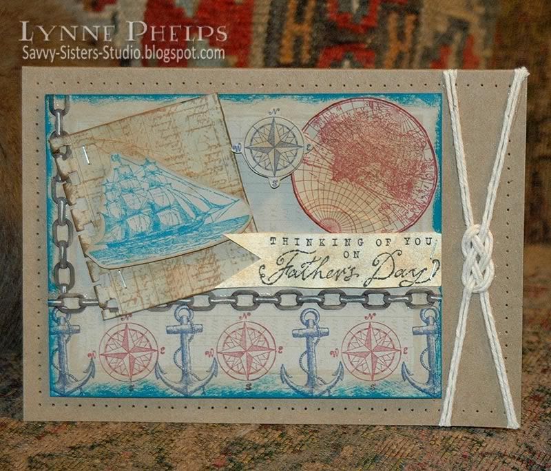
I have the most wonderful father in the whole world, and he means the whole world to me!  They say that we don't remember days, we remember moments and every moment with my Dad is a treasure. So a "world" theme seemed very appropriate for Father's Day!


Well, my wonderful Dad has a tardy daughter, as he will be seeing this card for the first time on the blog! I did not finish it until yesterday; I had all my bits and pieces ready earlier in the week but just couldn't get the arrangement the way I imagined it.  I'll get it in the mail tomorrow Dad, but in the meantime, enjoy this blog version!

This card uses "The Open Sea" stamp set from the Stampin' Up! Summer Mini catalog and it is only available until the end of August! Please contact me if you would like to order it; the coordinating designer paper is absolutely yummy. I have ordered it and I think I will get it in the digital paper set also.  My sister is an SU demo and we'd be happy to hook you up with this wonderful set, and by going through a demo you would get the preferred pricing on your order.

The problem I was having is the card front was too crowded. Then I decided to mount the A2 card front (Sahara Sand SU card stock) on a larger 5 x 6.5 inch kraft card base. I was going for a cluttered collage look, but it needed the blank space of the larger card base to ground it.  I decided to mount it off center and balance it with a sailor's knot. Then I needed something to unite the two elements, and a pierced border was the perfect element to tie everything together. The pierced border was created with the Stampin' Up! Mat Pack. This 3-part Mat Pack is always on my craft table within reach, just like my scissors and Stamp-a-Ma-Jig.


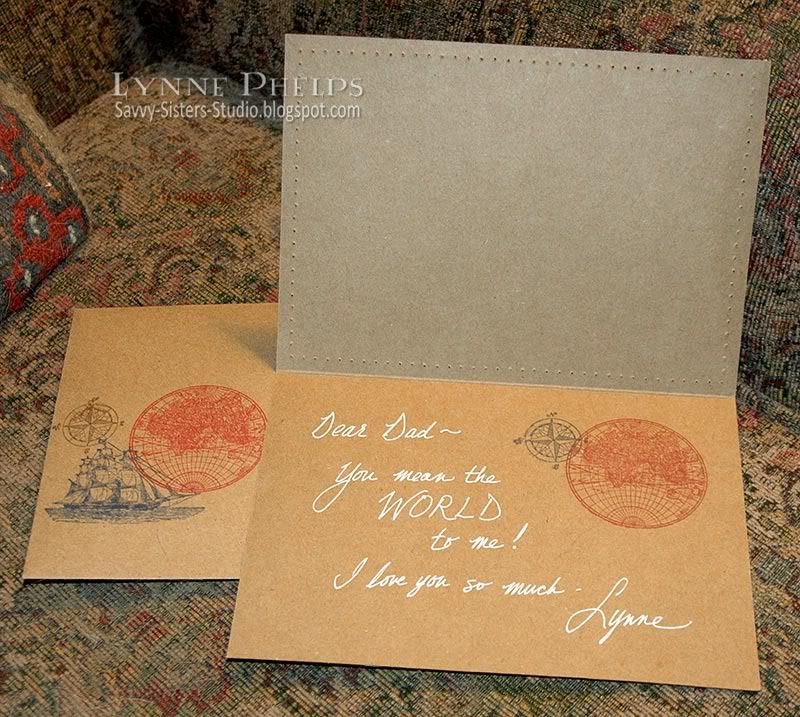
I did not have a stamp with the sentiment I wanted, so I just wrote it in white gel pen along with the stamped world and compass images. I also repeated some of the images on the left front of the envelope, just for fun.


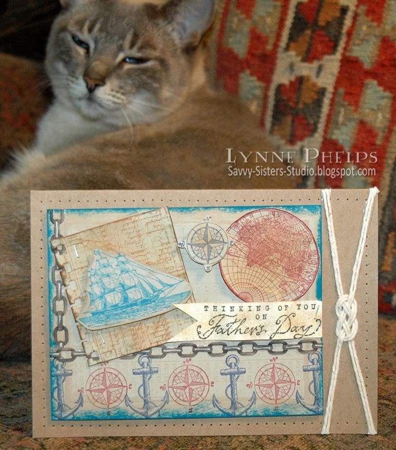
Dad really loves my two cats; in fact he calls them the "grandcats" and always asks after them when we talk on the phone. I was trying to get a photo with Abita's big turquoise eyes looking over the top of the card, but she started drifting into a little cat nap during the photo shoot. It is crazy; I can't keep them OUT of the picture when I am taking pictures of my cards, but when I am TRYING to include the cat, she decides it is time for a snooze! Oh well.

Happy Father's Day to my wonderful Dad, and you'll get the real card in the mail this week!  I love you bunches!

Wednesday, July 28, 2010

Quick Collage Stamping

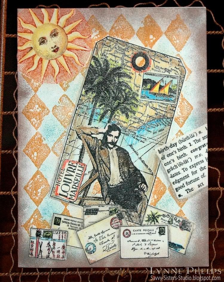
One night after dinner at my sister's house, she asked for a quick demo of this emboss/resist technique I kept telling her about. We moved into the craft room and I had fun raiding her stamp stash. Isn't it fun when you get to play with other people's toys? I picked out a background stamp, a focal image tag stamp, a birthday definition, a sun, and an accent image of letters and postcards. I set up near the heat gun, got out the clear detail embossing powder, located a versamarker pen and prismacolors and a few inkpads in my favorite colors. Now we were ready to roll!
Photobucket
Click to enlarge

This is a true one-layer card - this started off as a plain cream card front. There is no patterned paper or pre-colored images. When you stamp with the emboss/resist technique, you stamp the items in front first and move your way to the background. So the order here was:
  1. Envelopes
  2. Birthday dictionary definition
  3. Tag image
  4. Sun
  5. Diamond background
I stamped the envelopes near the bottom of the card front and colored them in with Prismacolor pencils. Notice that I colored in some gray shadows where one envelope overlapped another; this adds a lot of dimension without adding any layers. Then I colored over the whole stamped image with a Versamarker pen, which writes with clear watermark/embossing ink. I sprinkled clear detail embossing powder over the whole colored image and heat embossed. Now this layer of stamping will not be affected by the stamping that will come after it, as the embossing will repel future applications of ink.

Photobucket
Click to enlarge

Points for perfection: This card shows several flaws that happened with the Versamarker step. I was trying to move too fast and should have taken a bit more care. See the bottom corner of the envelope just to the left of middle?  I missed coloring in one little corner with the Versamarker, so the brown sponging that came later was able to stain the unprotected corner.  On several of the other envelopes, my Versamarker coloring went just outside the lines, so the subsequent brown sponging left white gaps where the embossing resisted the ink.  To avoid these problems, color the Versamarker up to the lines but not on or over the lines. It is better to be inside the lines than out of them.

I stamped the birthday dictionary defintion at an angle, colored a rectangular area with a Versamarker to encompass the text and heat embossed with clear detail powder. Next I stamped the tag. Although it is actually stamped on top of the envelopes and birthday definition, the glossy embossing does not accept the ink and easily wiped clean.  I colored in the tag with Prismacolor pencils, covered the entire surface with a Versamarker and heat embossed with clear detail powder.

Then the sun was inked with bright copper, then a dark brown inkpad was dabbed onto the eyes, nose and mouth, then stamped and colored in with Prismacolor pencils.  I colored with a Versamarker on the sun face and yellow rays, but NOT over the copper radient lines. Then I heat embossed the sun with clear detail powder.

Photobucket
Click to enlarge

Last, the diamond background was stamped with ochre ink over the entire surface. The open areas of the pattern were sponged with turquoise blue. Dark brown was sponged all around the edges. Notice how you can see the diamonds through the sun's radient lines but not in the yellow rays.  A slightly damp paper towel was used to wipe all the embossed surfaces clean of ink.  Shadows were added with a gray Prismacolor pencil around some elements to give a more 3D look. Voila!
Once you get used to the steps, this is a really fast technique, without the hassle of making masks out of paper. About 30 minutes for this card, not counting the stash raiding time! ;-)

Photobucket

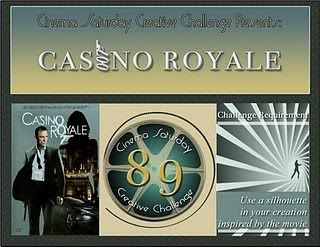
I am entering this in the Cinema Saturday Creative Challenge #89: Casino Royale. Although this man has a moustache, he reminds me of Bond lounging on the Mediterranean coast while he was happy with his love, before the betrayal. The European locale, the travel implied by the map, it all makes me think of the movie. The envelopes remind me of all the nationalities of the players in the poker game in the beginning. I know I am missing a silhouette, I just couldn't figure out how to work it in!

I hope you'll give the emboss/resist technique a try!  Please leave me a comment, I love to hear from you!

Stamps: Tin Can Mail (Inkadinkado) - tag and envelopes; Hero Arts - birthday definition; A Stamp in the Hand - sun; Stampin' Up! - Print Pattern (background).
Paper: Value Pack - 5 x 6.5 inch ivory card and envelope.
Ink: Marvy Matchables - black, copper, brown, turquoise and ochre; Tsukeniko - Versamarker; Prismacolor - colored pencils.
Miscellaneous: Ranger - clear detail embossing powder; heat gun; sponges.

Thursday, June 17, 2010

Waltzingmouse June Customer Blog Waltz!


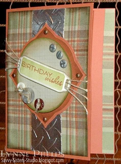
Welcome to the June Waltzingmouse customer blog waltz! Instead of hopping from blog to blog, we WMS fans waltz our way through! This month's theme is masculine cards.  I have also entered this in the brand new Waltzingmouse Sketch Blog competition for their second week's sketch! Have you visited this brand new WMS sketch blog? Sketches are card layouts, and everyone makes a card from the same layout and submits them. WMS stamps are not required for their new sketch blog challenges, but you get a bit extra if you win and have used Waltzingmouse stamps.  Last, I am submitting this card for Stamping Sisters in Christ Challenge #43, to create a masculine card.

Photobucket

Nothing says masculine to me like chrome diamond plate! I taped a piece of aluminum HVAC tape to a piece of cardstock, burnishing it down smooth. Then I ran the aluminum covered cardstock through my Cuttlebug in the diamond plate embossing folder. Doesn't it look real? I love it, but it was very difficult to photograph, hence all the angled photos! The background was created with several of Waltzingmouse's plaid building stamps in various widths, stamped on a light taupe card stock. I used nice manly shades of brown, olive, tan, and rust. Not a bright or pastel anywhere! The diamond plate was adhered to the plaid panel after the plaid had been sponged round the edges with Walnut Stain.

The center medallion started with a Label Three die cut, sponged with Walnut while still in the die. It was fastened to the plaid panel with antiqued copper brads. Then I stamped the grid background stamp in tan on light taupe card stock, sponged it with Corduroy and Peeled Paint along the very edge, grunging it up a good bit! Last, I cut one of the Ribbon Tag Trio from ivory card stock, sponging it with Peeled Paint while still in the die, edging it with Walnut Stain, and stamped in Copper with the sentiment.

I attached the screw head brads and the buttons tied with jute string to the grid circle, which I mounted with pop-dots to the label. Then I threaded twine and jute string through the ribbon tag, and attached it at an angle to the circle with a pop-dot. I fanned out the ends of the string for fun and to emphasize the angle!

Photobucket

When I made the background plaid, I had some strips I trimmed away. I attached one of the strips to the inside right margin of the card to carry the theme inside!

To see more of the Blog Waltz entries, go to the Waltzingmouse House Forum, where the links list thread will open at 10 a.m. Eastern time!  You need to go through a one-time simple free registration with no awkward questions, then you can see everyone's links to their projects. Please join us, it is so much fun!

Stamps: Waltzingmouse Stamps - Off Beat Backgrounds, Pic-Nic Patterns, Fancy Phrases.
Paper: Georgia Pacific - light taupe card stock; Stampin' Up! - Really Rust card stock.
Ink: Ranger Distress Ink - Walnut Stain, Corduroy, Peeled Paint, Scattered Straw; Memento - Rich Cocoa, Bamboo Leaves; Palette - Haystack; Marvy Matchables - Copper.
Embellishments: Jute string; hemp twine; The Paper Studio - buttons, antique copper mini-brads; Karen Foster - screw head brads.
Tools: Spellbinders - Labels Three, Ribbon Tag Trio; EK Success - 2¾ inch circle punch; Cuttlebug - Diamond Plate embossing folder.
   

Wednesday, June 16, 2010

Cinema Saturday #82: Golf - The Greatest Game Ever Played

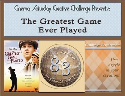
Have you tried the Cinema Saturday Creative Challenges? Each week they pick a new movie - sneak peeks start Friday and the new movie is announced each Saturday. You create something inspired by the movie and submit it on their blog! It is good fun, and it is always a good movie - NO horror!  I can't deal with horror movies, they give me bad dreams! This week the movie is The Greatest Game Ever Played, a Walt Disney movie from 2005.

Photobucket

We vacation on Captiva Island every summer, and our condo is in the middle of a golf course overlooking the ocean. When I think of fun in the sun for summer I think of ocean-side golf courses, so I am submitting this to the Shabby Tea Room Week #14 Fun in the Sun Challenge. I am also submitting this card for Stamping Sisters in Christ Challenge #43, to create a masculine card. So here is my fun-in-the-sun masculine card, inspired by the movie, with argyle!

Photobucket

Inside it says "Go confidently in the direction of your dreams; Live the life you've imagined."  I thought this quote by Thoreau truly captured the Francis Oimet's desire to play golf despite the class barriers that were holding him back.  This is a wonderful movie that always reminds me of Bagger Vance - golf is the vehicle, but it is really a story about life and the human spirit. Francis is told by everyone that he can't play, he is not a gentleman, he is just a caddy. He can't even be a member in the clubs where the championships were played! It is based on the true story of the 1913 U.S. Open Golf Tournament.

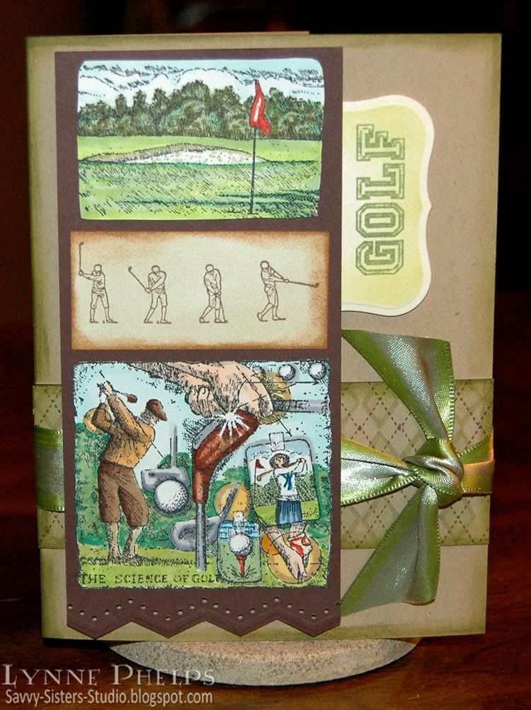
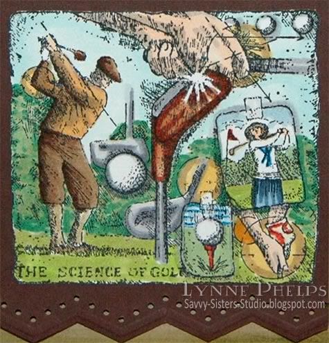
I knew right away what stamp set I wanted to use: "The Back Nine" by Stampin' Up!. I stamped the two sketchy images from "The Back Nine" stamp set with black on color laser printer paper, and had a wonderful time coloring them in with Copic markers. The large collage image really reminds me of the movie, back in the days when you had clubs called mashies and niblicks.  The man is also wearing the same kind of snap brimmed hat that Francis wore - perfect!!  And there was an lovely upper-class young lady in the movie, and the lady golfer in the collage made me think of her.

Photobucket

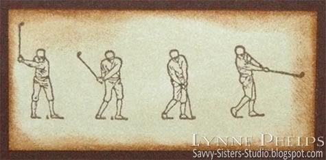
I stamped the golf swing steps image with brown on color laser paper and sponged it with distress inks. Love this image! All three images were trimmed out and mounted on a brown panel that was zig-zagged on the bottom with a border punch. The zig-zags and holes of this punch remind me of the diagram maps of golf courses that shows the layout of the holes.

Photobucket

I stamped a panel of kraft card stock with a background building argyle set; I was thrilled to have a reason to use this new set!  My green diamonds weren't showing up enough, so I edged the diamonds with YG91 Copic marker.

The kraft card base is a bit oversized to allow for all my images, 5 x 6.5 inches folded. I sponged the edges with green distress ink and cut a slit in the fold of the card for ribbon. I adhered my argyle panel then I edged a double-faced satin ribbon with YG03 to brighten it up a bit and knotted it around the card front and argyle panel.  The brown panel with the three images was adhered with dimensional pop-dots. I stamped the word "Golf" on a die-cut panel that had been sponged with lighter green ink. This was mounted on lower dimensionals, tucking in behind the brown panel.
My Dad says golf is a game that was invented to keep you humble. You are always striving to surpass your own past performances and struggling to do better. That is a pretty good metaphor for life, isn't it, always striving to become a better, wiser, and hopefully kinder person?

I hope you enjoyed my interpretation of  The Greatest Game Ever Played, and I hope it will encourage you to watch this movie yourself. I am not a huge golf fan but I love this movie - it is worth watching just to see his sidekick ten-year-old caddy! If you liked Bagger Vance you will probably like this movie - the main character reminds me so much of the little boy in Bagger Vance, only grown up a bit more but still golfing-mad!
Stamps: Stampin' Up! - The Back Nine set; Papertrey Ink - A Little Argyle; River City Rubber Works - Golf.
Paper: Papertrey Ink - kraft card stock; Stampin' Up! - Chocolate Chip card stock; HP - bright white color laser printer paper.
Ink: Memento - Tuxedo Black, New Sprout, Bamboo Leaves; Palette - Burnt Umber; Ranger Distress - Peeled Paint, Old Paper, Vintage Photo; Copic Sketch markers.
Miscellaneous: Double-faced satin ribbon; EK Success - slimline border punch.

Thursday, June 10, 2010

For My Favorite Dad - A Tri-Shutter Card!

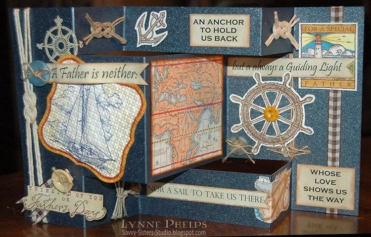
This card has been in the making for quite a while. I had all my bits and pieces stamped and cut out, but needed a piece of 12x12 inch cardstock because I wanted to make a Tri-Shutter card, so it had to wait on a run to Hobby Lobby. I found a wonderful pad of Bazill pearlized cardstock which included this beautiful dark blue that makes me think of light sparkling on the ocean and starry night skies! You can click on any of the photos to "embiggan!"

Photobucket

I create a lot of my sentiments on the computer, and I just print them out on my B&W laser and cut them up. Did you know that Scrapbook.com has an amazing Resources section, which includes Quotes & Phrases organized by topic, and even lets you send email with the ones you like? In the section called Father I found a wonderful verse that inspired this card, plus many more for future years!
A father is neither an anchor to hold you back,
Nor a sail to take you there,
But always a guiding light
Whose love shows you the way

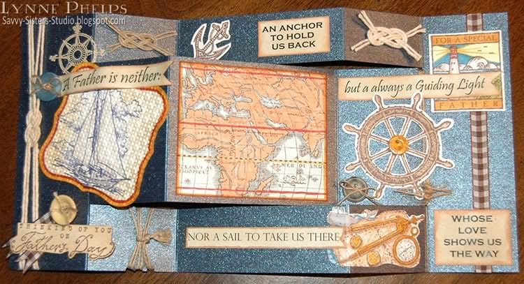
This was my first card of this type. Dad, I don't know why it is called a Tri-Shutter card. There is an awesome tutorial on Splitcoast Stampers that even includes a video for visual learners like myself.  It was so easy to make - you cut the sheet of 12 x 12 in half, then you score the long side at 2, 4, 8, and 10 inches. You cut twice down the length from the first score mark to the last. The trick is that you alternate your valley and mountain folds on each tier. Here is my card flattened out so you can see how simple the structure is.

Photobucket

Then I went to town decorating it with all the bits I had stamped and colored previously. Of course the verse demanded nautical elements, so I started with a sailboat stamped in blue, colored with Copic markers (gray on the sailboat and colors around the edge), textured with an embossing folder, then sponged with Distress ink. The small compass rose just above it was stamped with Versamark and heat embossed with Zing Brown Sugar embossing powder - the closest I have found to a cream or vanilla colored embossing powder so far.

Photobucket

The rest of the elements were stamped with brown ink on white cardstock and colored with Copics. The verses, which started on white printer paper, were colored with and edged with Distress Inks. Buttons were added for fun and for ballast - they make the card very steady when standing on a table. Tip - I had placed the first button high on the front, but it made the card topple. I added two more buttons to stabilize it, both placed low on the card, especially the one in the section that bends back!

I filled in with Sailors Knots on the small panels where none of my elements fit.  I love the look of this knot, but had to find a web resource to learn how to do it. Once you know it is so simple - just weaving over and under. I used two strands held as one for a more showy knot.  I found this page with an animated gif that made it easy to understand! Here is what they have to say about this knot: "The Sailor's Knot, also called The Anchor Bend, Carrick Bend and Full Carrick Bend. It's easy to tie, does not slip easily in the wet, and is among the strongest of knots - it can't jam and is readily untied."

I am submitting this card for Stamping Sisters in Christ Challenge #43, to create a masculine card.

Happy Father's Day to the most wonderful father in the whole world!  He is my very favorite Dad! (He is my ONLY Dad, but he always says I am his very favorite Lynne so I thought I would return the favor!) 
I hope you enjoyed my first Tri-Shutter card! It was such fun to make. It would be fun to make more - they are sort of like little tiny stand-up scrapbooks. I can see this one sitting on my Dad's desk for a little while - it might even rate the fireplace mantle for the first week! ;-)  Please leave a comment, they are so much fun to receive!!

Stamps: Stampin' Up! - Thinking of Father, Wonderful Woodcuts;  PSX -  sailboat, anchor;  Impression Obsession - ship's wheel;  Stampabilities - small compass rose.
Paper: Bazill - dark blue pearlized card stock; Beckett - Expressions Radience (white); Laser printer paper.
Ink: Memento - Rich Cocoa (brown); Ranger Distress Ink: Old Paper, Tea Dye; Tsukeniko - Versamark; Copic - alcohol Sketch markers.
Miscellaneous: Buttons; hemp twine; cotton twine; thin jute string; gingham ribbon; Zing - Brown Sugar (color) embossing powder.
Tools: Ranger - Ink Blending Tool; Stampin' Up! - Square Lattice embossing folder.
Related Posts with Thumbnails