Wednesday, March 18, 2009

BittyDot Sketch Challenge

This card was created for the fun "connect the dots" sketch that Papertrey Ink used to celebrate the release of their BittyDot paper. That second anniversary celebration really set a new level of superiority for blog events!  While I have a huge wish list of PTI stamps and other products, I do not actually own any. . . YET!  So instead I turned to dot-related stamps from my own collection to honor the dots theme. 


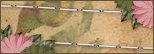
I started with SU "Dotted" background stamp using dark olive dye ink on an Old Olive background.  The white flowers were punched, then I cut between the petals towards the center and curled the petals up to give them some dimension and attached with mini black brads.  The center panel uses stamps from the SU "Be Happy" set.  The border punched panels have a punched dot in each scallop, and the dotted ribbon finished off the theme!

Polka dots of any size are fun, and I enjoyed mixing up all the different scales on this card!  What are some of your favorite polka dot creations?

Card Details:
Stamps: Stampin' Up! - Dotted, Be Happy
Ink: Marvy dye ink - Pond Green
Paper: Stampin' Up! Old Olive, black, white
Embellishments: brads, ribbon
Tools: Fiskars Threading Water border punch

Monday, March 16, 2009

Chalk Ink Resist Technique and DIY Flower Embellishments!


I made the flower embellishments on this card - they are kind of different and they look really neat IRL as they have a lot of dimension. They are punched out of white fun foam, then colored with Copic markers and attached with brads!  Easy! 

This card is made with a chalk ink resist technique that is quick and fun and always produces "Wow" effects! Chalk Ink has very special behaviors on glossy paper. 


You will need chalk inkpads in light to dark colors, glossy coated paper like Kromekote, lots of tissues, and stamps with solid areas.  Your inkpads must be juicy for the best results - reink your pads if necessary. Remember to really shake up the chalk reinkers before using on your pads.

Begin by stamping your lightest color - I used gold.  Then polish off the glossy paper with a tissue.  It is like magic - the matte chalk disappears and the vivid ink color appears to be part of the glossy paper!  Stamp your next color, buff with tissue, and so on.  

Overlap the stamping so you can see how the colors intersect.  It was so hard to place the olive cardstock band as I didn't want to cover anything up!  You can see how the colors interact in the center, where the olive green overlaps the gold, and the gold shows through where it resists the subsequent color.  You can also see where I went out of order - I decided I wanted a little more gold in the upper left corner, and it doesn't interact at all when stamped over the darker red and blue.  Remember - light to dark!

After everything was assembled, I didn't like the straight edge, so I cut it with a decorative edge scissors.  Remember those?  ;-)  Then I sponged olive around the edges to highlight against the More Mustard cardstock.

Have you tried this technique?  I'd love to see your results - leave a link on your comment!

Details:
Stamps: PostModern Design cube
Ink: Colorbox Fluid Chalk ink pads, Copic markers
Paper: Kromekote glossy cardstock, Stampin' Up! More Mustard, Old Olive cardstock
Accessories & Tools: ribbon, brads, decorative scissors, MS arches border punch

Sunday, March 15, 2009

Message in a Bottle

Who wouldn't like to find a message in a bottle?  This image of a bottle washed up on a beach made me think of messages to and from far-away friends!


This was a fun card to make. I stamped the Peddlar's Pack Message in a Bottle image by inking it with a Versamarks and then Black dye inkpad, stamping, and then embossing with clear detail powder.

I colored the image with markers, then I went over all the glass parts of the bottle (not the cork or tie around the neck) with a VersaMarker pen, and embossed it with clear embossing powder. 

Then I stamped the MSE Innie-Outie sentiment above and below the image, colored over the area with a VersaMarker and embossed with clear detail powder. I then sponged bright Marvy dye inkpad colors in the top and bottom areas and outlined with a silver Krylon leafing pen.

I put two photos so you can see how shiny the bottle is - much cooler looking in real life! It really does have a glass-like look.

You could probably get the same effects with Diamond Glaze (Crystal Effects in Stampin' Up speak), but I am too impatient to wait for it to dry.  I also thought the chances of it drying without being "investigated" by one of the cats was slim to none!

Thanks for visiting my new blog, and I hope you'll check in again soon!

Card Details:
Stamps: Peddlar's Pack - Message in a Bottle; My Sentiments Exactly - Innie/Outie sentiment
Ink: Marvy die inkpads; Marvy markers, Silver Krylon leafing pen
Accessories: Clear detail embossing powder

Tuesday, March 3, 2009

First Post, My First Blog Layout!

I am just starting my blog, and trying things out!  I couldn't find a blogger layout template that appealed.  I noticed a lot of the cute layouts have a credit in the corner for thecutestblogontheblock.  What a great site!  I did not use any of their wonderful free backgrounds, but I did rely on their Blog Secrets to customize this blog layout and create my own background!

I started with the Minima layout because it looked the easiest to alter.  Just like my love of altered art, I had to start my blog by altering it.  I added a third column, changed the width,  and it went on from there!  

They recommended the Digi Scrap Depot website for freebies, and were my eyes opened!  I am a graphic/web designer and had never known about digital scrapbooking.  I went a little crazy on my background, but I was having such a good time with digital paper and elements from the Beautiful collection by Bel Vidotti!

I hope it is not too much.  Let me know what you think. Future posts will contain info and pictures on cards and other projects, so please check back.
Related Posts with Thumbnails