Alice sighed wearily. `I think you might do something better with the time,' she said, `than waste it in asking riddles that have no answers.'
`If you knew Time as well as I do,' said the Hatter, `you wouldn't talk about wasting IT. It's HIM.'
`I don't know what you mean,' said Alice.
`Of course you don't!' the Hatter said, tossing his head contemptuously. `I dare say you never even spoke to Time!'
`Perhaps not,' Alice cautiously replied: `but I know I have to beat time when I learn music.'
`Ah! that accounts for it,' said the Hatter. `He won't stand beating.'
-- Chapter 7, Alice's Adventures in Wonderland
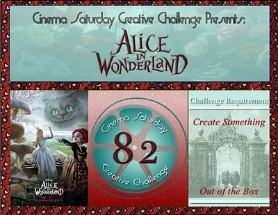
Time marches on so it's time for a new challege, and the challenge is to make something that represents TIME! Take your time, you have until May 27 at 8 p.m. Eastern Daylight Time (GMT -4:00) to show us YOUR timely creation - link it at the bottom of
this post on The Altered Alice! There are so many ways to represent time - you could use a clock or a watch, hourglass, calendar. . . take some TIME to think about it and then be sure you submit on TIME because TIME flies! Ok, I think I have it out of my system. . . or is that my clockworks?
Our sponsor this month is Fresh Brewed Designs, and they have some fabulous
Alice in Wonderland digi images that some of the design team will be using.
The randomly chosen winner of this month's challenge will receive five digi stamps of their choice from the Fresh Brewed Designs store!
While it is not required that you use Alice in Wonderland images, we do encourage it.
Entries that feature some aspect of Wonderland will be entered twice for the prize drawing!
Three guest designers will be joining us for May:
Jess Marin of
My Scrap Diary will be sharing her project in our Week 3 post, and
Retta Fox of
Foxy's Weblog and
Tracy (CuddlyBunny) of
Not a Moment to Spare will be sharing their creations during our Week 4 inspiration post. I know you will enjoy seeing the work of these talented designers, two of whom are past entrants to our challenges!
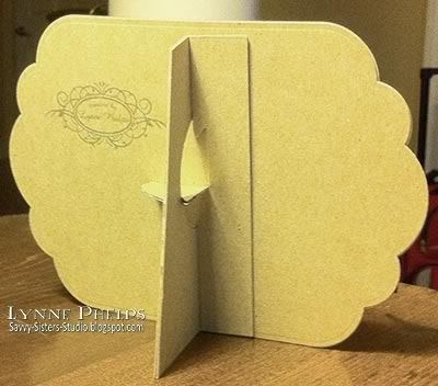
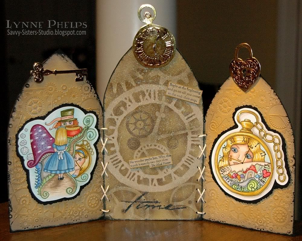
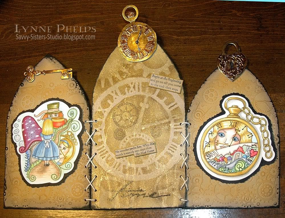
Arched Triptych:
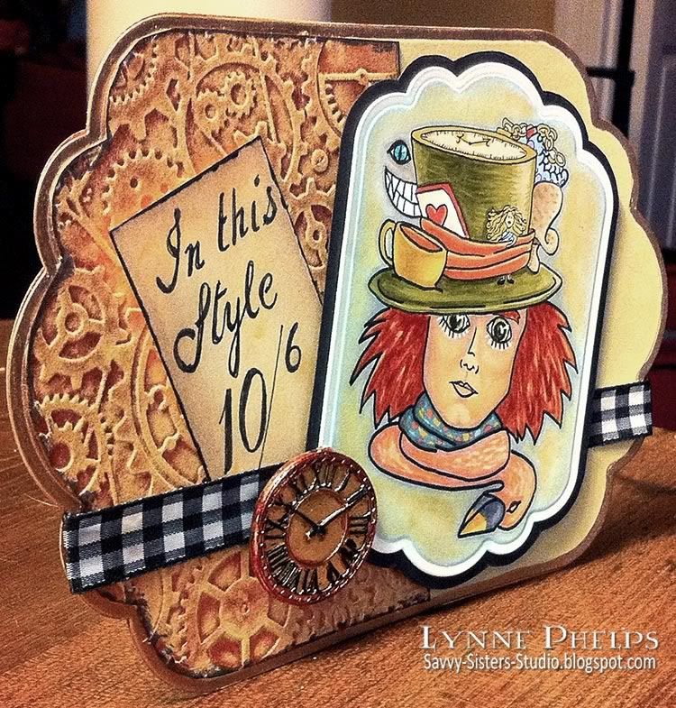
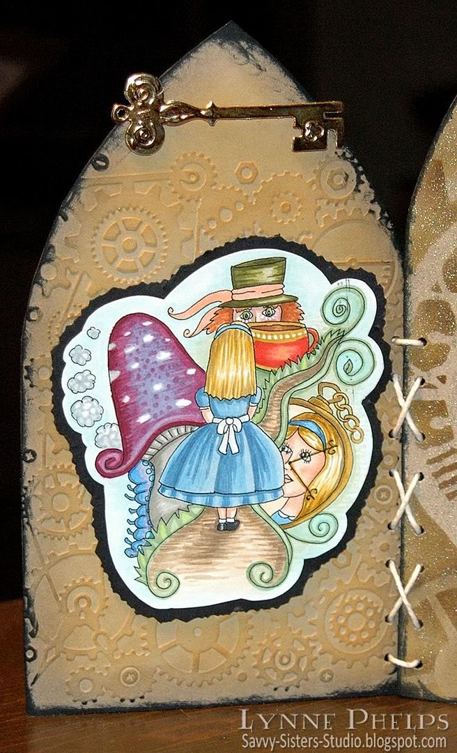
I created a freestanding arched triptych featuring clockworks and two of the Fresh Brewed Designs. The panels started as cut up chipboard packaging! I think it was a popcorn box and a cracker box that sacrificed their lives for this project, lol! On the two side panels, I embossed kraft card stock (Stampin' Up!) with the Cuttlebug Clockworks folder, then I sponged with gold and taupe inks, then I rubbed a black inkpad directly onto the edges to create a bold outline. I glued the embossed card stock to the patterned side of the packaging so the back looks nice too!
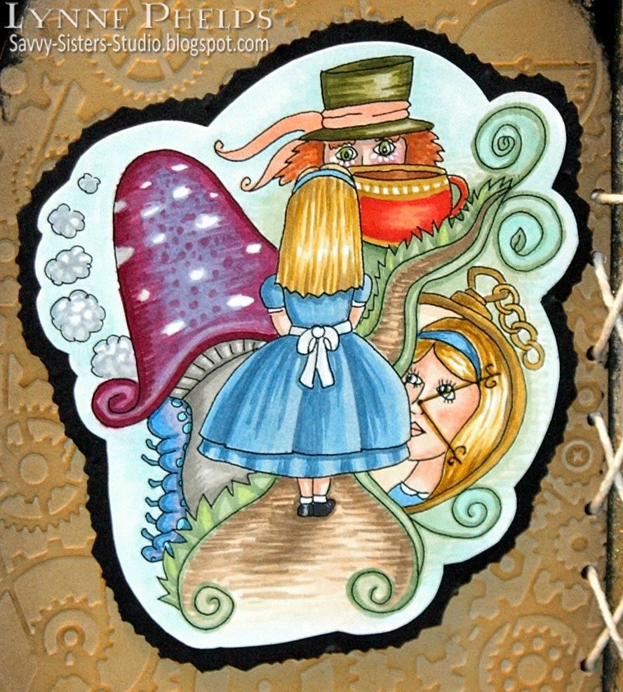
This image is called "
Wonderland" and you can find it with all of the Alice designs on
this page. These Fresh Brewed Designs images are such fun to color, as you keep finding more and more details. For instance I had not immediatlely seen that the Caterpillar is puffing away on his hookah behind the mushroom! I printed the images on color laser copy paper using a B&W laser printer. This is perfect for coloring with Copics, no worries about the printed ink smearing this way.
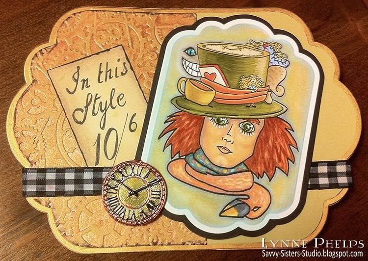
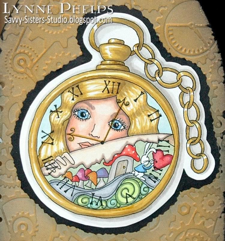
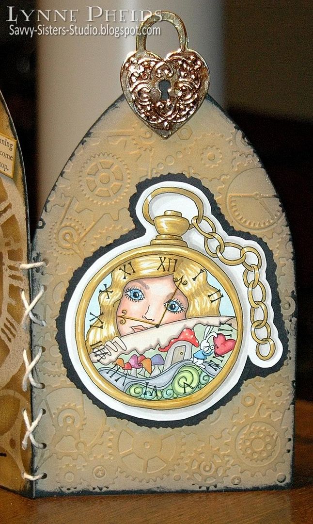
This image is called "
I'm Late" and you can find it with all of the Alice designs on
this page. I love the way Alice is peering through the clock on this image. I also love the instant gratification of digi stamps as there is no waiting for shipping. Consider using one of Heather's designs for your own project! I pasted the colored images onto card stock, trimmed them out, then pasted the trimmed out stiffened image onto black card stock. I cut the black layer out with a deckle edged scissors. I thought the rough edge went nicely with the blank inked edge on the panels, which were adhered to the arched panel with foam tape for dimension.
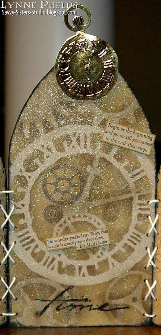
The center panel was masked with Tim Holtz Timeworks precut masks, airbrushed with Copics, then misted with Perfect Pearls Mist in Heirloom Gold. I love this stuff! I propped my image up at an angle when I misted it, and the metallic dripped and ran into the coolest texture, which looks so cool in real life! I popped up two Alice quotes from a Tweety Jill TJ Designs stamp set:
"No wonder you're late. Why, this watch is exactly two days slow." and
"Begin at the beginning and go on until you come to the end; then stop." The brown gears are from a Stampin' Up! set, and the Time stamp by Art Impressions was heat embossed with black detail powder. I adhered shiny aluminum HVAC duct tape to card stock, then die cut and embossed it with the Spellbinders Timeless Heritage die set. I colored it with Copics, including the tiny watch hands that I glued on, and mounted it to the panel with foam tape.
The left side panel was topped with a key from the same collection.
The right side panel was topped with the padlock. I colored the panel black behind the keyhole so you wouldn't look through to the gold.
I stacked the center and one of the side panels and punched holes through both at the same time with a
Crop-a-Dile
. This way I could be certain that the holes lined up perfectly! Then I repeated it on the other side and threaded cotton string through the holes to lace the panels together. I thought this added some fun and interest, and it helped to have another pop of white to tie in the background of the images.
I hope you have enjoyed my Fresh Brewed Designs arched triptych! You can enter your own creation for our
CHAPTER 4 TIME challenge at The Altered Alice.
ETA: Edited to add that my triptych was the Featured Project on the Fresh Brewed Designs Challenge Blog! Thanks Heather!
 Please leave me a comment before you go!