Showing posts with label Stampin' Up. Show all posts

Saturday, December 17, 2011

A Lewis Christmas Caroll to you!

Calling all Alice fans - make a Wonderland holiday card and link it on The Altered Alice; there is a wonderful prize up for grabs!
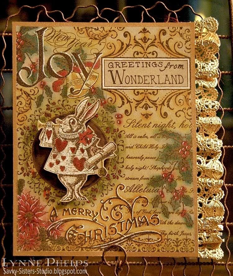
I have not had time to create anything this month, but I wanted to share a couple older Wonderland Christmas cards with you.  This first one is one of my top favorite cards ever! The background is a fabulous collage stamp by Stampin' Up! My sister is a hobby demo, so we'd be happy to help you get your own Christmas collage stamp if you need one.  I stamped it on Kraft card stock, double inking the rubber with brown dye ink and then Versamark before stamping, which allowed me to heat emboss with clear detail powder. Then I did detailed sponging, using the Tsukeniko Fantastix to rub in various colors of distress ink. I printed "Greetings from Wonderland" in the blank rectangle in the design using a brown pen.
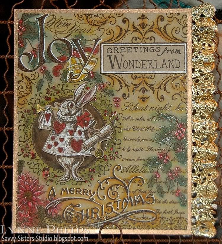
Then I highlighted some areas of red and gold with Smooch, love that stuff. I added white gel pen highlights to give dimension to the letters and berries. The White Rabbit was also embossed on kraft and colored with a white gel pen, prismacolors, and Smooch. The gold ruffled lace is a doily from the baking aisle. I cut out the center of the doily, just leaving a thin strip intact right above the lacy edge. When I straightened it out to adhere it the the edge, it creates lovely flounces that I manipulated with my fingers to make pleasing ruffles.

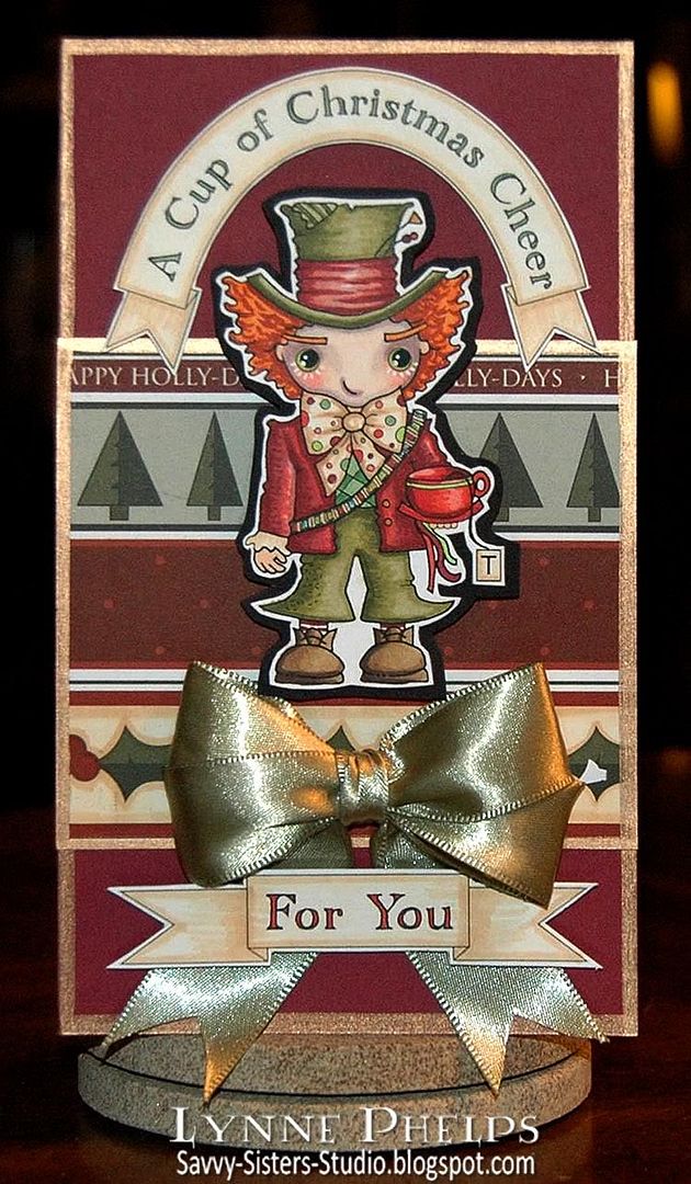
This next card is the Pixie Dust Studios Mad Hatter and the paper is Nikki Sivils. I created the banners and sentiments on the computer, coloring and trimming the printouts. The gold Krylon paint pen edging adds some elegance, and the rich satin ribbon is the perfect finishing touch
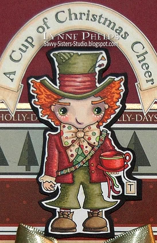
I had a wonderful time coloring this fun image with Copic alcohol markers. Of course I had to color the face a la Johnny Depp! I added more details with a multiliner, like defining the thread areas of the spools on the bandoleer. I trimmed it out, but the small white rim did not isolate it enough from the background patterns. I wanted the Mad Hatter to stand out, so I glued the trimmed out figure to black card stock and trimmed it out again with a larger margin. I really like the way this looked, and it isolated him from the background so he now stands out against the patterns.

Merry Christmas to you and yours! I hope you experience your own Wonderland this year as we once more welcome Christ into our hearts.

Notice Lewis Carroll and Alice in Wonderland in the left panel, and all the characters below.
I will leave you with the full quote from the poem that is quoted in the Lewis Carroll nativity window, "From a Fairy to a Child":


LADY dear, if Fairies may
For a moment lay aside
Cunning tricks and elfish play,
'Tis at happy Christmas-tide.

We have heard the children say—
Gentle children. whom we love—
Long ago, on Christmas Day,
Came a message from above.

Still, as Christmas-tide comes round,
They remember it again—
Echo still the joyful sound
"Peace on earth, good-will to men!"

Yet the hearts must childlike be
Where such heavenly guests abide;
Unto children, in their glee,
All the year is Christmas-tide!

Thus, forgetting tricks and play
For a moment, Lady dear,
We would wish you, if we may,
Merry Christmas, glad New Year! 

--Lewis Carroll; Christmas, 1867.

Friday, September 30, 2011

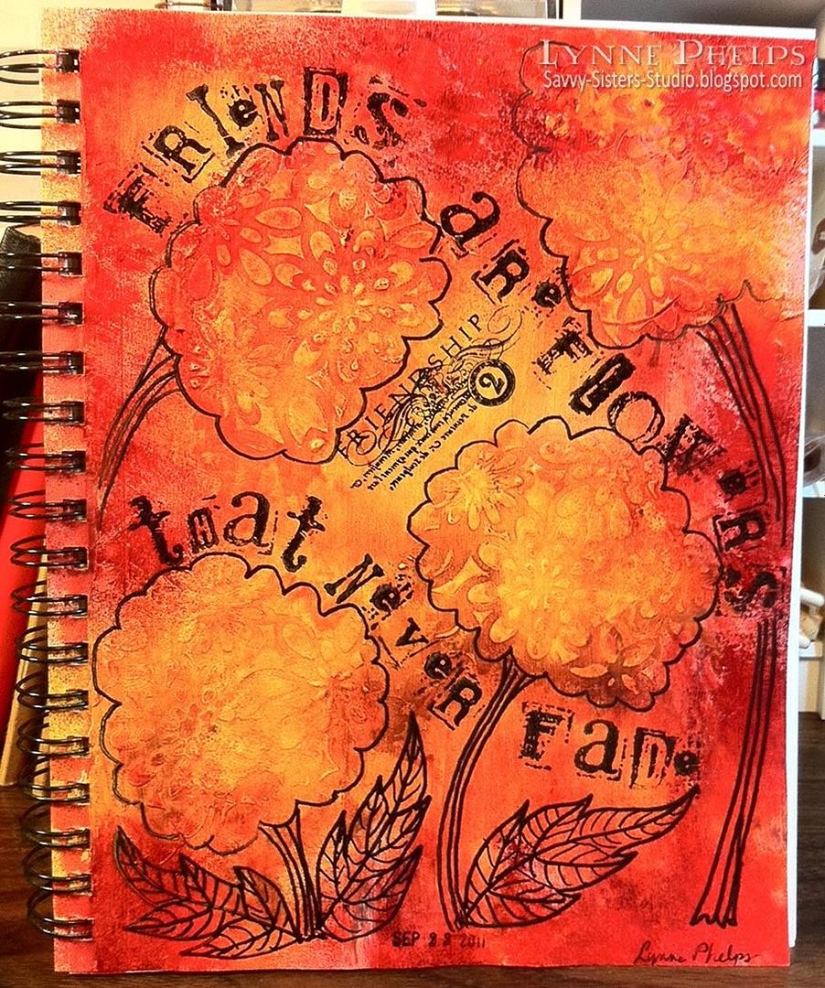
Friends are Flowers that Never Fade

Last Friday my little stamping group decided to play with spray inks. I had not used spray inks prior to this and it was quite a learning experience! We started by putting a coat of gesso on the page. This allows the ink to move around freely, it won't soak into the page.  The actual colors are deeper and richer than shown. Sorry about the photography, my iPhone doesn't come near my Nikon DSL but I was in a hurry! :-)

Click to enlarge
We used Ranger Color Wash Spray and Tim Holtz Distress Stains. After I had some red and yellow swimming around on the page of my 7 x 10 Canson Mixed Media journal, I heat dried it and added some texture with stenciling. Molly had a Crafters Workshop flower patterned stencil, so I used a credit card to swipe some gesso through the openings. I put several random splotches around the page. It looked really cool! Then more spraying fun. Note: gesso comes in various thicknesses. I was using the Claudine Helmuth gesso which is very thick and comes in a jar, not a bottle.

However, I had not really thought it through. I was thinking the acrylic gesso would act as a resist, but of course gesso is a primer and it is made to hold the paint that goes on top of it. I want to try this again with some acrylic paint, which I think will resist the subsequent layers of color. Still, the dimension of the gesso flowers caused the spray inks to pool around each raised area which gave a neat effect!

Then I added the words with my all time favorite alphabet set, the retired Stampin' Up! Collage letters and numbers. The Friendship stamp is part of a series of words by Kelli Everett from The Uptown Design Company, now sadly out of business. I used Stazon black ink; the stickiness of the ink was a plus on the non-porous surface. I used a black Sharpie to doodle flower outlines, stems and leaves.  A date stamp was added last.

Supplies: (Note - if you are reading this in email or a reader, you will have to go to the blog to see the supplies, just click the title of this post.)

Linky Tools - Personal Link Library!
There has been a lot of buzz about InLinkz new "Link Manager" tool.  I sent owner and programmer Brent Riggs a request to add this functionality to Linky Tools.  Three days later Brent contacted me to test the new functionality, and there is no extra cost or separate subscription! I can't tell you how wonderful it is working with Linky Tools.  I will do a separate post about the new Personal Link Library functionality; it is so cool. I just add all my supply links with thumbnail one time and it is so fast to do. Then I can pull those links onto any list I like! You'll be seeing lots of neat supply lists like this from now on. What tickled me (even more than the amazing responsiveness and quick turnaround) was that Brent featured my blog in one of the demonstration videos. I hope you'll check it out, my 90 seconds of fame, LOL!

This was a really fun project. The quote seemed perfect as I was having nice messy fun with friends while making flowers! This page will always bring back memories of a fun evening.

Please leave a comment; your comments are what keep me blogging!
:-)
Edited to add:
Several people commented on the alphabet I used - Stampin' Up! Collage Alphabet and Collage Numbers. Although they are retired, the two sets are readily available on eBay. Click here to see the search on the US eBay, or search for this string in your country's eBay: 
"stampin up" ("collage alphabet", "collage numbers") 
This will search for the alphabet OR the numbers set, so you will see both! They are available at all price points.

Monday, September 12, 2011

And now for something completely different. . .

Click to enlarge
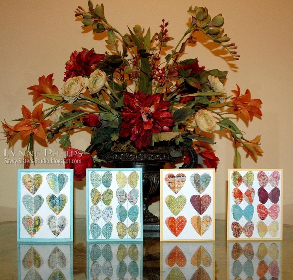
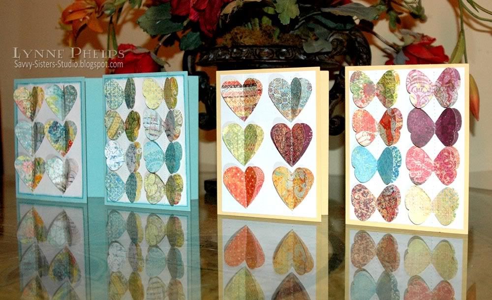
My little stamping group met recently at my friend Judy's house. She had prepared a really fun project for all of us to make! Using the Stampin' Up! Butterfly and Large Heart punches, she had dozens and dozens punched from the K & Co. Que Sera Sera pad. All of these were punched from the same pad, it has a wonderful range of colors. What beautful paper!

They were inspired by an example in this year's Stampin' Up! catalog at the top of one of the punch pages. A really fun fast project, especially since all the punching had been done ahead of time; thanks Judy!

Click to enlarge
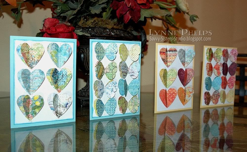
We stacked two of each and used a repositionable adhesive to tack them down until we sewed down the center of each column from top to bottom. Then the top layer of punched shapes are folded up to give dimension. The card bases on the right are So Saffron Stampin' Up! card stock. They are straight stitched on a small sewing machine.

Click to enlarge
The cards on the left use a zig-zag stitch which I like better. The card bases are one of the new Stampin' Up! In-Colors, I love this shade called Pool Party. I sponged the edge of the white cardstock with Broken China Distress Ink.

If you need any of these Stampin' Up! supplies let me know; my sister is a demo and we always have some kind of special! We'd be glad to get you fixed up.

Let me know if you make some of these cards, and please leave a comment before you go!


Sunday, June 19, 2011

Happy Father's Day to My Wonderful Dad!

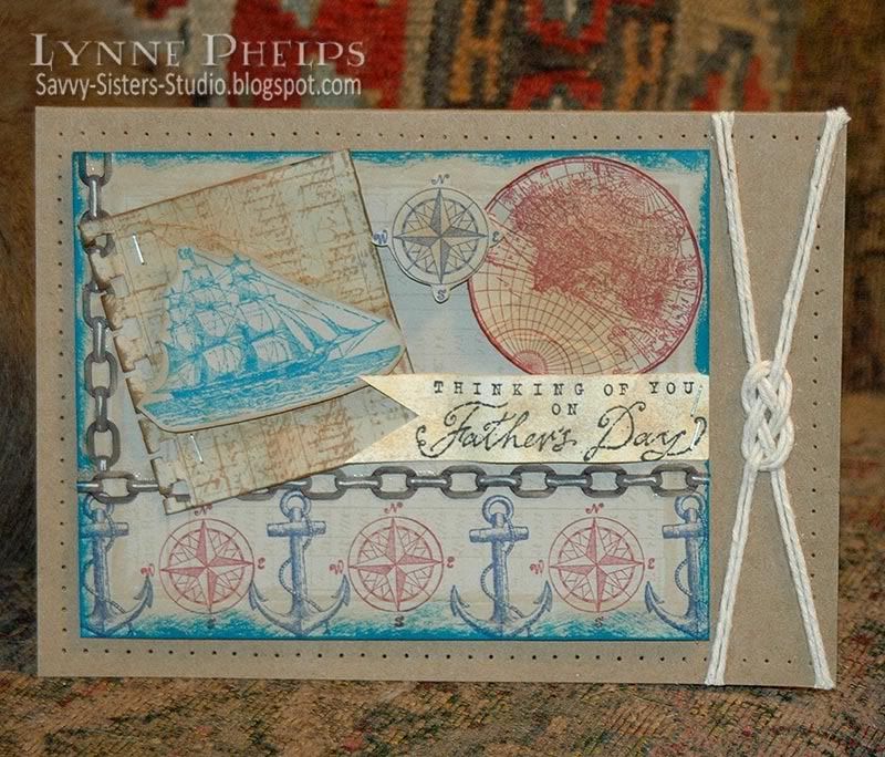
I have the most wonderful father in the whole world, and he means the whole world to me!  They say that we don't remember days, we remember moments and every moment with my Dad is a treasure. So a "world" theme seemed very appropriate for Father's Day!


Well, my wonderful Dad has a tardy daughter, as he will be seeing this card for the first time on the blog! I did not finish it until yesterday; I had all my bits and pieces ready earlier in the week but just couldn't get the arrangement the way I imagined it.  I'll get it in the mail tomorrow Dad, but in the meantime, enjoy this blog version!

This card uses "The Open Sea" stamp set from the Stampin' Up! Summer Mini catalog and it is only available until the end of August! Please contact me if you would like to order it; the coordinating designer paper is absolutely yummy. I have ordered it and I think I will get it in the digital paper set also.  My sister is an SU demo and we'd be happy to hook you up with this wonderful set, and by going through a demo you would get the preferred pricing on your order.

The problem I was having is the card front was too crowded. Then I decided to mount the A2 card front (Sahara Sand SU card stock) on a larger 5 x 6.5 inch kraft card base. I was going for a cluttered collage look, but it needed the blank space of the larger card base to ground it.  I decided to mount it off center and balance it with a sailor's knot. Then I needed something to unite the two elements, and a pierced border was the perfect element to tie everything together. The pierced border was created with the Stampin' Up! Mat Pack. This 3-part Mat Pack is always on my craft table within reach, just like my scissors and Stamp-a-Ma-Jig.


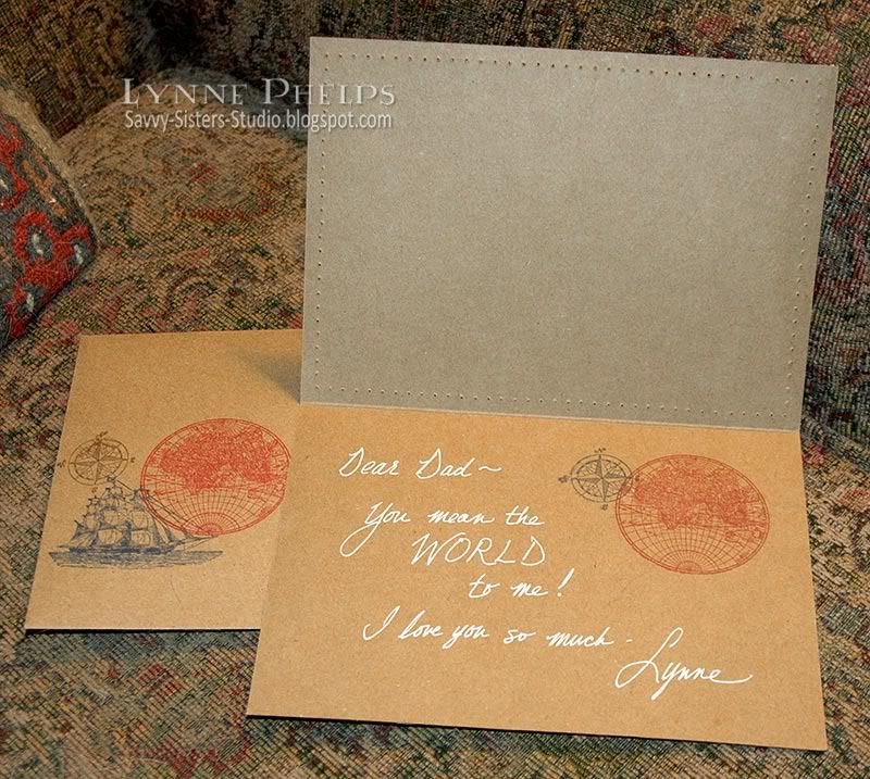
I did not have a stamp with the sentiment I wanted, so I just wrote it in white gel pen along with the stamped world and compass images. I also repeated some of the images on the left front of the envelope, just for fun.


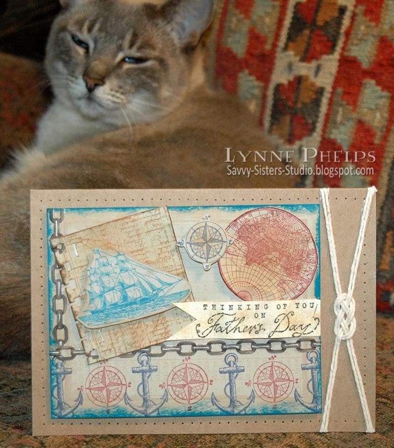
Dad really loves my two cats; in fact he calls them the "grandcats" and always asks after them when we talk on the phone. I was trying to get a photo with Abita's big turquoise eyes looking over the top of the card, but she started drifting into a little cat nap during the photo shoot. It is crazy; I can't keep them OUT of the picture when I am taking pictures of my cards, but when I am TRYING to include the cat, she decides it is time for a snooze! Oh well.

Happy Father's Day to my wonderful Dad, and you'll get the real card in the mail this week!  I love you bunches!

Tuesday, December 21, 2010

Oh Alice! CHAPTER 44: Curioser and Curioser - Winter Wonderland!

Click to enlarge;  Collage stamp © Stampin' Up!

`Curiouser and curiouser!' cried Alice (she was so much surprised, that for the moment she quite forgot how to speak good English); `now I'm opening out like the largest telescope that ever was! Good-bye, feet!' (for when she looked down at her feet, they seemed to be almost out of sight, they were getting so far off). `Oh, my poor little feet, I wonder who will put on your shoes and stockings for you now, dears? I'm sure _I_ shan't be able! I shall be a great deal too far off to trouble myself about you: you must manage the best way you can; --but I must be kind to them,' thought Alice, `or perhaps they won't walk the way I want to go! Let me see: I'll give them a new pair of boots every Christmas.'
Hello from all of us here in Wonderland! This week we are Curiouser and curiouser to see if you are willing to play along with our weekly challenge. The challenge is a simple one, and one that most of us should be able to play along with, we would like to take Wonderland and turn it into a Winter Wonderland! Yes, that's right.....put your boots on, hats, mittens and lets play in the snow! Alice, with a hat on? Rabbit in the snow? Anything that reflects a Winter Wonderland. Have fun with it!

This week we are being sponsored by SUGAR NELLIE / FUNKYKITS. They are a fabulous company and you really should go over and take a peek.
Sugar Nellie is a small Scottish company that brings you fantastic rubber stamps from some amazing artists. Funky Kits is the sole online retailer for Sugar Nellie stamps - so head on over to grab yourself some of that sugary goodness!

The prize for this week will be 1 set of 6, yes, I said 6 Leanne Ellis Alice in Wonderland stamps. I sure wish I was able to win this one. This set of stamps are fantastic!
My Card: Christmas Greetings from Wonderland!

I just received my order from the Stampin' Up! Holiday Mini Catalog, and this fabulous Christmas Collage stamp was at the top of my list! Isn't it just gorgeous? I started with kraft card stock, inking up the stamp first with Versamark and then with dark brown before stamping, which allowed me to heat emboss the image with clear detail powder. TIP: by inking up the stamp first with Versamark, I can turn any color of dye ink into an embossable ink. Otherwise I would need to use a Distress ink or a pigment ink to get the ink to stay wet long enough to emboss.  Then I sponged color into the image, applying Distress inks with Tsukinko Fantastix tools. I used the pointed tip for the red and green shades where I needed to pinpoint the color, and the rounded tip for the golds and yellows in the background. Highlights were added with a white gel pen and Smooch for touches of sparkle in gold, pearl moon, and red!


Click to enlarge

Then I stamped the White Rabbit the same way, sponging with the Fanstastix and highlighting with white gel pen and Smooch. I really love the way this looks on the natural colored kraft card stock.  I filled in the circle on the collage stamp with sponged brown ink and then adhered the White Rabbit cutout with a ⅛-inch thick pop dot. I edged it all the way around with a Krylon Leafing Pen in my favorite Pale Gold.

I love it that this collage stamp includes an open rectangle for you to really personalize the design! I wrote "Greetings from Wonderland" in the space using a dark brown Marvy marker.  I could have computer generated the sentiment, but with the vintage look of the collage stamp I thought handwriting would be ok. TIP: Draw a box on scratch paper and write in the words so you can see what kind of space each word will take. Then compensate for irregularities by changing letter style. My "greetings" was a little wider than I planned, so the "from" would not fit. I just changed to a narrower italic style and dropped down a bit to write the "from" so it looked like I planned it that way! ;-)

The final touch was added by cutting the lacy edge from a small gold paper doily. TIP: Make wonderful ruffled edging with a paper doily! When you trim the edging from the center of the doily, trim as closely to the lace edge as possible. Then straighten out the edge, carefully bending the edge back and forth about every eighth to fourth inch. As you straighten the curve, a wonderful ruffle will form as the outer edge is much fuller than the inner edge. Doesn't it look fantastic?  So rich and glitzy and textured!  Don't you think it adds a lot?

Check out the rest of the design team's creations at Oh, Alice! and enter your own Winter Wonderland card there!

Please leave me a comment and let me know what you think of my Greetings from Wonderland card, sponging, Smooch, or ruffled doily edgings! I love hearing from you and seeing your comments always makes my day!!!

Thursday, October 7, 2010

Stamped, Embossed, and Sponged Background Paper Technique!

I have a tendency to hoard patterned paper; after all, if I use it, I won't HAVE it anymore, now will I? So I really love stamping my backgrounds as I can endlessly recreate the pattern, or create endless variations of the design!

My dear little sister Janet (see how cute she is in the left sidebar!!!) has just started a Stampin' Up! business, which you can see at her nifty new blog, And She's Still Stamping. To celebrate the "grand opening" she is offering 15% on all solid colored cardstock, ink, and markers. Basically, if it is in the Shop by Color section, it's on sale.  Click here to see the Sale details!

To celebrate the special, I thought I would do some stuff with cardstock and ink, and I have had this design in mind since I first saw the fabulous Artistic Etchings stamp set.  Once I had my sheet fully stamped and clear embossed on kraft (Crumb Cake) card stock, I sponged part of it in rich deep Christmas colors and the other part just highlighted with white for a lacy look . Go to And She's Still Stamping for the details!

SU

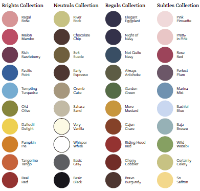
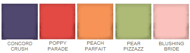
I really love Stampin' Up!'s cardstock. I think they have one of the most sophisticated color palettes out there, and the perfectly matching inks and markers are so cool!  I have a big wish list - I know I *need* Cherry Cobbler, which is such a fabulous rich red for Christmas!  I LOVE the new Cajun Craze, which is a wonderful paprika color! They brought back River Rock, Pink Pirrouette and Baja Breeze and I'm pretty happy about that too. And Concord Crush is the most amazing deep violet-blue, a really imperial purple!  They also have the most inexpensive re-inkers in the business, so I have all the new color family ink spots (love those little ink pad cubes) and refills on my wish list as well. The ink spots are a really inexpensive way to get a ton of colors at a great price.

SU
2010 In Colors
SU
Well, I am sure hoping some of you need to stock up on paper and ink with the Christmas card-making season looming ahead! We live in a very small town, so  we are hoping to get Janet's SU business launched through the internet with the Grand Opening Sale.

Wednesday, September 1, 2010

Savvy Sister Janet is a Stampin' Up! Demo!

My dear little savvy sister Janet has rejoined Stampin' Up!, and I have created a blog for her! Please go check out "And She's Still Stamping..."  at andshesstillstamping.blogspot.com.

She loves sunflowers, so I had fun creating this blog header for her to match a background we found in Blogger. And check out her cute shopping icon when you get there!

Photobucket

I still LOVE Stampin' Up! and I like the new catalog offerings better than I have in years, I have a huge list, LOL! They have done a "color renovation" and the new paper and ink colors are luscious and sophisticated - they still have the best color palette in the business. They have just stuffed a lot of wonderful items in the clearance bin, including many of the retired paper colors!

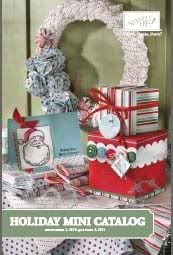
The Holiday Mini catalog was just released today. They have some wonderful new embellishments, dies, and embossing folders so be sure to check that out.

If you don't have a demo, please consider making Janet your demo for U.S. sales. This is our "soft opening" and we'll have some grand opening specials later this fall, so stay tuned.

Last, I'll be creating some SU only cards for Janet to feature on her blog, so that will be a lot of fun. I am nominating myself to her "design team" and I think this will be a fun bonding experience for the two of us, a design team of two!

Come back and let me know what you think of her blog design after you've checked it out!

Saturday, August 14, 2010

Oh, Alice! CHAPTER 26: Sizin' up a Sketch... Caterpillar Size!

"The Caterpillar was the first to speak.
`What size do you want to be?' it asked.
`Oh, I'm not particular as to size,' Alice hastily replied; `only one doesn't like changing so often, you know.'
`I DON'T know,' said the Caterpillar.
Alice said nothing: she had never been so much contradicted in her life before, and she felt that she was losing her temper.
`Are you content now?' said the Caterpillar.
`Well, I should like to be a LITTLE larger, sir, if you wouldn't mind,' said Alice: `three inches is such a wretched height to be.'
`It is a very good height indeed!' said the Caterpillar angrily, rearing itself upright as it spoke (it was exactly three inches high).
`But I'm not used to it!' pleaded poor Alice in a piteous tone. And she thought of herself, `I wish the creatures wouldn't be so easily offended!'
`You'll get used to it in time,' said the Caterpillar; and it put the hookah into its mouth and began smoking again..."
PhotobucketHello! How is everyone here in Wonderland today? We are sizing up a GREAT sketch by JEN and the main panel just HAPPENS to be THREE. INCHES. TALL. :) Now, of course you don't have to stick to this if your image won't fit, but we didn't want to anger Mr. Caterpillar by saying that Three inches wasn't a respectable height, so here's the sketch:

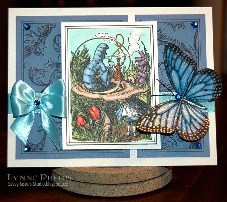
Now, I have to admit that my dimensions are not the same as Jen's sketch, but I am using the original Tenniel illustration of this conversation to show due respect to Mr. Caterpillar!  Also, as a nod to the final scene in the new Tim Burton movie, I have included Absolem the caterpillar  after he metamorphed into the blue butterfly. After the excesses of last week, there is not one bit of embossing or punches on the whole thing!

Photobucket
Click to enlarge

I started by stamping the image on white card and coloring it with Copics. I love this illustration, don't you? Then I trimmed it and outlined it with two different widths of multiliners to give it a bit of a border. I wanted to do the same thing to the background panels to give it some consistency. After I drew the double outlines around the blue panels, I masked the edges with Post-it notes and stamped an antique background design in the center of the panels. I thought the pen and ink style of the background stamp with its hatched shading was a good match for the style of the illustration. Click to look at the bigger version to see better. It looked a bit flat, so I colored a blue green in the background and a violet on the swirling leafy flourishes. It is a very subtle tone-on-tone alteration but it adds depth and interest to the otherwise flat background panels.

I adhered the background panels then ran an aqua blue ribbon around the card front - the ends are taped under the image. The background blue matched the caterpillar, and the ribbon matches the sky so it provides a nice balance! I made a double-looped bow on one side, then I stamped and colored the butterfly on a scrap of white card. I shaded the veins of the wings with deeper blue and colored the centers light blue and violet. The center of each veined area was highlighted with a clear Stardust Gelly Roll pen, love the shimmer! I colored the highlight on the body with a dark blue Stardust pen. I attached the main image with foam mounting tape and used Glue Glider to attach the body only on the butterfly, lifting the wings to give it dimension.

It still looked like it needed something, so I colored some self-adhesive rhinestones with a dark blue Copic marker. I put one in each outer corner of the background panels. I cut some very fine black hemp twine and stuck it down under another blue rhinestone for the butterfly head and antennae. I had more left that I'd colored, so I stuck it in the middle of the bow. Not sure about that last bit of bling!

Photobucket
Click to enlarge

I hope you will play along by submitting your creation on the Oh, Alice! blog. It is always fun to see what others do with the same sketch, so be sure to visit the other members of the Oh, Alice! team for more inspiration from our Twisted Tea Party:

I hope you like my card! Not quite so OTT as many others; I was going for a more tailored architechtural style with the lined panels. Of course I couldn't achieve a minimalist card to save my life, so it's still not too plain! Leave me a comment and let me know what you think; it makes my day when I hear from you!

Stamps: Nature's Blessing - Caterpillar stamp; Stampin' Up! - Wonderful Wings, Antique Background.
Paper: Value Pack - white 5x6.5 inch card and envelope; Stampin' Up! - blue card stock; Beckett - Radience (white) card stock (for coloring with Copics).
Ink: Memento - Tuxedo Black; Copic - Sketch markers, Multiliner SP pens; Sakura - Stardust Gelly Roll pens in clear and dark blue.
Miscellaneous: Ribbon; Paper Studio - adhesive rhinestones; Black hemp twine.
Tools: Tim Holtz - Design Ruler; Bow-Easy.
   

Thursday, July 22, 2010

Carte Postale Thank You - A One-Layer Card Through the Magic of Emboss/Resist!

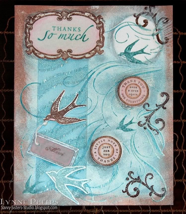
As much as I love Copic alcohol markers, I also love other coloring techniques! This card features coloring with Prismacolor pencils and sponging, used with my favorite emboss/resist technique. Other than the little cutout birds, ribbon,  and the vellum tag, this is a one layer card that started out as plain white card stock!

Photobucket

With the emboss/resist technique, you start by stamping the foreground elements first. So the frame was stamped in brown, the sentiment was stamped in teal, then it was colored colored in with a soft pink colored pencil and blended with odorless mineral spirits (sometimes called Gamsol) to smooth it out. You first color with Prismacolor pencils, then you take a paper blending stump and lightly dampen the tip with odorless mineral spirits and rub it over the coloring to smoothly blend. TIP: Remember to work in a ventilated area - odorless does NOT mean vapor-free, so work safe! Then I colored over the entire frame area with a Versacolor marker, being VERY careful not to go outside the outer line. This is the same clear watermark ink as comes in Versamark ink pads. Then I heat embossed the whole thing with clear detail embossing powder. This coats it with a shiny plastic-like finish so it will resist anything that comes later - it will wipe clean with a slightly dampened paper towel. The same thing was done with the two pink circles.

Next I stamped the large flourish and bird background stamp by inking it first with Versamark and next with a teal dye ink. This double-inking technique allows me to heat emboss with any dye ink; I heat embossed the background with clear detail embossing powder. It did not stick to the areas that were previously embossed.

Photobucket

Next the brown flourishes were stamped around the outer edge. It looks like the are behind because they don't stick to the embossed background image.

I punched a circle out of a Post-It note and stuck it on while I sponged brown all around the edges and teal in the center area. The circular Post-It note mask was removed and shadows were added around some elements with Prismacolor pencils. The heat embossed foreground elements were wiped clean with a damp paper towel. My white card was completely gone, and my card was still ONE layer!

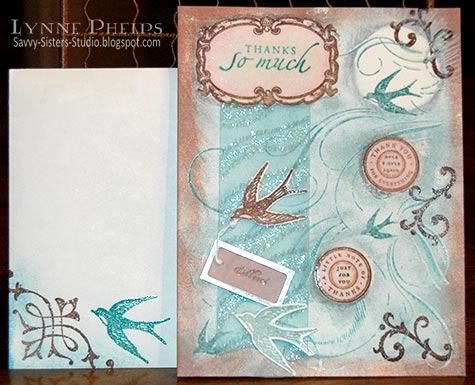
I cut two slits for a sparkly ribbon to pass through, along the bottom edge of the frame and another just above the brown sponging along the bottom edge. I stamped the bird twice, once in brown, once in teal, heat embossed and cut them out. I stamped "Merci" in brown ink on a pale pink vellum tag and heat embossed. I taped the end of the knotted string to the back of one of the birds and adhered them with foam tape over the ribbon.
Photobucket

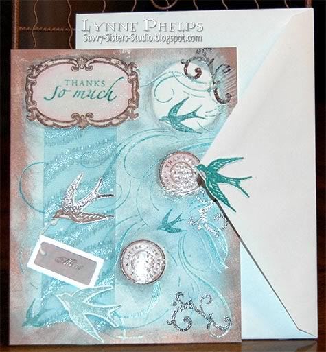
Can't forget the envelope! I added some stamping and sponging to the front left corner. On the back, I adhered a stamped and cutout bird to the tip of the envelope flap.

This card was for my sister, Janet, and she LOVED it! She has a clear acrylic store-type revolving card rack in her craft room and this card occupies a place of pride! I love the emboss/resist technique. To do this the "old" way you would have to stamp and trim out paper masks for everything, and this technique is so much easier and a lot more fun!

What do you think? Ready to try it? Leave me a comment and let me know what you think! :-)

Stamps: Stampin' Up! - Carte Postale set, Finials & Frames set, Sincere Salutations set, Circle of Friendship set, French Flair background.
Paper: Value Pack - white 5-inch x 6.5 inch white card and envelope.
Ink/Coloring: Marvy Matchables dye ink pads; Prismacolor colored pencils.
Miscellaneous: Metal-rimmed vellum tag; ribbon.
Tools: Sponges; Paper blending stump; Odorless mineral spirits.

Monday, July 5, 2010

Oh Alice! - I'm on the Permanent Design Team!!!!

Photobucket

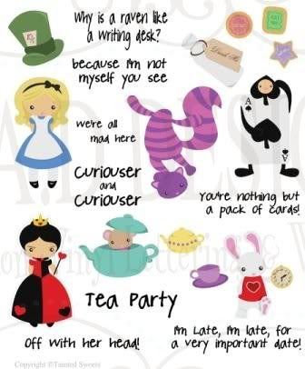
PhotobucketMy June Guest Designer spot on the Oh, Alice! challenge blog ended, and I was sad to see it end as I'd had such fun! You can imagine my joy when Jess, our Mad Hatter, asked me to join the real Design Team (or, as we say here in Wonderland, I was offered a seat at the Twisted Tea Party!) I missed our Chapter 20 Challenge to use red, white and blue as I was on vacation, and since Independence Day is over I am going to ignore that requirement and instead showcase the WONDERful sticker set from our sponsor for Chapter 20: EAD Designs! Play along and you could win a generous gift certificate from their store, and you could buy this Alice in Wonderland sticker sheet!

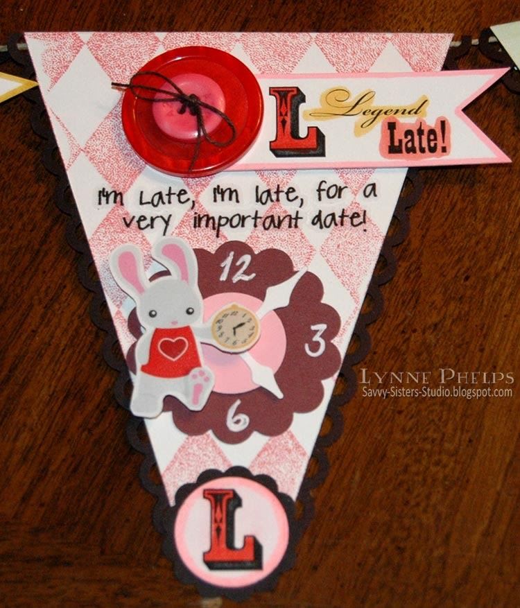
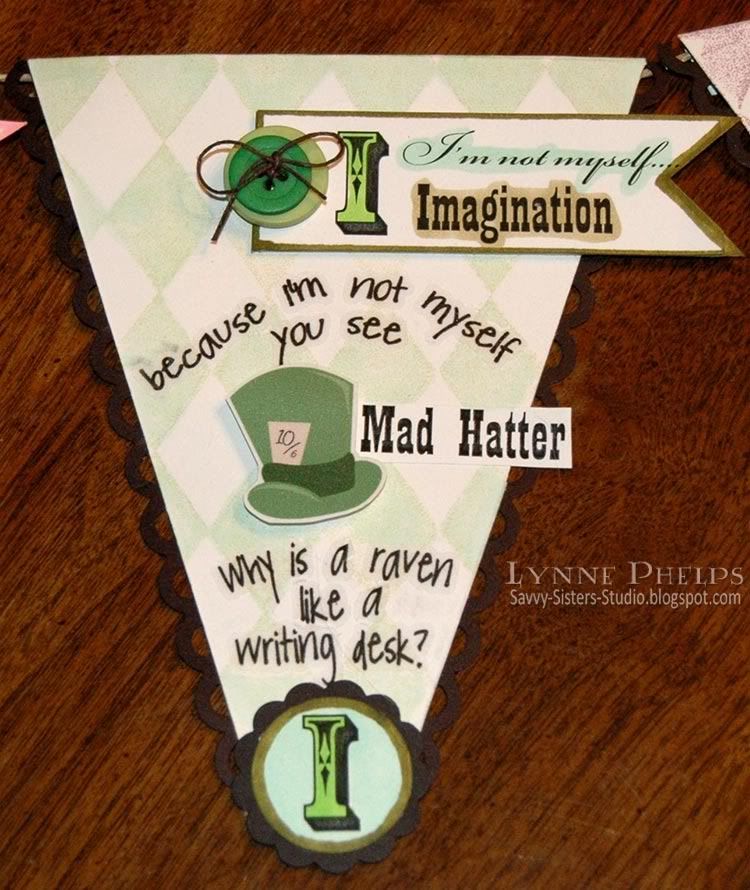
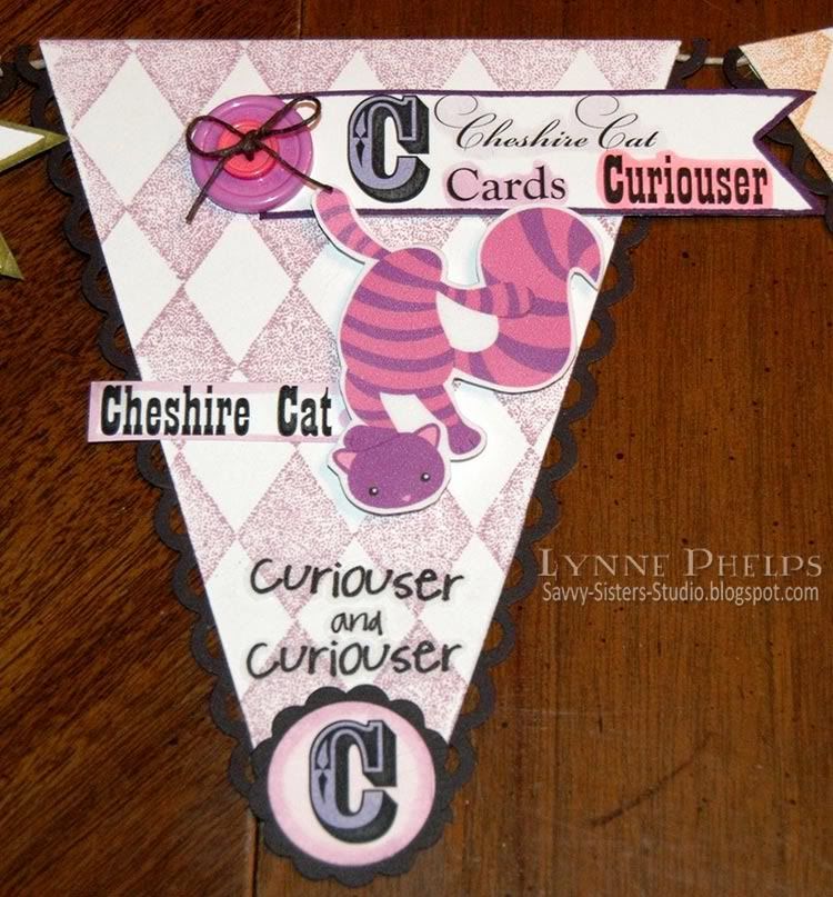
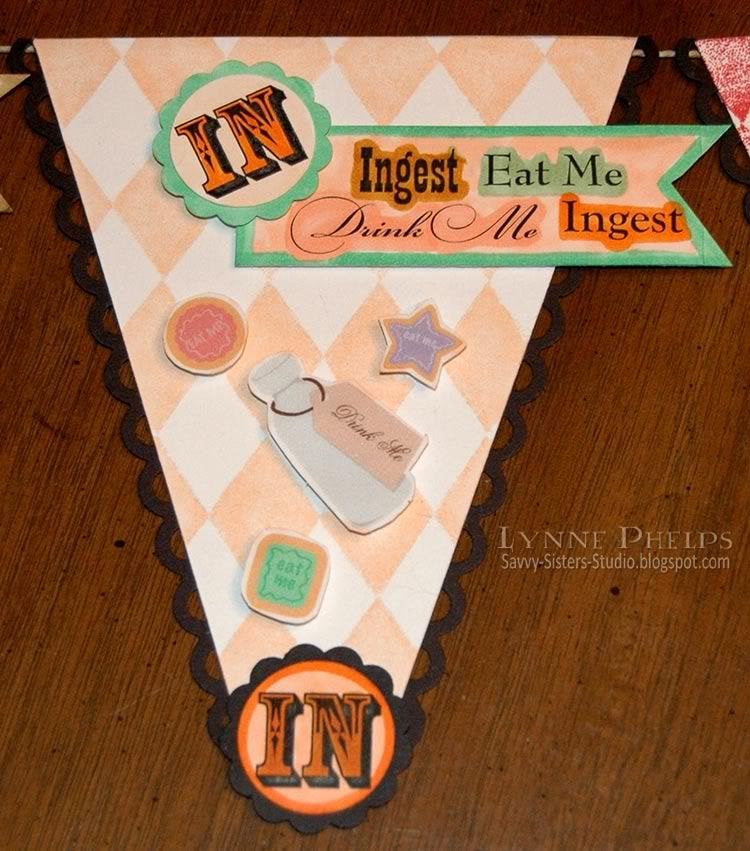
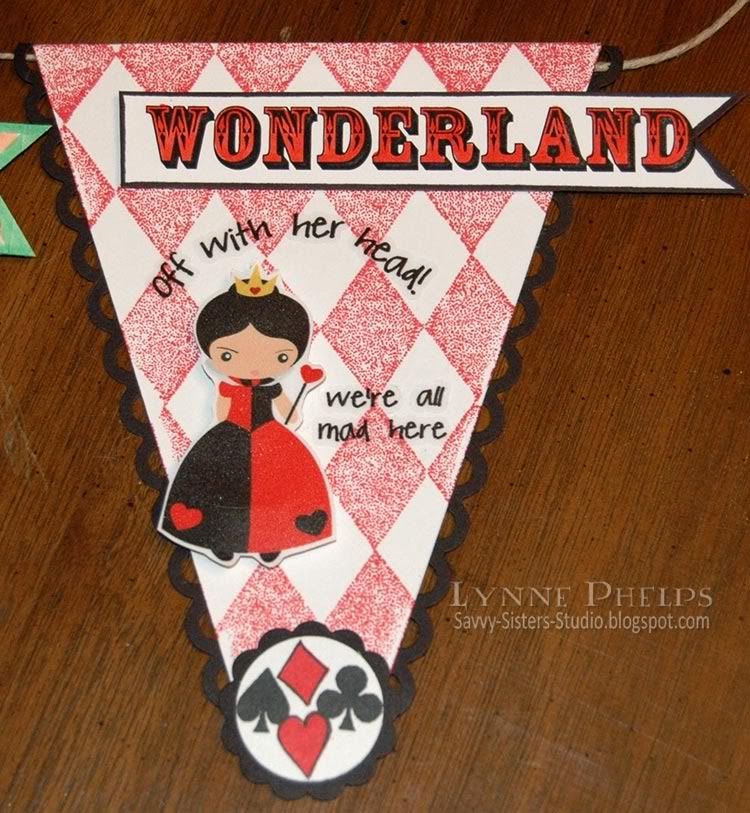
I have never used stickers before and I had a great time with these. The stickers are printed on a textured clear matte vinyl, but you also have the option of an opaque white material. I wanted the images popped up on dimensional pop-dots, so I adhered them to white card stock and trimmed them out. The words were adhered directly to my banner pennants so that the stamped diamond pattern shows through - it was nice to have that clear option! Another feature of the "Stickerz" that I appreciated is that the words are already trimmed out individually, which made it very easy to place each word exactly where I wanted it - I was not restricted to the way they were presented on the sticker sheet.  Nice job, EAD!!

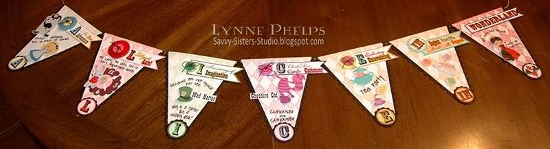
I wanted to do an alphabet banner with pennants spelling out A-L-I-C-E. I was totally inspired by Lynn Steven's entry in the Gingersnaps Mad Hatter Day blog hop! It wasn't even her main entry - just a small picture of an Alice banner. I HAD to make an Alice letter banner!

Photobucket

Each pennant started as an A4 sized piece of white card stock; one fourth of a letter sized sheet. I scored a fold one-half inch from the top. Along the bottom edge, I used a centering ruler to mark off one inch in the center where I knew my circles would be.  Then I trimmed from the foldline in each upper corner to the inch mark on each side. This left a triangle with the bottom tip cut off!  I stamped a stippled harlequin diamond background in a color to coordinate with the stickers for each particular pennant.

Photobucket

For the "L" pennant, I punched a scalloped and plain circle and some clock hands to create a clock background for the rabbit. They are held together with a brad that is hidden by the watch in the rabbit's hand.

Photobucket

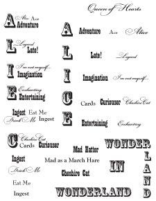
I set up a sheet of text on my computer and printed it out on my B&W laser onto color laser printer paper, which I prefer when I will be coloring the printout with Copic markers. I used several fun fonts as I love the jumbled-up font look.

TIP: Laser printers are best for coloring with Copics as the toner is fused onto the paper with heat, and you can color right over the lines with no fears of smudging. You could also print on an inkjet, and then use a B&W or color copy machine, as they are also toner based and fuse with heat.

I crammed everything I could think of on one page. I had the letters next to words beginning with that letter in a clump. These words were used at the top of each pennant. I had also placed all the words separated instead of clumped, as I was not sure how I would want to place them. This turned out to be a good thing as I wanted the large letter by itself for the bottom of each pennant.  You can see how I set the page up at left.

I adhered the different blocks of words with a glue stick to white card stock so it would be stiff enough to mount on dimensionals.

Photobucket

I trimmed out each block of words and notched the ends with a square punch then colored it with Copics. Buttons were stacked and tied together with black twine tied in a bow.

Photobucket

I punched each letter with a one-inch circle punch and colored it with Copics. Then I adhered it to a 1¼ inch black card stock scallop circle punch out.

Photobucket

I punched a strip of black card stock for each side with a scallop border punch. I adhered it behind the pennant so only the open scallops are exposed.


When I had all the pennants created, I cut a long length of hemp twine (found in the jewelry section) and placed it in the fold before adhering the flap down. I preferred the hemp twine for this as it is much smoother than jute twine - the pennants can actually slide along the twine.

Photobucket

I have not decided where to put it, but I draped it on this fun metal-framed mirror and I kind of like it here! The character of the mirror seems to lend itself to Alice, and I like the whole "Looking Glass" connection, a little visual pun that give me pleasure. Besides, I would rather look at my Alice banner and the tagged Alice sign than my own reflection any day!!! ;-)

Remember you can play along with the Oh, Alice! Chapter 21 challenge, which is to use red, white and blue.  If you win, you will get an EAD Designs gift certificate!

Check out the creations from the other members of the Oh, Alice! design team:
Please leave me a comment and let me know what you think about my Alice banner! It is always WONDERful to hear from you!

Stamps: Stampin' Up! - Harlequin diamond background; River City Rubber Works: card suits cube.
Paper: Georgia Pacific - white card stock; Stampin' Up! - black, pink and burgundy card stock.
Ink: Marvy Matchables - various colors for backgrounds.
Embellishments: EAD Designs - Alice in Wonderland Stickerz
Tools: Tim Holtz - Design Ruler; Fiskars - Apron Lace border punch; EK Success - Paper Shaper 1-inch circle and 1¼-inch scallop circle punches, Clock Hands punch; Scor-Pal.
  
Related Posts with Thumbnails