Tuesday, March 30, 2010

Twilight Birthday Card for My Favorite Twihard!

I'm a huge Twilight fan, are you? I had such fun making this birthday card featuring Jacob, Bella, and a sparkly Edward! My niece, Rebekah, is the one who introduced me to the Twilight Saga, so it seemed appropriate to use these cute character images from The Greeting Farm for her Sweet 16 birthday card! Twilight addicts are called twihards (twilight + diehard) or twifans. I prefer to think of myself as a Twihard!

Photobucket

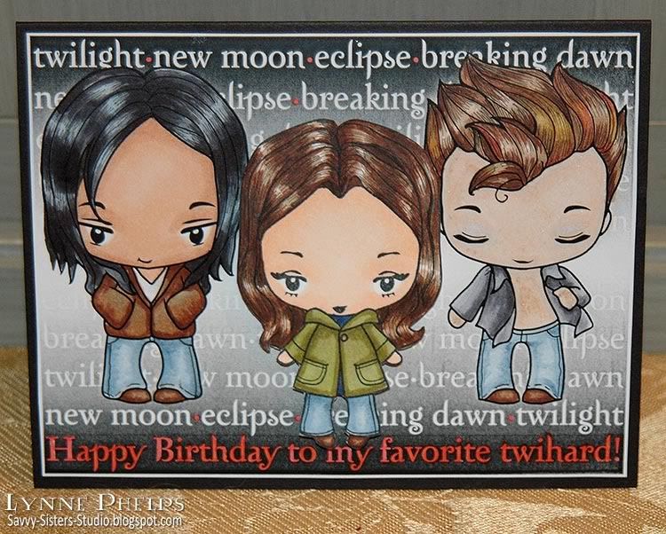
The Greeting Farm sells both digital and rubber stamps, often releasing a character in digital first, then making the rubber version when it proves popular. At that time, the digital version is removed. "Joseph" (Jacob) and "Flirty Edward" are digital stamps, while "Camille" (Bella) is now a rubber stamp; all three are in the Wild Sprouts series. They also have all the other Cullen family members and two other Edwards in casual and dressy versions!

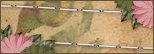
I started my hybrid card in Adobe Illustrator. I made a black to white to black gradient box. Then I created a text block using the Zephyr font, which is the font that was used on the original book covers. I wrote the titles of the four books separated by a bullet symbol; each line started with a different book to stagger the titles. I moved my white text in front of the black gradient. Then I decided to change the last line to my birthday wish--Happy Birthday to my favorite twihard!.  I opened Edward and Jacob in Photoshop and knocked out the backgrounds, so the characters where still filled with white but the background was transparent. I then placed these photoshop files in illustrator and put them on top of the text. Then I printed it out and took it to the craft room! One tip I got from the I Like Markers blog is to use color laser printer paper - the smoother, less porous surface makes it easy to blend the Copics and you do not need to use as much ink.  It is also much easier than running cardstock through the paper bypass tray, as I can just put the color laser paper in the paper tray on top of the regular paper.

Photobucket

I had a blast coloring in Edward and Jacob with Copics. Of course I went over Edward's skin with a Copic Atyou Spica glitter pen in clear!!  Gotta have sparkle!! Then I stamped my rubber Bella on cardstock and colored her with Copics. I used my finest Copic Multiliner to add more detail to the hair. I used a thicker Multiliner to add blue jean seams to Jacob's trousers.  I trimmed out Bella and mounted her to my panel with 1/8 inch thick pop dots.

Photobucket

On the computer, I had also typed my sentiment in Zephyr font: Hope your sweet sixteen is full of sparkle! I trimmed it out, and then used a square punch to notch the two ends. I went around the word "sparkle" with a clear Stardust glitter pen. I used the chisel end of a red Copic marker to add a red edge.  Then I decided the front needed red too, so I carefully dotted red inside the bullet symbols between the book titles, and inside all the white letters of the birthday wish on the bottom line.

I am really happy with how this card turned out, and I think my niece is going to be TOTALLY impressed! It was also my first hybrid project. Having a B&W laser printer made it easy to do the Copic coloring as I didn't need to worry about smearing the ink.  I think I will use digital stamps more for items I'm going to color with Copics. Making my own sentiments on the computer is also a lot of fun!

If you want to see the rest of The Greeting Farm's Twilight-inspired stamps, here is a key to the psuedonyms! Most have dressy and casual versions - be sure to check both the digital stamps and the rubber Wild Sprouts series!
  • Daniel = Dr. Carlyle Cullen
  • Odette = Esme
  • Joyce = Rosalie
  • Jeremy = Emmett
  • Ebony = Alice
  • Hugh = Jasper
  • Joseph = Jacob
  • Michael = Sam Utely?
I've read the books several times, then I got the unabridged audio books, which I highly recommend. The narration is EXCELLENT. I have my Twilight Saga playlist and l listen to the books again and again! In fact, that's what's on my iPod right now.  I downloaded mine from Audible.com - it's a lot cheaper if you are a member of Audible.

Let me know how you like my Twilight card! It was so much FUN to create. Comments anyone? Any other twihards out there?

Saturday, March 27, 2010

The Angels shouted for Joy - What a difference an ink color can make!

I was invited to dinner by a couple in my Sunday School class and brought these cards as a little hostess gift. I went with a musical theme as my hostess is the choir director at my niece's school. This is my favorite verse from Job, where God is talking about when he made the world. How fun to think about stars singing! I stamped the same image on both cards, first card in dark brown and second in medium gray. What a difference an ink color can make!

Photobucket

The index image on this stamp (Inkadinkado) was really deceptive. It looked like the shading was much lighter. No matter how sheer an ink I stamped with, the shaded areas still closed up. I stamped the first one in brown (Rich Cocoa - Memento) because that is a better pick for faces and skin than black. I used a Copic Multiliner to outline the letters and colored it in with Copic markers. The stars were highlighted with a glitter pen (Clear - Copic Spica). The background (Sage Shadow - Stampin' Up!) was embossed with a musical score (Allegro - Cuttlebug), then I highlighted the raised areas by brushing a shimmering Dazzle pad (Frost - VersaMark) over the top. I love the way this brings out the embossing. I wrapped a pink ribbon around, mounted the angel panel, tied a bow (Bow-Easy) and tucked in some punched foliage (Branch - Martha Stewart).

Photobucket

For the center, I stamped some musical symbols (Stampabilities) in gray and the sentiment (All Year Cheer - Stampin' Up!) in black (Tuxedo Black - Memento).

Photobucket

I decided I was on the right track in adding detail back with a Multiliner, so I went much lighter with the ink on this second try. After stamping with gray (London Fog - Memento), I sketched in line-art detailing throughout the image, especially where the shadows closed up. The gray made the shadowed areas much less distracting, and I am a lot happier with this card. I really want to get Memento Desert Sand - it is a light tan color that would have been even better for the faces.

Photobucket

This is the same as the first, except for the sentiment (Sincere Salutations - Stampin' Up!).

I am going to try lighter inks on a lot of images just to see, how about you? I think it might be particularly effective on florals! Which card do you prefer?

Thursday, March 25, 2010

Dollar Card Set Makeovers

I had no idea how much cool stuff was to be found in the dollar bins at Michaels! I found several sets of eight blank square cards with envelopes and thought they would be great to jazz up into something really special. I also found some neat large flourished letter stamps, so I picked an "R" and made Rebekah this cool set of personalized notecards!

Photobucket

The cards were all in different bold colors and graphical patterns. I chose this $1.00 deep pink and red patterned set of eight, using four so my investment is 50 cents so far! Then I found the flourished "R" stamp (Hampton Arts - Studio G) in a nearby bin - now I'm up to $1.50, LOL! The old dictionary cost 50 cents at the library's old book sale and I think I used one page for all this punching - less than a penny's worth!  All the letters were stamped and embossed on a single sheet of card stock, and I made my own brads with my new i-Top tool. A real budget project!

Photobucket

On this card, I used the Label 3 Nestie (Spellbinders) to cut out the initial which was stamped in Crimson Lake (Marvy) and heat embossed in clear. It was then sponged with Bubblegum Pink (Marvy). The border punch is Threading Water (Fiskars) and the leaves are Frond (Martha Stewart).

Photobucket

Same recipe as before, except I used the Doily Lace Trim punch (Martha Stewart). The green sponging on the initial actually matches the bright green ribbon pretty well but the camera changes it. The silk flower center is a brad I covered with dictionary paper using the i-Top tool (Imaginisce) and coated with Diamond Glaze (Judikins) for shine.

Photobucket

Again, the sponging and the ribbon actually match very well, but the matte cardstock and shiny satin ribbon are being picked up differently by the camera! Another home made brad, but I colored the dictionary paper with a copic first. It was covered with Diamond Glaze (Judikins) for shine.

Photobucket

I think this one is my favorite, wish I had tried the black first - although the cards with the bright green are so FUN when you see them in real life. The flower is an off-white Prima paper flower that I colored with Copics, centered with another home made brad. I fussy-cut the initial and shaded it with a Copic marker. The black band is punched with Apron Lace (Fiskars) and the dictionary paper is Threading Water (Fiskars). One of the things I really like about these two punches is the scallop profile is the same, so they are fun to stack!

Rebekah was very pleased, and I was really touched when she told me that she knew the real gift had been to give her a bunch of TIME. And she LOVED the metal tooled letter, totally! That was another budget gift, as the base chipboard letter cost $1.77 at Hobby Lobby, but looked like so much more when done! You'd never guess at its humble beginnings!

I'll have another, much quicker dollar card makeover for you on my next post! What are your favorite crafty gifts to make and give? Please leave a comment and let me know!

Saturday, March 20, 2010

Metal Tooling - R is for Rebekah!

For my niece's Sweet 16 tomorrow (is there anything scarier than a teenager getting their driver's license?) I bought a huge chipboard letter "R" and covered it with metal tooling. I freehanded several words and her name (Rebekah, Singing, Faith, Books, Music, Fantasy), and then filled in the areas between with patterns. It came out GREAT! Look! (Click image to "embiggan")

Photobucket - Metal tooled R for Rebekah

I have loved metal tooling for a long time, but it was a post on Hels Sheridan's Ink on my Fingers blog that sparked this particular project. I had not covered chipboard before, and I assure you I'll be doing it again!  Such fun!  Quick too - the whole project, start to finish, took less than two hours.

First, I drew in wavy lines and the words between them, embossing from the back and refining from the front. Then I used molds from Ten Seconds Studio (cool tools for cool people - hey, I'm cool!) for the areas of pattern between the words. I alternated big splashy patterns with smaller regular patterns.  The teflon tools make it so easy to work on the metal - much less hand fatigue. You can teach yourself all you need to know by watching their Taco Tuesday videos - irreverent, super funny and always inspiring!  I used the "Controlled Squish Technique" (we are very technical around here!) to avoid having high relief areas that would have needed to be filled with spackle on the backside for support. Love that!

After adhering the metal to the chipboard, I took a patterned wheel and rolled all around the edges, ala Hels Sheridan. It really gives it a finished look! Then I took a makeup sponge loaded with black acrylic paint and sponged the whole thing and the chipboard edges. I turned the sponge to a clean spot and carefully dabbed the paint off the raised areas. LOVE this look. It went from aluminum to instant pewter!

Here is a view at a different angle where you can see the relief better (click to embiggan):

Photobucket

Please leave a comment and let me know what you think - I LOVE hearing from you!

Wednesday, March 17, 2010

Waltzingmouse St. Paddy's Day Blog Hop

What could be more natural than an Irish stamp company sponsoring a St. Patrick's Day blog hop!  The blog roll is in a thread on the Waltzingmousehouse Forum - why don't you register so you can join us in hopping along? The forum thread will open in the "Play Room" around 3 p.m. today. If you don't see it, just check back. Remember to comment along the way!

Photobucket - St. Patrick's Day Waltzingmouse Card
For my card, I used one of Claire's free digi stamps - the bunch of clover. Have you seen the other free images included in the zip? Gorgeous! Other, traditional stamps I used include the sentiment and four-leaf clover stamp from the Waltzingmouse Celtic Heritage set, and tiny shamrock and inside sentiment from the Irish Blessings set.  The sets have so many wonderful images, like the Irish Cottage I used on another St. Patrick's Day card!

I printed the bunch of clover on color laser paper and colored it with Copics. Cardstock that allows Copics to blend well can be very expensive. A tip from the queen of Copics on the "I Like Markers" blog is to use color laser printer paper! It is trimmed with a label four nestie (Spellbinders).

I stamped the Celtic four-leaf clover with green ink (Bamboo Leaves - Memento), trimmed it with a label one nestie (Spellbinders) and colored the background and edges with Copics. It is adhered with a thick dimensional pop dot.

The sentiment and tiny clover was stamped with green on the base cardstock (Stampin' Up!). The striped paper is from the Sea Glass collection (K & Company).

Photobucket - St. Patrick's Day Clover Card - Inside

Inside I stamped the same large celtic four-leaf clover and a shamrock blessing in green (Bamboo Leaves - Memento). I had a sliver of the striped paper trimmed from the front and it made a nice dash of pattern on the inside of the card! Love tying the front and insde together with repeating design elements.

I hope you enjoyed this step in the blog hop, and would love it if you would leave a comment! Hearing from you is what makes blogging fun! Thanks for looking, and happy St. Patrick's Day!

Sunday, March 14, 2010

Going Green - Recycled Gift Container

The Friday challenge #009 on Just Rite's blog is to go green for St. Paddy's Day - green as in recycling! My niece's birthday is coming up, and she is a wonderful singer who just won the solo Literary competition in her school's region! Yes, I am SO PROUD of her, does it show?  I recycled a sugar-free drink mix package into a music-themed gift container. Now I just need to find the right goodies to tuck inside!

I used my Just Rite Horizontal Stamper and the uppercase and lowercase Times New Roman fonts to spell her name. I stamped it on color laser copy paper by inking the stamp first with Versamark and then with black (Marvy Matchable) and heat embossing it (Clear Detail Powder - Ranger). Then I sponged it with greens and blues (Marvy Matchables).

I really LOVE being able to spell my own messages with Just Rite fonts - after all, good luck finding a stamp that spelled Rebekah (or Lynne) the right way. Now, I can make my own sentiments and name stamps!

I wrapped the tube with blue and green striped paper (Sea Glass - K & Company) and adhered a musical score ribbon around it. I adhered a scalloped circle of the same paper to the lid, and stuck on an olive green organza bow. I made the bow with four loops on each side and fanned them out to make a circle, cutting off the tails even with the edge of the lid.

I made a double looped bow from the musical ribbon and stuck it on with Glue Dots. I added in the green tails I cut from the bow on the lid - more recycling!

Then I stamped more musical symbols (Stampabilities) and a vintage-style music image (Musical Manuscript - Stampin' Up!), sponged with blues and greens, cut them out and adhered them around the sides of the containger.


I think she'll really like whatever comes in this musical packaging!  What do you think?

Peaceful Irish Cottage - Shamrock Blessings to you!

I love this serene image of an Irish cottage by Waltzingmouse Stamps. I was looking for a peaceful scene and I think this really captures that feeling. The shamrock has three leaves, so it is associated with the Holy Trinity, and I have a shamrock blessing for all of you inside!  All stamps used are from the Irish Blessings set, except the large shamrock inside which is from the Celtic Heritage set.

Photobucket - Peaceful Irish Cottage Card

I stamped the scene in brown (Rich Cocoa - Memento) on Cream (110 lb. - Flourishes) and colored it with Copics - the cardstock was a dream for blending and coloring! I trimmed and embossed it with a Petite Oval Nestie (Spellbinders) and colored the edge with a brown Copic marker. This was backed by a pink scalloped layer.

The olive background (Stampin' Up!) was stamped with shamrocks (Bamboo Leaves - Memento) and the edge was scalloped with a border punch (Apron Lace - Fiskars) then wrapped with a pink and brown ribbon.  To extend the cardfront back to full size after punching the edge of it away, I backed it with cream cardstock tinted with pale yellow Copics.

Photobucket - Irish Cottage Card Inside

I wanted the cream cardstock to be decorative on the inside as well as the outside, so I scalloped the inside edge. It is always nice to repeat elements from the card front on the inside! I stamped the large Celtic shamrock in green and the shamrock blessing in brown.

This card is my submission for several challenges:

First, it is for Stamping Sisters In Christ Challenge #30:
SCRIPTURE
Psalm 29:11 "The LORD will give strength unto his people; the LORD will bless his people with peace."


CHALLENGE
Make a card/layout/project using a peaceful image or a verse about peace.
I think my peaceful Irish cottage and shamrock blessing fit this challenge perfectly!

Second, it is for the Waltzingmouse color challenge on Stamping Around, which was to use a neutral like white or kraft, plus pale green, sugar pink, and pale yellow. I came as close as I could with the green!


Third, it is for the Our Creative Corner Color Challenge by Silke Ledlow, who I had the good fortune to meet in the Flourishes booth at the show this weekend in Perry, Georgia! The color challenge was to use brown, pink, green, and yellow.

Fourth, it is for the Stamp Simply #130 Color Challenge - Pink and Green with added Brown!  I really lucked out that so many challenges were on the same color palette!

I hope you have enjoyed my peaceful Irish cottage card and I wish you lots of shamrock blessings!  Please leave a comment - that is what makes it all worthwhile!

Saturday, March 6, 2010

Shabby Chic - Dictionary Flowers!

This shabby chic card features a poofy flower and leaves made from old book pages. At the last Friends of the Library Old Books Sale, I purchased a bunch of old dictionaries, thesaurasus, and atlases for the express purpose of using them for papercrafts -   I spent about $3 for this treasure trove that even included a French-English dictionary! 

Photobucket - Dictionary Rose Card

The rose is made from six 1.5-inch and four 1.25-inch scalloped circles punched from a page of the dictionary. I stacked them all together, smaller ones centered on top, and used a paper piercer to punch a hole through the center which I secured with a small brad. then I smooshed each layer up tightly, inked the edges with my English Red ink pad (Marvy Matchables dye ink) and then un-smooshed them some. This is a very technical process, LOL!  This is a variation on the "poofy flowers" from Dawn McVey's blog.

Photobucket - Dictionary Rose Closeup

The leaves were also made with the scallop circle punch, first punching a circle and then moving the circle over and chomping some off to make a leaf shape. Then I folded them in half and ran them through my paper crimper. Remember paper crimpers? Hah!  I ran the Old Gold ink pad (Marvy) over the crimped surface to add some olive green color. A couple of branch punches (Martha Stewart) were tucked in to add more texture.

Photobucket - Dictionary Rose Card

Then I used more dictionary paper, trimmed with a large scallop border punch (EK Success) and sponged with tan ink (Tim Holtz - Corduroy Distress Ink).  I also heavily sponged the embossed background (Large Spots Quickutz Folder) with Corduroy ink. I swiped the edges with the English Red inkpad. A lovely champagne gold ribbon wrapped around and a beautiful bow (thank you, Bow-Easy!) seemed like the perfect elegant contrast to all the shabby sponging.

The sentiment was stamped in English Red on a scrap of cream cardstock. I notched the ends and sponged with Old Gold in the center and Pond Green (Marvy) around the edges, with a little Corduroy (Distress) over the top to grunge it up a little.  I curved the cardstock and left a little curl in it when I stuck it down.

Photobucket - Dictionary Rose Card - Inside

Of course you can't forget the inside! Several of you have asked me to show the insides of the cards so I am trying to get better about remembering to photograph them!  I embossed each edge with the large dots folder by just tucking the edge of the card into the embossing folder. Love how that turned out - I'll be doing that again for sure! I sponged it with Corduroy (Distress) and stamped the sentiment (SU) in Pond Green (Marvy). I took another scallop punched circle, this time 2-inches, and sponged the edges and dotted the center with English Red. I smooshed it up really good and then unsmooshed it and adhered it to the card. The leaf was a circle with some punched off to make a leaf shape.

I am really thrilled with this card!! I have not done too much with Shabby Chic, but with all these old dictionaries to use up, I think you'll be seeing me explore this style a lot more! What do you think?  Does it work for you? Please leave me a comment - I really LOVE hearing from you!  Thanks for looking!

Tuesday, March 2, 2010

Life is too short to drink House Wine & Gingersnap Birthday Blog Candy!

Scroll down to read about Gingersnap Creations birthday celebration! This card features a wonderful stamp of a wine bottle and glass in a lovely sketchy style (Stamps Happen), perfect for a thank you card for a bottle of very nice wine I received from the head of the company where I work. I do not often drink, but when I do a glass of good Cabernet Sauvignon is my fave! The stamp features Merlot, but you can't have everything, LOL!
Photobucket - Wine Cellar Thank You Card

The base is Bravo Burgundy (Stampin' Up!). I cut out the stone card stock panel with the largest Nestie Label 8 (Spellbinders), sponged it while still in the die with a muted gold (Ochre - Marvy dye ink) and had a wonderful time coloring it with Copic markers. I used a slot punch on one side (Stampin' Up!) to make a place for the ribbon to come to the front, and cut a slit in the fold of the card to allow it to pass through to the inside of the card. I used two layers of sheer organza ribbon - a bright gold and a narrower old gold stacked on top of each other - love that look! I used a granny knot instead of a square knot to make the tails go perpindicular to the ribbon band, and covered it with rustic button with narrow hemp twine knotted through.

I wish I'd remembered to take a picture of the inside. On the left, above the ribbon, I stamped two sentiments at different angles, one higher than the other. One said "Life is too short to drink house wine!" (Ann-ticipations) (I heard someone else say that life is too long not to, LOL!) The other was a quote from an ancient Greek writer: "No thing more excellent nor more valuable than WINE was ever granted mankind by God. --Plato" (Serendipity Stamps). On the inside right I used a standard thank you sentiment.

What do you think, does it look good enough to drink? Please leave a comment!

Blog Candy Alert - Gingersnap Creations Birthday Blog Candy Bonanza!

Gingersnap Creations is a wonderful challenge blog that I enjoy reading, and I need to challenge myself to start entering their challenges, LOL! To celebrate their birthday, however, they are making it easier, no challenge entry required.


You can read all about how to enter and see the WONDERFUL birthday blog candy in this post. The drawing is on March 19, 2010.
Related Posts with Thumbnails