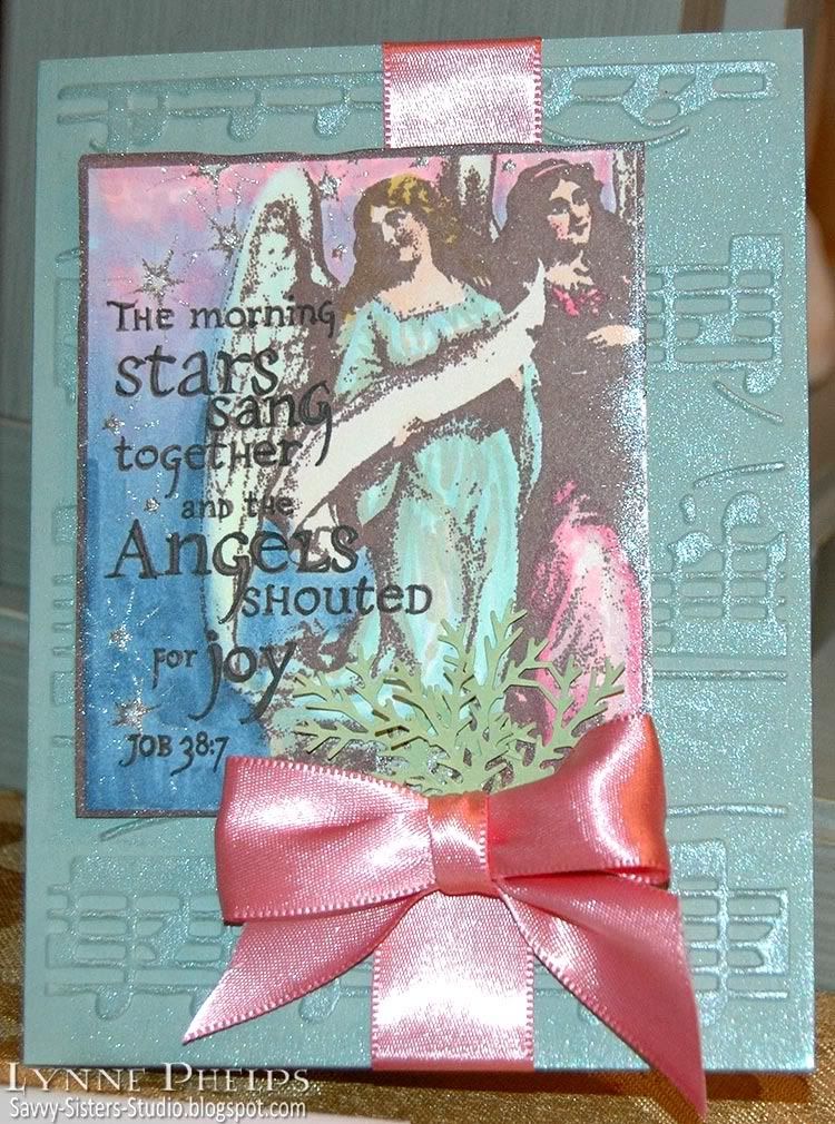
I was invited to dinner by a couple in my Sunday School class and brought these cards as a little hostess gift. I went with a musical theme as my hostess is the choir director at my niece's school. This is my favorite verse from Job, where God is talking about when he made the world. How fun to think about stars singing! I stamped the same image on both cards, first card in dark brown and second in medium gray. What a difference an ink color can make!
The index image on this stamp
(Inkadinkado) was really deceptive. It looked like the shading was much lighter. No matter how sheer an ink I stamped with, the shaded areas still closed up. I stamped the first one in brown
(Rich Cocoa - Memento) because that is a better pick for faces and skin than black. I used a Copic Multiliner to outline the letters and colored it in with Copic markers. The stars were highlighted with a glitter pen
(Clear - Copic Spica). The background
(Sage Shadow - Stampin' Up!) was embossed with a musical score
(Allegro - Cuttlebug), then I highlighted the raised areas by brushing a shimmering Dazzle pad (
Frost - VersaMark) over the top. I love the way this brings out the embossing. I wrapped a pink ribbon around, mounted the angel panel, tied a bow
(Bow-Easy) and tucked in some punched foliage
(Branch - Martha Stewart).
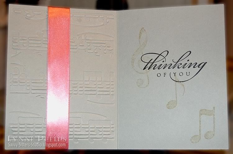
For the center, I stamped some musical symbols
(Stampabilities) in gray and the sentiment
(All Year Cheer - Stampin' Up!) in black
(Tuxedo Black - Memento).
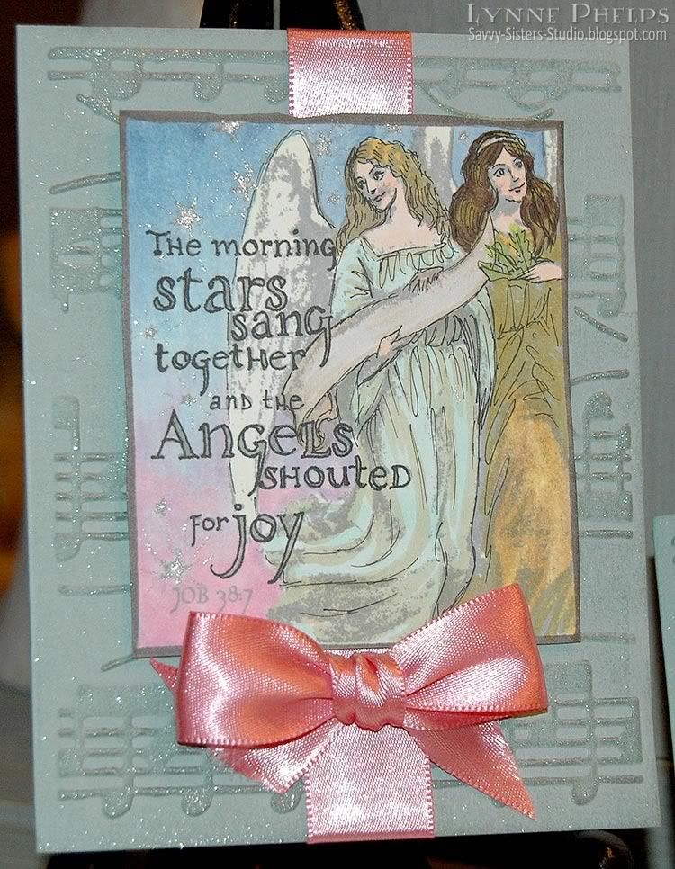
I decided I was on the right track in adding detail back with a Multiliner, so I went much lighter with the ink on this second try. After stamping with gray (London Fog - Memento), I sketched in line-art detailing throughout the image, especially where the shadows closed up. The gray made the shadowed areas much less distracting, and I am a lot happier with this card. I really want to get Memento Desert Sand - it is a light tan color that would have been even better for the faces.

This is the same as the first, except for the sentiment
(Sincere Salutations - Stampin' Up!).
I am going to try lighter inks on a lot of images just to see, how about you? I think it might be particularly effective on florals! Which card do you prefer?


Thank you for giving me an idea on how to use the Dazzle Versamark pad! As for which one I prefer, I like the first one becuase it is very vintage looking, and I am a fan of vintage, but I like the second one for a more modern take. In this regard, it's a versatile stamp!
ReplyDelete