Showing posts with label Birthday. Show all posts

Sunday, June 12, 2011

Birthday Style for Hannah!


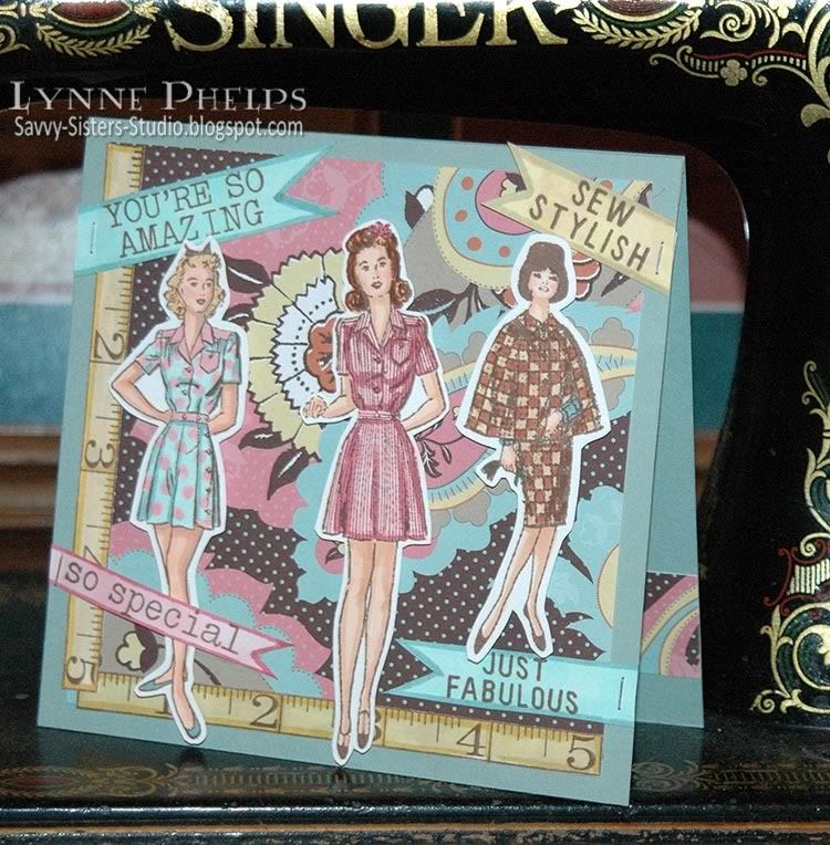
My wonderful niece turned 20 a few days ago; where do the years go? It seems like she was a darling four year old who loved purple just a few days ago!  Now she is a very sweet, smart, and stylish college student and I am so proud of her.  I had some paper that made me think of her, and although Hannah is not into vintage fashion, all the sentiments in this Sew Stylish stamp set by Hero Arts made me think of her!

The Polka Dot Paisley paper was the jumping off point for the entire project. It is part of the Funky Vintage - Lizzie Collection by Making Memories, which I received as a gift from my stamping friend Judy! I stamped the models, two of the ruler stamp, and one of every sentiment in the set with Memento Rich Cocoa ink.  Then I colored them in with Copic markers, choosing colors from the paisley paper.

I cut out the sentiments with notched ends, then colored them with Copics to match the paper. Last were the rulers; I had to blend several shades to make it match the muted yellow in the patterned paper.


The 5½ inch square top-fold card base was made from Sage Shadow card stock (Stampin' Up!, retired). I cut out my fashion models, leaving a generous margin to help with the stability and durability of thin areas like their legs. I adhered the patterned paper with my Scotch ATG tape runner, I absolutely love this tape gun! The models were attached with foam pop-dots, then the sentiments were stapled on with the Tim Holtz Tiny Attacher.  I really love the petite scale of these staples, and I can use them on things that are way too small to attach with normal sized staples and it is such a neat look. Notice the way the placement of the yellow items both balances and guides your eye though the composition. The two long thin rulers bound the bottom and left sides are balanced by the medium sized fan shaped area in the middle of the pattern and the smaller sentiment in the upper right corner.


On the inside I stamped the birthday sentiment, followed by an Postmodern Design setiment slab saying "Be the Diva".  I used one of the strips I trimmed from the patterned paper to anchor the arrangement.


I used more snippets of paper to cover up the back of the staples. I also took a scrap of the Sage Shadow card stock to make a pocket for some money or a gift card. To make it more fun I border punched the top edge with a Martha Stewart Loops punch and glued a strip of ribbon across the pocket.

Happy Birthday Hannah!  And thanks to Judy for the Funky Vintage paper pad!  Please leave a comment before you go and let me know how you like Hannah's card.


Tuesday, May 10, 2011

Sunflower Happy Birthday for Janet


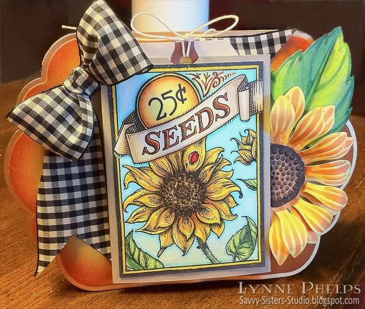
Happy birthday Janet!  My sister loves sunflowers and this is one of those "big" birthdays so I wanted to make her a really special card. I am so pleased with how it turned out!


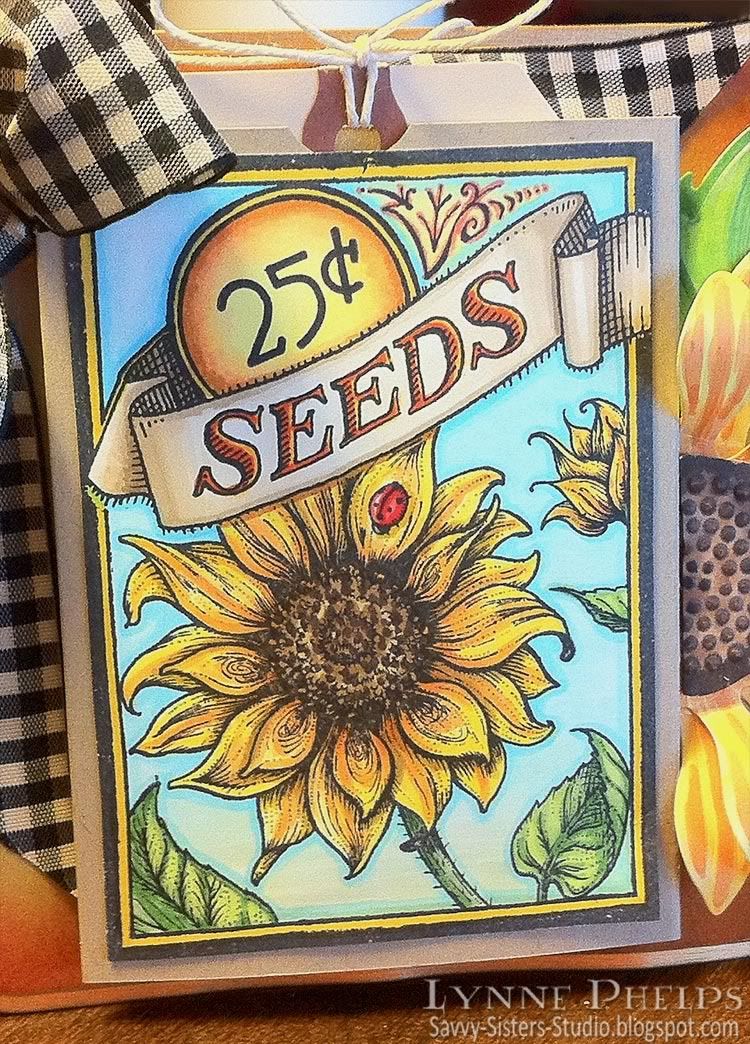
I *HAD* to have this Flourishes Sunflower set when it came out, and it had yet to see ink. I combined it with another of my favorite Flourishes stamp sets that needed to get inky - the seed packet set!  This set is so cool - you can use any fruit or floral set to fill the main area! Click on the images above for more details about the stamps.  I stamped the frame, first on my good card stock and again in the middle of a thin sheet of copy paper, which I used as a mask after I cut out the openings in the image. Then I stamped the large sunflow, leaf, and bud in the opening.

I had a wonderful time coloring in the combined image with Copic markers.  I folded a piece of kraft card stock to make a pocket and adhered the colored image to the front. Inside the pocket is a manilla shipping tag stamped with some birthday sentiments and a Michaels gift card stuck on to the back of the tag!

I knew I wanted to use the Spellbinders Sunflower 1, one of my favorite of their non-nestie dies! I cut one leaf, one center and two of the petals out of white card stock which I then colored with Copics. I did not stay precise with this, I wanted more of a sketchy watercolor look and I love how it turned out!  I curled the lower ring of petals slightly by wrapping the tips of each petal around the barrel of a pen. I curled each of the top petals all the way from tip to base so they really lift up! I curled each half of the leaf around the barrel of the pen also.  To assemble all the bits, I glued each ring of petals to a card stock circle with Aleene's Fast Grab Tacky Glue. The center is popped up with dimensional foam tape. 

Next, I knew I wanted to use this black and white gingham ribbon. I colored the ribbon with the same neutral Copics I used to color the banner on the seed packet, which toned it down to an ivory and black ribbon; perfect!  I tied the ribbon into a nice fat bow on the Bow-Easy and left nice long tails to frame the seed packet.


Now it was time to start assembling all these elements into a finished piece. I started by cutting two Labels Eleven Grand Nestabilities. The front one was cut out completely, and while it was still in the die, I sponged around the edges with Memento in Lady Bug Red and then Distress Ink in Wild Honey, then I edged it with a Krylon Leafing Pen in Pale Gold.  Before I cut the back piece, I had to include a folded area for the hinge. I trimmed the kraft card stock about an inch taller than it needed to be, and scored it and folded over the extra inch. When I placed it in the die, I put the fold line just inside the cutting edge on one side.  I adhered the folded over inch to the inside of the front cover, and this forms the hinge at the top of the card.


The bow was adhered first with Fast Grab Tacky Glue. The seed packet was adhered next with dimensional foam mounting tape. Then I glued the leaf and flower with Fast Grab Tacky Glue. I couldn't make my composition work with the whole sunflower, so I cut it in two and nudged the raw edge under the popped up seed packet. It turns out I liked it with the half-flower much better than with a whole one, and it allows the seed packet to stay at center stage. 

 My sister Janet LOVED the card. I am going to have to make something similar for myself because I had a REALLY hard time letting go of this one (see how much I love you Janet? *wink*).   And I've got a head start as the other half of that flower is still sitting on my work table! I'm going to add a twine loop through the fold of the card so Janet can use it as a little wall hanger or suspend it from a knob. The base is a just under 2/3 of a letter sized sheet of card stock, so it is a really nice size. LOVE the Grand Nestabilities, and I can't wait for them to release more of the label shapes in the larger size.

What do you think?  I'd love to hear from you!

Monday, November 15, 2010

Let's Communicate who's the Blog Candy Winner!


Remember I had offered a digi stamp set of my challenge winner set, Let's Communicate, in honor of my Dad's birthday?

There were 17 comments on that blog post and Random.Org selected #14, which corresponds to Sammi!!!

Sammi, please contact me within a week and I will send you instructions on how to get your download from the Amber INK store!

Sammi  said...
Happy Belated birthday to your Dad! I just love the cards you've been making with this set! Well.. If I used this set I think I would make lots of birthday cards for friends.. and I think I would have to try CASEing your card where she looks just like Jess! LOL!
(hugs)
xxx
I hope Sammi does make lots of birthday cards and I would love to see them on her blog, Stuff by Sammi; I'll be watching to see what happens! Here are three cards I made with the set, for inspiration! Clicking on an image will take you to the original post:


Congratulations Sammi, I look forward to hearing from you!

Wednesday, October 27, 2010

Happy Belated Birthday Card, Dear Da-ad, and Happy BLOG CANDY to YOU!

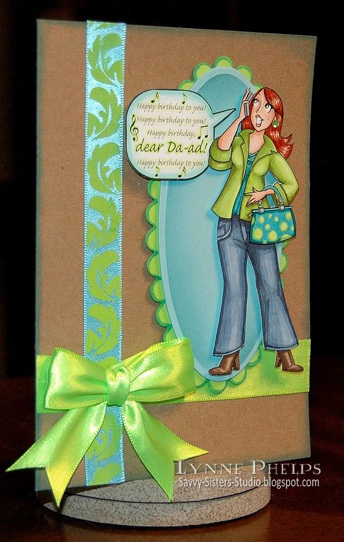
(New BLOG CANDY below, so stick with me!)  I did remember my Dad's birthday ON the correct day. I just didn't remember it ahead of time, like make-a-card-and-mail-it ahead of time! Our family has been scattered for a long time, so we always call each other and sing Happy Birthday on the phone. I know I never feel like it's really my birthday until I get that phone call. I do (finally) have his card ready and here it is!

Click to enlarge

I am using my favorite new Let's Communicate set again that I designed with Amber of Amber INK! My idea and her fabulous drawing skills created this set, which was my prize for winning the Amber INK challenge a couple months ago! This time I colored the figure to look like me. She is wearing my ultimate favorite lime green and turquoise.  She has my red hair and hazel eyes. I cannot even tell you how fun this set is to color!  I went a little crazy on the purse with a mod polka dot pattern, and of course I love to color jeans.  There is no paper piecing, this was all done with Copic markers. I had printed the figure out with a black and white laser printer onto color laser printer paper, which works great for blending Copics.  After coloring, I adhered the figure to white card for stiffness and trimmed her out with scissors and a Fiskars fingertip craft knife for the interior cuts, very easy to do.  Then I added one lime green crystal for a fun earring!  I computer generated the sentiment and bubble, adding some musical symbols so you know she is singing.

I sponged around the edges of this 5 x 6.5 inch kraft card (Recollections) with Broken China Distress Ink. I adhered two strips of ribbon to the card front with Fast Grab Tacky Glue, then added my bow, tied with the Bow-Easy, with the same glue. This glue is thick enough that it does not saturate through the ribbon and is so much less expensive than ScorTape and glue dots; it really holds the slippery ribbon securely in place.

The Spellbinders Mega Ovals with their elongated shape are the perfect backdrop for figures like this. The scalloped oval was not the right color of green, so I colored it lime green all around the edges where it showed to match the figure, and edged it with a turquoise marker to make it stand out better from the kraft background. The turquoise layer (SU Cool Caribbean) was sponged with Broken China Distress Ink while it was still in the die to highlight the embossed edge. Each layer is adhered to the front with dimensional foam mounting tape, so by the time I got to the figure it was three layers of foam tape high. Since one foot was hanging out in space, I layered three pieces of foam tape to stick behind the leg to secure it at the right level. It looks great from the front but a bit odd from the side, as you can see below.  If I had considered it earlier, I would have used a tan Copic marker to color the sides of the foam tape to match the card base, so it would have blended in better.

 Click to enlarge

Whenever I complain about my birthdays (how old I am getting) my Dad always says that the alternative to birthdays is grim!  I sure would rather continue to have birthdays than not, LOL!  So when I found this sentiment in a Hero Arts clear set, I had to buy it. It had a turtle on the same stamp but I carefully trimmed it so I could use the sentiment on it's own!  It says "Birthdays are good for you. The more you have, the longer you live."  Isn't that perfect?  I stamped it with Peeled Paint Distress Ink onto the turquiose card stock and sponged around the edges of the punched shape (SU - Curly Label Punch) with Broken China Distress Ink. I used foam tape to mount it over a piece of loosely folded, notched ribbon, then added a twine-threaded button just for fun.

Happy belated birthday card to you, Da-ad, Happy birthday to you!

Blog Candy!
In honor of my Dad's birthday, I am going to give away a Let's Communicate digital stamp set to one lucky commenter. Just tell me what kinds of cards YOU would like to make with this set, and if you will enter the Amber INK challenges!   You do not need a blog to enter, but if you use anonymous be sure to list your name in the comment!  I'll draw the evening of Nov. 12th.  Check back on Saturday, Nov. 13th to see if you've won!
Leave a comment here to enter for the Let's Communicate digi stamp set before you go!

Wednesday, September 15, 2010

Amber INK: You're Still Lookin' Good!

First, I want to thank everyone who voted for my cards in Amber INK's very first challenge; YOU helped me get into the top three! Now the incoming September design team will select a winner from the top three, which will be announced on the 20th when the new release comes out! I would LOVE to win the very first challenge at Amber INK's INKredible 21 Day Challenge Blog!
Photobucket
Click to enlarge

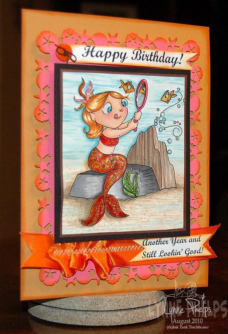
One of my favorite images in this release is this little mermaid with her tongue sticking out in concentration! She comes with a whole set of different images; for this one I used the rocks, two fish, the mirror,bubbles, and the baby mermaid.

Photobucket
Click to enlarge

I had fun creating this scene. I positioned the mirror to reflect a fish - he looks quite startled at his reflection! I printed it with a black and white laser printer on color laser printer paper, then I colored it with Copic markers. I shaded the tail with colors of hot pink, orange, and gold, which is a little hard to see after I gave it a coating of gold glitter glue. The tail had the same treatment but was coated with rust glitter glue, as was her top. The seaweed has green and the fish have gold glitter glue. I guess you can see the trend here?  In addition the mermaid's eyes, the mirror, the fish's eyes and the bubbles have a coating of glossy effects! I'm telling you, this thing is a wonder to behold in person! You can see it in the glare of this flash shot:

Photobucket


To frame the colored image, I cut a fancy edge on some hot pink card using a seashell border punch, then sponged the edges with orange. I zig-zagged some ribbon onto the bottom, ruching it partway and laying it smooth the rest of the way, then cutting a notch into each end.

Photobucket
Click to enlarge

I computer generated the sentiments, sponged them with orange and adhered them to the pink panel, making the notch cut into the bottom sentiment nestle into the notch in the ribbon. The top one was anchored on the left with a button tied with black twine, adhered with a glue dot. I edged the colored image with a copper leafing pen, glued it to a piece of white card to stiffen it, then adhered it to the pink panel with thick foam mounting tape. Then the whole thing was mounted to a mustard colored card base with edges sponged in orange.

PhotobucketThis is my farewell post as a Torch Bearer. I'll be handing my torch over to someone really special, I hand picked her as my successor and I know you will love her style! Check back on the 17th to see who I picked, and we'll see who the challenge winner is on the 20th! I may die of suspense between now and then, LOL! Plus we'll see all the fabby new stamps from Amber INK!
Please leave a comment and let me know what you think about my little mermaid card, the challenge, torch bearers or anything at all!

Stamps: Amber INK - "Baby Mermaids - Friendship"
Paper: Stampin' Up! - More Mustard, black and pink card stock; HP - Color laser printer paper; Georgia Pacific - white card stock.
Ink: Copic - Sketch markers; Ranger Distress Ink - Marmalade; Krylon - metallic Copper Leafing Pen.
Miscellaneous: Ribbon, Ranger - Glossy Accents, Frosted Lace Stickles; Hampton Arts - Gold, green,and rust glitter glue.
Tools: Martha Stewart Crafts - Shell & Sand Dollar border and corner punches; Janome Sew Mini sewing machine; Ranger Inksentials - Ink blending tool and foam pad.
 

Wednesday, July 28, 2010

Quick Collage Stamping

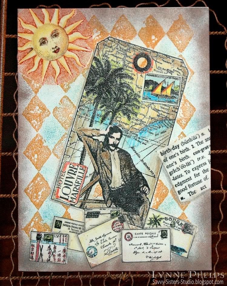
One night after dinner at my sister's house, she asked for a quick demo of this emboss/resist technique I kept telling her about. We moved into the craft room and I had fun raiding her stamp stash. Isn't it fun when you get to play with other people's toys? I picked out a background stamp, a focal image tag stamp, a birthday definition, a sun, and an accent image of letters and postcards. I set up near the heat gun, got out the clear detail embossing powder, located a versamarker pen and prismacolors and a few inkpads in my favorite colors. Now we were ready to roll!

Photobucket
Click to enlarge

This is a true one-layer card - this started off as a plain cream card front. There is no patterned paper or pre-colored images. When you stamp with the emboss/resist technique, you stamp the items in front first and move your way to the background. So the order here was:
  1. Envelopes
  2. Birthday dictionary definition
  3. Tag image
  4. Sun
  5. Diamond background
I stamped the envelopes near the bottom of the card front and colored them in with Prismacolor pencils. Notice that I colored in some gray shadows where one envelope overlapped another; this adds a lot of dimension without adding any layers. Then I colored over the whole stamped image with a Versamarker pen, which writes with clear watermark/embossing ink. I sprinkled clear detail embossing powder over the whole colored image and heat embossed. Now this layer of stamping will not be affected by the stamping that will come after it, as the embossing will repel future applications of ink.

Photobucket
Click to enlarge

Points for perfection: This card shows several flaws that happened with the Versamarker step. I was trying to move too fast and should have taken a bit more care. See the bottom corner of the envelope just to the left of middle?  I missed coloring in one little corner with the Versamarker, so the brown sponging that came later was able to stain the unprotected corner.  On several of the other envelopes, my Versamarker coloring went just outside the lines, so the subsequent brown sponging left white gaps where the embossing resisted the ink.  To avoid these problems, color the Versamarker up to the lines but not on or over the lines. It is better to be inside the lines than out of them.

I stamped the birthday dictionary defintion at an angle, colored a rectangular area with a Versamarker to encompass the text and heat embossed with clear detail powder. Next I stamped the tag. Although it is actually stamped on top of the envelopes and birthday definition, the glossy embossing does not accept the ink and easily wiped clean.  I colored in the tag with Prismacolor pencils, covered the entire surface with a Versamarker and heat embossed with clear detail powder.

Then the sun was inked with bright copper, then a dark brown inkpad was dabbed onto the eyes, nose and mouth, then stamped and colored in with Prismacolor pencils.  I colored with a Versamarker on the sun face and yellow rays, but NOT over the copper radient lines. Then I heat embossed the sun with clear detail powder.

Photobucket
Click to enlarge

Last, the diamond background was stamped with ochre ink over the entire surface. The open areas of the pattern were sponged with turquoise blue. Dark brown was sponged all around the edges. Notice how you can see the diamonds through the sun's radient lines but not in the yellow rays.  A slightly damp paper towel was used to wipe all the embossed surfaces clean of ink.  Shadows were added with a gray Prismacolor pencil around some elements to give a more 3D look. Voila!
Once you get used to the steps, this is a really fast technique, without the hassle of making masks out of paper. About 30 minutes for this card, not counting the stash raiding time! ;-)

Photobucket

I am entering this in the Cinema Saturday Creative Challenge #89: Casino Royale. Although this man has a moustache, he reminds me of Bond lounging on the Mediterranean coast while he was happy with his love, before the betrayal. The European locale, the travel implied by the map, it all makes me think of the movie. The envelopes remind me of all the nationalities of the players in the poker game in the beginning. I know I am missing a silhouette, I just couldn't figure out how to work it in!

I hope you'll give the emboss/resist technique a try!  Please leave me a comment, I love to hear from you!

Stamps: Tin Can Mail (Inkadinkado) - tag and envelopes; Hero Arts - birthday definition; A Stamp in the Hand - sun; Stampin' Up! - Print Pattern (background).
Paper: Value Pack - 5 x 6.5 inch ivory card and envelope.
Ink: Marvy Matchables - black, copper, brown, turquoise and ochre; Tsukeniko - Versamarker; Prismacolor - colored pencils.
Miscellaneous: Ranger - clear detail embossing powder; heat gun; sponges.

Thursday, July 1, 2010

Metal Tooling: Large Chipboard H for Hannah!

I made a large "R" for Rebekah a few months ago, and I really love how it turned out. I thought I would make an "H" for Hannah's birthday! It starts by picking out five to seven words that describe a person or their activities. Once you have the list of words, it is all downhill from there!

Photobucket

Start by tracing the outline of the chipboard letter on a piece of paper. Then draw some bands across, with a line to mark the top and bottom of the band. I like to use curved bands. Then lightly letter a word into each band and see how they fit - you may have to erase and try again. Once you have the word layout, trace around the chipboard letter again, this time on your piece of metal. VERY LIGHTLY on the front, make marks where the bands and letters will go; make the marks as light as possible. Then turn the metal over, and on a padded surface and a ball tip, make raised lines and letters. From the front, on a glass or acrylic mat, refine the area around each letter with a teflon calf's foot tool.

Photobucket

Between each word band, fill in by placing metal over a pattern mold. First use a jumbo blending stump to rub the pattern into the metal, then a rounded teflon tip, finally with a fine point teflon tip.

TIP: PLEASING PATTERN PLACEMENT
A design like this could be pretty chaotic. There are a couple of design primciples at work that make it a very harmonious layout instead!
  1. First, there are repeating elements. The same small scale pattern is used on all four ends. Where patterns do not have an exact match, they have a match that is the same scale and character.
  2. Second, the design is well balanced. The two largest motifs, the stylized floral medallion on the left side and the stylized fleur dis lis on the upper right are diagonally opposite. The small square grid pattern is on both legs of the "H" and the same pattern is used "on point" to create diamonds, also used on both legs. A Moorish tile design on the right is balanced by a Moorish-feeling pattern on the left, so the whole cross bar is covered with similar scale and similar character patterns. The smallest motif, the grid that can be used square or on point was used on and near the ends, including being used as background on the large fleur dis lis
When the design was completely tooled, I covered the surface of the chipboard letter with Scor-Tape. I turned the metal, front side down onto a padded surface, and centered the adhesive covered chipboard letter and pressed it down firmly to the metal. A Tim Holts scissors was used to trim the metal to the edge of the chipboard, then a patterned wheel was run around the edges of the metal to give it a finished look.

 Photobucket

TIP: USE PAINT TO ANTIQUE YOUR METAL TOOLING
Then comes the magic! My shiny tooled aluminum looks like shiny tooled aluminum. Not quite the look I was going for! I dabbed a make-up sponge into black acrylic paint and sponged the chipboard edges and the metal. Paint was sponged on the entire surface, then brushed off the high points with a clean spot on the sponge. Voila - instant pewter! The difference is amazing and it only takes a moment!

I hope you will try making a letter like this! It is fun, quick and easy and is so personal and fun! Leave me a comment, I'd love to hear what you think!

Paper: The Paper Studios - large chipboard letter; Maid O' Metal - aluminum tooling foil
Tools: Ten Seconds Studio - teflon metal tools, molds, pattern wheel, mats, paper blending stump
Miscellaneous: Black acrylic paint, Scor-Tape, Tim Holtz scissors
   

Thursday, June 17, 2010

Waltzingmouse June Customer Blog Waltz!


Welcome to the June Waltzingmouse customer blog waltz! Instead of hopping from blog to blog, we WMS fans waltz our way through! This month's theme is masculine cards.  I have also entered this in the brand new Waltzingmouse Sketch Blog competition for their second week's sketch! Have you visited this brand new WMS sketch blog? Sketches are card layouts, and everyone makes a card from the same layout and submits them. WMS stamps are not required for their new sketch blog challenges, but you get a bit extra if you win and have used Waltzingmouse stamps.  Last, I am submitting this card for Stamping Sisters in Christ Challenge #43, to create a masculine card.

Photobucket

Nothing says masculine to me like chrome diamond plate! I taped a piece of aluminum HVAC tape to a piece of cardstock, burnishing it down smooth. Then I ran the aluminum covered cardstock through my Cuttlebug in the diamond plate embossing folder. Doesn't it look real? I love it, but it was very difficult to photograph, hence all the angled photos! The background was created with several of Waltzingmouse's plaid building stamps in various widths, stamped on a light taupe card stock. I used nice manly shades of brown, olive, tan, and rust. Not a bright or pastel anywhere! The diamond plate was adhered to the plaid panel after the plaid had been sponged round the edges with Walnut Stain.

The center medallion started with a Label Three die cut, sponged with Walnut while still in the die. It was fastened to the plaid panel with antiqued copper brads. Then I stamped the grid background stamp in tan on light taupe card stock, sponged it with Corduroy and Peeled Paint along the very edge, grunging it up a good bit! Last, I cut one of the Ribbon Tag Trio from ivory card stock, sponging it with Peeled Paint while still in the die, edging it with Walnut Stain, and stamped in Copper with the sentiment.

I attached the screw head brads and the buttons tied with jute string to the grid circle, which I mounted with pop-dots to the label. Then I threaded twine and jute string through the ribbon tag, and attached it at an angle to the circle with a pop-dot. I fanned out the ends of the string for fun and to emphasize the angle!

Photobucket

When I made the background plaid, I had some strips I trimmed away. I attached one of the strips to the inside right margin of the card to carry the theme inside!

To see more of the Blog Waltz entries, go to the Waltzingmouse House Forum, where the links list thread will open at 10 a.m. Eastern time!  You need to go through a one-time simple free registration with no awkward questions, then you can see everyone's links to their projects. Please join us, it is so much fun!

Stamps: Waltzingmouse Stamps - Off Beat Backgrounds, Pic-Nic Patterns, Fancy Phrases.
Paper: Georgia Pacific - light taupe card stock; Stampin' Up! - Really Rust card stock.
Ink: Ranger Distress Ink - Walnut Stain, Corduroy, Peeled Paint, Scattered Straw; Memento - Rich Cocoa, Bamboo Leaves; Palette - Haystack; Marvy Matchables - Copper.
Embellishments: Jute string; hemp twine; The Paper Studio - buttons, antique copper mini-brads; Karen Foster - screw head brads.
Tools: Spellbinders - Labels Three, Ribbon Tag Trio; EK Success - 2¾ inch circle punch; Cuttlebug - Diamond Plate embossing folder.
   

Monday, June 14, 2010

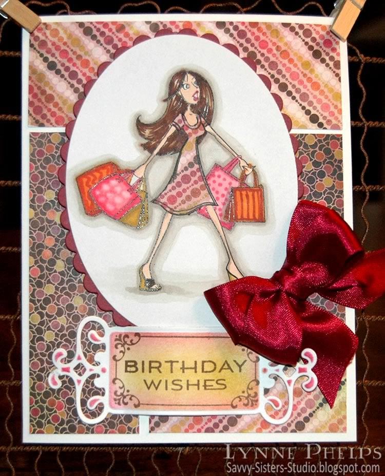
Happy Birthday Hannah: Reverse Paper-Piecing with Digi-Stamps

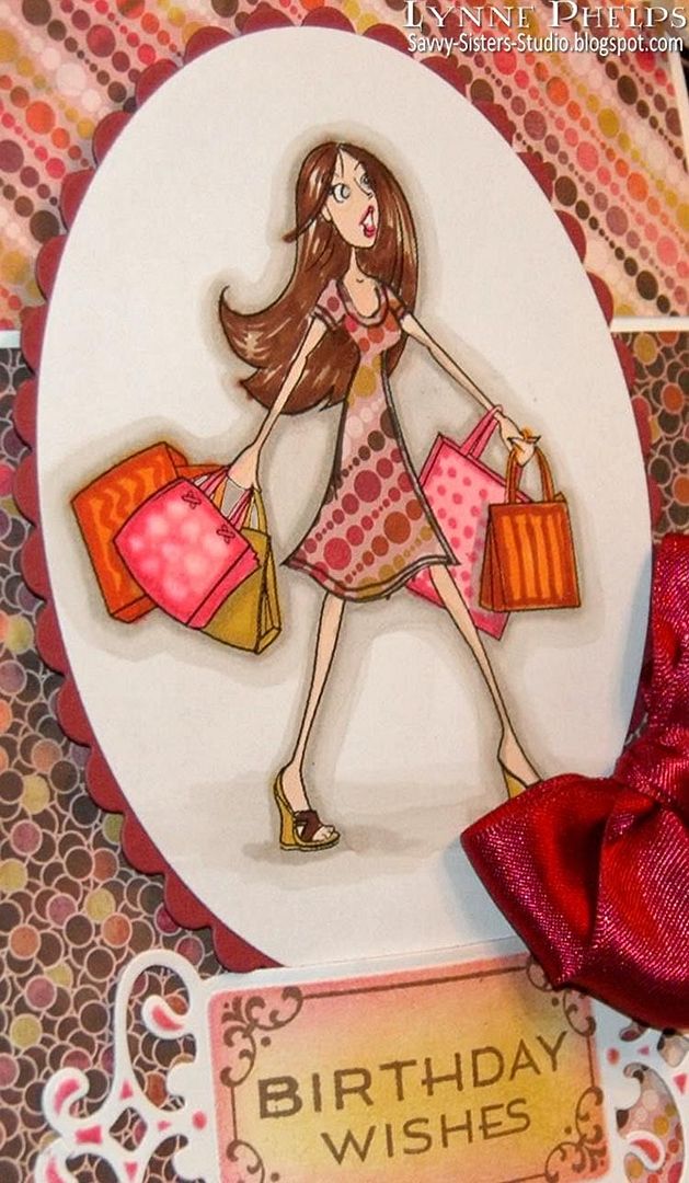
My neice Hannah just had her 19th birthday, and I thought this fun digi image from Amber Ink suited her perfectly! Hannah is very a very smart, stylish, funny young lady with loads of personality and I love her dearly!
 
Amber Ink Digi Stamp

Have you heard about Amber Ink?  The artist, Amber, and her mother have started up a new company. In the "Amber Girls" line, she is offering Digi sets - just like you might find in a clear stamp set. I only used the main image, but there are also shoes, purse, tote, etc. plus a sentiment: "But I need it. . . ." And for a limited time, several of the Amber Girl sets are FREE! They are just darling, and I can't wait to use the other sets. I also LOVE her Love Bunny stamps, they are so cute and expressive! She also has coordinating digi-paper, and clear stamps will be coming.  Plus Amber Ink is perfect for me, because I'm brilliant, not patient!!!! ;-)

Back to my card. I knew I wanted to paper-piece her dress.  In the normal way when you paper-piece with a rubber stamp, you stamp once on your base paper and color as usual, then you ink up just the part of the stamp with the item you want to paper-piece and stamp it on the patterned paper, then you cut it out and glue it over the corresponding spot on the base image.

There are some issues when you try to do this with a digital image:
  • I was using Basic Gray "Indian Summer" paper which comes on 6 x 6 inch sheets, which would have been an awkward size to try and run through my printer.
  • I did not want to print the whole image again which would have wasted the whole sheet of patterend paper.
  • I would have to do some image editing to print only the area with her dress.
  • It was too much of a hassle!
My solution was reverse paper-piecing! I used a craft knife to cut out her dress from my printed and colored image.  Basically there was now a dress shaped hole in the middle of the image. I put glue stick on the back of the image around the opening, making sure every edge around the cut-out dress was covered. Then I put a snippet of patterned paper behind the opening and made sure all the edges were pressed down firmly. I drew the hem lines back on with a black Copic Multiliner.

Unless you run your finger over the image, it is very difficult to tell that the patterned paper is behind instead of in front!

Photobucket

TIP: Try the new Fiskars Fingertip Craft Knife. The handle is a ring which goes around your index finger and the knife becomes an extension of your finger. I was very pleased at how much more dexterity and control I had when making intricut cuts - it was easy!  Here is a short product demo I found on YouTube:


I hope you will go check out Amber Ink, and also consider getting the fingertip knife. They also have a version with the tiny swivel blade.

Stamps: Amber Ink - But I Need It digi set; Waltzingmouse Stamps - Fancy Phrases.
Paper: ValuePack - 5 x 6.5 inch white card & envelope; Basice Gray - Indian Summer 6 x 6 inch pad; Stampin' Up! - Bravo Burgundy card stock.
Ink: Copic - alcohol Sketch markers, 0.5 MultilinerSP; Ranger Distress - Worn Lipstick, Scattered Straw; Memento - Rich Cocoa.
Miscellaneous: Spellbinders - Fancy Tags die, Petite Ovals and Scalloped Petite Ovals; Ribbon; Fiskars Fingertip Craft Knife; Glue Stick; PopDots.
Related Posts with Thumbnails