Showing posts with label Waltzingmouse Stamps. Show all posts

Thursday, June 17, 2010

Waltzingmouse June Customer Blog Waltz!


Welcome to the June Waltzingmouse customer blog waltz! Instead of hopping from blog to blog, we WMS fans waltz our way through! This month's theme is masculine cards.  I have also entered this in the brand new Waltzingmouse Sketch Blog competition for their second week's sketch! Have you visited this brand new WMS sketch blog? Sketches are card layouts, and everyone makes a card from the same layout and submits them. WMS stamps are not required for their new sketch blog challenges, but you get a bit extra if you win and have used Waltzingmouse stamps.  Last, I am submitting this card for Stamping Sisters in Christ Challenge #43, to create a masculine card.

Photobucket

Nothing says masculine to me like chrome diamond plate! I taped a piece of aluminum HVAC tape to a piece of cardstock, burnishing it down smooth. Then I ran the aluminum covered cardstock through my Cuttlebug in the diamond plate embossing folder. Doesn't it look real? I love it, but it was very difficult to photograph, hence all the angled photos! The background was created with several of Waltzingmouse's plaid building stamps in various widths, stamped on a light taupe card stock. I used nice manly shades of brown, olive, tan, and rust. Not a bright or pastel anywhere! The diamond plate was adhered to the plaid panel after the plaid had been sponged round the edges with Walnut Stain.

The center medallion started with a Label Three die cut, sponged with Walnut while still in the die. It was fastened to the plaid panel with antiqued copper brads. Then I stamped the grid background stamp in tan on light taupe card stock, sponged it with Corduroy and Peeled Paint along the very edge, grunging it up a good bit! Last, I cut one of the Ribbon Tag Trio from ivory card stock, sponging it with Peeled Paint while still in the die, edging it with Walnut Stain, and stamped in Copper with the sentiment.

I attached the screw head brads and the buttons tied with jute string to the grid circle, which I mounted with pop-dots to the label. Then I threaded twine and jute string through the ribbon tag, and attached it at an angle to the circle with a pop-dot. I fanned out the ends of the string for fun and to emphasize the angle!

Photobucket

When I made the background plaid, I had some strips I trimmed away. I attached one of the strips to the inside right margin of the card to carry the theme inside!

To see more of the Blog Waltz entries, go to the Waltzingmouse House Forum, where the links list thread will open at 10 a.m. Eastern time!  You need to go through a one-time simple free registration with no awkward questions, then you can see everyone's links to their projects. Please join us, it is so much fun!

Stamps: Waltzingmouse Stamps - Off Beat Backgrounds, Pic-Nic Patterns, Fancy Phrases.
Paper: Georgia Pacific - light taupe card stock; Stampin' Up! - Really Rust card stock.
Ink: Ranger Distress Ink - Walnut Stain, Corduroy, Peeled Paint, Scattered Straw; Memento - Rich Cocoa, Bamboo Leaves; Palette - Haystack; Marvy Matchables - Copper.
Embellishments: Jute string; hemp twine; The Paper Studio - buttons, antique copper mini-brads; Karen Foster - screw head brads.
Tools: Spellbinders - Labels Three, Ribbon Tag Trio; EK Success - 2¾ inch circle punch; Cuttlebug - Diamond Plate embossing folder.
   

Tuesday, June 15, 2010

Embellish Color Challenge with Labels: Yellow, Coral & Brown

Embellish Challenge
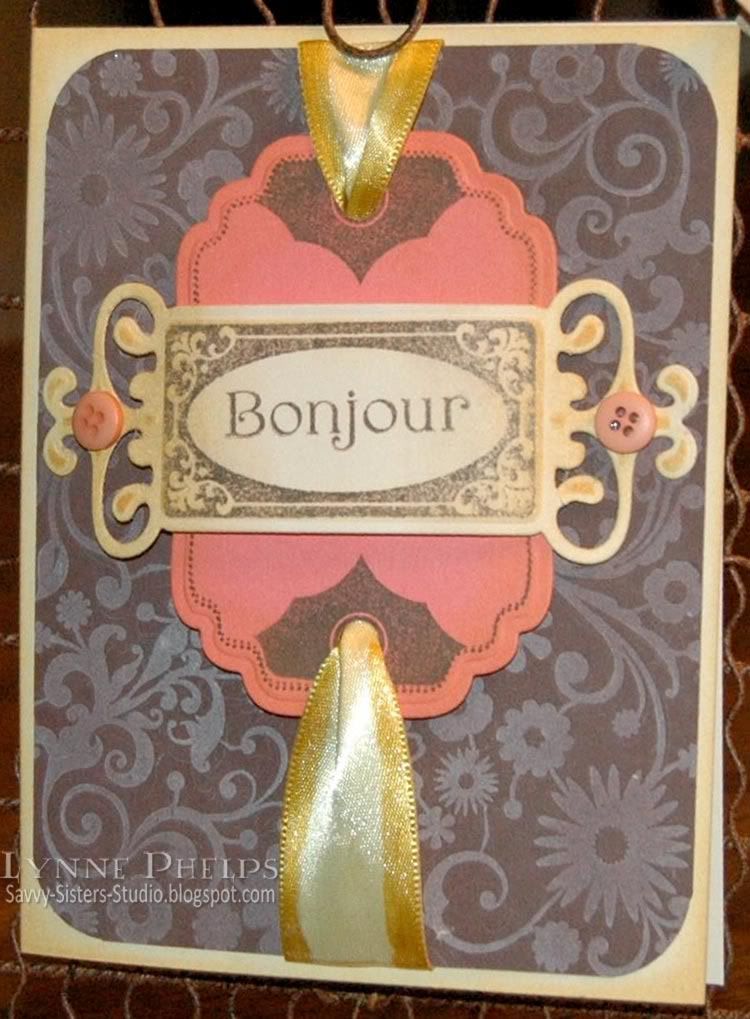
Waltzingmouse Stamps is sponsoring the current Embellish Magazine color challenge. We are to use yellow, coral, and brown, and include labels.  I love all the Spellbinders label shaped dies, so it was easy to reach for one of my favorites, Labels Four, and the corresponding stamp set from Waltzingmouse.

Photobucket

I started with a pale yellow card base, sponged round the edges with Distress Ink in Scattered Straw. Next, I took a flowered Spellbinders Impressibility and brayered it with white pigment ink. I empressed the inked stencil into a piece of brown card stock with my Cuttlebug.  I need to work on this; it was my first time using an impressibility and the impression was not as deep as I would have liked on this 80 pound card stock. I think a lighter weight card stock would have made a better impression.  I wish the letterpress effect showed better in the photo!

Then I stamped the dotted border and fun triangular tag-end stamps on coral card stock, and cut it and embossed with with the Label Four Nestability. I used a Copic Sketch marker to add a gold edge to pale gold satin ribbon. I punched holes in the label and ran the ribbon through, then attached the coral label with dimensional pop-dots.  I cut and embossed the pale yellow with a Fancy Tag die, and sponged it with Scattered Straw while it was still in the die.  On this, I stamped the frame and Bonjour.  This is actually attached at both ends to the brown card base, and then arches up and over the coral label. From the top view it curves out quite a bit. Buttons were added with mini glue dots.

One person will win their choice of a Waltzingmouse stamp set! You know I'll do anything for a WMS stamp set, they are my favorites and my wish list is a mile long, LOL! Be sure to check back on the 17th for their monthly customer blog hop.

Stamps: Waltzingmouse Stamps - Vintage Labels Four, Fancy Phrases.
Paper: Stampin' Up! - brown and coral 80 lb. card stock; Unknown - pale yellow card stock.
Ink: Palette - Burnt Umber (brown hybrid); Color Box - Frost White (pigment); Ranger Distress - Scattered Straw; Copic Sketch Marker Y26.
Embellishments: The Paper Studio - buttons; Double-faced Satin Ribbon (Hobby Lobby).
Tools: Spellbinders - Labels Four Nestability die, Fancy Tags Shapability die, Flowers Impressibility stencil; We R Memory Keepers - Corner Chomper; Standard hole punch.

Monday, June 14, 2010

Happy Birthday Hannah: Reverse Paper-Piecing with Digi-Stamps

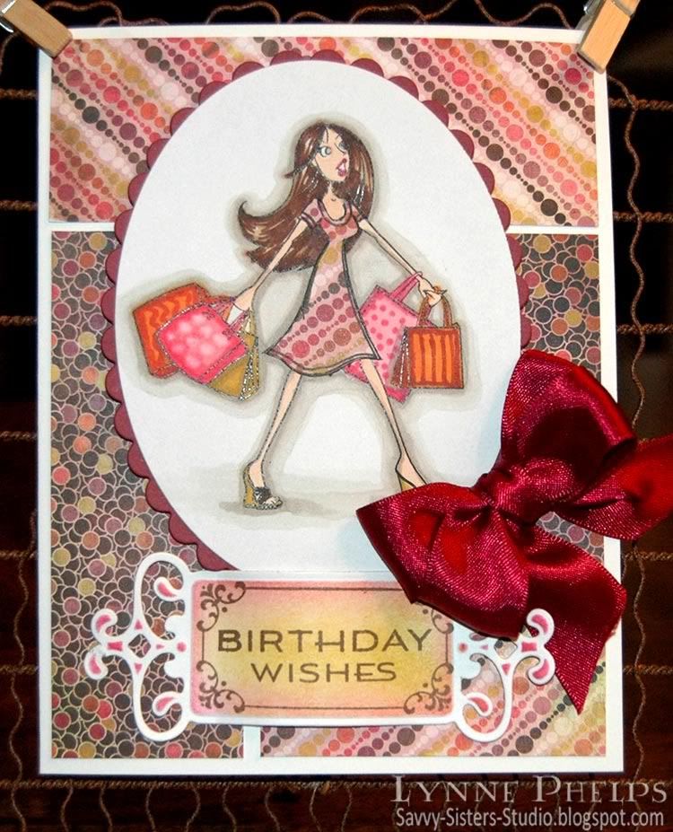
My neice Hannah just had her 19th birthday, and I thought this fun digi image from Amber Ink suited her perfectly! Hannah is very a very smart, stylish, funny young lady with loads of personality and I love her dearly!
 
Amber Ink Digi Stamp

Have you heard about Amber Ink?  The artist, Amber, and her mother have started up a new company. In the "Amber Girls" line, she is offering Digi sets - just like you might find in a clear stamp set. I only used the main image, but there are also shoes, purse, tote, etc. plus a sentiment: "But I need it. . . ." And for a limited time, several of the Amber Girl sets are FREE! They are just darling, and I can't wait to use the other sets. I also LOVE her Love Bunny stamps, they are so cute and expressive! She also has coordinating digi-paper, and clear stamps will be coming.  Plus Amber Ink is perfect for me, because I'm brilliant, not patient!!!! ;-)

Back to my card. I knew I wanted to paper-piece her dress.  In the normal way when you paper-piece with a rubber stamp, you stamp once on your base paper and color as usual, then you ink up just the part of the stamp with the item you want to paper-piece and stamp it on the patterned paper, then you cut it out and glue it over the corresponding spot on the base image.

There are some issues when you try to do this with a digital image:
  • I was using Basic Gray "Indian Summer" paper which comes on 6 x 6 inch sheets, which would have been an awkward size to try and run through my printer.
  • I did not want to print the whole image again which would have wasted the whole sheet of patterend paper.
  • I would have to do some image editing to print only the area with her dress.
  • It was too much of a hassle!
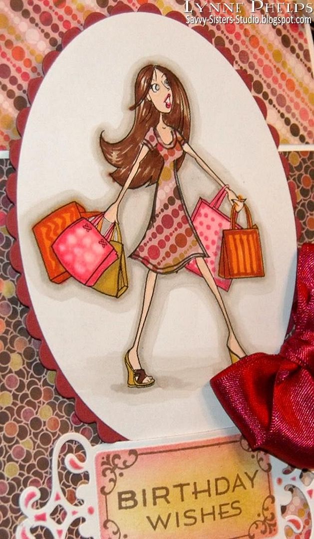
My solution was reverse paper-piecing! I used a craft knife to cut out her dress from my printed and colored image.  Basically there was now a dress shaped hole in the middle of the image. I put glue stick on the back of the image around the opening, making sure every edge around the cut-out dress was covered. Then I put a snippet of patterned paper behind the opening and made sure all the edges were pressed down firmly. I drew the hem lines back on with a black Copic Multiliner.

Unless you run your finger over the image, it is very difficult to tell that the patterned paper is behind instead of in front!

Photobucket

TIP: Try the new Fiskars Fingertip Craft Knife. The handle is a ring which goes around your index finger and the knife becomes an extension of your finger. I was very pleased at how much more dexterity and control I had when making intricut cuts - it was easy!  Here is a short product demo I found on YouTube:


I hope you will go check out Amber Ink, and also consider getting the fingertip knife. They also have a version with the tiny swivel blade.

Stamps: Amber Ink - But I Need It digi set; Waltzingmouse Stamps - Fancy Phrases.
Paper: ValuePack - 5 x 6.5 inch white card & envelope; Basice Gray - Indian Summer 6 x 6 inch pad; Stampin' Up! - Bravo Burgundy card stock.
Ink: Copic - alcohol Sketch markers, 0.5 MultilinerSP; Ranger Distress - Worn Lipstick, Scattered Straw; Memento - Rich Cocoa.
Miscellaneous: Spellbinders - Fancy Tags die, Petite Ovals and Scalloped Petite Ovals; Ribbon; Fiskars Fingertip Craft Knife; Glue Stick; PopDots.

Sunday, June 6, 2010

Six Impossible Things Before Breakfast. . . to show Jess!

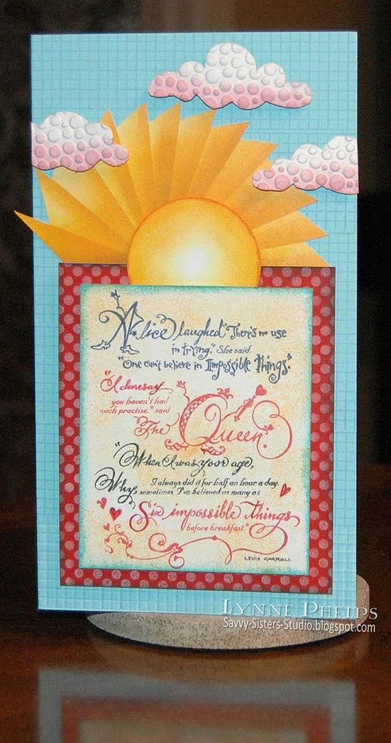
I have always loved this old PSX stamp with the passage from Alice about believing six impossible things before breakfast! This is for three different challenges, but mainly it is to show this stamp to Jessica who is longing for a "Six Impossible Things" stamp of her very own. I think she is looking for a sentiment stamp, while mine is more of a focal point stamp, but I thought I would make a card with it so she could see what this old PSX stamp looks like. Click photo to enlarge.

Photobucket

This is also for Jessica's Diedrich Daredevils June challenge, which was to use this beautiful image shown at left as an inspiration piece. I loved the half sun at the top, and the beautiful Caribbean blue, and the touches of red in the flowers.  I may make several cards inspired by this painting - I just love it, don't you?  Not to mention that there is a prize - you might want to accept the dare yourself, KWIM? (Dad, that means "know what I mean?")

Flourishes is also having a challenge: The Sunshine & Blue Skies (FLLCJUN10) color challenge! You have to use a combination of any shades you like of blue and yellow.  Not only does my card include these two colors, but I also have the sunshine and a blue dawn sky!  It had to be a DAWN sky because we are believing six impossible things BEFORE breakfast, LOL!

Last, although I am too late to submit it, this card follows Card Positioning Systems CPS-169 Sketch!

Photobucket

I colored the stamp with water-based markers, as I wanted different areas of the stamp in different colors. I hit a snag here, as my markers were halfway dried out. It makes me mad; I have hardly used these markers but they have no shelf-life at all. This is what makes the investement in Copic alcohol markers so worthwhile (except that they do not work well for this technique - I would have had to mist the stamp with rubbing alcohol which would have blurred the words.) Anyway, some of the fine print is not as clear as it should be as the markers were not juicy enough to ink up the stamp well enough. I sponged the panel with some yellow-gold and edged it with aqua to coordinate with my sun and background.


I stamped the polka dots in white on the red panel, and the graph pattern in light blue on the aqua card base.  I learned that I can't line the patterns up properly if I don't put reading glasses on!!!  My crazy, crooked sun and rays were sponged in yellow, yellow-orange, and ochre, by moving a large post-it note around as I sponged. This is not an original idea; I saw a video or photo tutorial on someone's blog and I cannot find it now to give proper credit. If the author of the tutorial (or someone who saw and it knows where it is) will contact me I will happily edit to add the credit.

The clouds are from a white cardboard package, probably a pasta box! I save chipboard boxes and some of them are lined with white, perfect for my fluffy clouds! I ran a piece through an embossing folder, drew cloud shapes on the printed package side and cut out the clouds.  Then I sponged the bottom of each cloud with pink because it's before breakfast on this card!

Photobucket

Everything was put together with dimensional pop-dots, so it has a lot of dimension; this angled shot shows the shadows and how each layer is elevated above the one below. The center of the sun is raised above the rays. The cards are floating above the surface. The sentiment is raised above the red panel, which is raised above the card base and sun rays.

I hope you enjoyed my "Sunshine & Blue Skies 169 Wild Air Dare Card!"  Especially you, Jess!  Please leave a comment, I'd love to hear from you!

Stamps: PSX - Sentiment; Waltzingmouse Stamps - Off Beat Backgrounds.
Paper: Papertrey Ink - Pure Poppy cardstock; Stampin' Up! - Cool Caribbean cardstock; Georgia Pacific - white cardstock.
Ink: Palette - New Canvas (white); Memento: Summer Sky, Angel Pink; Marvey - yellow, yellow-orange, ochre, Carribean blue ink pads and ALMOST DRIED OUT navy, red and black water-based markers.  :-(
Miscellaneous: Cuttlebug - Tiny Bubbles embossing folder; Post-it Notes; Ranger Ink Blending Tool and foam.

Wednesday, May 19, 2010

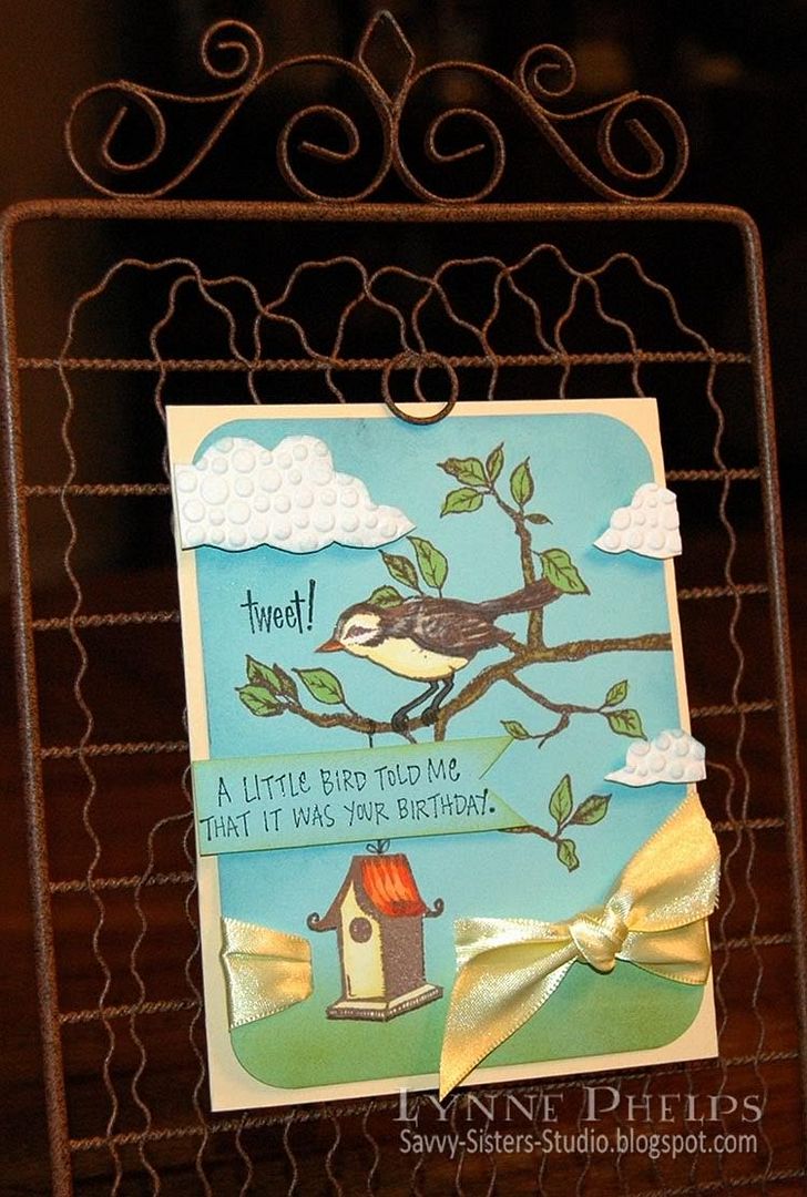
Tweet! Heard it was your Birthday!

Now that my nieces are home for the summer, we are belatedly celebrating their friend Karlie's birthday. She is so bright and cheerful and animated, and the bright eyed bird in Flourish's "Home Tweet Home" set makes me think of her! I also wanted to enter the Flourishes Timeless Tuesday Challenge FTTC67 which is to use chipboard.

Photobucket

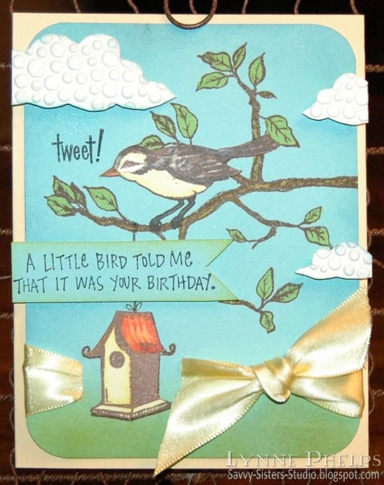
I stamped the branch, bird, and birdhouse with brown ink on the blue cardstock, then I stamped the bird and birdhouse again on white cardstock. I colored in the branch, leaves, and bird's legs with Copic markers. Then I sponged blue around the edges and in the sky area, and green across the bottom.  I colored the bird and birdhouse on the white cardstock and cut them out. Because I had also stamped the images on the blue cardstock, I did not have to worry about trimming around the bird's legs or the spirals at the edge of the birdhouse roof - I trimmed them off when I cut out the images. Much easier!! I adhered them in place on the blue cardstock.  I stamped "tweet!" in black and heat embossed it with clear detail powder.

I save cereal boxes and other packaging, do you?  I especially love it when you find items packaged in white chipboard, and that is what I used for my clouds. Clouds are a very hot trend right now! I drew some clouds on the printed side of the chipboard, then ran it through my Cuttlebug in an embossing folder. Then I cut out the clouds and sponged a little blue around the edges.  I also stamped the "little bird" sentiment on a piece of blue cardstock and trimmed it out, sponging the edges with green.

Photobucket

Now to assemble everything! I cut a slot for ribbon on either side of the birdhouse and ran yellow satin ribbbon around the panel and through the slots, tying it in a square knot.  I rounded the corners, then adhered it to my pale yellow cardbase. I added the sentiment on regular dimensionals, and the clouds on ⅛ inch thick dimensionals to really lift them up! I aligned them all with the edge of the card base, not with the blue panel. I like having elements that break through the boundaries, must be the rebel in me!!

Can't forget the inside!

Photobucket

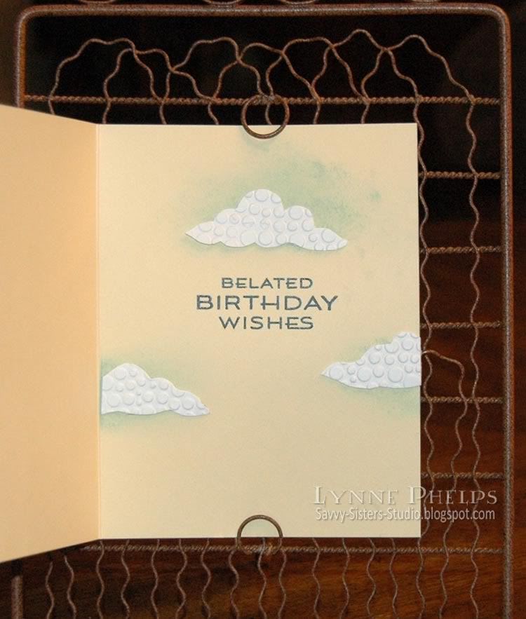
I stamped the sentiment and heat embossed it with clear detail powder. I cut out a few more clouds, again having some floating off the edge of the paper, and sponged some blue where I planned to put them. I adhered these flat against the cardstock.

I hope Karlie will enjoy receiving this birthday card at dinner tomorrow night. We are having a big meal and cake at my sister's house, gotta love a big family meal!  Happy belated birthday Karlie!


I purchased this stamp set at the Flourishes booth at a scrapbooking & stamping show in Perry, Georgia! I can't tell you how exciting it was to be able to do some stamp shopping in my own town, which is tiny!!  I got to meet two of my blog heroes, Silke Ledlow of My Life, and Dee Jackson of Stampin' Cuz I Luv 2 and made them pose for a picture with me - my sister Janet is behind the camera!  I was so excited as I have subscribed to their blogs for years, and there they were doing Copic coloring make-it-take-its at the show. Of course I recognized Silke immediately because of the picture on her blog, and the minute Dee told me her name, I said "Stampin' Cuz I Luv 2" and then we all squealed and jumped and hugged! It was just like being ten years old again!

Stamps: Flourishes -  bird, branch, birdhouse, tweet from "Home Tweet Home" set; Inkadinkado - little bird sentiment; Waltzingmouse - belated birthday sentiment from "Fancy Phrases" set
Paper: Stampin' Up cardstock - Cool Carribean, pale yellow; Georgia Pacific - white cardstock
Ink: Memento - Rich Cocoa; Ranger Distress - Black Soot; Marvy Matchable - Salvia Blue, Yellow-Green; Copic Markers
Embellishments: Hobby Lobby: Double-faced satin ribbon; Recycled chipboard packaging
Tools: Embossing Folder - Cuttlebug Tiny Bubbles; Corner Chomper (½ inch side); Tack sponges

Monday, May 17, 2010

Waltzingmouse 1st Birthday Blog Waltz!

We don't hop, we waltz our way through the blogs instead - a bit less linear, with some fun dips and twirls along the way! Waltzingmouse Stamps is 1 year old - Happy Birthday!

My order came in just in time for me to make a birthday card, not only for WMS but also for my sister. This card uses the two-stripe plaid stamp from Off Beat Backgrounds, the medium plaid stripe from Pic-Nic Patterns, and a frame and sentiments from Fancy Phrases. The Fancy Phrases fit perfectly into Spellbinders' Fancy Tags dies; mine have not arrived yet so I simply trimmed out the frame with a scissors.

Photobucket

First I stamped the plaid. It is so much fun to do, and you can coordinate it with any color scheme. I went with pink, rose, and soft green for my sister's card.  I took a small paper doily and scored it from point to point all the way around. Then I cut the center out so I could make fan-fold pleats all the way around. I adhered the folded doily to a punched circle to hold it and cover up the inside edges. I saw this idea on the Bits and Pieces blog and ran out and bought a pack of doilies the next day at my local Wal-Mart!

Next, I made some of the spiral cut roses you are seeing a lot out there. Did you know Sizzix actually makes a Bigz die for these now? Not having the die (or the money for one!!), I just drew a spiral on printer paper with a pencil and cut it out with a scalloped scissors. I carefully erased the pencil marks then colored the whole thing with light pink Copic markers and edged it with a deeper rose along the spiral cut. There are a lot of tutorials out there, but what I used is this Sizzix PDF on how to assemble the flower.

PhotobucketI used a pearl bead in the center of each, isn't that a pretty touch? I wanted to control how the bead hole was oriented, so I put it on a pin, applied a blog of Diamond Glaze glue on one side of the bead, and lowered it into the center of the flower. This allowed me to keep the bead hole horizontal, so the hole does not show from the top.
Remember your crimper? That tool that has been gathering dust since embossing folders were created? Pull it back out as your leaf maker! I punched a 1¼ inch circle, folded it in half and ran it through the crimper at an angle diagonal to the fold. Then, while still folded, I cut the sides down to make a half teardrop shape. Open up the fold and you have a perfect textured leaf. You could stop there, but since when do I know when to stop? So the edges, center fold, and ridges were accented with Copic markers!

For the sentiment, I stamped the medium sized plaid stripe in soft green, then stamped the frame and sentiment on top with rose. I wanted it to stand out more from the base plaid, so I filled in the area between the frame and the edge of the paper with a pink Copic marker and edged it with a rose marker. It is mounted on a ⅛-inch thick dimensional. I also ran the rose Copic along the edge of the ribbon on the front to make it match the plaid a bit better.

Can't forget the inside:

Photobucket

I stamped some of the plaid stripes down the sides and used another Fancy Phrase sentiment, plus one of the little flourishes that comes with the set.  I am not sure what the marks are at the bottom of the card - they are not there IRL (in real life); perhaps I need to clean the lens!!!

To see other entries in the blog waltz, just stop by the Play Room forum at the Waltzingmouse House - everyone has listed their entries in the Play Room! Come on in, registration is free and easy and you get to see a lot of good cards, not to mention chances at some very nice blog candy! The blog waltz will kick off Monday, May 17th at 10 a.m. EDT when the blog waltz forum thread opens and we start adding our links!

I hope you are enjoying Waltzingmouse's 1st birthday! Congratulations Claire!

Stamps: Waltzingmouse Stamps - Fancy Phrases, Off Beat Backgrounds, Pic-Nic Patterns
Paper: Printer paper for plaid, roses; 5 x 6 inch ValuePack white card.
Ink: Memento Dye Ink - Angel Pink, New Sprout, Rose Bud; Copic alcohol markers
Embellishments: Paper Doily, Pearl Beads
Tools: ScorePal; Scalloped Scissors, Bow Easy, Crimper

Tuesday, May 4, 2010

FTTC65 - Card with Matching Gift Idea

Flourishes Timeless Tuesday Challenge #65 is to make a card with a matching gift idea. Silke Ledlow, the challenge hostess, made a beatiful pillow box and matching card.  I thought what about a card that included a matching gift INSIDE the card? So I came up with this card which has matching earrings hanging inside from a cute hanger:

Photobucket

Do you ever have a card that you are just not happy with? This is a re-make of the card on my last blog post and you can read most of the details there. For this version, I added two leaves to the lower flower and all the sudden everything was in balance! The leaves are super easy, made with my favorite method: punch a circle, fold it in half, and run it through the crimper diagonally. Then trim part of the folded circle away to make a leaf shape.  I sponged a dark olive green ink across the crimped leaves.

I made some earrings in the same colors as my card, and I couldn't find a box, so I decided to include them in the card itself. I am really pleased with the way this earring hanger worked out! My second feline photographer's assistant, Abita, is keeping an eye on things!

Photobucket

The earring hanger base is Mellow Moss cardstock (SU), sponged with Vintage Photo (Distress - Ranger) and punched with the Designer Label Punch (SU). Then the circle was sponged and punched with two small holes to hold the earrings. It is mounted with a really thick 1/8" dimensional to give the earring wires room to hang nicely.

Stamps: Waltzingmouse Stamps - Happy Birthday; Hero Arts - Sentiment.
Paper: Stampin' Up! - Creamy Caramel, Mellow Moss, Natural Confetti.
Ink: Memento - Rich Cocoa; Ranger Distress - Vintage Photo.
Embellishments: Imaginisce - Silk Flowers
Tools: Spellbinders Lattice Pendant; Stampin' Up! Designer Label Punch; All Night Media small flower punch.; Cuttlebug - Textile embossing folder
Earrings: Hobby Lobby - glass beads and copper findings; Blue Moon - antiqued copper double-swirl dangles

Friday, April 30, 2010

Happy 1st Birthday Waltzingmouse!

Waltzingmouse Stamps is one year old! Happy Birthday! Claire is releasing eight new stamp sets May 1, and if you order on May 1-2 you get free international shipping with an order over 50GBP (approx. $77). That is really something to celebrate! Claire has a sketch challenge contest, with the  prize being all 8 sets in the new release. Here is the sketch:

And here is my card:


Photobucket


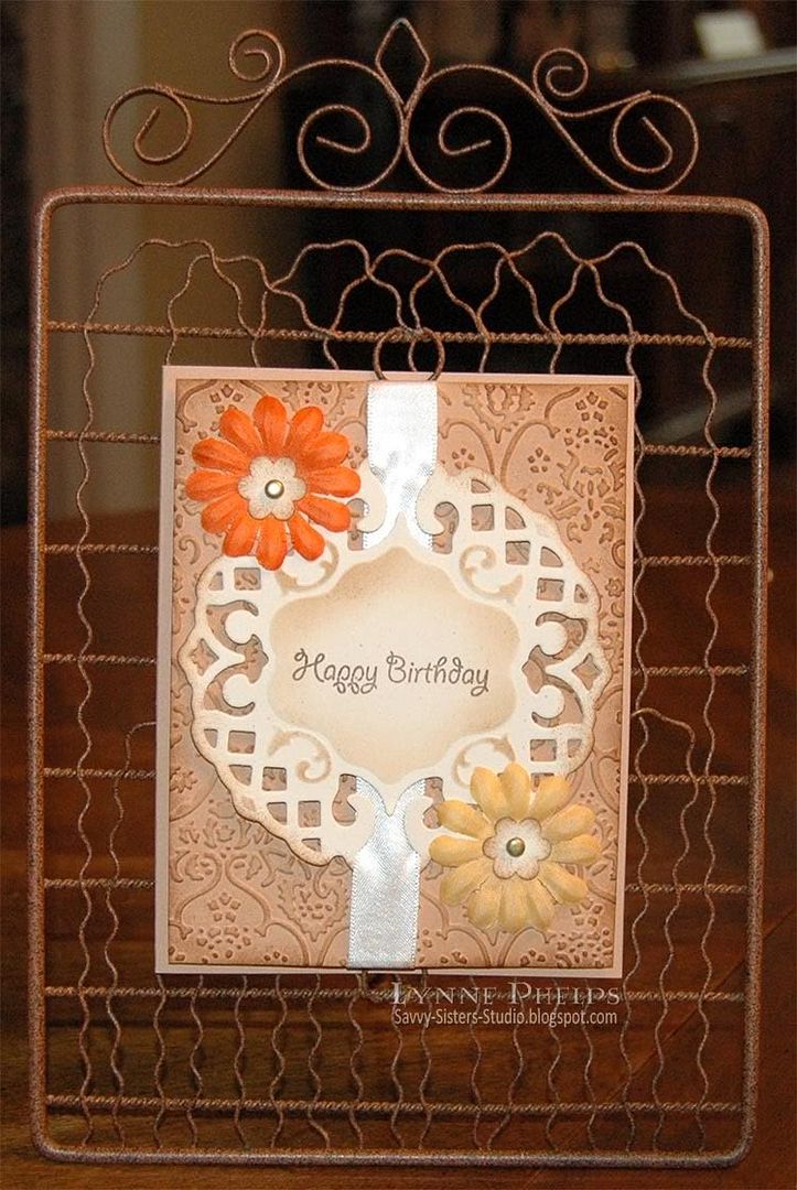
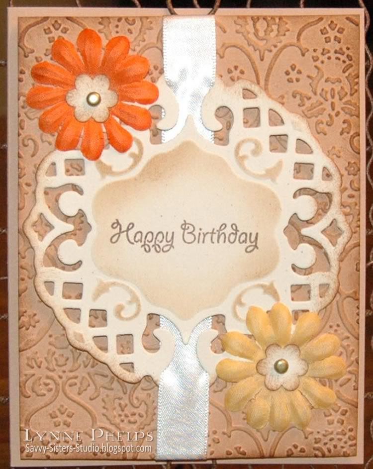
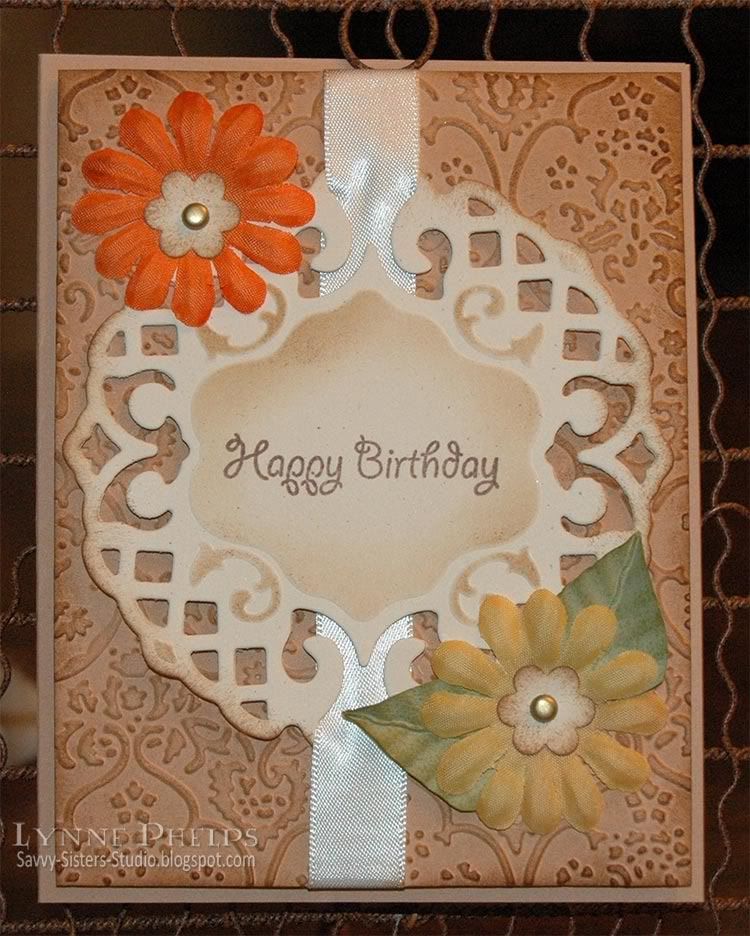
The card base and the panel embossed with Textile Pattern (Cuttlebug) are Creamy Caramel (Stampin' Up!). The center panel is Natural Confetti cardstock (SU), cut out with a Lattice Pendant die (Spellbinders) and sponged with Vintage Photo (Distress Ink - Ranger). The embossed panel and punched flower centers were also sponged with Vintage Photo. The sentiment is from Waltzingmouse's Earth Angel set, one of my faves!

Photobucket


The flowers are silk, from a big autumn assortment (Imaginisce) and are designed to be used to make flowered brads with the iTop tool. I used a small punched flower and antiqued gold mini-brad as a center instead.


Photobucket


Of course you can't forget the inside! I added a couple more of the small punched and sponged flowers, coloring in the centers to coordinate with the flowers on the outside. I love this sentiment by Hero Arts! It had a turtle on the same clear stamp but I trimmed it so the words and turtle were two separate stamps.

This card is also for my sister's mother-in-law, Sparky! Happy birthday Sparky!

I hope you have lots of birthdays too - they really are good for you! Please leave a comment, I treasure them all. It really makes my day when I hear from you!

Wednesday, March 17, 2010

Waltzingmouse St. Paddy's Day Blog Hop

What could be more natural than an Irish stamp company sponsoring a St. Patrick's Day blog hop!  The blog roll is in a thread on the Waltzingmousehouse Forum - why don't you register so you can join us in hopping along? The forum thread will open in the "Play Room" around 3 p.m. today. If you don't see it, just check back. Remember to comment along the way!

Photobucket - St. Patrick's Day Waltzingmouse Card
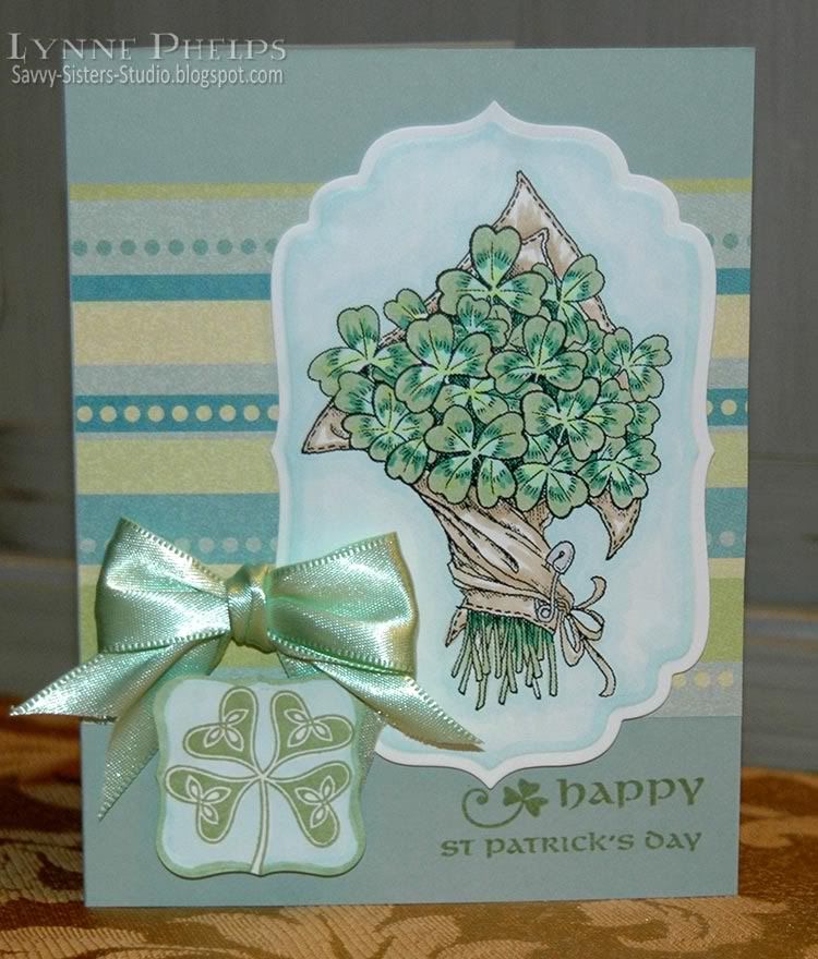
For my card, I used one of Claire's free digi stamps - the bunch of clover. Have you seen the other free images included in the zip? Gorgeous! Other, traditional stamps I used include the sentiment and four-leaf clover stamp from the Waltzingmouse Celtic Heritage set, and tiny shamrock and inside sentiment from the Irish Blessings set.  The sets have so many wonderful images, like the Irish Cottage I used on another St. Patrick's Day card!

I printed the bunch of clover on color laser paper and colored it with Copics. Cardstock that allows Copics to blend well can be very expensive. A tip from the queen of Copics on the "I Like Markers" blog is to use color laser printer paper! It is trimmed with a label four nestie (Spellbinders).

I stamped the Celtic four-leaf clover with green ink (Bamboo Leaves - Memento), trimmed it with a label one nestie (Spellbinders) and colored the background and edges with Copics. It is adhered with a thick dimensional pop dot.

The sentiment and tiny clover was stamped with green on the base cardstock (Stampin' Up!). The striped paper is from the Sea Glass collection (K & Company).

Photobucket - St. Patrick's Day Clover Card - Inside

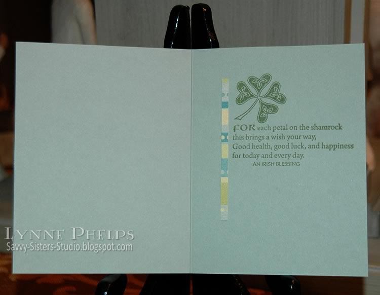
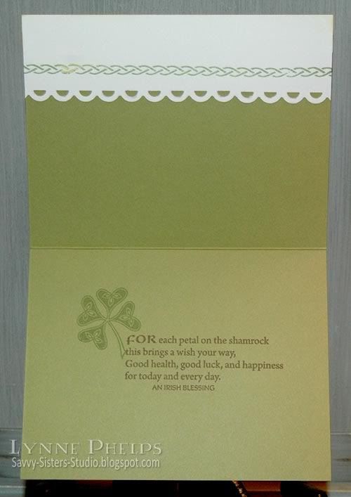
Inside I stamped the same large celtic four-leaf clover and a shamrock blessing in green (Bamboo Leaves - Memento). I had a sliver of the striped paper trimmed from the front and it made a nice dash of pattern on the inside of the card! Love tying the front and insde together with repeating design elements.

I hope you enjoyed this step in the blog hop, and would love it if you would leave a comment! Hearing from you is what makes blogging fun! Thanks for looking, and happy St. Patrick's Day!

Sunday, March 14, 2010

Peaceful Irish Cottage - Shamrock Blessings to you!

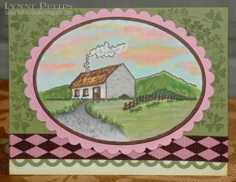
I love this serene image of an Irish cottage by Waltzingmouse Stamps. I was looking for a peaceful scene and I think this really captures that feeling. The shamrock has three leaves, so it is associated with the Holy Trinity, and I have a shamrock blessing for all of you inside!  All stamps used are from the Irish Blessings set, except the large shamrock inside which is from the Celtic Heritage set.

Photobucket - Peaceful Irish Cottage Card

I stamped the scene in brown (Rich Cocoa - Memento) on Cream (110 lb. - Flourishes) and colored it with Copics - the cardstock was a dream for blending and coloring! I trimmed and embossed it with a Petite Oval Nestie (Spellbinders) and colored the edge with a brown Copic marker. This was backed by a pink scalloped layer.

The olive background (Stampin' Up!) was stamped with shamrocks (Bamboo Leaves - Memento) and the edge was scalloped with a border punch (Apron Lace - Fiskars) then wrapped with a pink and brown ribbon.  To extend the cardfront back to full size after punching the edge of it away, I backed it with cream cardstock tinted with pale yellow Copics.

Photobucket - Irish Cottage Card Inside

I wanted the cream cardstock to be decorative on the inside as well as the outside, so I scalloped the inside edge. It is always nice to repeat elements from the card front on the inside! I stamped the large Celtic shamrock in green and the shamrock blessing in brown.

This card is my submission for several challenges:

First, it is for Stamping Sisters In Christ Challenge #30:
SCRIPTURE
Psalm 29:11 "The LORD will give strength unto his people; the LORD will bless his people with peace."


CHALLENGE
Make a card/layout/project using a peaceful image or a verse about peace.
I think my peaceful Irish cottage and shamrock blessing fit this challenge perfectly!

Second, it is for the Waltzingmouse color challenge on Stamping Around, which was to use a neutral like white or kraft, plus pale green, sugar pink, and pale yellow. I came as close as I could with the green!


Third, it is for the Our Creative Corner Color Challenge by Silke Ledlow, who I had the good fortune to meet in the Flourishes booth at the show this weekend in Perry, Georgia! The color challenge was to use brown, pink, green, and yellow.

Fourth, it is for the Stamp Simply #130 Color Challenge - Pink and Green with added Brown!  I really lucked out that so many challenges were on the same color palette!

I hope you have enjoyed my peaceful Irish cottage card and I wish you lots of shamrock blessings!  Please leave a comment - that is what makes it all worthwhile!

Monday, February 22, 2010

Waltzingmouse Spring Blog Hop!

ETA: Edited to add that I've entered this card in the Flourishes Timeless Tuesday(FTTC55) to make, stamp or add flowers in some way. I think this Celtic Flower qualifies!
Welcome to the very first Waltzingmouse Stamps Customer Blog Hop. The theme is Spring, a welcome thought with all this cold weather. If you came here from Mona Pendleton's blog, Cupcake's Creations, then you are in the right place. If not, you may want to start at the beginning on Claire Brennan's Waltzingmouse Makes blog!

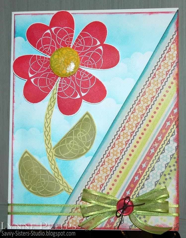
Photobucket - Celtic Flower Card Front
I don't have any of Claire's darling Spring sets - yet - so I turned to my all-time favorite sets, Celtic Heritage and Irish Blessings. I think you can find a way to use these sets for ANY occasion - I even used them for my Christmas cards last year!

I sponged Carribean Blue (Marvy dye ink pad) onto the white background, moving around a scallop circle punched paper as a mask to create clouds. I swiped the edges with a Crimson Lake ink pad (Marvy) and topped it with a patterned paper panel (K&Company Mat Pack) which also had edges swiped with Carribean Blue and Crimson Lake. Then I had fun creating my flower - I stamped the heart four times using Crimson Lake and "rocking and rolling" the edges with English Red (Marvy). I stamped the solid lunette twice with Pond Green (Marvy). I curved the beautiful braided border on the acrylic block and stamped with Pond Green to create a stem. The leaves and stem were sponged with Old Gold (Marvy) to make them more yellowy to match the patterned paper better.

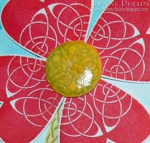
Photobucket - Celtic Flower Brad Center
I used a 60% off coupon at Michals to purchase an i-Top brad making tool (Imaginisce) -what can I say, the price was right! It is a lot of fun, but be sure to watch their YouTube videos to get all the tips, it makes a big difference. I stamped the small lunette twice in Pond Green (Marvy) to make a full circle, then sponged it with yellow and gold. I cut it out with the template and then dampened the paper before using it in the brad maker. I covered it with Diamond Glaze (Judikins) to make it shiny. TIP - don't press your finger into it when you test to see if it is dry - just ignore that fingerprint!

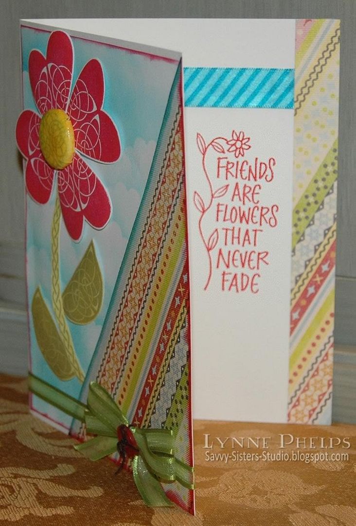
Photobucket - Celtic Flower Card Inside
On the inside, I pasted a leftover piece of the patterned paper and a strip of striped blue ribbon. The sentiment, "Friends are flowers that never fade" (Hero Arts) seemed perfect for this happy card!

Your next stop on the blog hop is the Stamping With Val blog!

I hope you enjoyed my Celtic Flower! Please leave a comment - your comments are what make blogging fun. Thanks so much for hopping by!

Friday, December 11, 2009

And they wrapped the Babe in swaddling clothes...

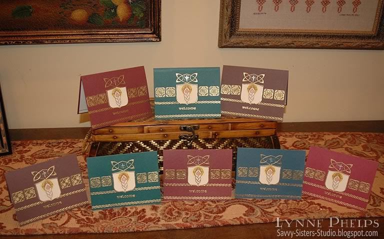
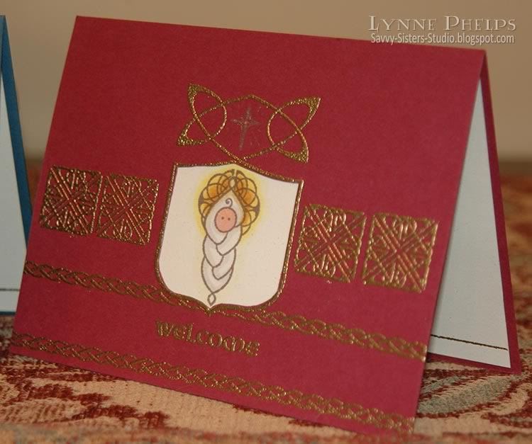
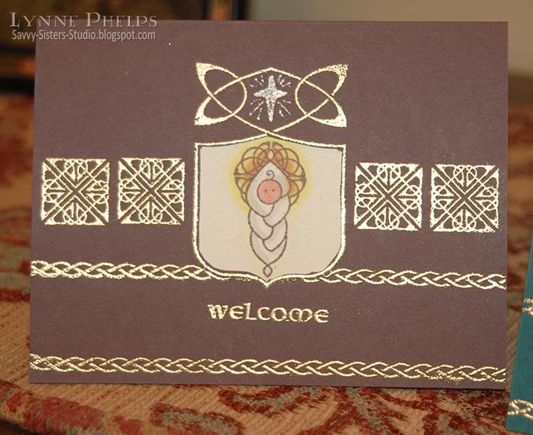
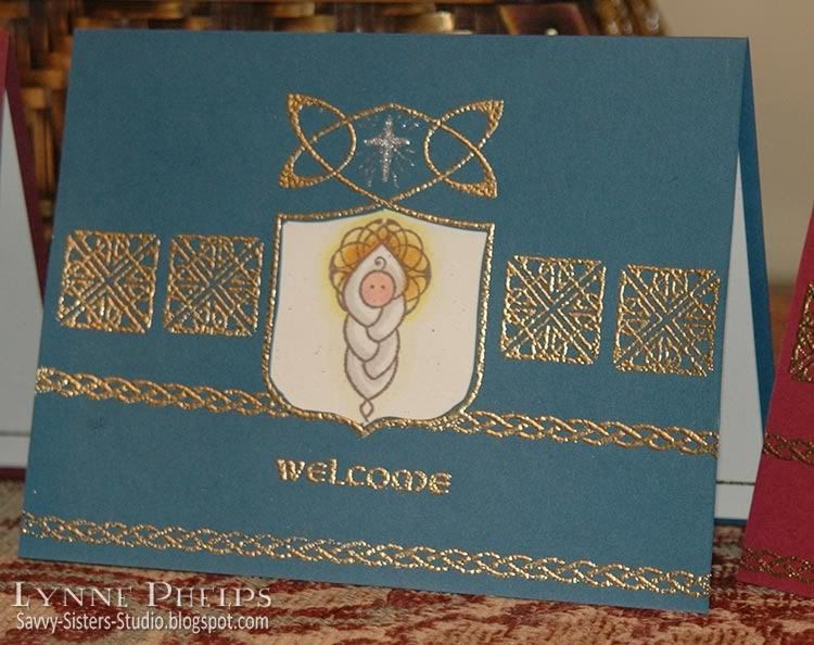
When I first saw Waltzingmouse Stamps' "Celtic Heritage" set, I knew the baby wrapped in a cable or "plaited" blanket would be on this year's Christmas card. It made me think of Baby Jesus right away! Other stamps are from Waltzingmouse "Irish Blessings" set and the inside sentiment is by Sweetgrass Stamps. (Note - Edited to add Labels, a forgotten photo and a stamp credit)

Cardstock is SU Chocolate Chip, Bravo Burgundy, Handsome Hunter and Not Quite Navy. Light cardstock is SU Natural Confetti - it has great little flecks in it that add a lot of interest.

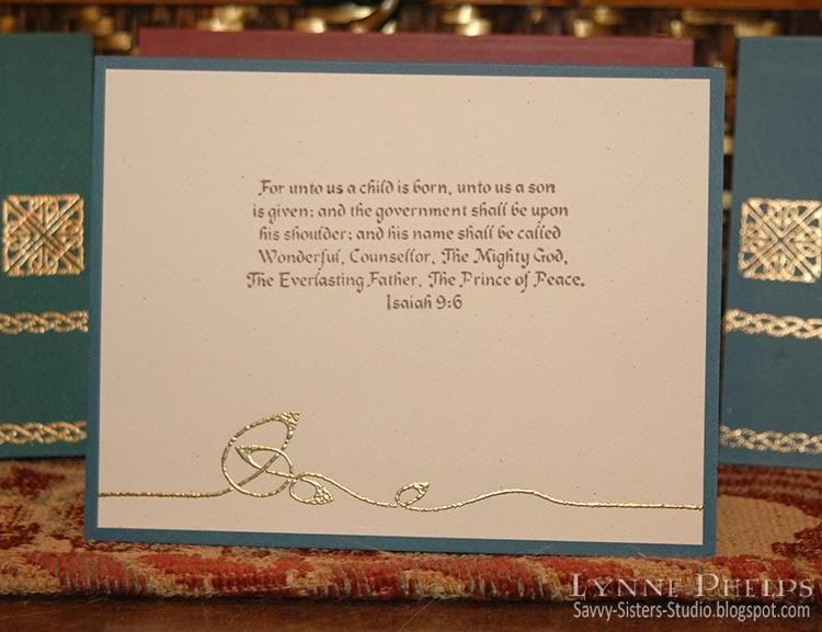
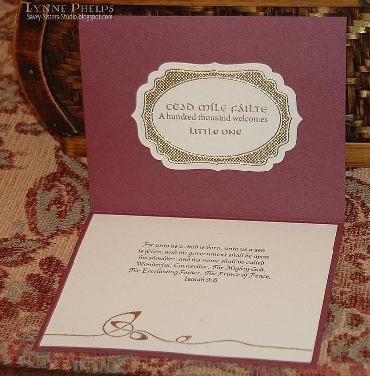
Here is a closeup of the inside, with a passage from Isaiah (Sweetgrass) stamped in Rich Cocoa Memento ink and a beautiful knotwork border (Celtic Heritage) stamped with VersaMark and heat embossed in Ranger Gold embossing powder. The sentiment is the only "Christmas" stamp used in the whole card!! (Am I the only person who hears Handel's Messiah singing in my head whenever I read this passage? Just wondering!!)


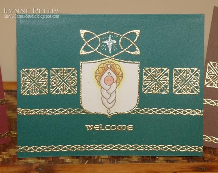
First the shield (Celtic Heritage) was stamped, embossed and masked, and then the braided borders (Irish Blessings) were added plus the Welcome (Irish Blessings). The knotwork squares(Irish Blessings) were added last using a Stamp-a-ma-jig for placement. The opening was cut out with an Xacto knife. The baby (Celtic Heritage) was stamped in Rich Cocoa Memento, then I masked the baby and the stamped the small open Lunette (Irish Blessings) twice to form a full circle for the halo. There are larger solid and open versions of the Lunette in Celtic Heritage, but this is the tiny one from Irish Blessings. The baby is colored with Copics, then adhered to the inside of the cardfront to show through the window opening. I drew in a little star in the upper shield opening using a Sakura Stardust clear pen.


Because the Copics that I colored the baby with saturated the backside of the paper, which showed inside the top of the card, I used a Nestibilities Label Four to cover it up on the inside. It is gold embossed with Nestie-friendly Waltzingmouse stamp (Vintage Labels Four) and then stamped with "One hundred thousand welcomes" in Gaelic and English (Irish Blessings) and "Little One" (Celtic Heritage). I thought this was a really elegant cover up and it continued the idea from the front of welcoming the baby Jesus!

More closeups of the card fronts:


It was so much fun to create these cards without using ANY stamps that would be normally thought of as being for Christmas, with the exception of the inside sentiment of course! I thought Welcome was an appropriate message for Jesus' arrival on Earth; it is certainly expressive of the spirit in my heart at this, or anytime of year! Please leave a comment to let me know what you think of my little swaddled Baby Jesus!

Tuesday, November 24, 2009

Waltzingmouse Earth Angel - Fall Colors

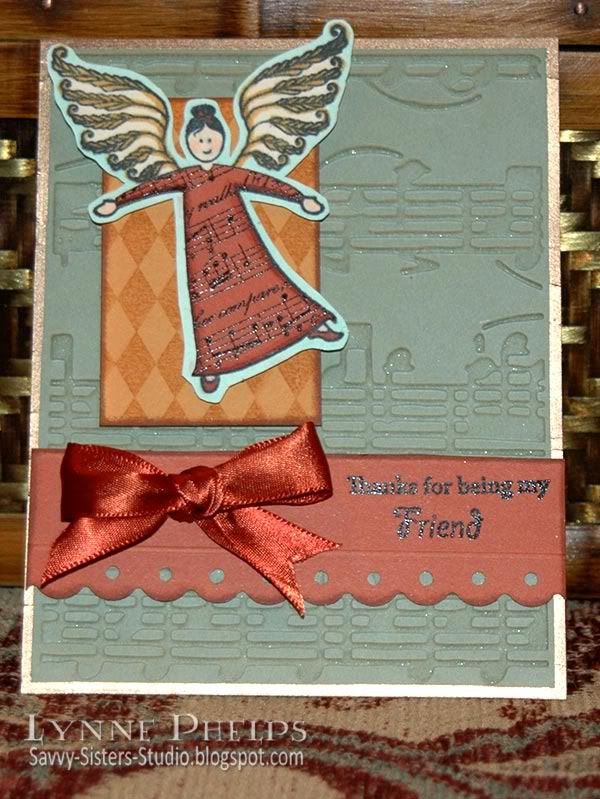
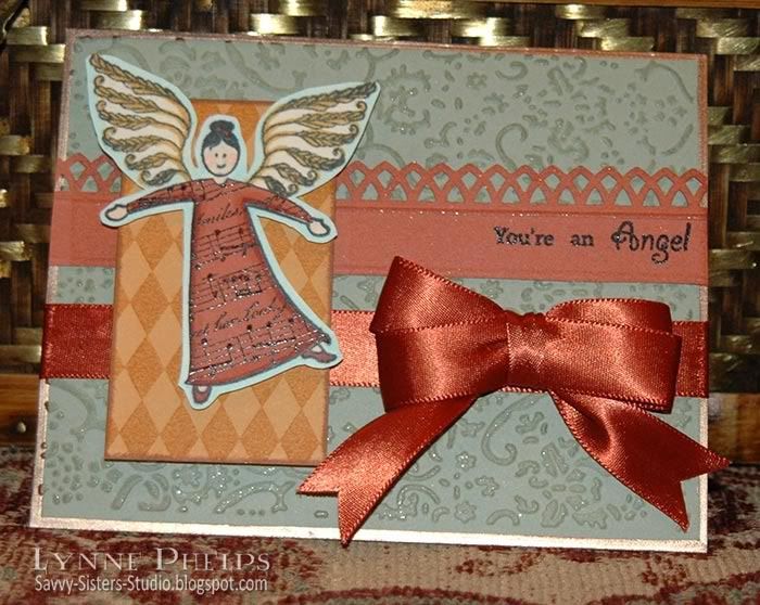
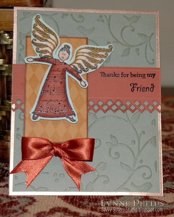
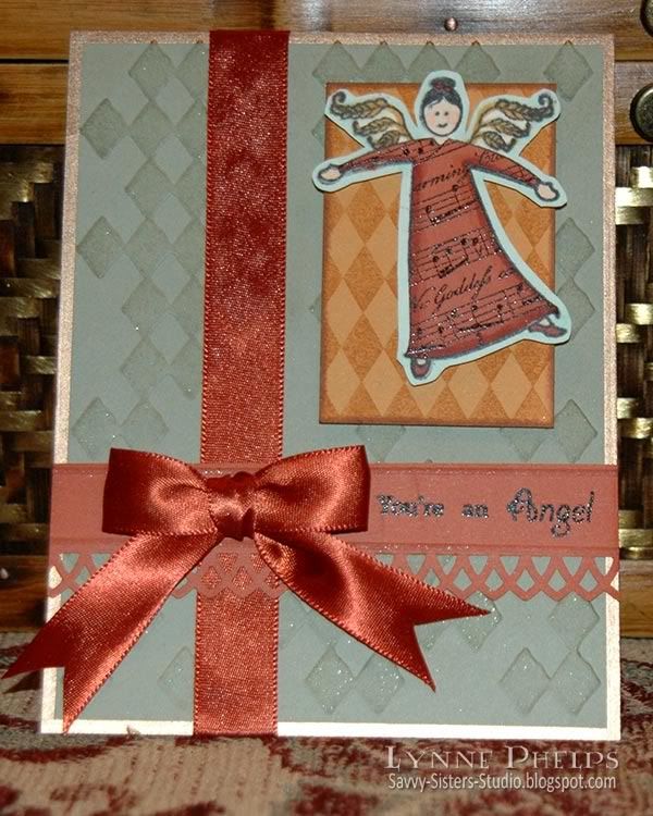
I am having such fun with my new Waltzingmouse Earth Angel stamp set! Instead of the spring colors of the last set of cards (see previous post), this set uses the warm colors of Autumn. I love all the different wings that come with the set. Last time for my spring cards I used the leafy wings. This time I used the Wheat wings to stay with the harvest color scheme.


Note - sorry for the yellow color cast in this photo - I took it without flash so you could see the embossing. Card photos below show real color!

I heat embossed a music stamp on SU Really Rust cardstock and used that to paper piece the angel's dress; the rest of the angel is colored with Copics. The angels are set on a rectangle of SU More Mustard, stamped with a harlequin diamond stamp from Stamper's Anonymous. All have bows tied with the Bow-Easy. The background is SU Mellow Moss embossed with various Cuttlebug folders and edged with a Krylon leafing pen in Pale Gold. I also used my Versamark Champagne Dazzle pad to add definition to the embossed backgrounds and raised areas on the sentiment strips - I really like the subtle shimmer on the raised areas!


This one uses the Cuttlebug "Allegro" backround.


This one uses the Cuttlebug "Textile" backround.


This one uses the Cuttlebug "Birds and Swirls" backround.


This one uses the Cuttlebug "Rough Diamonds" backround.


This set comes with a huge variety of sentiments. These are made up of separate stamps. "Thank you for being a" + "Friend." The other sentiment is all separate words in the set: "You're" + "an" + "Angel". You can see all the different stamps in the Earth Angel set here.

Related Posts with Thumbnails