Showing posts with label Cuttlebug. Show all posts

Sunday, April 3, 2011

The Altered Alice CHAPTER 3 - Week 1: Alice Colors of Blue and Yellow

"Mr. Tenniel is the only artist, who has drawn for me, who has resolutely refused to use a model, and declared he no more needed one than I should need a multiplication table to work a mathematical problem! I venture to think that he was mistaken and that for want of a model, he drew several pictures of "Alice" entirely out of proportion - head decidedly too large and feet decidedly too small."
-- From a letter by Lewis Carroll (pseudonym of Charles Lutwidge Dodgson)
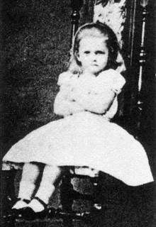
Although the stories were written for and inspired by the brunette Alice Liddell, when it came time for Tenniel to create the illustrations, Carroll sent him a photo of blonde Mary Hilton-Badcock as his image of what Alice should look like. Early color illustrations of Alice show a girl with long blonde hair, wearing either a blue dress with a white pinafore, or a yellow dress with a blue and white pinafore.

Therefore, our challenge this month is to create something that is predominantly blue and yellow, the colors associated with Alice! Although it is not required that you use Wonderland in your project, those that do feature Wonderland will receive two chances at the drawing instead of one! Enter by Friday, April 22 at 8 p.m. Eastern Daylight Time (GMT -4:00) and the winner will be posted sometime on Sunday, April 24.


Our April sponsor is Aritistic Outpost, makers of fabulous rubber art stamp sets including the Wonderland Collage set that will be featured by our design team. The Artistic Outpost design team will be playing along as well! One lucky winner will receive a $14 gift certificate to the Artistic Outpost store.

The Artistic Outpost's full line of vintage inspired art stamps are sold in unmounted themed collections. All the unmounted sets are $14, so the winner will be able to select the set of their choice. They also offer several collections pre-cut and mounted on cling foam. Be sure to visit their blog for frequent udates, ideas, and inspiration from Artistic Outpost and their talented design team. I have used their stamps and the fine-line detail they are able to achieve in their rubber art stamps is truly outstanding!

These gorgeous Wonderland Collage images feature the original Tenniel illustrations, so I thought this quote that shows how much Lewis Carroll cared about the appearance of Alice in the book illustrations is a fitting start to this month's challenge! 

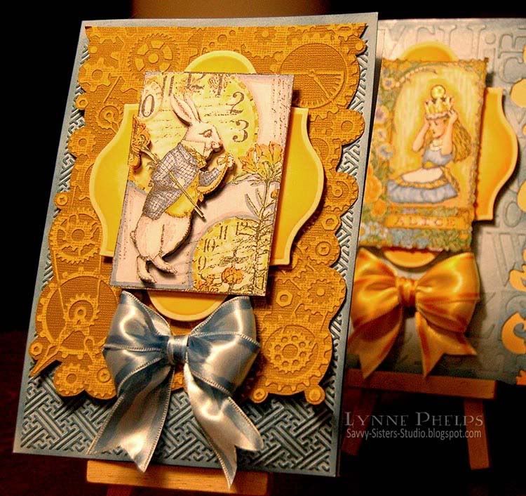
My White Rabbit Card
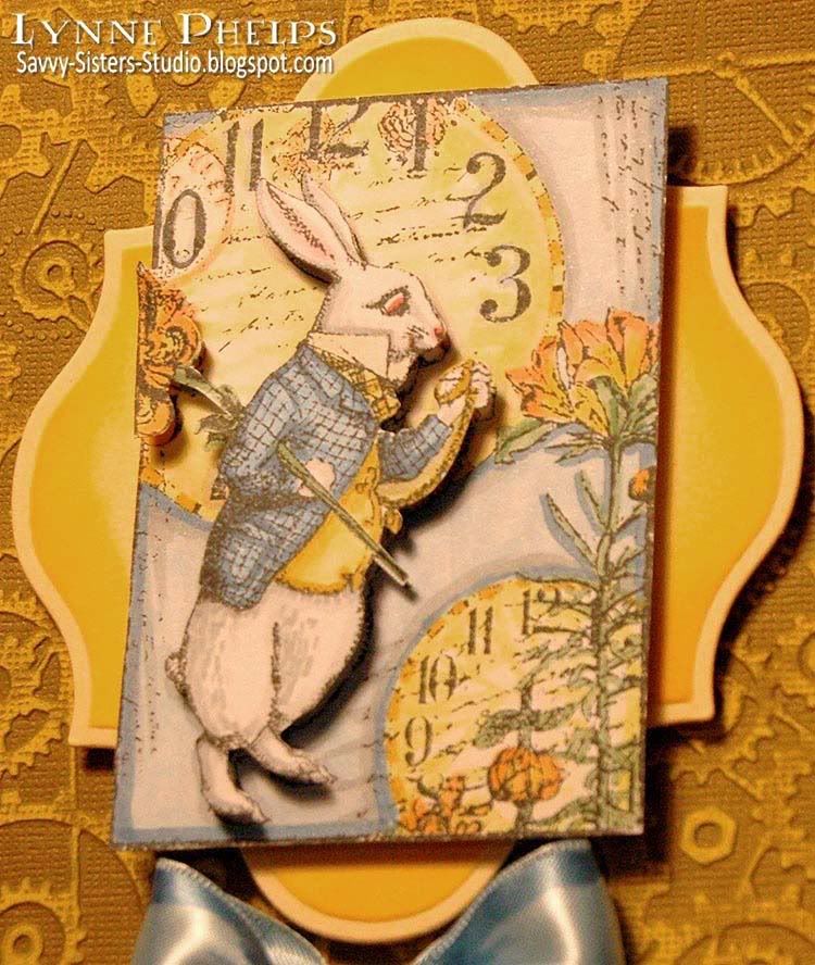

My White Rabbit collage was stamped with Memento Tuxedo Black ink on Copic X-Press It card stock and colored with Copic markers. The rabbit was stamped again and popped up on dimensional foam tape. The layered image was trimmed out and mounted with foam tape to a Label Thirteen Nestability cut from pale yellow card stock and sponged with Mustard Seed Distress Ink using an ink blending tool.
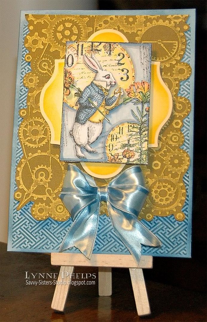

The next layer down is Crushed Olive Core'dinations card stock. I embossed it with my all time favorite Cuttlebug Clockworks embossing folder, then sanded down to reveal the bright yellow core and trimmed out around the gear pattern. The card base, SU Bashful Blue, was embossed with another Cuttlebug 5x7 Oriental Weave embossing folder from the Asian collection. I sponged it with Faded Jeans Distress Ink to highlight the embossing.


A blue satin double looped bow finished it off. I used the Bow Easy to make the bow, then I colored the edges of the bow with a darker blue Copic marker - love that look, it makes it look like very expensive ribbon! Plus it makes the ribbon perfectly match my card!

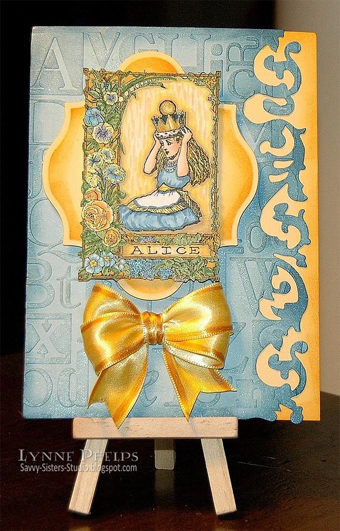
My Alice Card


 You all know how much I LOVE coloring and this Alice image was a pure joy! The fine line detail Artistic Outpost achieves in their red rubber stamps is truly amazing. The floral border is gorgeous! The set comes with two companion stamps that fit into the open area below the kneeling Alice - one says "If the crown fits..." and the other says "Alice in Wonderland."  However my favorite Stamp-A-Ma-Jig stamp positioner has gone missing, so instead I wrote "Alice" in the space using a Copic Multiliner!


The ATC-sized collage image was trimmed out and mounted on a Label Thirteen Nestability cut out of pale yellow, only this time I sponged it with Wild Honey Distress Ink.

The Bashful Blue layer was cut out with a Tim Holtz On the Edge Scrollworks die, then embossed with  a 5x7 Typeset folder. The raised areas were brushed with a VersaMark Dazzle Pad,. I love the way this darkens the embossing just a little bit and adds shimmer to the raised areas! The edges were sponged with Faded Jeans Distress Ink using the ink blending tool. This layer was mounted on a pale yellow card base with the edges sponged with Wild Honey Distress Ink.
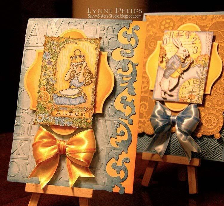

The finishing touch was another double looped bow, in yellow edged with darker Copic marker. I love ribbon, especially since finding Fast Grab Tacky Glue. I can adhere any type of ribbon with this glue and it will not soak through the ribbon - you never see the glue and it holds even the most slippery satin ribbon!

Remember to link YOUR blue and yellow projects on the The Altered Alice CHAPTER 3 Week 1 post; I can't wait to see your creations! Remember the winner will receive a gift certificate from Artistic Outpost! You have until Friday, April 22nd to enter your project and the winner will be announced on the last Sunday of the month.

I hope you have enjoyed my blue and yellow Artistic Outpost creations! Please leave me a comment before you go, it really makes my day when I hear from you!

Sunday, March 20, 2011

Altered Alice CHAPTER 2: Hall of Doors

"There was not a moment to be lost: away went Alice like the wind, and was just in time to hear it say, as it turned a corner, `Oh my ears and whiskers, how late it's getting!' She was close behind it when she turned the corner, but the Rabbit was no longer to be seen: she found herself in a long, low hall, which was lit up by a row of lamps hanging from the roof.

There were doors all round the hall, but they were all locked; and when Alice had been all the way down one side and up the other, trying every door, she walked sadly down the middle, wondering how she was ever to get out again."
     -- Chapter 1, Alice's Adventures in Wonderland
This month's challenge is to use a door or doors, and preferably for the door or doors to open and close so we can see what lays beyond! While it is not required that your project include Alice in Wonderland, we do encourage it. If your project features Wonderland you will get two chances in the prize drawing instead of one!

HURRY UP and get you entry in! You have until this Friday and  our winner will be announced next Sunday! You can make it as simple or complex as you like, just feature a door and link it on the Week 1 post for this challenge!
The Octopode Factory is our March sponsor! We are celebrating because Lily has moved into the world of rubber! That's right - RUBBER STAMPS! Most of the digital images we will be using are those that are now available in rubber,
One lucky winner will win a $30 gift certificate for digital images from The Octopode Factory's Etsy store! Enter by Friday, March 25 at 8 p.m. Eastern time (GMT -5:00) and a winner will be announced on Sunday, March 27. While we'd love to see your Octopode, you can use stamps from any company on your creations, so show us your DOORS!

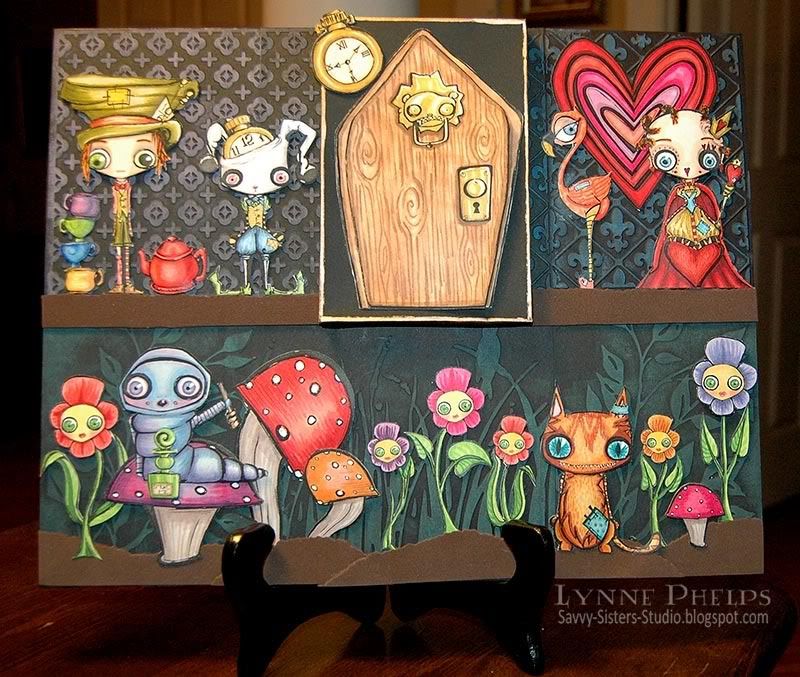
And now for my mad Octopode Wonderland!


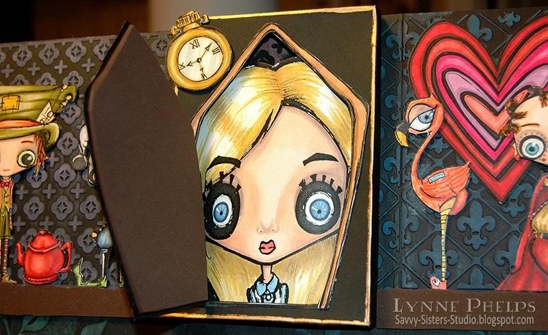
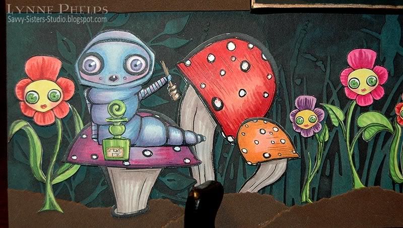
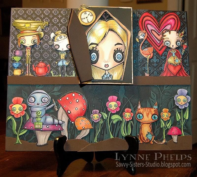
I started with an 11 x 14 inch canvas panel to create this fantasy scene with both the Alice in Wonderland set plus the new Alice Elements. All the elements were printed using a black and white laser on color laser printer paper. They were colored with Copics, adhered to inexpensive cardstock and then carefully trimmed out. The canvas board was covered with panels of black paper that I embossed with my Cuttlebug and then brushed over the high spots with fluid chalk ink pads. All images are Ocotopode, including the brand new door that Lily created in honor of our challenge. I love the Teddy bear door knocker!  The Rainbow Heart is a freebie from Lily's blog!
 

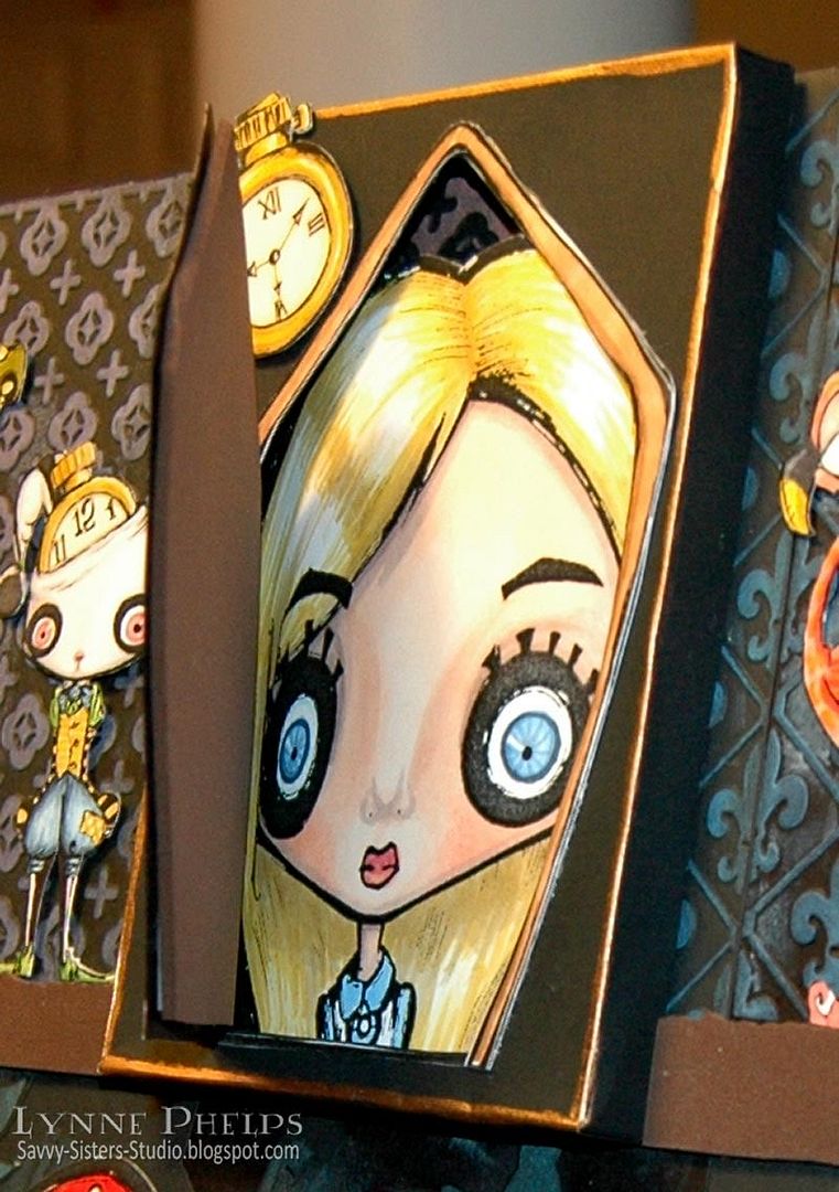
I made a shallow box, a half-inch deep. I set the door into the lid of the box, trimming away the box lid beneath the door opening.  I stretched the door image wider to accomodate the size of the Alice face I was putting inside.

Alice is set into the base of the box, curved over a thick stack of mounting foam tape to give her some dimension. I added a little scrap of leftover embossed black paper in the bottom of the box. Then the lid with the door was glued on to seal it into place.


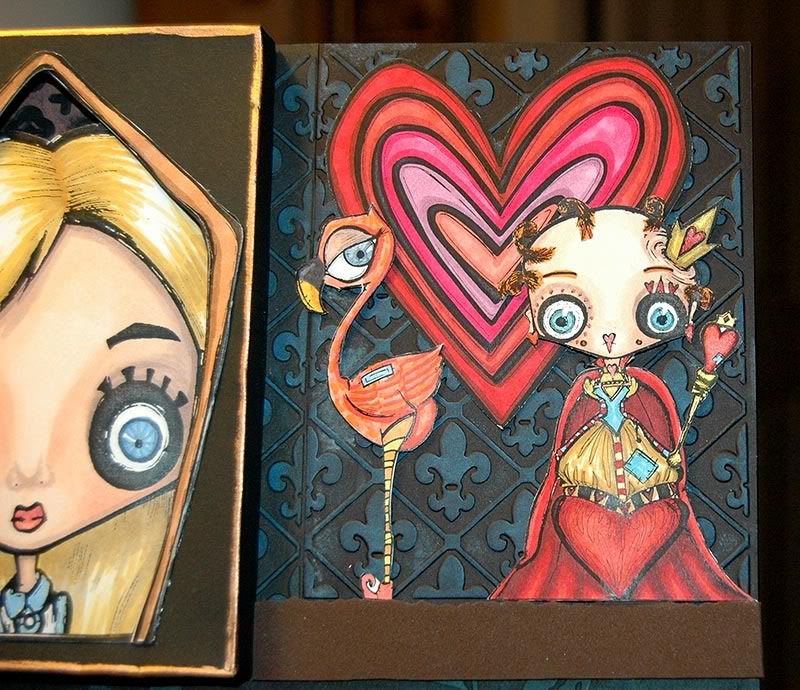
These crazy Octopode images are so much fun to color! The Queen of Hearts with her scepter (with Smooch accents), a flamingo (croquet anyone?) and the Rainbow Heart (blog freebie) are set against fleur-de-lis brushed with blue.
 
 
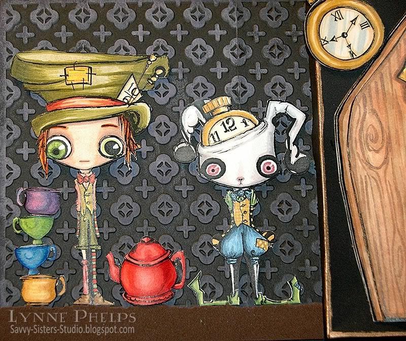
I love the Mad Hatter and White Rabbit! I love drawings that have the pin-dot eyes because it lets me color in the irises and highlights to make wonderful eyeballs, LOL! Look carefully at they way I colored all the eyes, it gives a whole different feeling to their little faces! :-)
 
 
The Caterpillar image along with his stash is why I HAD to get the Alice Elements set (which also includes flamingo, teapot and cups, pocket watch, mushrooms, flower face, etc.)  I had great fun coloring his eyes, which are red and glazed from all that smoke, tee hee! Because they are digital images, I was able to flip and scale the two mushroom images to make many, including stretching one wide enough for the Caterpillar and his stash to sit on one!
 
 
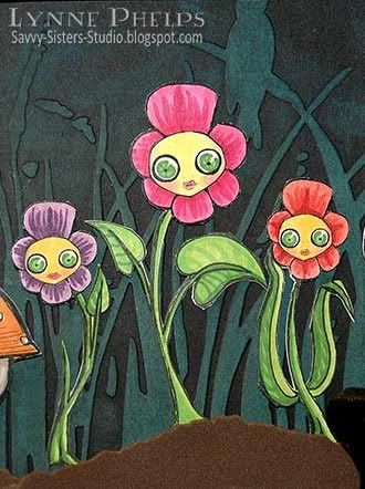
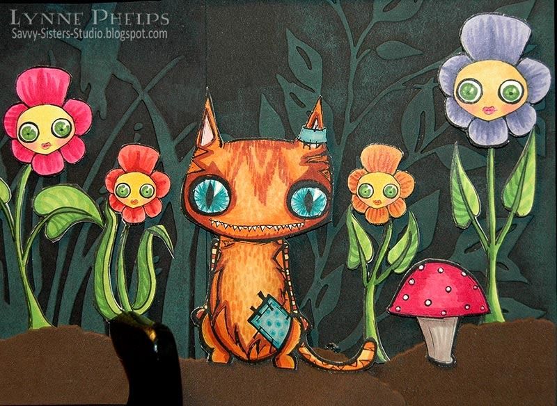
I had fun coloring in the flower faces with their leaf green eyes, and doodling in some leaves to give them a sassy attitude!
 
 
LOVE the Cheshire Cat!  I doodled slitted pupils instead of the round pin-dot pupils to make it look more like my cats with their blue, blue eyes, LOL!  I also had a lot of fun doodling in the fur.
 

Please leave me a comment about my creation for The Altered Alice CHAPTER 2: Hall of Doors challenge! 
 
You have until this Friday, so be sure to link your creations on the Week 1 post!  And be sure to check out the rest of the Design Team creations on Week 2 and Week 3!

Wednesday, May 19, 2010

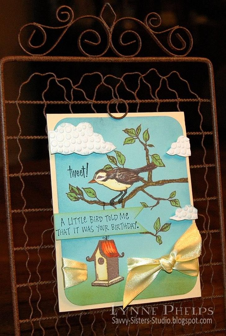
Tweet! Heard it was your Birthday!

Now that my nieces are home for the summer, we are belatedly celebrating their friend Karlie's birthday. She is so bright and cheerful and animated, and the bright eyed bird in Flourish's "Home Tweet Home" set makes me think of her! I also wanted to enter the Flourishes Timeless Tuesday Challenge FTTC67 which is to use chipboard.

Photobucket

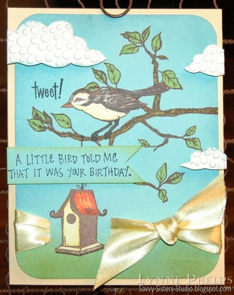
I stamped the branch, bird, and birdhouse with brown ink on the blue cardstock, then I stamped the bird and birdhouse again on white cardstock. I colored in the branch, leaves, and bird's legs with Copic markers. Then I sponged blue around the edges and in the sky area, and green across the bottom.  I colored the bird and birdhouse on the white cardstock and cut them out. Because I had also stamped the images on the blue cardstock, I did not have to worry about trimming around the bird's legs or the spirals at the edge of the birdhouse roof - I trimmed them off when I cut out the images. Much easier!! I adhered them in place on the blue cardstock.  I stamped "tweet!" in black and heat embossed it with clear detail powder.

I save cereal boxes and other packaging, do you?  I especially love it when you find items packaged in white chipboard, and that is what I used for my clouds. Clouds are a very hot trend right now! I drew some clouds on the printed side of the chipboard, then ran it through my Cuttlebug in an embossing folder. Then I cut out the clouds and sponged a little blue around the edges.  I also stamped the "little bird" sentiment on a piece of blue cardstock and trimmed it out, sponging the edges with green.

Photobucket

Now to assemble everything! I cut a slot for ribbon on either side of the birdhouse and ran yellow satin ribbbon around the panel and through the slots, tying it in a square knot.  I rounded the corners, then adhered it to my pale yellow cardbase. I added the sentiment on regular dimensionals, and the clouds on ⅛ inch thick dimensionals to really lift them up! I aligned them all with the edge of the card base, not with the blue panel. I like having elements that break through the boundaries, must be the rebel in me!!

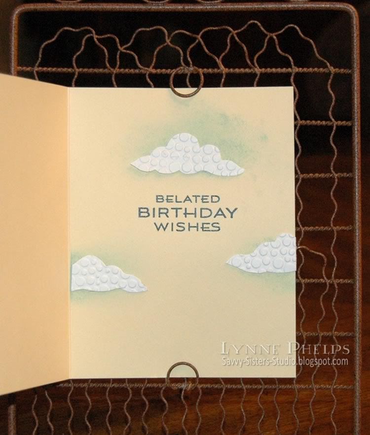
Can't forget the inside!

Photobucket

I stamped the sentiment and heat embossed it with clear detail powder. I cut out a few more clouds, again having some floating off the edge of the paper, and sponged some blue where I planned to put them. I adhered these flat against the cardstock.

I hope Karlie will enjoy receiving this birthday card at dinner tomorrow night. We are having a big meal and cake at my sister's house, gotta love a big family meal!  Happy belated birthday Karlie!


I purchased this stamp set at the Flourishes booth at a scrapbooking & stamping show in Perry, Georgia! I can't tell you how exciting it was to be able to do some stamp shopping in my own town, which is tiny!!  I got to meet two of my blog heroes, Silke Ledlow of My Life, and Dee Jackson of Stampin' Cuz I Luv 2 and made them pose for a picture with me - my sister Janet is behind the camera!  I was so excited as I have subscribed to their blogs for years, and there they were doing Copic coloring make-it-take-its at the show. Of course I recognized Silke immediately because of the picture on her blog, and the minute Dee told me her name, I said "Stampin' Cuz I Luv 2" and then we all squealed and jumped and hugged! It was just like being ten years old again!

Stamps: Flourishes -  bird, branch, birdhouse, tweet from "Home Tweet Home" set; Inkadinkado - little bird sentiment; Waltzingmouse - belated birthday sentiment from "Fancy Phrases" set
Paper: Stampin' Up cardstock - Cool Carribean, pale yellow; Georgia Pacific - white cardstock
Ink: Memento - Rich Cocoa; Ranger Distress - Black Soot; Marvy Matchable - Salvia Blue, Yellow-Green; Copic Markers
Embellishments: Hobby Lobby: Double-faced satin ribbon; Recycled chipboard packaging
Tools: Embossing Folder - Cuttlebug Tiny Bubbles; Corner Chomper (½ inch side); Tack sponges

Sunday, May 9, 2010

Mother's Day Tulips: Step by Step Brayered Emboss-Resist Technique

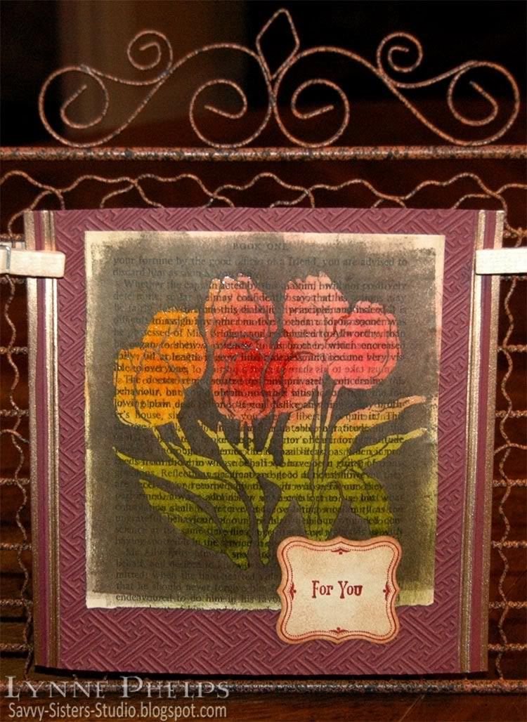
I kept trying to explain to people how I made the card in the last post. They say a picture is worth a thousand words, so I made another card using the same technique and took some photos along the way. These beautiful tulips are for my sister Janet on Mothers' Day; tulips are her favorite flower and she is the mother of my favorite kids!

Photobucket

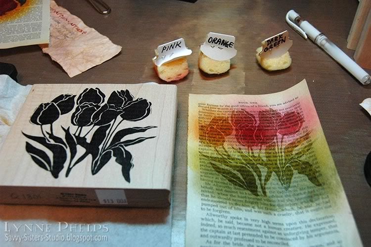
I started with a page from an old book; I picked up a bunch of them at the library's old book sale. I like to set the stamp I am going to use right next to the page while I sponge on colors. This way I have an idea about where I want to place each color. Be sure the colors you select for sponging are medium tone or lighter - you will need a lot of contrast with the dark color used to cover the background. Remember that the colors will get a lot darker when they are clear embossed!  I like Distress Inks best for sponging - they stay wet a little longer so you don't need as much ink.

Photobucket

Dry your sponging with a heat tool, then stamp with Versamark and heat emboss with clear detail powder.  If you don't dry the sponging completely before this step, the powder will cling to the page in all the wrong places, which would be a disaster during the next step.  You need stamps with large areas of solid color - silhouette stamps are perfect for this technique. Note: If you were working on plain, unpatterned paper instead of a book page, you could probably get good results with a more detailed stamp, but it would still need bold thick lines.

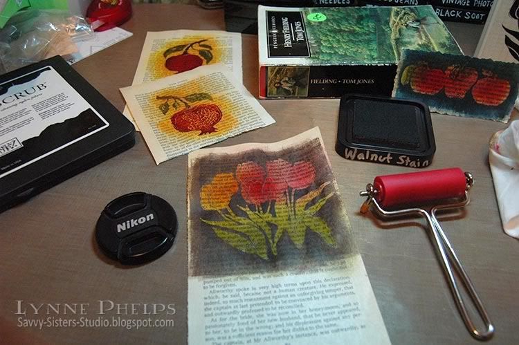
Next, brayer a dark colored ink over everything - dark enough to cover up all the colors from the previous step. You could sponge it, but the book page may start to tear from the amount of rubbing it would take to put this much ink on with a sponge. If you don't have a brayer, a better alternative would be to swipe your inkpad across the page in a direct to paper technique. 

Photobucket

I have a tiny brayer from Ranger that is perfect for this technique, as I like to leave some of the book page un-inked around the edges. I think the irregularly inked edged give it more of a vintage look. The small size brayer is MUCH less expensive than the larger sizes, and you can get a pack of three or four additional rollers for when you are brayering with different colors, so you can switch without having to clean up. The small size roller also takes less ink to cover and is easier to clean up than the larger brayers.

Take a slightly damp paper towel and wipe the ink off the embossed image and watch how it glows out of the dark background! Try to be careful and use your fingertip so as not to get the damp paper towel on the book page. You may want to use your heat tool again to dry the background if you are as impatient as I am!

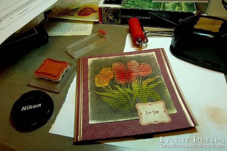
Because I am using paperback book paper, it is very thin and the embossed area is somewhat translucent. To make sure the image stays vivid, I carefully glue the book page to a sheet of white cardstock. This keeps the embossed image bright even when you place it on a dark card.  The paper may also be a bit rippled after being soaked with all that ink, and you can carfully smooth out the ripples without wrinkling if you go slowly as you glue the paper.

Photobucket

Then you make your card! I used an embossing folder from the Cuttlebug Asian set and some scoring and pale gold leafing pen.  I stamped a label frame and sentiment and punched it out, sponging it to give it an aged paper look. On the inside, I inked the edges with gold and scored a square frame border near the edges. No sentiment stamped inside - I left it open to have room to write a little note to my sister. One more closeup look at the finished card:

Photobucket

Did this help you to understand the technique better?  I hope it helped to see it before the dark ink covered it all up.  Let me know if you try this technique, it is a lot of fun!

Ink on my Fingers Sunday Stamper Challenge


I am submitting this card for Hels Sheriden's Ink on My Fingers Sunday Stamper Challenge. The challenge for week 102 is "We are Golden" and I put the gold edges on my card both inside and out with Hels in mind! Not to mention there is some fabby classic Hels candy up for grabs - I love her style!

Stamps: Tulips: A Stamp in the Hand; Sentiment and frame: Stampin' Up! "Vintage Labels"
Paper: Book page; Stampin' Up! - Bravo Burgundy cardstock; Georgia Pacific - white cardstock
Ink: Versamark; Ranger Distress Ink - Peeled Paint, Mustard Seed, Spiced Marmalade, Fired Brick, Worn Lipstick, Antique Linen, Tea Dye, Mahogany; Krylon - Pale Gold Leafing Pen
Tools: Punch: Stampin' Up! - Curly Label punch; Embossing Folder: Cuttlebug - Asian; Score-Pal; Tack Sponges; Ranger Inkssentials Small Inky Roller (Brayer)
Related Posts with Thumbnails