Tuesday, December 29, 2009

Nativity Starburst - one last Christmas card to share!

We are still in the twelve days of Christmas, so I thought I would share one last card that didn't make it onto the blog before the big day.
blog,Christmas,nativity
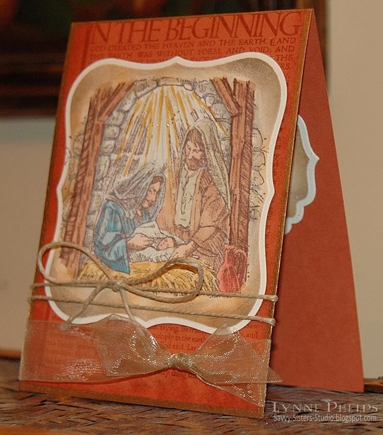
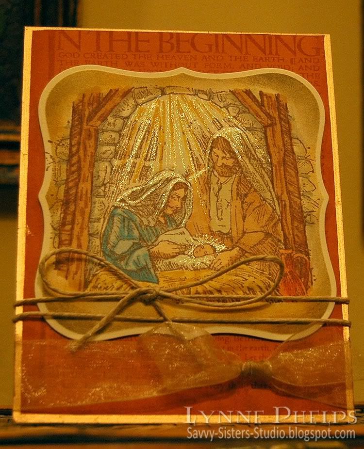
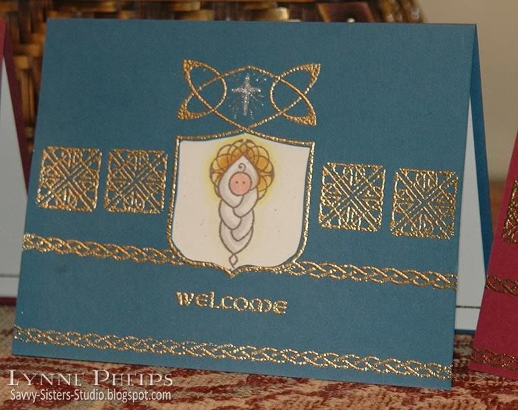
I stamped the Indadinkado nativity scene on color laser paper (Memento ink, Rich Cocoa). I colored it in with markers (Sketch, Copic). The color laser paper really allows you to blend the colors without having to use so much ink to saturate the paper, and I was very pleased with the results. It is also much less expensive than the cardstock varieties that work well with Copics! I mounted it on Really Rust cardstock (SU) after punching a border (Arched Lattice, Martha Stewart) and gilded the border with a gold leafing pen (Gold, Krylon). The background is Mellow Moss cardstock (SU) that has been embossed with the Fleur de Lis folder (Cuttlebug) and edged with the leafing pen. A gold organza ribbon was tied into a multi-loop bow (Bow-Easy). I cut a slit just wider than the ribbon in the fold of the card, so the ribbon passes all the way around the card front, with ends taped under the Nativity panel.
blog,Christmas,nativity
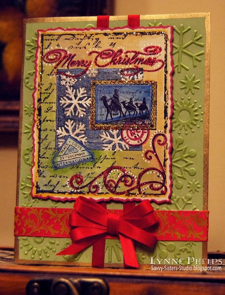
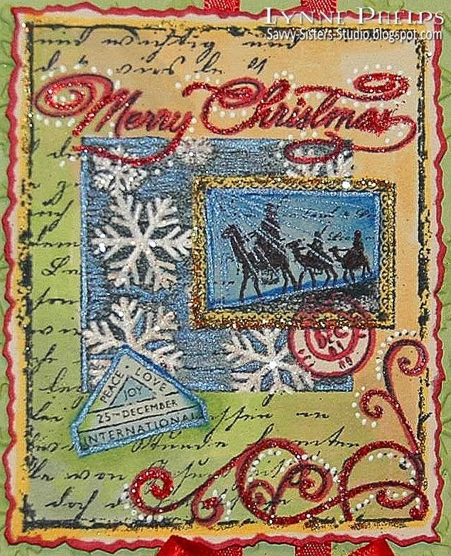
The color is more accurate in the first picture, but this one shows the shiny stuff better! I am still loving the sparkle, and I used a blue gel pen (Sakura, Metallic Blue/Black)in the sky around the starburst. The star itself was accented with a glitter pen (Sakura, Stardust Clear), as was the halos on Mary, Joseph and the Baby.

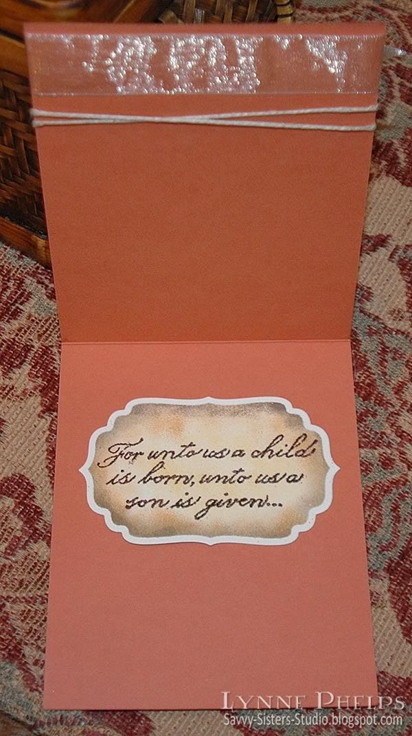
I hope you are enjoying a wonderful twelve days of Christmas yourself! I hate it when people think it is all over after Dec. 25th, as the twelve days of Christmas are not the days leading up to Christmas, but the time from the Nativity to the arrival of the wisemen on Epiphany.

Your comments mean a great deal, and thanks for looking!

Saturday, December 19, 2009

Wisemen - Same Song, Second Verse!

If you recall, EVERYTHING (including the cats!!) was sparkling after my first glittered card, so I thought I'd better stay away from the hard stuff until I got a better handle on glitter control! Here is the same Wisemen collage stamp from Hero Arts, done with Prismacolor pencils and accented with metallic paint pen.
Wisemen collage card
I stamped the card base (SU Celery, I think) with the "Print Pattern" diamond background stamp (Stampin' Up!) with Marvy Ochre dye ink. Then I edged it with a gold leafing pen (Krylon). The collage was stamped with black Marvy dye ink on white cardstock and colored with Prismacolors and blended with odorless mineral spirits. The words and flourishes were accented with a fine point metallic gold gel pen. After trimming, the gold edge was added with a gold leafing pen (Krylon)and it was mounted on the base with dimensionals.

The ribbon was tied in a double looped bow on the Bow-Easy. Thank goodness for whoever invented this gadget, I love it!
Wisemen collage card
The music was embossed on a scrap of paper, torn, and sponged with Ochre and Pond Green Marvy dye inks. I embossed the music by first inking the stamp with VersaMark and then inking it with a red Marvy dye ink pad, then embossed with clear detail embossing powder. I use this technique all the time - it allows me to emboss with any ink, any color. I rarely use any other color of embossing powder since discovering this technique on Michelle Zindorf's blog. When I mounted it on the card, I folded it over the edge so it also appears on the inside card front. The ribbon wraps all the way around, so that appears on the inside of the card as well.

I hope you enjoyed this different card using the same stamp! I enjoy your comments very much and would love to hear what you think!

Monday, December 14, 2009

Hero Arts Wise Men Collage - with Sparkle!!

Well, I am sure it happens sooner or later to every stamper. That brightly shining moment from which there is no turning back. That's right; I just discovered GLITTER. I started off small, adding a tiny little star to my Celtic Christmas cards with a Stardust clear glitter pen. Then my Nativity card had LOTS of Stardust glitter pen to show the rays of starlight falling on the scene. But now. . . I've moved on to the hard stuff, the real deal. . . loose glitter and glue.


The base is green SU cardstock - I am afraid I don't know the name of the color. Celery maybe? I hate it that they don't put the labels on the cardstock packages anymore. I embossed it with the original Cuttlebug snowflake embossing folder. I wanted to bring out the raised areas - normally I'd hit it with a VersaMark Dazzle pad, but I was afraid any stray glitter would stick to it like crazy! I also wanted a little more yellow color in the green, so I hit the raised areas with Y000 which warmed up the green just enough! A flourished red ribbon and a narrow satin ribbon with a triple loop bow (thank you Bow-Easy!) and Krylon gold leafing pen around the edge finished it off.


I love collage stamping - I do a lot with the emboss-resist technique. When I saw this series of collage stamps by Hero Arts, I couldn't resist - look at all the assemblage work they had done for me! I colored it with Copics and added white dots to accent the flourishes, then used a Tombow glue pen and added Stampendous red glitter and Art Institute gold glitter. I have to say, there are big differences in glitter - that Art Institute stuff is amazing! I also used a dark blue Sakura Stardust pen in the wise men postoid and in the snowflake backgound. I trimmed it out with a deckle scissors, ran a red Copic marker around the cut edges and mounted it on pop dots.


Here is the back of the card. I got this neat personalized unmounted stamp on eBay! This seller is in Malaysia, the prices are wonderful and I was pleased with the transaction. They are by Loongchai74 and you can see all the options here. He sent me proofs of the artwork before he made the stamps, and did not charge extra for custom artwork. I also got a wonderful circular address stamp for my envelope flaps. Just wanted to share in case any of y'all are looking for this kind of thing - it makes me really happy every time I see my new stamp, only now I want to order another that includes my blog address!

So, I need to know. What kind of glitter do you like best? Are there better glue pens than the Tombow? I had a hard time keeping a smooth flow of glue - I kept having to tap it and scribble to get it flowing again. I'd like to find a glue pen that flowed really smoothly. Please leave a comment and let me know!

I also have glitter EVERYWHERE. The cats are sparkling, and how it got in MY hair I do not know! Hmmmm. I think I feel some STICKLES coming on! :-) Leave a comment if you have any glitter management tips for me, LOL!

Sunday, December 13, 2009

In the Beginning, a Child is Born...

As you may guess by the lack of snowmen and Santas around here, my very favorite kind of Christmas cards center around nativity scenes. The reason for the season, right? This card uses the "A Child is Born" set (Stampin' Up!, retired) which contains one of my favorite nativy scenes. Mary and Joseph look so happy and relieved and fascinated by the new baby, just like any new parents. I imagine Mary has just finished marveling at the tiny fingers and toes!

The base is Really Rust cardstock (SU). I stamped "In The Beginning" (Stamp Out Cute) with Brown (Marvy dye ink). This is an awesome stamp with the actual text from the beginning of Genesis. I sponged around the edges with the same ink, then I ran a Pale Gold leafing pen (Krylon) around the edges.
The image was stamped on Natural Ivory cardstock (SU) with Rich Cocoa ink (Memento)and cut and embossed in a Label One die (Spellbinders) and then colored with Copics. After coloring, I put the image back into the die to use it as a mask and sponged around the edges with Timeless Sepia and Ochre (Marvy dye ink). It was mounted on the base with pop dots, then hemp twine was wrapped and tied in a bow and old gold organza ribbon was tied in a square knot.

I shot this one without the flash to bring out the sparkle! I used a clear glitter pen (Sakura Stardust) to emphasize the rays of starlight pouring down, and also added the shimmer wherever the light touched their robes, and around the baby's face.

Inside, I stamped the sentiment that came with the set and cut it out with a Label Four die (Spellbinders). I sponged it with Ochre and Timeless Sepia (Marvy) before removing it from the die.
I think the contrast of rustic elements (color, twine, the sketchy style of the image) elegant lines (Label die cuts), and the shimmer (organza ribbon and glitter) are what make it work, in real life anyway. I wish the photgraph did it justice!

I love hearing from you - your comments are what makes blogging worthwhile!

Friday, December 11, 2009

And they wrapped the Babe in swaddling clothes...

When I first saw Waltzingmouse Stamps' "Celtic Heritage" set, I knew the baby wrapped in a cable or "plaited" blanket would be on this year's Christmas card. It made me think of Baby Jesus right away! Other stamps are from Waltzingmouse "Irish Blessings" set and the inside sentiment is by Sweetgrass Stamps. (Note - Edited to add Labels, a forgotten photo and a stamp credit)

Cardstock is SU Chocolate Chip, Bravo Burgundy, Handsome Hunter and Not Quite Navy. Light cardstock is SU Natural Confetti - it has great little flecks in it that add a lot of interest.

Here is a closeup of the inside, with a passage from Isaiah (Sweetgrass) stamped in Rich Cocoa Memento ink and a beautiful knotwork border (Celtic Heritage) stamped with VersaMark and heat embossed in Ranger Gold embossing powder. The sentiment is the only "Christmas" stamp used in the whole card!! (Am I the only person who hears Handel's Messiah singing in my head whenever I read this passage? Just wondering!!)


First the shield (Celtic Heritage) was stamped, embossed and masked, and then the braided borders (Irish Blessings) were added plus the Welcome (Irish Blessings). The knotwork squares(Irish Blessings) were added last using a Stamp-a-ma-jig for placement. The opening was cut out with an Xacto knife. The baby (Celtic Heritage) was stamped in Rich Cocoa Memento, then I masked the baby and the stamped the small open Lunette (Irish Blessings) twice to form a full circle for the halo. There are larger solid and open versions of the Lunette in Celtic Heritage, but this is the tiny one from Irish Blessings. The baby is colored with Copics, then adhered to the inside of the cardfront to show through the window opening. I drew in a little star in the upper shield opening using a Sakura Stardust clear pen.


Because the Copics that I colored the baby with saturated the backside of the paper, which showed inside the top of the card, I used a Nestibilities Label Four to cover it up on the inside. It is gold embossed with Nestie-friendly Waltzingmouse stamp (Vintage Labels Four) and then stamped with "One hundred thousand welcomes" in Gaelic and English (Irish Blessings) and "Little One" (Celtic Heritage). I thought this was a really elegant cover up and it continued the idea from the front of welcoming the baby Jesus!

More closeups of the card fronts:


It was so much fun to create these cards without using ANY stamps that would be normally thought of as being for Christmas, with the exception of the inside sentiment of course! I thought Welcome was an appropriate message for Jesus' arrival on Earth; it is certainly expressive of the spirit in my heart at this, or anytime of year! Please leave a comment to let me know what you think of my little swaddled Baby Jesus!

Sunday, December 6, 2009

Cuttlebugged Gift Card Holders

This is the time of year for gift card holders, and I got the idea for these from Sharon Johnson's No Time to Stamp blog in this post. I did not have any velcro tape on hand, so instead I used brads or slits to hold the flap closed.

These gift card holders are each made of a strip of 8½ inch paper (SU Mellow Moss or Old Olive) folded twice to create a pocket and a flap. It was super quick to do on my Scor-Pal! The bottom flap is folded up and secured on both sides with tape runner or brads and a brad or slit holds the top flap closed. A border punched strip (Fiskars) is adhered to the edge of the top flap. All edges are sponged.

I cuttlebugged each one twice as they were too long to fit in the folder. Except for the holly holder, each pocket flap is embossed with a different folder than the top flap. The score lines showed me where to place the paper in the folder, so the patterns start and stop in the right place.

Except for the holly version, they all have a cardstock panel with decorative cardstock adhered to the top flap (SU Real Red & Basic Grey - Figgy Pudding) which is held shut with a decorative snowflake brad or a curved slit. The back is also covered with Red/DP panels.

All have "To You from me" (Stampin'Up!) stamped, punched, and edges sponged, popped up on dimensionals on top of a larger punched circle and/or punched scalloped circle.
I enhanced the cuttlebug embossing on most of them by shading the raised areas with a white Prismacolor pencil.
The holly holder is a little different. The Cuttlebug holly folder is so beautiful that I did not need any decorative paper to enhance it. I Cuttlebugged the back and top flap in the first pass, and the pocket flap in the second pass. I lightly shaded the raised areas with green, red, and brown Prismacolor pencils. Then I stamped and gold heat embossed flourishes (Indadinkado Flourises set) in the open areas, then outlined the gold flourishes with a black pen. The scalloped circle was gilded with a gold Krylon leafing pen.

I wish I had noticed that the red edge I put behind the scallop had slipped up on one side - I should have retaped it before taking the photo. This provided a straight edge to fasten under the two brads.

Please leave a comment - I would love to hear what you think!

Thursday, November 26, 2009

I am thankful for you

As I reflect on my blessings this year at Thanksgiving, you come to mind. Yes, YOU! The online stamping community brings so much pleasure and inspiration into my life.

I live in a small town, and other than my BFF stamping buddy, a.k.a. my little sister Janet, I rarely have the opportunity to share my joy in this craft with other people face-to-face.

I am so inspired by and fulfilled by this online community that I have started this new blog to be able to participate more fully. I am so grateful for those of you who take the time to view and comment on my creations;

Happy Thanksgiving! I am thankful for YOU!

Tuesday, November 24, 2009

Waltzingmouse Earth Angel - Fall Colors

I am having such fun with my new Waltzingmouse Earth Angel stamp set! Instead of the spring colors of the last set of cards (see previous post), this set uses the warm colors of Autumn. I love all the different wings that come with the set. Last time for my spring cards I used the leafy wings. This time I used the Wheat wings to stay with the harvest color scheme.


Note - sorry for the yellow color cast in this photo - I took it without flash so you could see the embossing. Card photos below show real color!

I heat embossed a music stamp on SU Really Rust cardstock and used that to paper piece the angel's dress; the rest of the angel is colored with Copics. The angels are set on a rectangle of SU More Mustard, stamped with a harlequin diamond stamp from Stamper's Anonymous. All have bows tied with the Bow-Easy. The background is SU Mellow Moss embossed with various Cuttlebug folders and edged with a Krylon leafing pen in Pale Gold. I also used my Versamark Champagne Dazzle pad to add definition to the embossed backgrounds and raised areas on the sentiment strips - I really like the subtle shimmer on the raised areas!


This one uses the Cuttlebug "Allegro" backround.


This one uses the Cuttlebug "Textile" backround.


This one uses the Cuttlebug "Birds and Swirls" backround.


This one uses the Cuttlebug "Rough Diamonds" backround.


This set comes with a huge variety of sentiments. These are made up of separate stamps. "Thank you for being a" + "Friend." The other sentiment is all separate words in the set: "You're" + "an" + "Angel". You can see all the different stamps in the Earth Angel set here.

Monday, November 23, 2009

Waltzingmouse Stamps Earth Angels

Claire Brennan, author of Waltzingmouse Makes blog and designer of Waltzingmouse Stamps is one of my favorite artists! I have been longing to get some of her stamps but the word for my current income is "paycut" (stinkin' economy). You can imagine how THRILLED I was when a friend (you know who you are!) sent me this Earth Angel stamp set. Needless to say, I had to get it inky right away!


I immediately thought of paper piecing my little angel. She looks great with any small-scale pattern! There were four sentiments I wanted to use right away, but this set is jam-packed with versatile sentiments, including Flowergirl and Bridesmaid thank you's!! It comes with four different kind of wings in both large and small wing sizes, and you can also use the wings to create butterflies with the supplied butterfly body stamp! I went with the Leaf wings for this set of cards.


I used the little sprinkling seeds stamp to go with my "Sow" sentiment. The stamp set also comes with a seed pocket for her dress, but that didn't really work with my paper piecing. Background is embossed with the Cuttlebug Birds & Swirls folder and raised lines were scored with a Scor-Pal. I am not sure of my Stampin' Up! colors, but I think the cardstock is Celery or Mellow Moss and the tan paper is natural confetti.


This one uses an Inkadinkadoo floral flourish stamped in Versamark and clear embossed. A strip of the patterned paper was adhered along the bottom and a hemp twine was tied in a bow. I love the rustic touch added by the hemp with this sweet little angel!


This card uses the same floral flourish and some organza ribbon. I used the little seed stamp again to go with my "seed sowing" sentiment.


I hope you will be encouraged to go check out all of Claire's stamps! Next on my list are her fabulous Nestie-friendly stamp sets, designed to go with the label series of Spellbinders dies.

Thanks again to my buddy for being an "Earth Angel" and giving me this stamp set!

Sunday, November 22, 2009

"Cards by Kerri" offers wonderful Blog Candy!

Kerri is celebrating her one year "Blogiversary" and is offering this wonderful conglomeration of blog candy, valued at $99.75. You have to post this picture on your blog, become a follower, and enter the info in your comment on her blog prior to her birthday on December 20th. Read all about it!

Saturday, November 21, 2009

Sleep is a Symptom of Caffeine Deprivation...

Isn't that a great sentiment? I love coffee and collect coffee related stamps of any kind, and tend to be somewhat of an insomniac...hmmm. I wonder if those two are related? I am also hooked on the emboss-resist technique of collage stamping, which I first learned from Michelle Zindorf's blog!

  • I stamped the coffee cups (Stampington) first with black ink and colored them in with Prismacolor pencils. Then I colored them in completely with a Versamarker, being very careful to stay within the lines, and clear embossed the cups.
  • Next, I stamped the steam (Stampin' Up! Like it a Latte) and embossed with white powder. I offset slightly and stamped it again in pale gray, using a stamp positioner to get it in the right place.
  • Next I stamped "Sleeping Kizette" (Cherry Pie Art Stamps) and colored in with Prismacolors.
  • I masked her shoulder and stamped "Product of Columbia" (source unknown) and colored in a waxing crescent moon in the center.
  • Next the sentiment that inspired the whole card - "Sleep is a symptom of caffeine deprivation" (Impression Obsession, discontinued I think).
  • Then I sponged brown ink on anything that still showed white cardstock and edged with a Krylon Leafing Pen in Copper. I love it that the Krylon Leafing Pens come in so many metallic shades!

Cherry Pie Art Stamps is the creation of Marina, a lovely Italian lady who now lives in the States. She started her rubber stamp company while she was still living in Genova, Italy, which is about 50 miles north of where I lived for several years in La Spezia (actually in the village of Tellaro, near Lerici). I had the pleasure of visiting her at her home, and seeing how she designed the stamps and pressed the rubber. She also showed me how she does her wonderful water colors. Please visit her site and check her gallery and the user galleries - totally inspiring! She also has a very active Yahoo group, which are always doing trades and swaps!

Many of her stamps are Marina's interpretaton of fine art - she has a wonderful line of Klimt stamps, and I suspect that "Sleeping Kizette" on my card today was inspired by a Tamara de Lempicka, a famous painter in the art deco period. She also has tons of Halloween related images and scenic stamps. One of Marina's trademarks is the fantastically fine shading she achieves on her stamps. The way she processes her images to get the fine shading is a trade secret - you will be amazed at the subtle shading she achieves in rubber!

Well, that wore me out. I think I need a cup of coffee!!

Thursday, November 12, 2009

With Deepest Sympathy

A few years ago (seems like yesterday sometimes), I lost my mother to pancreatic cancer. I had taken family medical leave and my dad and I were her primary caregivers for several months. It was an amazing and harrowing and horrific and blessed time. Afterwards, the hole that had been ripped in our lives was SO HUGE, and it really changed my perspective on sympathy cards. So many of them featured flowers and butterflies and what meaning did that have for me in my grief? It was as though people outside my family were on some whole other planet.

This Judikins Angel Faces cube is my go-to stamp for sympathy cards. The angels remind me of the beautiful art you see in old cemetaries, like in New Orleans, Savannah, London. I love how they look sorrowful, as though they are sharing in your grief.

card
Each side of the cube was stamped with Tuxedo Black Memento ink on white cardstock, then colored in with Copics in the Warm Gray family (W0, W1, W3). I love how the warm gray makes the beautiful angels look like stone.

This card has a lot of dimension which you can't really see - all the panels are punched up on dimensionals. The black panel was punched with Martha Stewart's Arched Lattice border punch. The background has been stamped with a retired SU background stamp called "Antique" in Adirondack Lake Mist and and sponged with the same to mute it down. Edges were sponged with black. A wide black organza ribbon goes around the entire front face of the card with the ends hidden on the front under the panel. A bow was tied around the ribbon at the bottom. "With deepest sympathy" was stamped at the bottom in Alabaster Fluid Chalk ink.


Inside is a Wordsworth stamp that says "Christ has made of death a narrow, starlit strip between the companionship of yesterday and the reunions of tomorrow" on the right, and the stripe of the black ribbon on the left.


I still miss my Mom. Life goes on, but I look forward to the reunions of tomorrow - hopefully a long way away!! A fellow knitter told me that when you lose someone, it leaves a hole in your life. Like the hole in a sock, time gradually begins to darn the hole, passing more and more strands of yarn across the opening. Eventually, there are enough strands that the sock can once again serve its function, but it will always have a darn. It will be a useful sock again, but it will never be the same sock as it was before the hole was ripped. I find that very comforting!


Whew! I hope this post has not been too gloomy! This is actually one of my favorite cards!

Wednesday, November 4, 2009

Lynn Stevens - 1 year Blogaversary of "Trash to Treasure Art"

Lynn Stevens, a mixed media artist I greatly admire, is having her one-year blogaversary and of course there are presents!

Her work has been featured recently in Somerset Studio. You can read about her excitement on being published here. Her work was also on the cover of a recent Stampers' Sampler, pictured below.
Her work ranges from shabby-chic mixed media paper art to hand-crafted jewelry. The blog candy goodies are pretty special and certainly one-of-kind! Be sure to check out her blog, Trash to Treasure Arts.

Happy one-year anniversary, Lynn!

Tuesday, October 27, 2009

Blog Hops

There She Goes has a new product - Card Bins! Check out the TSG blog hop, you can win a free box. If you don't win, they are only $2. I am sure that I need some!

Also, the Paper Crafts Connection featured Lisa Johnson, one of my favorite Paper Trey Ink designers. They are offering blog candy too on this post!

And the new Believe set by Verve is a fund-raiser, and it is beautiful. $10 from EVERY SALE goes to breast cancer cure research. Check out all the beautiful samples on their Believe Blog Hop.


Saturday, April 11, 2009

One Krafy Kat has Blog Candy!

Jenny over at One Krafty Kat is offering blog candy - a $25 gift certificate to Repeat Impressions!  Don't you love blog candy that you get to pick yourself?  Go check it out - she also has a great shoe card to share, and you can never have enough shoes!

Wednesday, March 18, 2009

BittyDot Sketch Challenge

This card was created for the fun "connect the dots" sketch that Papertrey Ink used to celebrate the release of their BittyDot paper. That second anniversary celebration really set a new level of superiority for blog events!  While I have a huge wish list of PTI stamps and other products, I do not actually own any. . . YET!  So instead I turned to dot-related stamps from my own collection to honor the dots theme. 


I started with SU "Dotted" background stamp using dark olive dye ink on an Old Olive background.  The white flowers were punched, then I cut between the petals towards the center and curled the petals up to give them some dimension and attached with mini black brads.  The center panel uses stamps from the SU "Be Happy" set.  The border punched panels have a punched dot in each scallop, and the dotted ribbon finished off the theme!

Polka dots of any size are fun, and I enjoyed mixing up all the different scales on this card!  What are some of your favorite polka dot creations?

Card Details:
Stamps: Stampin' Up! - Dotted, Be Happy
Ink: Marvy dye ink - Pond Green
Paper: Stampin' Up! Old Olive, black, white
Embellishments: brads, ribbon
Tools: Fiskars Threading Water border punch

Monday, March 16, 2009

Chalk Ink Resist Technique and DIY Flower Embellishments!


I made the flower embellishments on this card - they are kind of different and they look really neat IRL as they have a lot of dimension. They are punched out of white fun foam, then colored with Copic markers and attached with brads!  Easy! 

This card is made with a chalk ink resist technique that is quick and fun and always produces "Wow" effects! Chalk Ink has very special behaviors on glossy paper. 


You will need chalk inkpads in light to dark colors, glossy coated paper like Kromekote, lots of tissues, and stamps with solid areas.  Your inkpads must be juicy for the best results - reink your pads if necessary. Remember to really shake up the chalk reinkers before using on your pads.

Begin by stamping your lightest color - I used gold.  Then polish off the glossy paper with a tissue.  It is like magic - the matte chalk disappears and the vivid ink color appears to be part of the glossy paper!  Stamp your next color, buff with tissue, and so on.  

Overlap the stamping so you can see how the colors intersect.  It was so hard to place the olive cardstock band as I didn't want to cover anything up!  You can see how the colors interact in the center, where the olive green overlaps the gold, and the gold shows through where it resists the subsequent color.  You can also see where I went out of order - I decided I wanted a little more gold in the upper left corner, and it doesn't interact at all when stamped over the darker red and blue.  Remember - light to dark!

After everything was assembled, I didn't like the straight edge, so I cut it with a decorative edge scissors.  Remember those?  ;-)  Then I sponged olive around the edges to highlight against the More Mustard cardstock.

Have you tried this technique?  I'd love to see your results - leave a link on your comment!

Details:
Stamps: PostModern Design cube
Ink: Colorbox Fluid Chalk ink pads, Copic markers
Paper: Kromekote glossy cardstock, Stampin' Up! More Mustard, Old Olive cardstock
Accessories & Tools: ribbon, brads, decorative scissors, MS arches border punch

Sunday, March 15, 2009

Message in a Bottle

Who wouldn't like to find a message in a bottle?  This image of a bottle washed up on a beach made me think of messages to and from far-away friends!


This was a fun card to make. I stamped the Peddlar's Pack Message in a Bottle image by inking it with a Versamarks and then Black dye inkpad, stamping, and then embossing with clear detail powder.

I colored the image with markers, then I went over all the glass parts of the bottle (not the cork or tie around the neck) with a VersaMarker pen, and embossed it with clear embossing powder. 

Then I stamped the MSE Innie-Outie sentiment above and below the image, colored over the area with a VersaMarker and embossed with clear detail powder. I then sponged bright Marvy dye inkpad colors in the top and bottom areas and outlined with a silver Krylon leafing pen.

I put two photos so you can see how shiny the bottle is - much cooler looking in real life! It really does have a glass-like look.

You could probably get the same effects with Diamond Glaze (Crystal Effects in Stampin' Up speak), but I am too impatient to wait for it to dry.  I also thought the chances of it drying without being "investigated" by one of the cats was slim to none!

Thanks for visiting my new blog, and I hope you'll check in again soon!

Card Details:
Stamps: Peddlar's Pack - Message in a Bottle; My Sentiments Exactly - Innie/Outie sentiment
Ink: Marvy die inkpads; Marvy markers, Silver Krylon leafing pen
Accessories: Clear detail embossing powder

Tuesday, March 3, 2009

First Post, My First Blog Layout!

I am just starting my blog, and trying things out!  I couldn't find a blogger layout template that appealed.  I noticed a lot of the cute layouts have a credit in the corner for thecutestblogontheblock.  What a great site!  I did not use any of their wonderful free backgrounds, but I did rely on their Blog Secrets to customize this blog layout and create my own background!

I started with the Minima layout because it looked the easiest to alter.  Just like my love of altered art, I had to start my blog by altering it.  I added a third column, changed the width,  and it went on from there!  

They recommended the Digi Scrap Depot website for freebies, and were my eyes opened!  I am a graphic/web designer and had never known about digital scrapbooking.  I went a little crazy on my background, but I was having such a good time with digital paper and elements from the Beautiful collection by Bel Vidotti!

I hope it is not too much.  Let me know what you think. Future posts will contain info and pictures on cards and other projects, so please check back.
Related Posts with Thumbnails