Showing posts with label Challenge Entries. Show all posts

Sunday, December 4, 2011

It's time for a Lewis Christmas Carroll over at The Altered Alice!


Merry Christmas and Happy New Year from The Altered AliceThis month the design team brings you their holiday wishes, and we invite you to send your holiday greetings to The Altered Alice. You have until Friday, Dec. 23 to enter. The winner post will either be a little early or late, as the last Sunday of the month falls on Christmas day!

Our prize this month is a $40.00 gift certificate to Custom Crops, the premier online retailer for crafters of all kinds. From Accuquilt to Zva Creative, adhesives to vinyl and everything in between, Custom Crops offers a huge selection of the products you've been looking for at competive prices with fast, friendly customer service. Thanks to design team member Donna for organizing this Christmas prize!

To celebrate the season, we bring you The Lewis Carroll Memorial Window at Daniell Chapel in England. Notice the left panel where Lewis Carroll and Alice kneel to pay homage to the newly born Christ in this wonderful Nativity scene! This month's quote is actually contained within the windows, do you see it?
Click to enlarge
The window was designed by stained glass artist Geoffrey Webb,  a must-see for anyone that loves Wonderland. A wonderful Christmas poem by Lewis Carroll is shown in the center three bottom panels, which include characters from Wonderland - the White Rabbit, Dodo, the Caterpillar, Mad Hatter, and more! Our own Sue Roddis visited this chapel and gave me permission to show her close-up photos here, click to enlarge:


We look forward to seeing your holiday greetings, so send us a Christmas card or tag! If it features Wonderland, you will have two chances at the randomly awarded prize instead of one. Multiple entries are fine, but each must be on a separate post. 

Stop by The Altered Alice to see some AMAZING design team inspiration projects, and we hope you will play along as well!

Sunday, September 4, 2011

The Altered Alice CHAPTER 7 Challenge Begins: Text as Nonsense!


Alice didn't dare to argue the point, but went on: `-- and I thought I'd try and find my way to the top of that hill -- ' `When you say "hill,"' the Queen interrupted, `I could show you hills, in comparison with which you'd call that a valley.' `No, I shouldn't,' said Alice, surprised into contradicting her at last: `a hill can't be a valley, you know. That would be nonsense -- ' The Red Queen shook her head, `You may call it "nonsense" if you like,' she said, ` but I've heard nonsense, compared with which that would be as sensible as a dictionary!' -- Chapter 2, Through The Looking Glass and What Alice Found There

Using text as pattern is a trend right now that I really love. Your challenge is to use text as nonsense - not to read but as pattern on your project! Of course you can still have words or sentiments, but we also need to see text used in a non-reading way. I have a stack of old books and dictionaries that I use for this purpose.


Our sponsor is Stamp Attack, a British company that is well known (among other things) for their fantastic Alice stamp plates which have sold to customers all over the world. In fact, Helena Bonham Carter, the actress who played the Red Queen in the Tim Burton Alice movie, purchased sets of Alice stamps from Stamp Attack, which were then delivered to the studio!  Enabler alert: Stamp Attack offers speedy worldwide shipping for only £1 on unmounted stamp orders, so go on and check out their beautiful stamps!

The winner will receive a Stamp Attack gift certificate for £13.50, which is equivalent to one of the stamp plates that the design team will be using!


You have until Friday, September 23 to enter your creation at The Altered Alice and the winner and honorable mentions will be announced on the last Sunday of the month, September 25.  All kinds of projects are welcome, they do not have to be "altered art" and as always, entries that feature some aspect of Wonderland are given two chances instead of one in the random prize drawing. You may enter multiple times as long as each project is on a separate post.

My Project


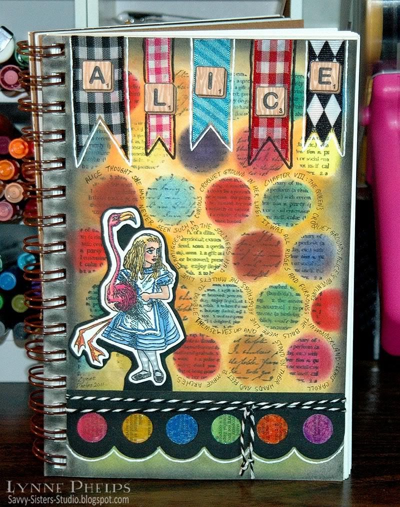
My art journal page was inspired by this Stamp Attack image of Alice on the Queen's croquet ground. The Scrabble tiles spelling Alice are another Stamp Attack stamp, cut apart and displayed on a banner of ribbon snippets, outlined with black or white. They are both from the Stamp Attack Alice 2 plate; it is a full-sized plate and the images are very deeply etched on thick red rubber.  I'm working on another project with this stamp collection so stay tuned!

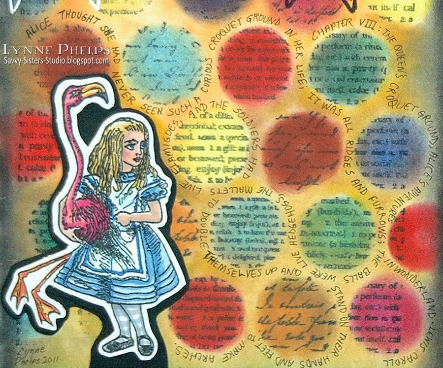
Cling Rubber Stamp: Word PopsI am working in a Strathmore Visual Journal - the mixed media version. Love the heavy book board covers and the paper is great. The background of my page is a Hero Arts cling stamp called Word Pops; I had to have this stamp! The text circles were stamped and then the whole page was colored in using PanPastels (love them!). I applied the color using the Sofft Tool palette knives; this product is a unique cross between a soft pastel and a fluid medium. The black strip on the bottom was punched with a fun EK edger punch with scallops and huge dots, then backed with dictionary paper colored with oil pastels. That takes care of the "text as pattern" required by the challenge; all the circles make me think of colorful painted croquet balls, although I know Alice will be using hedgehogs instead!

It is a journal so I decided to include some writing. I had fun wrapping a quote from the story describing the croquet game around all the text polka dots! I used a Copic 0.2 Multiliner SP to scribble in this fine print. I love how this turned out. If you click the image above you can enlarge it enough to read the story. Please visit me at Savvy Sisters Studio and leave a comment, I love it when you do!

I hope you are inspired to make something and play along with The Altered Alice!

NOTE: If you decide to buy some of the products mentioned above, please consider using the links above to do so. I will get a tiny referral fee and you will get the same great price. It is a small way you can help to support this blog and The Altered Alice. Eventually it might cover my Linky Tools and professional Photobucket subscriptions, LOL!!! Thanks!

Sunday, August 21, 2011

The Altered Alice Chapter 6: Painting the Roses Red!


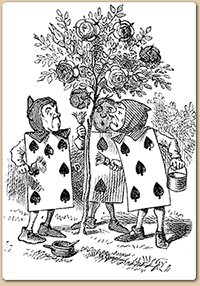
'A large rose-tree stood near the entrance of the garden: the roses growing on it were white, but there were three gardeners at it, busily painting them red. Alice thought this a very curious thing, and she went nearer to watch them, and just as she came up to them she heard one of them say, `Look out now, Five! Don't go splashing paint over me like that!'  -- Chapter 8, Alice's Adventures in Wonderland 
The club cards were painting the white roses red to avoid angering the Queen of Hearts, so your challenge, should you choose to accept it, is to use PAINT on your creation! Of course you can paint it RED like the design team will be doing, but you can also use other colors. You need to tell us what item was painted and what technique you used!

We are sponsored this month by Creative Inspirations [Store | Blog], makers of wonderful shimmering paint which comes in almost 60 colors, including clear iridescent Fairy Dust. They also carry hot fix Jeweled Inspirations and Metallic Inspirations; I am particularly intrigued by the latter as they look like brilliant nail heads. The Altered Alice design team will be using Garnet paint, a bright sparkling red, and I hope the Creative Inspirations design team might decide to play along! The winner of this month's challenge will receive five colors of their choice.

Be sure to enter by 11:59 p.m. EDT (Eastern Daylight Time, UTC -4:00) on Friday, August 26. The winner and honorable mentions will be announced the last Sunday of the month on August 28.


My Art Journal Page


I have wanted to try art journaling for a long time and decided to jump in with supplies I had on hand, namely a 40 cent composition book and some big ideas. Like fellow design team members Erin and Terri, I had to use this fabulous Stampin' Up embossing folder with big bold roses. (My sister is an SU demo and offers a lot of specials, so if you *need* this folder let me know!)


I used a piece of heavy acetate (I actually recycled a Spellbinders package) and embossed it.  Then I followed Barbara's method of painting with the shimmering Creative Inspirations paint from the back side of the acetate. At first it was very streaky, but the paint dries very quickly, especially given that it was a non-porous surface. I gave it about four coats and it has the most unbelievable glistening radiance in real life. The garnet paint is a bright gleaming red but the shimmer is a deep fuschia pinky-violet color! Fabulous! From the front, I just went over all the raised lines with a black Sharpie and trimmed it out. I LOVE this look! Spellbinders Foliage rose leaves complete the focal point.


As this was the cheapest of cheap paper, first I coated the whole page with Ranger gesso. Then I used my airbrush with Copic markers to tint the page green at the bottom and blue at the top. My foam brush still had some white gesso in it, so I dabbed in some clouds.


Next, I used a Plaid rose stencil and pounced gesso through it using a foam brush. When it was dry, I partially painted my white rose red and added some drips of paint. I outlined the drops and segments of the rose with a black sharpie felt tip marker, and added some white gleams on the drops with a Posca pen.  Then I took a 0.3 Copic Multiliner SP to write in the quote from Chapter 8 about painting the roses red. I tucked in some other words here and there. I really like how this turned out! At this point I had the stenciled rose on the left and the acetate roses that would be placed somewhere to the right but it was missing something. I had planned to use two stamps I had of the card characters that were painting the tree, but they were way too small to hold up against all my huge roses.


I purchased this amusing Queen of Hearts from Mo's Digital Pencil. I wanted to print her larger than the normal, so I used a FREE program called SmillaEnlarger to blow up the image a bit. I think this program does a better job of enlarging than Photoshop; it is a great utility. This allowed me to print it at a blown up size without the least hint of jaggy pixels.  I colored her in with Copics then trimmed her out with a bit of a margin.  But when I placed the cutout on my page, she fell right into the busy background stenciled rose. So I used my black sharpie to color all the margins black, which gave it a nice bold outline. Now it can hold its own amongst the other elements.


I couldn't resist adding this snarky comment, just for fun! It makes me laugh as the Queen looks so out of control!


I hope you have enjoyed my first foray into art journaling as much as I have! After creating this page, I did some "research" (a.k.a. pestering  design team member and art journal expert Sue Roddis!), and have now ordered a Moleskine sketchbook of my very own! Two actually; a red one for Alice and a black one for everything else. I got them for a fantastic price on Amazon!


If you decide to buy some, please use the links above to do so. I will get a small referral fee and you will get the same great price. It is a small way you can help to support this blog and The Altered Alice. Eventually it might cover my Linky Tools and professional Photobucket subscriptions, LOL!!!


I love hearing from you; please let me know what you think about this page, about embossing acetate, art journals, smarty-pants remarks, or anything else you like! Then hurry up and PAINT something and link it on The Altered Alice! Time is running out. . . tick tock, tick tock!

Sunday, June 26, 2011

Celebrating the Mad Hatter


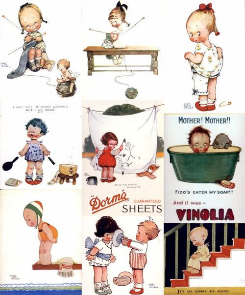
The challenge this month on The Altered Alice was to celebrate Mad Hatter Day, and the whole design team was given this same stamped image by Jennie at The Artistic Stamper. I really love these vintage Mabel Lucie Attwell illustrations of Alice in Wonderland that The Artistic Stamper has translated into rubber.

Attwell was born in England in 1879 and by 1914 had established her trademark style of illustrating roly-poly toddlers, loosely based on her daughter's appearance at that age. By the 1920s her children's picture book illustrations had captured the public's fancy. In fact the author of Peter Pan specifically requested that Attwell illustrate her gift book edition. If these appeal to you, The Artistic Stamper has several of these charming Attwell toddler drawings in rubber! And remember - free worldwide shipping over £35!

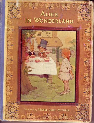
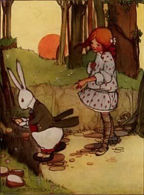
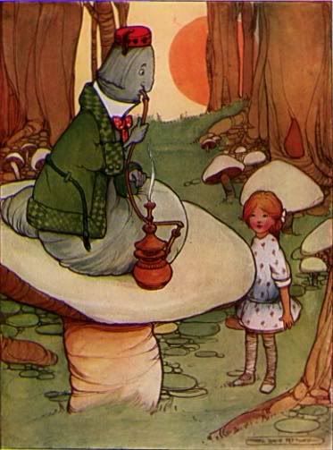
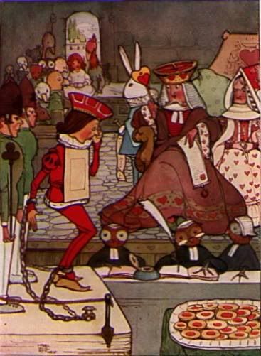
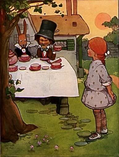
Attwell's illustrations of Alice in Wonderland are in quite a different style, and I was really inspired by the original color illustrations when I created my piece. First off, Attwell's Alice was a redhead, and as a redhead myself I approve! She wears the drop waist dresses typical of that period, and all the illustrations have a retro-vintage charm that stops short of being cute.

Here are some of the illustrations that inspired me - click to enlarge:


Aren't they great? I hope The Artistic Stamper will come out with more Attwell Alice stamps! They remind me of British art pottery of the same period, with the stylized trees and restricted color palette.  I wanted to make my stamp look more like this image of the Mad Tea Party:


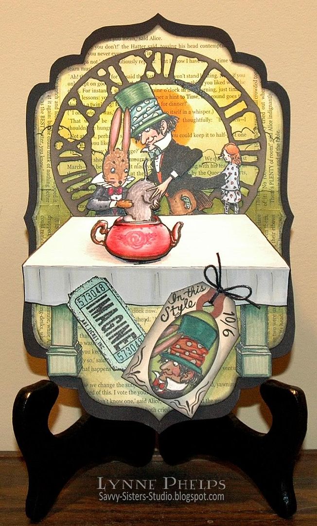
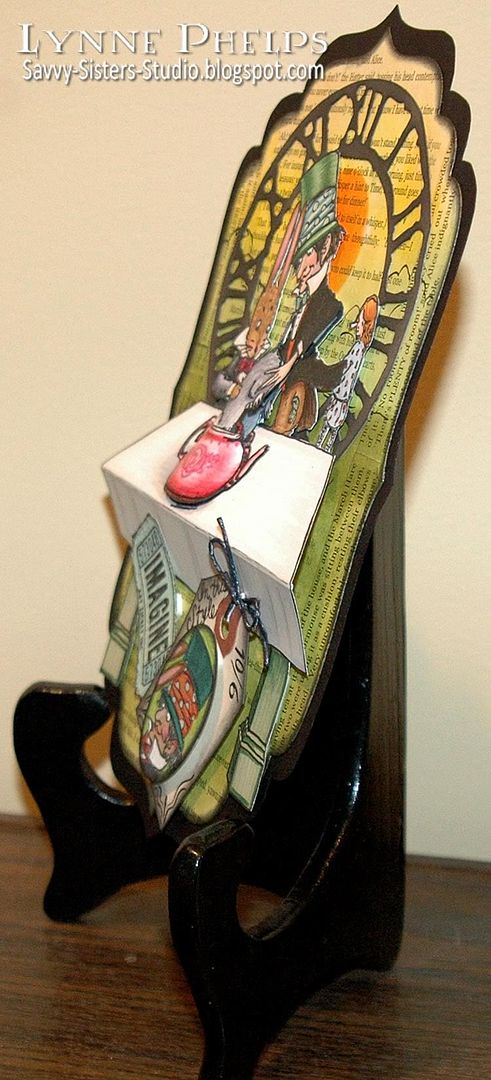
So the first thing I did after stamping the image on Beckett Radiance card stock with Memento Tuxedo Black ink was to use various weights of Copic Multiliner SP illustration pens to draw in the rest of the table under the teapot. You can see that I modeled my table legs on those pictured here, as well as the yellow skies, orange sun and yellow-green foreground. I also colored the clothes and the teapot and teacups to match this illustration.  Then I trimmed it out carefully with my Cutter Bee non-stick scissors, which are my favorite for intricate fussy-cutting.  Now what to do?

I knew I wanted to have the book text in the background. I tried to find a likely background shape amongst my die cuts and I decided the Grand Label Four Nestability shape would work best. I used the next the the largest die to cut my text covered card stock. It is the actual words from the Mad Tea Party chapter of the book!  I sponged the background with Distress Ink in Scattered Straw, Mustard Seed, Shabby Shutters and Peeled Paint. I took the brush Copic Multiliner pen and loosely sketched in a horizon line and some bush outlines above it. I made a mat by tracing along the inside rim of the largest Grand Label Four die and glued the two together. Now my background was complete, but the table was really bugging me. I wanted it to have dimension. It also looked disproportionate, as I had to draw the table top front edge so low due to the position of the teapot.


Then I had a brainwave! I scored the cut out image along the front and back of the table. I attached it to the background with dimensional foam mounting tape, centered on a Sizzix Weathered Clock die cut. I stamped and colored the Mad Hatter and March Hare arms, Dormouse and teapot and added that layer as you can see above.


Then it looked too empty under the table. I made a little price tag with another image stamped on kraft card stock and colored with pencils. I added an "Imagine" ticket and it was done! I wish I could tell you how cool this 3D effect is in real life!  Now it is even more so as I added a layer of Glossy Accents over the entire teapot to make it shine.


 You can see the rest of the design team's creations here: Original challenge post, Week 2, Week 3, and Winners & Honorable Mentions. Going last has it's advantages, as Tracy/CuddlyBunny's project on book text was a major inspiration, and the Glossy Accents coating to give the teapot a glass effect was inspired by Terri DeVine's stolen tarts project!

Please leave me a comment and let me know what you think of my dimensional Mad Tea Party!
Related Posts with Thumbnails