Showing posts with label Emboss-Resist Technique. Show all posts

Sunday, April 15, 2012

Your Sunday Best!


The challenge this month at The Altered Alice is to show us your Sunday best - ribbons, pleats, frills, lace; however you choose to interpret the challenge! The challenge is derived from this passage:
"After a time she heard a little pattering of feet in the distance, and she hastily dried her eyes to see what was coming. It was the White Rabbit returning, splendidly dressed, with a pair of white kid gloves in one hand and a large fan in the other: he came trotting along in a great hurry, muttering to himself as he came, `Oh! the Duchess, the Duchess! Oh! won't she be savage if I've kept her waiting!'"-- Chapter 2; Alice's Adventures in Wonderland
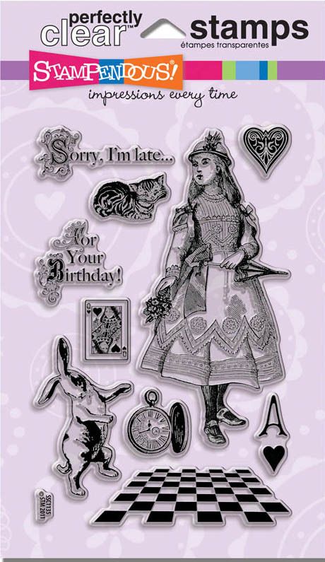
The Altered Alice design team is showing off the brand new Wonderland Perfectly Clear™ Stamps from our sponsor, Stampendous (Website | Blog). This Alice is all dressed up from her shining shoes to the top of her hat, not to mention her frilly parasol! We will have THREE winners this month, and they will each receive the same Wonderland stamp set the design team is using!

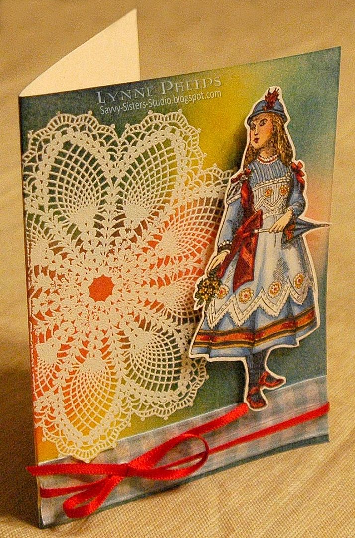
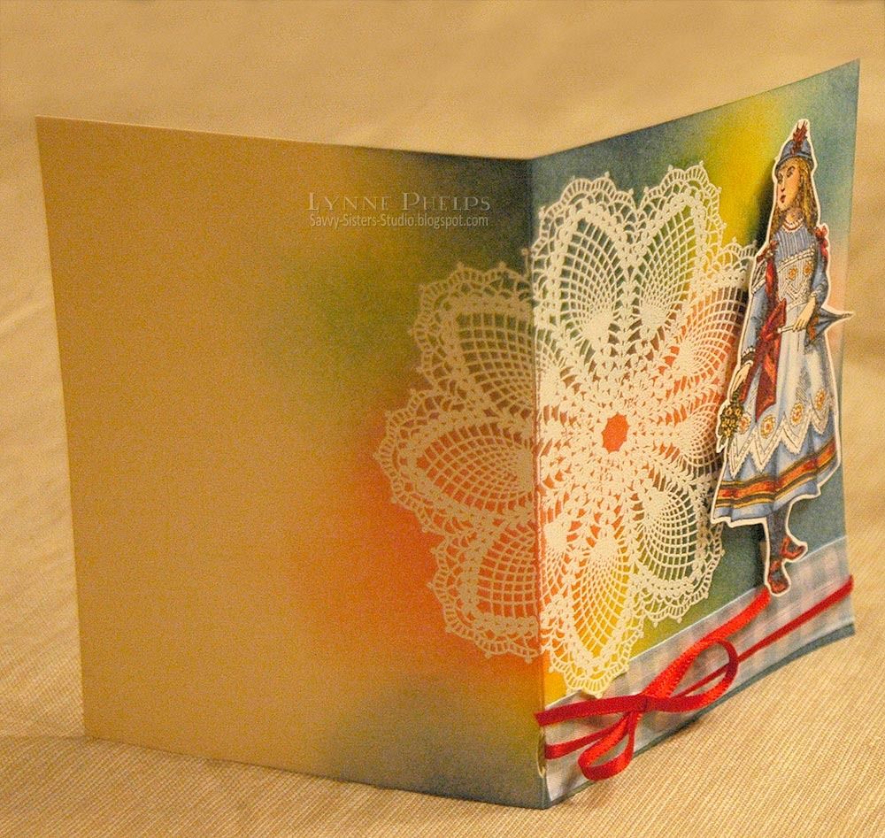
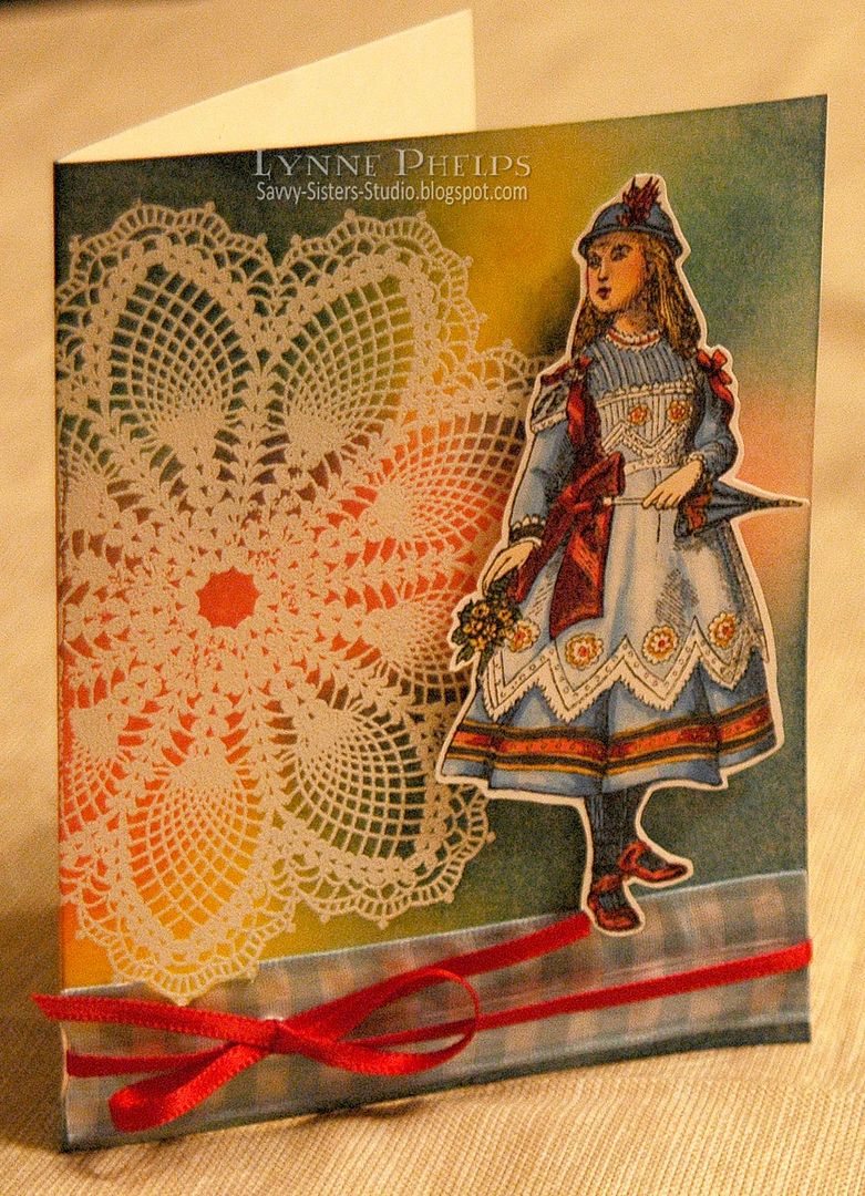
I really enjoyed coloring Alice with Copic markers. I tried to make it look like she is wearing an organdy pinafore, so you see the folds of the dress through the sheer white fabric. I trimmed the Alice out, then began on the card base. I stamped a large lace doily stamp (Stampin' Up!) on ivory card stock with Versamark ink, then I used Stampendous White Detail embossing powder to heat emboss the doily. The raised embossing makes the lace look almost real! I stamped it before I folded the card, so it wraps around the back; I really like how that turned out
Then I used a Ranger Ink Blending Tool with various shades of Distress ink to make the doily stand out, creating a vivid background for the gorgeous Stampendous Alice image. I added blue gingham ribbon to create a ground for the figure, glued on with Fast Grab Tacky Glue. I cut a small slit in the fold to tie a red ribbon all the way around the card front.

All in all, I am pleased with how this card turned out, but if I had it to do over again I would start with white card stock instead of ivory; the warmly colored card base shifted the sponged blue into a teal. I have another item I hope to share next week using more of the images in this charming Wonderland set!

You still have time to enter, so hop on over to The Altered Alice and show us your Sunday best! Enter by Friday, April 27, for a chance to win this wonderful stamp set! There are some AMAZING entries this month, so be sure to take a look at all the wonderful submissions!

Please leave a comment, I love hearing from you!

Wednesday, August 25, 2010

15 Minute Sponged Scribbled Roses

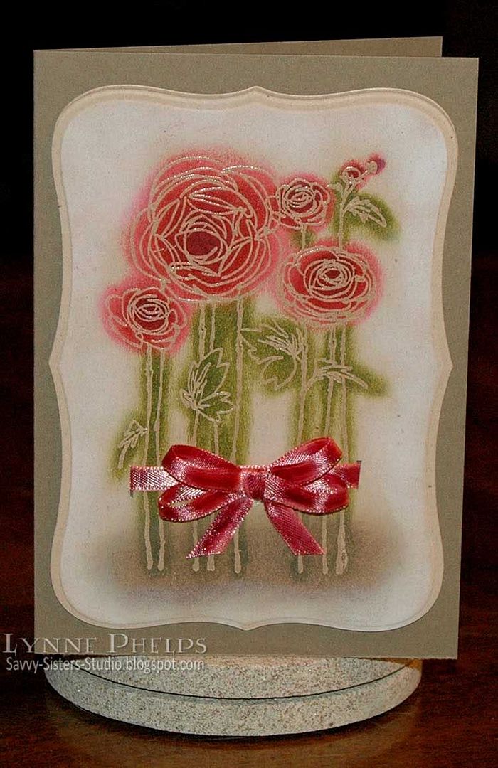
This was a super quick card to make, just for fun! I saw this stamp of scribbled roses from Stampendous at a local store and had to buy it. The minute I saw it I knew it was perfect for sponging, and there is no faster way to color!

Photobucket

I started by die-cutting a piece of natural confetti card. I thought the rustic flecks in the paper would compliment this quick technique. I sponged a bit of white ink around the edges before removing it from the die. Then stamped the flowers with clear Versamark ink and heat embossed with clear detail powder. Now the flowers would retain the color of the paper, as the clear enamel coating would resist the sponging to come.

I used a Q-tip to sponge various colors of ink on the flowers and leaves. I used a craft knife to cut a small slit on either side of the stems for a ribbon to pass through. I used Copic markers to tint the pale ribbon to match my flowers. I ran a lighter color down the two ribbon edges and a darker shade down the middle. LOVE that look, it makes my 99¢ ribbon look expensive and hand-dyed!

I mounted the image panel to my card base and it was done! 15 minutes and what a cheerful, pretty bunch of flowers to show for the time spent! If I had skipped the die cutting it would have been 10 minutes, can't beat that.

Please leave me a comment, I'd love to hear what you think of this super-quick technique!

Stamps: Stampendous
Paper: Stampin' Up! - Natural Confetti (discontinued), Soft Suede card stock.
Ink: Versamark; Ranger Distress Ink - Peeled Paint (green), Corduroy (brown), Worn Lipstick (pink), Fired Brick (red) and Aged Mahogany (burgundy); Copic - Sketch markers (to die ribbon).
Miscellaneous: Ribbon.
Tools: Q-tips; Spellbinders - Label 8 Nestabilities die; Bow-Easy.
  

Saturday, August 21, 2010

Oh, Alice! CHAPTER 27: Prizes for Dodo...

"This question the Dodo could not answer without a great deal of thought, and it sat for a long time with one finger pressed upon its forehead (the position in which you usually see Shakespeare, in the pictures of him), while the rest waited in silence. At last the Dodo said, `EVERYBODY has won, and all must have prizes.'
`But who is to give the prizes?' quite a chorus of voices asked.
`Why, SHE, of course,' said the Dodo, pointing to Alice with one finger; and the whole party at once crowded round her, calling out in a confused way, `Prizes! Prizes!'
Alice had no idea what to do, and in despair she put her hand in her pocket, and pulled out a box of comfits, (luckily the salt water had not got into it), and handed them round as prizes. There was exactly one a-piece all round. `But she must have a prize herself, you know,' said the Mouse.
`Of course,' the Dodo replied very gravely. `What else have you got in your pocket?' he went on, turning to Alice..."
Hello all! We are so excited about today's inspiration piece, which just so happens to feature Alice! The Mad Hatter herself is VERY fond of Tarina Tarantino jewelry and is lucky enough to own a VERY fun ring that she scored while in Disneyworld last time. Check out the fabulous Queen Alice ring HERE.

For today's challenge, we are all gaga over the beautiful piece at right - although it pictures a flamingo instead of our lovable Dodo, it is quite prize-worthy for those who can afford to buy it! Your mission today is to create SPARKLY FABULOUSNESS (yes, include some BLING, please!) as inspired by this photo.

For myself, I was inspired by our chapter reading and wanted to include the original illustration of the kind Dodo offering Alice a piece of candy from her own pocket as a prize!  Dodos are such amusing looking birds, and I love how Tenniel gave him human hands, too funny!  I also wanted to echo the bezel frame that holds the pendant, so I created a medallion as a "setting" for my illustration with rhinestones all around. Although it doesn't show, the medallion is clear heat embossed which adds a lot of shine to the whole project, to echo the glossy shine of the pendant.

Photobucket
Click to enlarge

Emboss-Resist Background:
I started by creating this medallion background, and I am SO pleased with how it turned out. I started by sponging a piece of white cardstock with a circle of Scattered Straw Distress Ink, then encircled that with Broken China, then a ring of Faded Jeans. I lightly misted it with water and used a clean makeup sponge to blend all the sponging together. I dried the paper with my embossing heat gun. By heating both sides of the paper, it straighted back out pretty nicely. Then I stamped this gorgeous medallion stamp with clear Versamark ink and heat embossed it with clear detail powder. This put a clear enamel coating over the sponged color. Because I used cheap white card instead of watercolor paper for this panel, all the water and rubbing roughed up the the surface, which resulted in the medallion stamp looking distressed instead of solid!

Next I brayered gray Weathered Wood Distress Ink over the whole area. The embossed medallion resisted the ink, only the unprotected paper absorbed the ink. I wiped the medallion off with a baby wipe. I wanted more contrast between the background and the medallion, so I sponged Black Soot Distress Ink just over the medallion area. Once I wiped off the medallion again, it really popped!! Just what I wanted. It is always so GREAT when the vision in your head comes out just right on paper!!! I trimmed it to a 4.75-inch square and edged it with a Pale Gold leafing pen.

I printed the scene with the Dodo with my black and white laser printer on color laser printer paper and colored it with Copics. In my image editor I had masked the image to a circle and added the black outline, which made it easy to trim out with scissors.  I die cut and embossed a Peony Nestability shape from white card and colored the part that would show with Copic markers to match the image and background. I adhered the colored Alice with Dodo image to the center.

Photobucket
Click to enlarge

I wrapped this beautiful gold double-faced satin ribbon around the black card front, taping the ends down where they would be hidden by the medallion panel. Then I adhered the medallion panel with my new pink ATG glue gun (love love love the new ATG gun!!!) and adhered the peony image panel to the center with thick foam tape to pop it up from the background.  Bling was required, so I used Copics to color some clear rhinestones gold to match my project and stuck them on around the medallion.

I like to make the bow look like it was tied from the base ribbon, not just stuck on. So I took a piece of fine twine and tied it around to pinch the ribbon where the bow would be adhered. Then I stuck the bow on with Fast Grab Tacky Glue and it was done!

Here are some blingtastic samples from the rest of our Twisted Tea Party:
I love to hear from you - your comments really make my day!

Stamps: Free digital image from Lenny's Alice in Wonderland site; Stampin' Up! - Medallion.
Paper: Georgia Pacific - white card stock; ValuePack - 5 x 6.5-inch black card and envelope; HP - Color laser printer paper.
Ink: Memento - Tuxedo Black; Ranger Distress Ink - Scattered Straw, Broken China, Faded Jeans, Weathered Wood, Black Soot; Copic - Sketch Markers; Krylon - Pale Gold Leafing Pen.
Miscellaneous: Ribbon - Double-faced 7/8-inch satin ribbon from Hobby Lobby; The Paper Studio - Self-adhesive clear flatback rhinestones; May Arts - scrap of Jute String.
Tools: Ranger Inksentials - Small brayer, ink blending tool, ink blending foam pads; Spellbinders - Peony nestabilities; Scotch - Adanced ATG gun, foam mounting tape.

Wednesday, July 28, 2010

Quick Collage Stamping

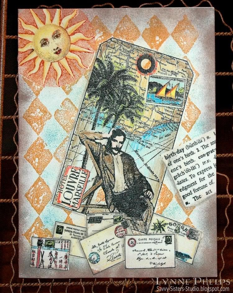
One night after dinner at my sister's house, she asked for a quick demo of this emboss/resist technique I kept telling her about. We moved into the craft room and I had fun raiding her stamp stash. Isn't it fun when you get to play with other people's toys? I picked out a background stamp, a focal image tag stamp, a birthday definition, a sun, and an accent image of letters and postcards. I set up near the heat gun, got out the clear detail embossing powder, located a versamarker pen and prismacolors and a few inkpads in my favorite colors. Now we were ready to roll!

Photobucket
Click to enlarge

This is a true one-layer card - this started off as a plain cream card front. There is no patterned paper or pre-colored images. When you stamp with the emboss/resist technique, you stamp the items in front first and move your way to the background. So the order here was:
  1. Envelopes
  2. Birthday dictionary definition
  3. Tag image
  4. Sun
  5. Diamond background
I stamped the envelopes near the bottom of the card front and colored them in with Prismacolor pencils. Notice that I colored in some gray shadows where one envelope overlapped another; this adds a lot of dimension without adding any layers. Then I colored over the whole stamped image with a Versamarker pen, which writes with clear watermark/embossing ink. I sprinkled clear detail embossing powder over the whole colored image and heat embossed. Now this layer of stamping will not be affected by the stamping that will come after it, as the embossing will repel future applications of ink.

Photobucket
Click to enlarge

Points for perfection: This card shows several flaws that happened with the Versamarker step. I was trying to move too fast and should have taken a bit more care. See the bottom corner of the envelope just to the left of middle?  I missed coloring in one little corner with the Versamarker, so the brown sponging that came later was able to stain the unprotected corner.  On several of the other envelopes, my Versamarker coloring went just outside the lines, so the subsequent brown sponging left white gaps where the embossing resisted the ink.  To avoid these problems, color the Versamarker up to the lines but not on or over the lines. It is better to be inside the lines than out of them.

I stamped the birthday dictionary defintion at an angle, colored a rectangular area with a Versamarker to encompass the text and heat embossed with clear detail powder. Next I stamped the tag. Although it is actually stamped on top of the envelopes and birthday definition, the glossy embossing does not accept the ink and easily wiped clean.  I colored in the tag with Prismacolor pencils, covered the entire surface with a Versamarker and heat embossed with clear detail powder.

Then the sun was inked with bright copper, then a dark brown inkpad was dabbed onto the eyes, nose and mouth, then stamped and colored in with Prismacolor pencils.  I colored with a Versamarker on the sun face and yellow rays, but NOT over the copper radient lines. Then I heat embossed the sun with clear detail powder.

Photobucket
Click to enlarge

Last, the diamond background was stamped with ochre ink over the entire surface. The open areas of the pattern were sponged with turquoise blue. Dark brown was sponged all around the edges. Notice how you can see the diamonds through the sun's radient lines but not in the yellow rays.  A slightly damp paper towel was used to wipe all the embossed surfaces clean of ink.  Shadows were added with a gray Prismacolor pencil around some elements to give a more 3D look. Voila!
Once you get used to the steps, this is a really fast technique, without the hassle of making masks out of paper. About 30 minutes for this card, not counting the stash raiding time! ;-)

Photobucket

I am entering this in the Cinema Saturday Creative Challenge #89: Casino Royale. Although this man has a moustache, he reminds me of Bond lounging on the Mediterranean coast while he was happy with his love, before the betrayal. The European locale, the travel implied by the map, it all makes me think of the movie. The envelopes remind me of all the nationalities of the players in the poker game in the beginning. I know I am missing a silhouette, I just couldn't figure out how to work it in!

I hope you'll give the emboss/resist technique a try!  Please leave me a comment, I love to hear from you!

Stamps: Tin Can Mail (Inkadinkado) - tag and envelopes; Hero Arts - birthday definition; A Stamp in the Hand - sun; Stampin' Up! - Print Pattern (background).
Paper: Value Pack - 5 x 6.5 inch ivory card and envelope.
Ink: Marvy Matchables - black, copper, brown, turquoise and ochre; Tsukeniko - Versamarker; Prismacolor - colored pencils.
Miscellaneous: Ranger - clear detail embossing powder; heat gun; sponges.

Thursday, July 22, 2010

Carte Postale Thank You - A One-Layer Card Through the Magic of Emboss/Resist!

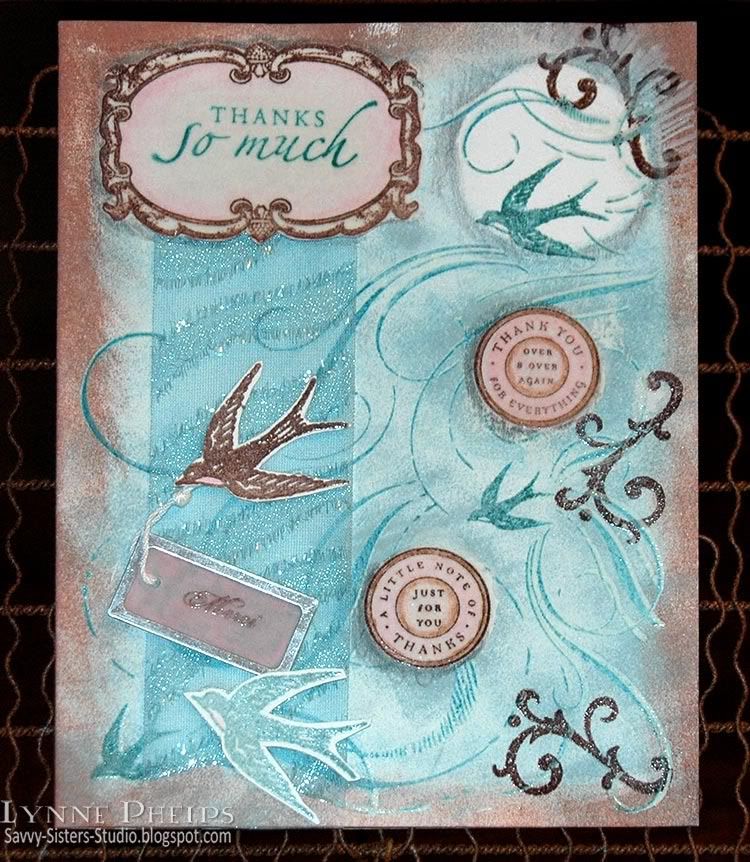
As much as I love Copic alcohol markers, I also love other coloring techniques! This card features coloring with Prismacolor pencils and sponging, used with my favorite emboss/resist technique. Other than the little cutout birds, ribbon,  and the vellum tag, this is a one layer card that started out as plain white card stock!

Photobucket

With the emboss/resist technique, you start by stamping the foreground elements first. So the frame was stamped in brown, the sentiment was stamped in teal, then it was colored colored in with a soft pink colored pencil and blended with odorless mineral spirits (sometimes called Gamsol) to smooth it out. You first color with Prismacolor pencils, then you take a paper blending stump and lightly dampen the tip with odorless mineral spirits and rub it over the coloring to smoothly blend. TIP: Remember to work in a ventilated area - odorless does NOT mean vapor-free, so work safe! Then I colored over the entire frame area with a Versacolor marker, being VERY careful not to go outside the outer line. This is the same clear watermark ink as comes in Versamark ink pads. Then I heat embossed the whole thing with clear detail embossing powder. This coats it with a shiny plastic-like finish so it will resist anything that comes later - it will wipe clean with a slightly dampened paper towel. The same thing was done with the two pink circles.

Next I stamped the large flourish and bird background stamp by inking it first with Versamark and next with a teal dye ink. This double-inking technique allows me to heat emboss with any dye ink; I heat embossed the background with clear detail embossing powder. It did not stick to the areas that were previously embossed.

Photobucket

Next the brown flourishes were stamped around the outer edge. It looks like the are behind because they don't stick to the embossed background image.

I punched a circle out of a Post-It note and stuck it on while I sponged brown all around the edges and teal in the center area. The circular Post-It note mask was removed and shadows were added around some elements with Prismacolor pencils. The heat embossed foreground elements were wiped clean with a damp paper towel. My white card was completely gone, and my card was still ONE layer!

I cut two slits for a sparkly ribbon to pass through, along the bottom edge of the frame and another just above the brown sponging along the bottom edge. I stamped the bird twice, once in brown, once in teal, heat embossed and cut them out. I stamped "Merci" in brown ink on a pale pink vellum tag and heat embossed. I taped the end of the knotted string to the back of one of the birds and adhered them with foam tape over the ribbon.
Photobucket

Can't forget the envelope! I added some stamping and sponging to the front left corner. On the back, I adhered a stamped and cutout bird to the tip of the envelope flap.

This card was for my sister, Janet, and she LOVED it! She has a clear acrylic store-type revolving card rack in her craft room and this card occupies a place of pride! I love the emboss/resist technique. To do this the "old" way you would have to stamp and trim out paper masks for everything, and this technique is so much easier and a lot more fun!

What do you think? Ready to try it? Leave me a comment and let me know what you think! :-)

Stamps: Stampin' Up! - Carte Postale set, Finials & Frames set, Sincere Salutations set, Circle of Friendship set, French Flair background.
Paper: Value Pack - white 5-inch x 6.5 inch white card and envelope.
Ink/Coloring: Marvy Matchables dye ink pads; Prismacolor colored pencils.
Miscellaneous: Metal-rimmed vellum tag; ribbon.
Tools: Sponges; Paper blending stump; Odorless mineral spirits.

Tuesday, May 25, 2010

Botanical Resist for Beverly

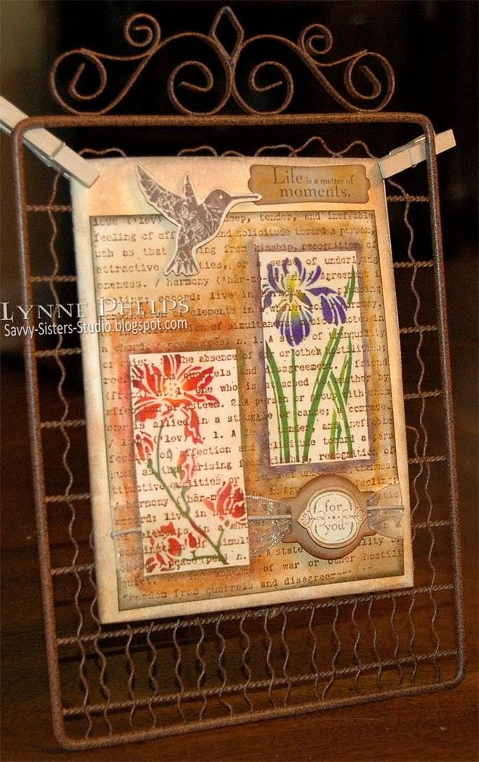
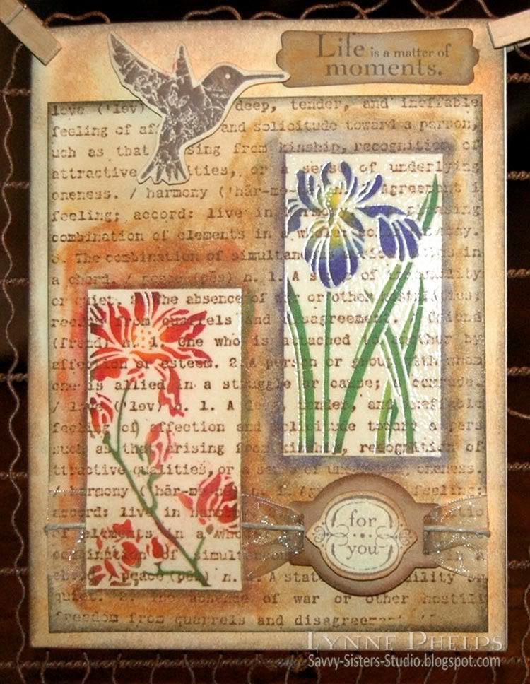
A dear stamping buddy recently lost her beloved husband. Our stamping group is getting together this Saturday to play with this technique, so I made this "thinking of you" card for Beverly. Hmmm. I wonder if she is a blog subscriber? I guess maybe now I'll find out! ;-)

Photobucket

Patie, the organizer of our band of stampers, saw this technique on a video by Jennifer McGuire. Jennifer is an amazing teacher and you can see a list of all her video blog posts here.  You need a negative image stamp - one where the background is stamped, leaving the focal point image unstamped, like a silhouette stamp in reverse.  I was really anxious to try out the technique and found I had only one stamp set that would work!

I began by stamping the text background, then sponged randomly with a lighter color to add some texture. I stamped the two negative floral images with VersaMark ink and heat embossed them in clear.  I used a Q-tip to apply ink to the open areas of the flowers. Then I sponged more inks on the background to make the flower images pop! It still needed a little something, so I used the colors on the Q-tip to go around the edges of the images, adding a little color.

Photobucket

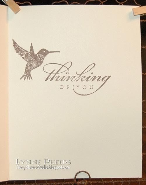
I sponged around the edges of the cream card base to match the panel. I die-cut a ribbon slide tag from kraft cardstock and layered the "for you" on top with a dimensional. I ran old gold organza ribbon and twine through the slider and wrapped it around the panel. The "Life is a matter of moments" was stamped on kraft, punched and sponged. The hummingbird added the final touch to the pretty flowers!

Can't forget the inside!

Photobucket

I have submitted this card to the "How do you distress" contest on the Tim Holtz blog, as sponging with Distress inks is my favorite distressing technique!

Amazingly, this card is all Stampin' Up! except for the ribbon slide die-cut, ribbon, and twine! The background stamp is perfect, as it is definitions of love and friendship. I hope this card will be a reminder for Beverly of a fun day playing with this same technique, and of how much she is loved by her friends! Life really is a matter of moments and I know she treasures every memory of moments shared with her beloved Bill.  Love you Bev!

Stamps: Stampin' Up! - Botanical Garden, Elements of Style, By Definition
Paper: Cream cardstock; Papertrey Ink - kraft cardstock; ValuePack 5 x 6½ inch cream card and envelope
Ink: Ranger Distress Ink - Vintage Photo, Tea Dye, Old Paper, Walnut Stain; Marvy Matchables - English Red, Yellow, Violet, Lilac, Green, Pine Green, Prussian Blue; Memento - Rich Cocoa
Miscellaneous: Ranger - Clear Detail Embossing Powder; Organza Ribbon; Hemp Twine
Tools: Cuttlebug - Ribbon slider tag die; Stampin' Up! - Modern Label Punch

Sunday, May 9, 2010

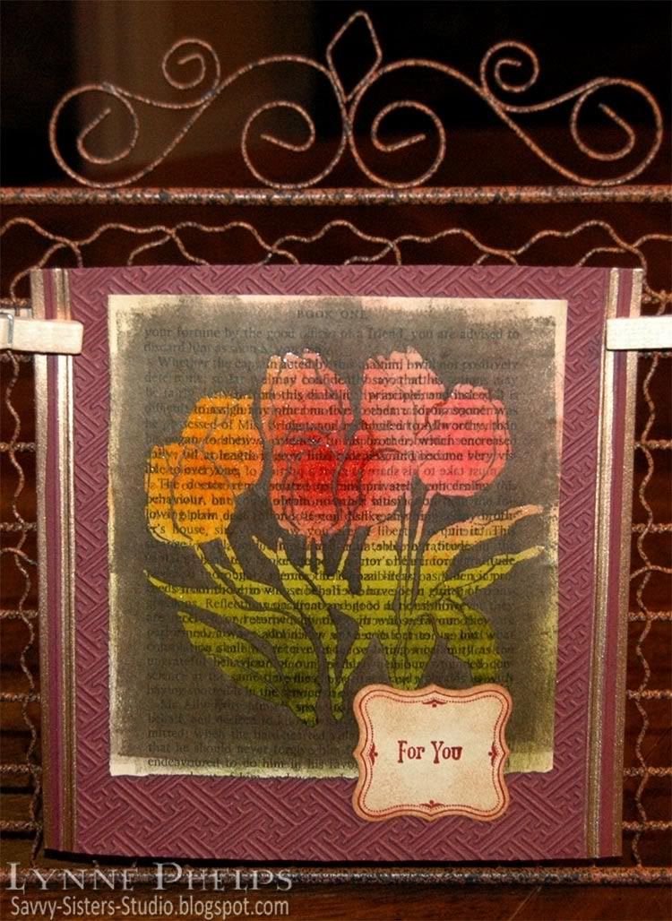
Mother's Day Tulips: Step by Step Brayered Emboss-Resist Technique

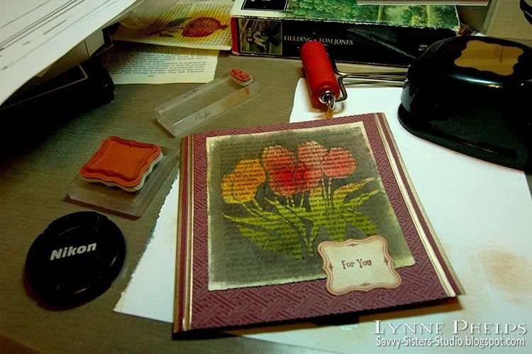
I kept trying to explain to people how I made the card in the last post. They say a picture is worth a thousand words, so I made another card using the same technique and took some photos along the way. These beautiful tulips are for my sister Janet on Mothers' Day; tulips are her favorite flower and she is the mother of my favorite kids!

Photobucket

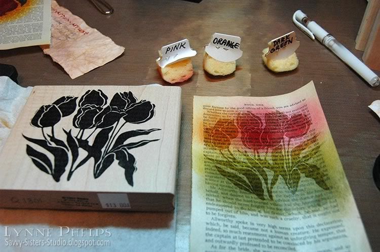
I started with a page from an old book; I picked up a bunch of them at the library's old book sale. I like to set the stamp I am going to use right next to the page while I sponge on colors. This way I have an idea about where I want to place each color. Be sure the colors you select for sponging are medium tone or lighter - you will need a lot of contrast with the dark color used to cover the background. Remember that the colors will get a lot darker when they are clear embossed!  I like Distress Inks best for sponging - they stay wet a little longer so you don't need as much ink.

Photobucket

Dry your sponging with a heat tool, then stamp with Versamark and heat emboss with clear detail powder.  If you don't dry the sponging completely before this step, the powder will cling to the page in all the wrong places, which would be a disaster during the next step.  You need stamps with large areas of solid color - silhouette stamps are perfect for this technique. Note: If you were working on plain, unpatterned paper instead of a book page, you could probably get good results with a more detailed stamp, but it would still need bold thick lines.

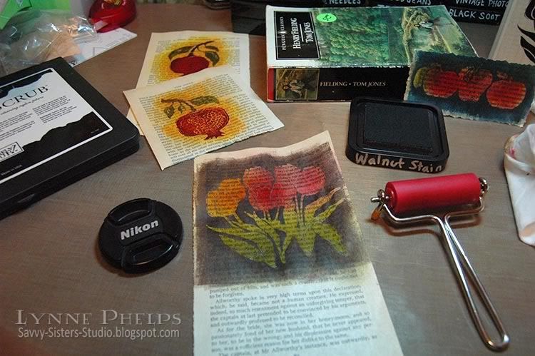
Next, brayer a dark colored ink over everything - dark enough to cover up all the colors from the previous step. You could sponge it, but the book page may start to tear from the amount of rubbing it would take to put this much ink on with a sponge. If you don't have a brayer, a better alternative would be to swipe your inkpad across the page in a direct to paper technique. 

Photobucket

I have a tiny brayer from Ranger that is perfect for this technique, as I like to leave some of the book page un-inked around the edges. I think the irregularly inked edged give it more of a vintage look. The small size brayer is MUCH less expensive than the larger sizes, and you can get a pack of three or four additional rollers for when you are brayering with different colors, so you can switch without having to clean up. The small size roller also takes less ink to cover and is easier to clean up than the larger brayers.

Take a slightly damp paper towel and wipe the ink off the embossed image and watch how it glows out of the dark background! Try to be careful and use your fingertip so as not to get the damp paper towel on the book page. You may want to use your heat tool again to dry the background if you are as impatient as I am!

Because I am using paperback book paper, it is very thin and the embossed area is somewhat translucent. To make sure the image stays vivid, I carefully glue the book page to a sheet of white cardstock. This keeps the embossed image bright even when you place it on a dark card.  The paper may also be a bit rippled after being soaked with all that ink, and you can carfully smooth out the ripples without wrinkling if you go slowly as you glue the paper.

Photobucket

Then you make your card! I used an embossing folder from the Cuttlebug Asian set and some scoring and pale gold leafing pen.  I stamped a label frame and sentiment and punched it out, sponging it to give it an aged paper look. On the inside, I inked the edges with gold and scored a square frame border near the edges. No sentiment stamped inside - I left it open to have room to write a little note to my sister. One more closeup look at the finished card:

Photobucket

Did this help you to understand the technique better?  I hope it helped to see it before the dark ink covered it all up.  Let me know if you try this technique, it is a lot of fun!

Ink on my Fingers Sunday Stamper Challenge


I am submitting this card for Hels Sheriden's Ink on My Fingers Sunday Stamper Challenge. The challenge for week 102 is "We are Golden" and I put the gold edges on my card both inside and out with Hels in mind! Not to mention there is some fabby classic Hels candy up for grabs - I love her style!

Stamps: Tulips: A Stamp in the Hand; Sentiment and frame: Stampin' Up! "Vintage Labels"
Paper: Book page; Stampin' Up! - Bravo Burgundy cardstock; Georgia Pacific - white cardstock
Ink: Versamark; Ranger Distress Ink - Peeled Paint, Mustard Seed, Spiced Marmalade, Fired Brick, Worn Lipstick, Antique Linen, Tea Dye, Mahogany; Krylon - Pale Gold Leafing Pen
Tools: Punch: Stampin' Up! - Curly Label punch; Embossing Folder: Cuttlebug - Asian; Score-Pal; Tack Sponges; Ranger Inkssentials Small Inky Roller (Brayer)

Thursday, February 25, 2010

Birthdays - Time Keeps Ticking Away!

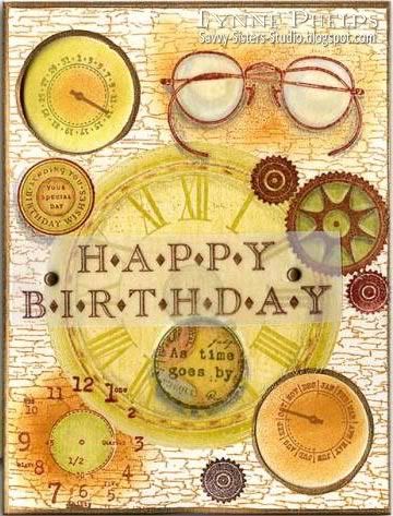
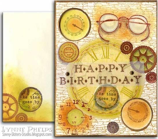
When it comes to having birthdays, my Dad always says "The alternative is grim!"  I guess I would rather have a birthday than not, although I've converted to having anniversaries of birthdays!!  This card really focuses on TIME, which seems appropriate on a birthday, where we celebrate how much time has passed!

Photobucket - Birthday Time Card
I have been inspired by Michelle Zindorf's tutorials and have been bitten with the emboss-resist bug! Images in the main area were stamped, clear embossed, colored with Prismacolor pencils, colored over with a Versamarker, then clear embossed again. I worked from the foreground to the background, so the large clock face in the center and the weathered wood background were stamped last. I guess you can tell how much I love collage stamping and this emboss-resist technique makes it so much fun!

I love this "It's About Time" stamp set (SU), especially because the clock hands are on two separate stamps so you can set them on the right month and day. They are showing from inside the card through two large hole punches (upper left and lower right corner).

Photobucket - Time Birthday Card with Envelope
Of course you can't forget the envelope!

Stamps include It's About Time and Circle of Friendship (SU), Roman Numeral Clock Face (Magenta), Weathered Wood (Judikins), Spectacles and "As time goes by" stamp from Michaels

This card is also my entry for Stamping Sisters in Christ Challenge #27:
SCRIPTURE:
Esther 4:14 “For if you remain silent at this time, relief and deliverance for the Jews will arise from another place, but you and your father’s family will perish. And who knows but that you have come to royal position for such a time as this?"

CHALLENGE:
Make a card or project using a time piece or in some way denoting time or the passage of time. Let imagination be your guide! There are no rules!
I think this card is all about the passage of time! What do you think?  And remember - birthdays are good for you - the more you have, the longer you live!

Saturday, November 21, 2009

Sleep is a Symptom of Caffeine Deprivation...

Isn't that a great sentiment? I love coffee and collect coffee related stamps of any kind, and tend to be somewhat of an insomniac...hmmm. I wonder if those two are related? I am also hooked on the emboss-resist technique of collage stamping, which I first learned from Michelle Zindorf's blog!

  • I stamped the coffee cups (Stampington) first with black ink and colored them in with Prismacolor pencils. Then I colored them in completely with a Versamarker, being very careful to stay within the lines, and clear embossed the cups.
  • Next, I stamped the steam (Stampin' Up! Like it a Latte) and embossed with white powder. I offset slightly and stamped it again in pale gray, using a stamp positioner to get it in the right place.
  • Next I stamped "Sleeping Kizette" (Cherry Pie Art Stamps) and colored in with Prismacolors.
  • I masked her shoulder and stamped "Product of Columbia" (source unknown) and colored in a waxing crescent moon in the center.
  • Next the sentiment that inspired the whole card - "Sleep is a symptom of caffeine deprivation" (Impression Obsession, discontinued I think).
  • Then I sponged brown ink on anything that still showed white cardstock and edged with a Krylon Leafing Pen in Copper. I love it that the Krylon Leafing Pens come in so many metallic shades!

Cherry Pie Art Stamps is the creation of Marina, a lovely Italian lady who now lives in the States. She started her rubber stamp company while she was still living in Genova, Italy, which is about 50 miles north of where I lived for several years in La Spezia (actually in the village of Tellaro, near Lerici). I had the pleasure of visiting her at her home, and seeing how she designed the stamps and pressed the rubber. She also showed me how she does her wonderful water colors. Please visit her site and check her gallery and the user galleries - totally inspiring! She also has a very active Yahoo group, which are always doing trades and swaps!
Many of her stamps are Marina's interpretaton of fine art - she has a wonderful line of Klimt stamps, and I suspect that "Sleeping Kizette" on my card today was inspired by a Tamara de Lempicka, a famous painter in the art deco period. She also has tons of Halloween related images and scenic stamps. One of Marina's trademarks is the fantastically fine shading she achieves on her stamps. The way she processes her images to get the fine shading is a trade secret - you will be amazed at the subtle shading she achieves in rubber!
Well, that wore me out. I think I need a cup of coffee!!

Sunday, March 15, 2009

Message in a Bottle

Who wouldn't like to find a message in a bottle?  This image of a bottle washed up on a beach made me think of messages to and from far-away friends!


This was a fun card to make. I stamped the Peddlar's Pack Message in a Bottle image by inking it with a Versamarks and then Black dye inkpad, stamping, and then embossing with clear detail powder.

I colored the image with markers, then I went over all the glass parts of the bottle (not the cork or tie around the neck) with a VersaMarker pen, and embossed it with clear embossing powder. 

Then I stamped the MSE Innie-Outie sentiment above and below the image, colored over the area with a VersaMarker and embossed with clear detail powder. I then sponged bright Marvy dye inkpad colors in the top and bottom areas and outlined with a silver Krylon leafing pen.

I put two photos so you can see how shiny the bottle is - much cooler looking in real life! It really does have a glass-like look.

You could probably get the same effects with Diamond Glaze (Crystal Effects in Stampin' Up speak), but I am too impatient to wait for it to dry.  I also thought the chances of it drying without being "investigated" by one of the cats was slim to none!

Thanks for visiting my new blog, and I hope you'll check in again soon!

Card Details:
Stamps: Peddlar's Pack - Message in a Bottle; My Sentiments Exactly - Innie/Outie sentiment
Ink: Marvy die inkpads; Marvy markers, Silver Krylon leafing pen
Accessories: Clear detail embossing powder

Related Posts with Thumbnails