


Click to enlarge
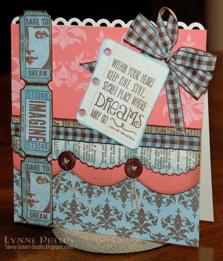
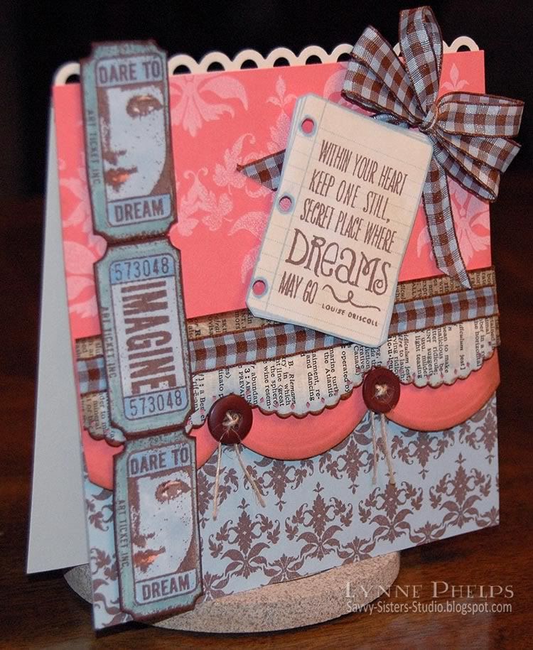
I have had several questions lately about the design process, so I thought I would walk you through it on this post. My cards ALWAYS start with the focal point - all decisions about the other elements happen after the focal point is created. I was lucky enough to pick up this Verve Blue Skies set with the little notebook page while it was on sale! It has several uplifting sayings in this fun lettering that all fit onto the notebook page, plus some butterlies and flouishes. I stamped the page in light blue and then stamped the text in brown and cut it out. Focal point - check!
I wanted to create an eclectic feeling, so I went for an elegant damask background to contrast with the whimsical lettering. I stamped the rows of small damask motifs repeatedly my only sheet of light blue card stock using the brown ink, thus coordinating with the colors of the focal point image. I covered the whole page of light blue so I would have leftovers for other projects. Rats! I had wanted to stamp these cool tickets on the blue. I stamped them with brown ink on white and colored with Copic markers to match my blue paper. It still looked like no Copics! Nobody would know! I cut them out and taped them end-to-end.
I had intended the top area to be brown but it was too harsh a contrast with the cream notebook page. Cream on top would be too blah. Even if I stamped a pattern on it, it was going to be too matchy-matchy. I tried a few different colors next to the blue and brown and decided this vibrant coral was just the thing to inject some energy and excitement! Plus my notebook page would stand out against the coral instead of blending. I stamped the coral with a large damask motif in white. Things were looking up!
I thought a text element would tie in really well with my other "printed" elements of notebook paper and tickets. Using things in threes is always a good design rule. I glued a page from an old dictionary onto white card stock and punched it with a large scallop punch and sponged the edges with ink. It created too much of a barrier across the middle, coral above and blue below. So I used a similar scallop punch on the coral panel, so some would show above and below the text band. Getting there, now I had coral below the band but how to pull more blue above the band? Remember at this point I still have a bunch of loose pieces that I keep shuffling around. Nothing is trimmed to size yet.
Click to enlarge
This is where I completely broke down on the no Copics plan. Sorry Emma, I blew it! I took some brown and white gingham ribbon and colored it blue. Perfect! I cut all my panels, adhered everything. Added a bow. Hmm. Added buttons and twine. Almost...but everything was looking so matchy-matchy! What the heck. I used a Copic colorless blender to remove the color from the eyes and lips of the girl on the tickets and added a touch of coral. I colored over the outside edges of the tickets with a pale green. Took one more look. Good design means you have repeating elements. I needed something else in cream, so I added the punched border across the top.
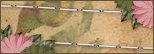
Now I'm happy with this card. Three pops of cream with the text band, notebook page, and top punched edge. Three pops of coral, above and below the text band and the lipstick on the ticket faces. Small dark damask motifs on the bottom balanced by large, light damask motifs on the top. Three printed elements. Different scallops that share the same curve. Buttons anchoring and punctuating the two curves.
Hope I didn't bore you to death talking about the design process, but a few people have asked me about it recently so I thought I would share. Let me know if you like or hate posts like this, I would really like to know - so leave me a comment!
Stamps: Verve - Blue Skies; Invoke Arts - Art Tickets; Papertrey Ink - Damask Designs.
Paper: Stampin' Up! - light blue, coral, vanilla.
Ink: Memento - Rich Cocoa, Summer Sky; Copic - Sketch markers; Ranger Distress Ink - Walnut Stain, Broken China.
Miscellaneous: May Arts - jute string; Paper Studios - buttons; Ribbon.
Tools: EK Success - scallop punches.


Beautiful card, very classy. I always love this colour combination and the scallops are gorgeous, I need to get more punches like this, really adds to the design element. Everything co-ordinates beautifully and those tickets are fab. This blog thing is costing me a fortune LOL. I think the detail you give is fantastic. Tracy x
ReplyDeleteFantastic card Lynne! I forgive you for giving in to your copics...hehe! They tend to call you when you don't reach for them...hehe! I love how you have matched everything on this and made your own background paper, it is just AWESOME! I really need to get myself a dictonary that I can rip apart!!
ReplyDeleteAbsolutely GORGEOUS card, Lynne! I LOVE the way it was put together, those fab tickets and the paper layers are so pretty!!!
ReplyDeleteI LOVE LOVE LOVE your go-bys & sometimes even want more detail (for instance once you stated that you kept cereal boxes (?I think that was what you said) & being new to this I wondered why... & so when I throw things away I often wonder.... should I be saving this? what should I be using this for?)
ReplyDeleteCheryl
;-)
What a gorgeous card Lynne! What a fabulous collage of so many amazing products! Love the strip of Vintage tickets & the scallops are divine!
ReplyDeleteGorgoeus card Lynne, am loving those Invoke Arts tickets...mmm, I can feel a little spree coming on LOL You bad influence you ;O)) x
ReplyDeleteWow great layout and some seriously awesome layers going on there!
ReplyDeleteThanks so much for your kind words on my blog
Hugs Lynn
Gorgeous card, Lynn! Have a wonderful day!
ReplyDeleteHugs and smiles
This is so stunning Lynne, i think this has to be one of my favourite cards. The colours are so cooll together and really pretty, i love the details and those tickets are 'just the ticket' lol yep i am really bad with puns lol!
ReplyDeleteI adore the sentiment and how its placed - amazing card
love tasha xx