Monday, August 30, 2010

Amber INK: From the Library of....


Photobucket
Click to enlarge

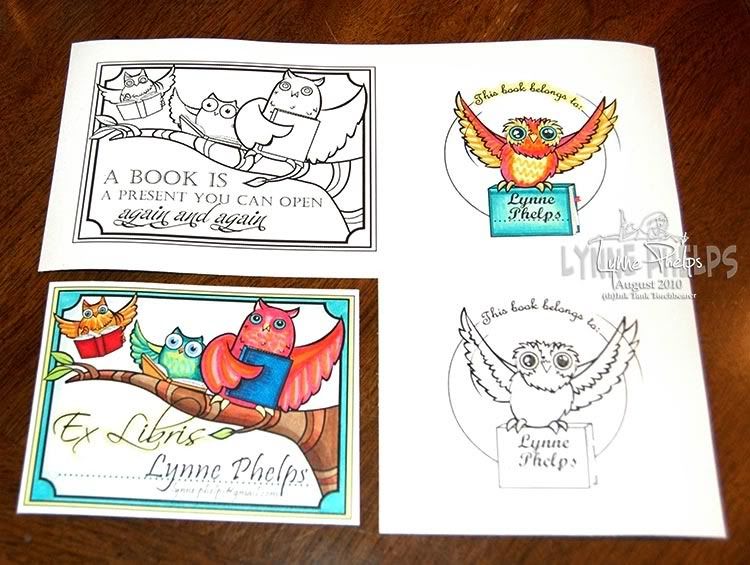
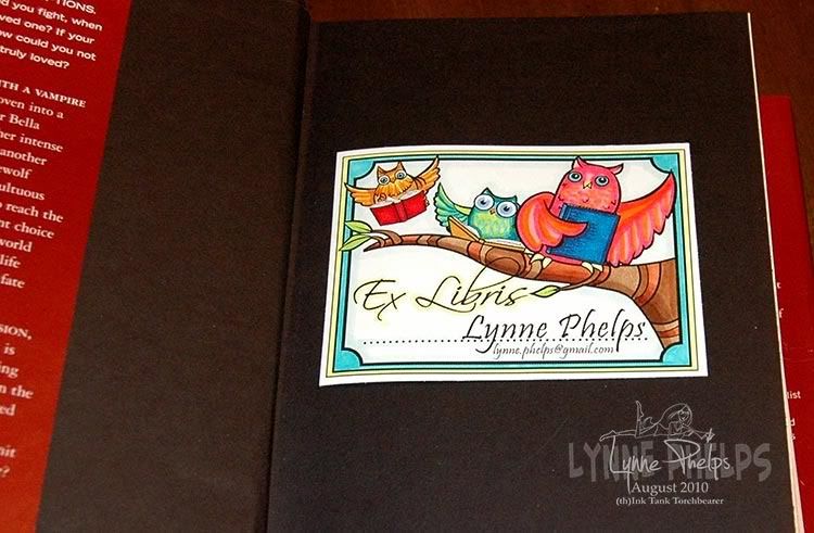
This set of bookplates is one of my favorite items in the August release from Amber INK. There are two bookplates featuring the cutest owls that were so much fun to color!  The round design says "From the Library of" and there is room on the book the owl is carrying to put a name. The larger rectangular design says "Ex Libris" which is Latin meaning "of the books" or in more modern terms, from the library of! There is a dotted line on which you can put your name. I thought it would be a good idea to have my name and email address.  Also, since I love reading fantasy and science fiction, I saw no reason why I needed to stick with reality when coloring these book loving owls! I was a girl in the 70's and part of me has retained that love of hot pink, orange, lime green and bright turquoise blue, colors that were so popular back in the day!

Photobucket
Click to enlarge

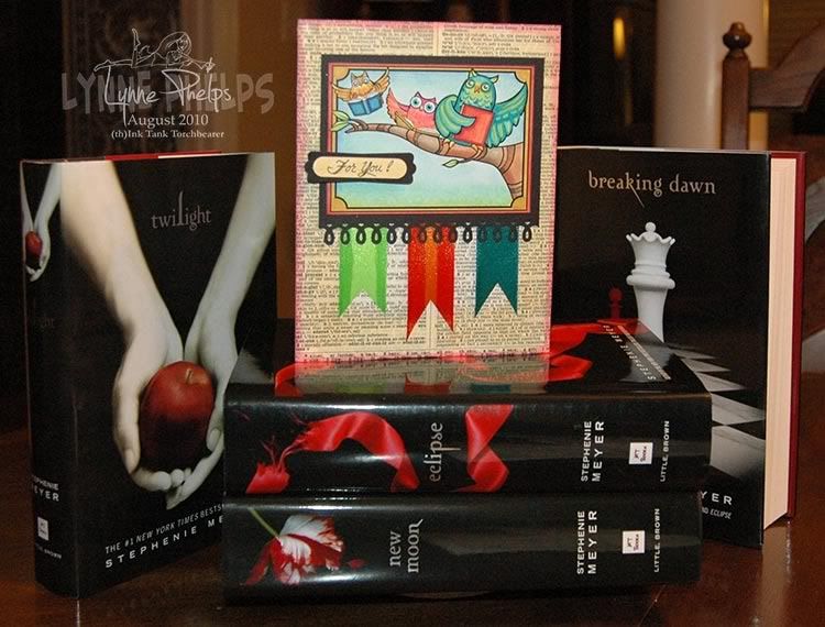
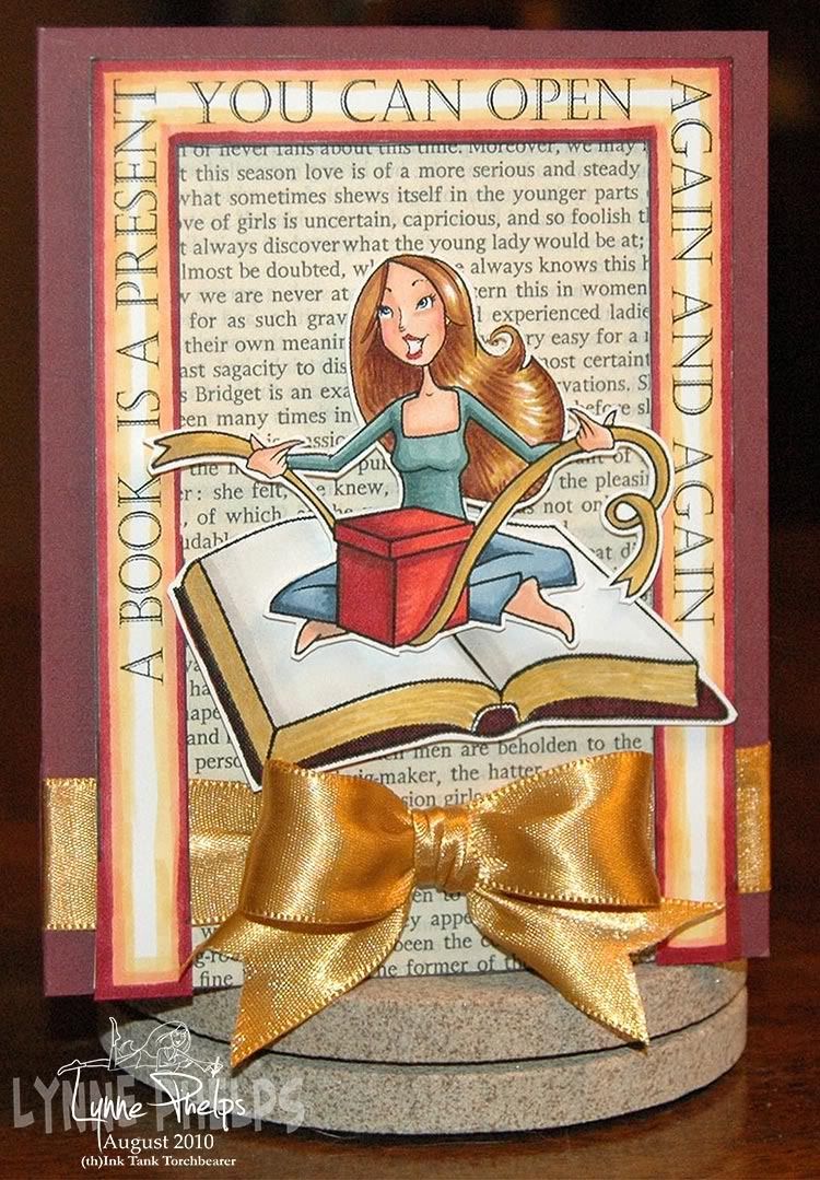
I really adore the owls on the branch and I wanted the versatility to use it for more than a book plate. I was working with the digital version of this set (it is also available in clear stamps) so I saved a copy of the file and ever so carefully erased the Ex Libris words and the dotted line. The only tricky part was where the loop of the B crossed the branch, and I just zoomed in close and went slow. This gave me a version I could add my own words to, such as the top image above where I put "A book is a present you can open again and again." I plan to use this version on a gift card holder for a bookstore gift card; how much more perfect can you get?  On the card below, I used the version I saved with no words at all - love that too!

Photobucket
Click to enlarge

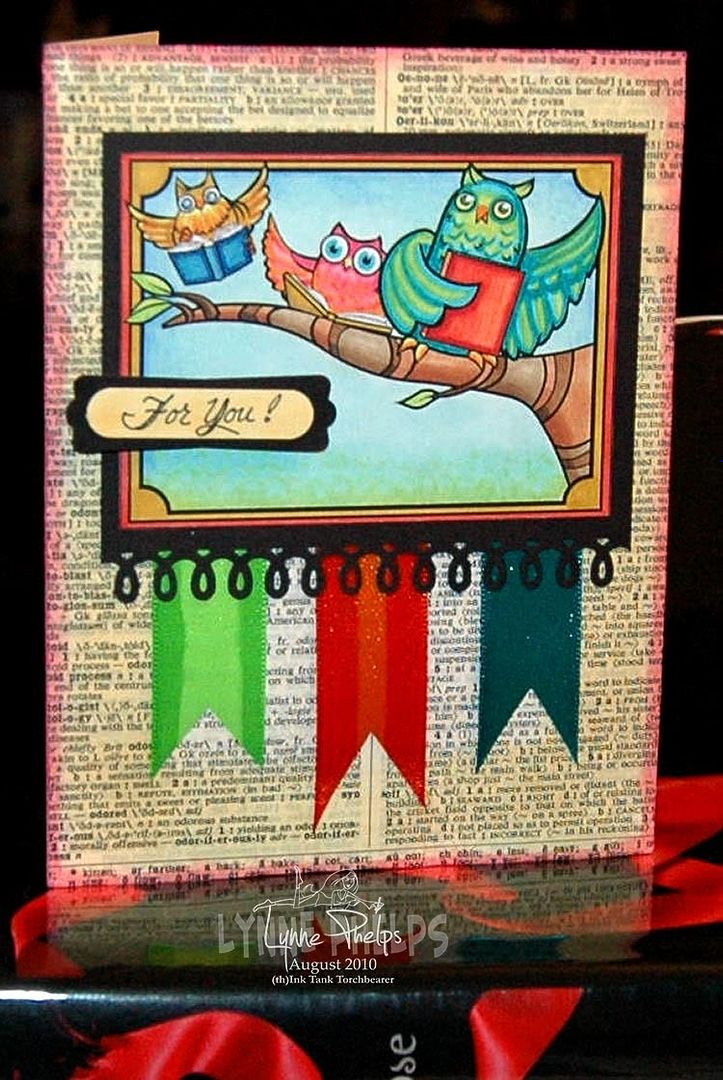
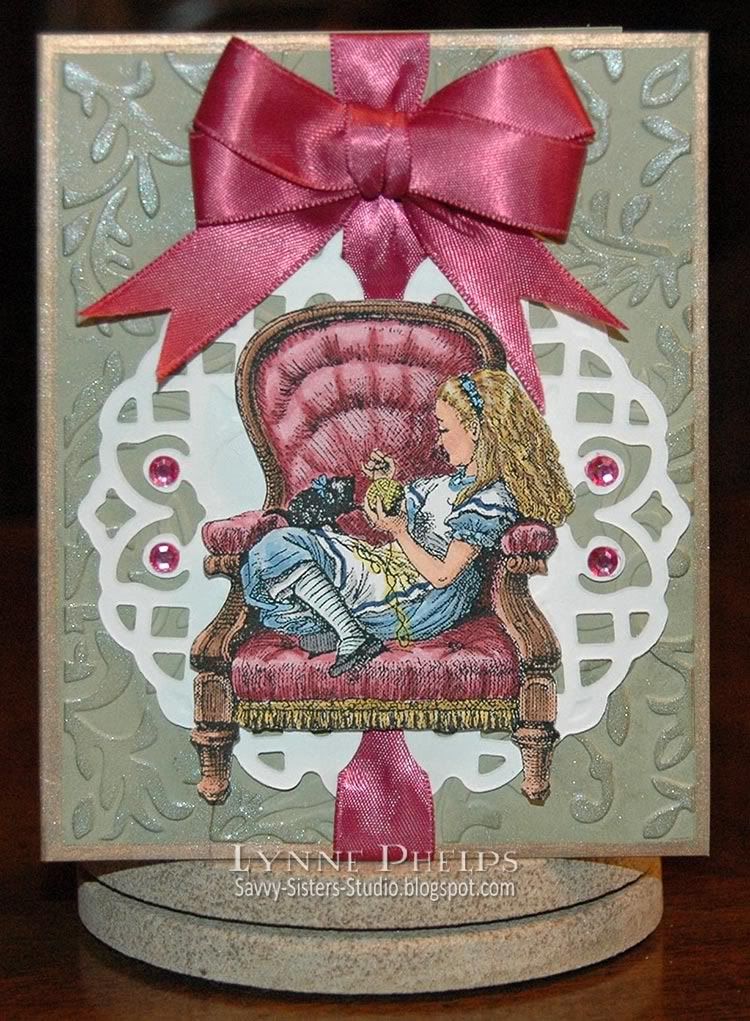
On the "For You!" card, I used my wonderful new pink ATG gun to adhere the page from an old dictionary to my card front. I then sponged around the very edges with Distress Ink in Worn Lipstick (pink) ink and in a bit more with Scattered Straw (pale gold). I then mounted my bright image, colored with Copic markers, to a piece of black card that I had decorated with a Martha Stewart border punch of loops. I cut three lengths of double-faced satin ribbon, and edged the orange with hot pink and the green with a deeper lime color. I love doing this with my Copic markers!

Photobucket
Click to enlarge

I had such fun coloring these whimsical owls! My favorite detail is the eyes of the middle owl, who is actually a much more vibrant hot pink and orange than it appears here! I wrote my sentiment on white card with a Multiliner pen, then colored the paper gold with a Copic marker before punching it out. I layered it on a black punch out and adhered it to the card with dimensional foam mounting tape.  This card makes me smile every time I look at it!

Photobucket
Click to enlarge

Here is a closeup of the rectangular bookplate. This is the image as you receive it from Amber INK. I just added my name above the dottted line and my email below it.

Photobucket
Click to enlarge

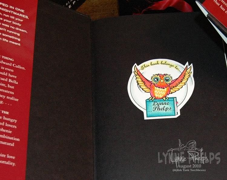
Here is the round bookplate with the flying owl.

I hope you enjoyed my various  bookplate projects! Of course I am going to enter it in the new Amber Ink 21-day INKredible challenge, as the theme for this month's challenge is BOOKS!

Please leave me a comment, I love hearing from you!
  

Saturday, August 28, 2010

Oh, Alice! CHAPTER 28: Child of the Pure Unclouded Brow...

Photobucket
Click to enlarge

Child of the pure unclouded brow
And dreaming eyes of wonder!
Though time be fleet, and I and thou
Are half a life asunder,
Thy loving smile will surely hail
The love-gift of a fairy-tale.

I have not seen thy sunny face,
Nor heard thy silver laughter;
No thought of me shall find a place
In thy young life's hereafter -
Enough that now thou wilt not fail
To listen to my fairy-tale.

Taken from "Child of the Pure Unclouded Brow:
preface to "Through the Looking Glass"

Hello everyone! We are celebrating the wonder of childhood today at Oh, Alice! and are thrilled to announce this week's sponsor, Paper Pretties Stamps! Are you all familiar with Paper Pretties? If you're new to them, check out their darling images! If it's been a while, Paper Pretties is PROUD to announce that they're under NEW ownership and is pleased to offer you faster, cheaper shipping, WAY more reliable service, and lots of new items in the store. We are thrilled to congratulate Heather Lee-Reppen on her new endeavor and are honored to have her sponsorship this week! Paper Pretties is offering a Prize package of rubber stamps this week to ONE lucky winner!

This week's theme is simply to make a card with a LITTLE GIRL theme. :) Alice is such a whimsical free spirit and we LOVE that about her! Channel your inner girlie this week with this great (and free-to-be-you!) challenge!

I was inspired to go Victorian, as Alice was a Victorian girl! I love this image of Alice tempting her little black kitten with a ball of yarn! I know other members of the design team will be more whimsical in their offerings, but I love this picture of Alice curled up in her chair. I was a great reader as a child and this big chair brings back many happy memories of curling up with a good book! The other thing I love about this image is that there is nothing more playful than a kitten!

Photobucket
Click to enlarge


I did some cleanup on this image from Through the Looking Glass to erase the background, then printed with my black and white laser printer on color laser printer paper. I then colored with Copic markers (love love love my Copics) and glue-sticked it to a piece of white cardstock, so it would be stiff enough to cut out and pop up on dimensional foam.  I cut a Lattice Pendant from the same white cardstock. I cut, scored, and folded my card base and ran it through the Cuttlebug with only the front panel inside an embossing folder, then edged the front with a gold leafing pen. I ran ribbon through the lattice, adhered it to the card front, and then swiped the exposed embossed areas with a Versamark Dazzle pad to highlight the raised areas.  I tied a bit of jute string around the ribbon about half an inch down from the top to pinch it in. I made a double looped bow and adhered it with glue to the pinched ribbon. The chair was adhered with pop-dots and I colored some bling to match and stuck it on the pendant on either side.
Here's your weekly inspiration from our Twisted Tea Party:
Thanks again to Paper Pretties for this great prize! You have until FRIDAY, September 3rd at 8pm CST to play along this week for the prize! Submit your entry on Oh, Alice! and the winner will be announced next week!

Enjoy being young at heart and we'll see you soon back in WONDERLAND! Please leave a comment, I really love hearing from you!

Stamps: Digital image from Lenny's Alice in Wonderland website.
Paper: Stampin' Up! - Mellow Moss card stock; Georgia Pacific - white card stock; HP - color laser printer paper.
Ink: Copic - Sketch markers; Versamark - Frost Dazzle pad; Krylon - Pale Gold Leafing Pen.
Miscellaneous: Ribbon; Paper Studios - clear self-adhesive flatback rhinestones.
Tools: Spellbinders - Lattice Pendant die; Cuttlebug - Victorian embossing folder, machine; Fast Grab Tacky Glue (for ribbon); ATG - gun and tape.

Friday, August 27, 2010

Amber INK - Om Nom Nom, a.k.a. Yum Yum Yum!

PhotobucketOm nom nom is an onomatopoeia, (like boom or cuckoo) one of those words or phrases that sounds like what it means. This is the sound the Cookie Monster makes when gobbling cookies! It has become a popular phrase and you see it all over the internet, particularly on cute pet photos!

Here's an urban dictionary definition of it: An onomatopoeical adjective based on the sound emitted when something is "oh so tasty" (either through hunger or flavorological value) that one gnaws through it without regard to cleanliness or etiquette. This sort of ravenous eating will often result in an "om nom nom nom" noise being emitted from the eater.

Back 2 School - Om Nom Nom: Little Things is also the name of one of this month's new releases, and the set features FOOD of course - particularly kid food! There is also a Back 2 School kiddie recipe card, front and back, new this month. I decided to put the two of them together!

Photobucket
Click to enlarge

Now, I don't cook and I don't have any children so I am handicapped here. But I remember the feeling of satisfaction when, as a small girl, I was able to do things all by myself, just like Mommy! I think it would be such fun to put together a bunch of kiddie recipes, laminate them and put them into a little book! Since I don't cook, I have instead filled my card with food images from the Om Nom Nom set, and added text in the Comic Sans font, showing what to include in a school lunch sack. So on the Directions side of the recipe card, I put the instructions on eating it, LOL!


Click to enlarge

I hope you will get a kick out of these video explaining the Om Nom Nom trend! Amber shared it with us and it is fun to watch. NOTE: if you are reading this in an email, you will need to go to my blog to see the video.


I hope you will come up with some great ideas to inspire some Om Nom Nomming for both you and your kids!

Please leave a comment, I love hearing from you!

Wednesday, August 25, 2010

15 Minute Sponged Scribbled Roses

This was a super quick card to make, just for fun! I saw this stamp of scribbled roses from Stampendous at a local store and had to buy it. The minute I saw it I knew it was perfect for sponging, and there is no faster way to color!

Photobucket

I started by die-cutting a piece of natural confetti card. I thought the rustic flecks in the paper would compliment this quick technique. I sponged a bit of white ink around the edges before removing it from the die. Then stamped the flowers with clear Versamark ink and heat embossed with clear detail powder. Now the flowers would retain the color of the paper, as the clear enamel coating would resist the sponging to come.

I used a Q-tip to sponge various colors of ink on the flowers and leaves. I used a craft knife to cut a small slit on either side of the stems for a ribbon to pass through. I used Copic markers to tint the pale ribbon to match my flowers. I ran a lighter color down the two ribbon edges and a darker shade down the middle. LOVE that look, it makes my 99¢ ribbon look expensive and hand-dyed!

I mounted the image panel to my card base and it was done! 15 minutes and what a cheerful, pretty bunch of flowers to show for the time spent! If I had skipped the die cutting it would have been 10 minutes, can't beat that.

Please leave me a comment, I'd love to hear what you think of this super-quick technique!

Stamps: Stampendous
Paper: Stampin' Up! - Natural Confetti (discontinued), Soft Suede card stock.
Ink: Versamark; Ranger Distress Ink - Peeled Paint (green), Corduroy (brown), Worn Lipstick (pink), Fired Brick (red) and Aged Mahogany (burgundy); Copic - Sketch markers (to die ribbon).
Miscellaneous: Ribbon.
Tools: Q-tips; Spellbinders - Label 8 Nestabilities die; Bow-Easy.
  

Saturday, August 21, 2010

Oh, Alice! CHAPTER 27: Prizes for Dodo...

"This question the Dodo could not answer without a great deal of thought, and it sat for a long time with one finger pressed upon its forehead (the position in which you usually see Shakespeare, in the pictures of him), while the rest waited in silence. At last the Dodo said, `EVERYBODY has won, and all must have prizes.'
`But who is to give the prizes?' quite a chorus of voices asked.
`Why, SHE, of course,' said the Dodo, pointing to Alice with one finger; and the whole party at once crowded round her, calling out in a confused way, `Prizes! Prizes!'
Alice had no idea what to do, and in despair she put her hand in her pocket, and pulled out a box of comfits, (luckily the salt water had not got into it), and handed them round as prizes. There was exactly one a-piece all round. `But she must have a prize herself, you know,' said the Mouse.
`Of course,' the Dodo replied very gravely. `What else have you got in your pocket?' he went on, turning to Alice..."
Hello all! We are so excited about today's inspiration piece, which just so happens to feature Alice! The Mad Hatter herself is VERY fond of Tarina Tarantino jewelry and is lucky enough to own a VERY fun ring that she scored while in Disneyworld last time. Check out the fabulous Queen Alice ring HERE.

For today's challenge, we are all gaga over the beautiful piece at right - although it pictures a flamingo instead of our lovable Dodo, it is quite prize-worthy for those who can afford to buy it! Your mission today is to create SPARKLY FABULOUSNESS (yes, include some BLING, please!) as inspired by this photo.

For myself, I was inspired by our chapter reading and wanted to include the original illustration of the kind Dodo offering Alice a piece of candy from her own pocket as a prize!  Dodos are such amusing looking birds, and I love how Tenniel gave him human hands, too funny!  I also wanted to echo the bezel frame that holds the pendant, so I created a medallion as a "setting" for my illustration with rhinestones all around. Although it doesn't show, the medallion is clear heat embossed which adds a lot of shine to the whole project, to echo the glossy shine of the pendant.

Photobucket
Click to enlarge

Emboss-Resist Background:
I started by creating this medallion background, and I am SO pleased with how it turned out. I started by sponging a piece of white cardstock with a circle of Scattered Straw Distress Ink, then encircled that with Broken China, then a ring of Faded Jeans. I lightly misted it with water and used a clean makeup sponge to blend all the sponging together. I dried the paper with my embossing heat gun. By heating both sides of the paper, it straighted back out pretty nicely. Then I stamped this gorgeous medallion stamp with clear Versamark ink and heat embossed it with clear detail powder. This put a clear enamel coating over the sponged color. Because I used cheap white card instead of watercolor paper for this panel, all the water and rubbing roughed up the the surface, which resulted in the medallion stamp looking distressed instead of solid!

Next I brayered gray Weathered Wood Distress Ink over the whole area. The embossed medallion resisted the ink, only the unprotected paper absorbed the ink. I wiped the medallion off with a baby wipe. I wanted more contrast between the background and the medallion, so I sponged Black Soot Distress Ink just over the medallion area. Once I wiped off the medallion again, it really popped!! Just what I wanted. It is always so GREAT when the vision in your head comes out just right on paper!!! I trimmed it to a 4.75-inch square and edged it with a Pale Gold leafing pen.

I printed the scene with the Dodo with my black and white laser printer on color laser printer paper and colored it with Copics. In my image editor I had masked the image to a circle and added the black outline, which made it easy to trim out with scissors.  I die cut and embossed a Peony Nestability shape from white card and colored the part that would show with Copic markers to match the image and background. I adhered the colored Alice with Dodo image to the center.

Photobucket
Click to enlarge

I wrapped this beautiful gold double-faced satin ribbon around the black card front, taping the ends down where they would be hidden by the medallion panel. Then I adhered the medallion panel with my new pink ATG glue gun (love love love the new ATG gun!!!) and adhered the peony image panel to the center with thick foam tape to pop it up from the background.  Bling was required, so I used Copics to color some clear rhinestones gold to match my project and stuck them on around the medallion.

I like to make the bow look like it was tied from the base ribbon, not just stuck on. So I took a piece of fine twine and tied it around to pinch the ribbon where the bow would be adhered. Then I stuck the bow on with Fast Grab Tacky Glue and it was done!

Here are some blingtastic samples from the rest of our Twisted Tea Party:
I love to hear from you - your comments really make my day!

Stamps: Free digital image from Lenny's Alice in Wonderland site; Stampin' Up! - Medallion.
Paper: Georgia Pacific - white card stock; ValuePack - 5 x 6.5-inch black card and envelope; HP - Color laser printer paper.
Ink: Memento - Tuxedo Black; Ranger Distress Ink - Scattered Straw, Broken China, Faded Jeans, Weathered Wood, Black Soot; Copic - Sketch Markers; Krylon - Pale Gold Leafing Pen.
Miscellaneous: Ribbon - Double-faced 7/8-inch satin ribbon from Hobby Lobby; The Paper Studio - Self-adhesive clear flatback rhinestones; May Arts - scrap of Jute String.
Tools: Ranger Inksentials - Small brayer, ink blending tool, ink blending foam pads; Spellbinders - Peony nestabilities; Scotch - Adanced ATG gun, foam mounting tape.

Friday, August 20, 2010

Amber INK - There's a new Challenge Blog in town!!!

Photobucket Today is the big day for Amber INK - the August Release stamps will be in the store today. Most are available as both digital or clear stamps, so there is something to please everybody! The Baby Mermaid sets from last month and this month play well together, so just think of all the fun scenes you could make!

But the big news is that Amber and Pam have started a new challenge blog, and in keeping with our back to school focus, the theme for the first challenge is BOOKS! There will be prizes as Amber INK is a built in sponsor! And, typically, this is not your average challenge blog!! How is it different? 

AmberINK's INKredible 21 Day Challenge...
  • You will have three weeks (21 days) to enter your project(s)
  • When submissions are closed, you have three days VOTE on the three you like the best!
  • The design team will pick a winner from the top three that YOU have selected!
  • Everyone can play, the only requirement is that you MUST use at least one Amber INK product. If you don't have any products (and why don't you? They're adorable!) check Amber's store, some images and the iPaper are $1 or less so you can totally do this!
  • Check it out at http://amberinkchallenges.blogspot.com/
I don't know about you, but I'm busy and I have a terrible time with weekly challenges. By the time I sort out what they are, they're over before I have a chance to submit. So I make something and then I go scrounging around for challenges that it will work for. With 21 days, I'll be able to make something to specifically meet the challenge! Much more fun!

So, with all that, here is my entry:

Photobucket
Click to enlarge

I hope you will vote for me, after you have voted for your own entry of course! thescubasite.com See, won't this be FUN? Like a mini stamping royalty contest each month!

I made an 8 x 10.5 inch 300 dpi document in my photo editor. I found some free clip art of an open book and modified it a bit, then I copied it into my file. Then I set the text in a square and copied in this wonderful Amber INK "Amber Girl" image from "You're the Perfect Package" digi set. So in my file, I had all three elements but they were separate on the page. I printed in on my black and white laser printer on color laser printer paper. I colored in the book and the girl with Copic markers. 

I decide to draw some bounding lines around the text with a 0.5 Multiliner, then I drew in bands of color to highlight the text. I thoroughly glue-sticked the back of each element and I adhered the whole page to a piece of white card stock, then I cut out each item.

I took a page from a book (purchased specifically for this purpose at a Friends of the Library book sale, where I also buy stacks of old dictionaries), trimmed it down and used foam mounting tape to adhere my "U" of text over it like a frame, except that I left the bottom 1.5 inches open on each side to allow me to add the ribbon later. Then I used thicker mounting squares to adhere the book and added the girl last. When I set the text, I made sure to add an extra space so there would be room for the end of her ribbon at the left, so it wouldn't cover up any words.

Almost done! I cut a slit in the fold of the card to pass my gold double-faced satin ribbon through. The two ends are adhered underneath one of the text bands, so it looks nice inside the card too. I tied the bow separately using a Bow-Easy. I'm a perfectionist, so I used some fine twine to tie around the ribbon to pinch it in the center, then I stuck on the bow with Fast-Grab Tacky Glue, which is what Sharon Johnson recommends for adhering ribbon. It is thick enough that it does not soak through and show on the front of the ribbon. All done!

Photobucket
Click to enlarge

I love to read and I love books, so this is one of my favorite cards! Perfect to use for a book store gift card, I think! Submit your own book-inspired project (and vote for me and you! thescubasite.comon AmberINK's INKredible 21 day challengeAnd be sure to go to Amber INK to see the new August releases!

Be sure to check out the other August torch-bearers creations!
Please leave me a comment, I love hearing from you!
    

Wednesday, August 18, 2010

Pssst - It's another Amber Ink Kiddo!

Photobucket It's time for another Amber Ink sneak peek! Yesterday I merged all the kiddos into one scene, and today I am using just one of these cute kids. My little gossip girl wants to tell you that you're the best!

I printed the image with a laser printer onto color laser printer paper and colored with Copic markers. I cut it out with a circle nestie and sponged pink around the edges using a makeup sponge wedge. Still in the die, I ran a black line around the edge using a Multiliner and ran a bright green marker around the edge.


Click to enlarge

Of course the whole card was inspired by Amber's amazing digital iPaper! This "Spin Pin Tiny" pattern is one of my favorites, so lively and fun! I printed it out and cut a piece to mount on my black card base. I printed the whole 8.5 x 11 inch page so I would have scraps, but another option would have been to copy a piece at the exact size I needed and pasted it in a new file - then I could have printed out just the size I needed with no wasted ink.

I computer generated the sentiments and cut them out. The bottom one was colored with Copics to go with the paper. I cut a slit in the fold of the card so I could slip a white ribbon through. I tied a big green button around the knot with some fine black twine. Everything was attached to the card with foam mounting tape.
Be sure to check out the other August torch-bearers creations!
I have entered this in the following challenges:
I'll have another sneak peek tomorrow with a whole different set, can't wait to show you! The iPapers are already in the store, and the new digital stamps we've been showing you will be in the Amber Ink store on Friday! August 20 is a big day - in addition to the new release we have a super-duper surprise for you so stay tuned!


Please leave me a comment, they really make my day!

Tuesday, August 17, 2010

I'm in the Amber Ink (th)INK Tank!

Photobucket
Check out the name on this custom design team badge! I have been invited by the brilliant (but not patient) Amber to carry the torch for Amber Ink for the month of August! Amber Ink features digital stamps, digital "iPaper" and clear stamps. We are saying farewell to Karin Martin, Nicole Anderson, Patricia O'Hagan (Pinky), Suzi McKenzie, and Taylor Usry. Shannan Tuebner, the design team co-ordinator, is providing some continuity as we welcome the August leg of the th(INK) Tank relay!
We are starting the sneak peeks for the August release. Today I am sharing three darling first-day-of-school kiddos that will be available in the Amber Ink shop on August 20th. It is so much fun working with digital stamps because you can do all the compositing of images without having to do any masking. This card includes New Girl, Gossip Girl, and the Turned Head Boy; I don't know their official names yet!

Photobucket

Notice that fun background paper! Amber has wonderful iPaper designs that coordinate with each of the stamp lines, or you can mix and match! This design, Clutter Dots-Green, is actually from The Little Top Collection of circus-inspired designs, but I thought the primary colors really suited my first-day-of-school kiddos! Another really different feature is each design is available in three levels of brightness from full strength, as shown above, Whisper, which is paler, and Hint which has the faintest pattern.

I put my three kiddos together in Photoshop. The first thing I like to do with digital images is to select only the background and delete it, so the inside of each kiddo and desk, etc. still has white inside. I then save the files as a PNG, which allows transparency, as opposed to a JPG or TIF which does not.  This makes it so easy to put the images together. I create a new 300 dpi document that is 8x10.5 inches (letter-sized minus a quarter inch margin all the way around) then I copy or place each PNG file into the new file. It is easy to rearrange them, and I can change the order of what is in front or in back. Because each image is solid and the background is clear, there is no special masking needed.

Photobucket

I fill up the whole page with images, and it makes it easy to judge how to size each one and how much space to leave.  I like to print on my B&W laser printer onto color laser printer paper. The laser printer fuses the toner onto the page with heat, so the markers will not smudge the ink. The color laser printer paper is ultra smooth and thicker than regular copy paper, and it is easy to blend Copic markers and so much less expensive that a good quality card stock, plus it takes a lot less ink to saturate the paper. I die cut the image and sponged around the edges while it was still in the die.

After that I just added ribbon, buttons, and a thank you sentiment. Remember to recycle - the bright green scalloped circle behind the sentiment is punched from a Windstream DSL broadband flyer that came in the mail!  I think this would make a fun teacher thank you card, and with a different sentiment it would make a fun birthday card, invitation, or thinking of you card.

Challenges:
Hope you liked my first-day-of-school kiddos, and I'll be sneaking peeks at another Amber Ink stamp collection in a couple days!  Please leave a comment, I LOVE hearing from you!
  

Saturday, August 14, 2010

Oh, Alice! CHAPTER 26: Sizin' up a Sketch... Caterpillar Size!

"The Caterpillar was the first to speak.
`What size do you want to be?' it asked.
`Oh, I'm not particular as to size,' Alice hastily replied; `only one doesn't like changing so often, you know.'
`I DON'T know,' said the Caterpillar.
Alice said nothing: she had never been so much contradicted in her life before, and she felt that she was losing her temper.
`Are you content now?' said the Caterpillar.
`Well, I should like to be a LITTLE larger, sir, if you wouldn't mind,' said Alice: `three inches is such a wretched height to be.'
`It is a very good height indeed!' said the Caterpillar angrily, rearing itself upright as it spoke (it was exactly three inches high).
`But I'm not used to it!' pleaded poor Alice in a piteous tone. And she thought of herself, `I wish the creatures wouldn't be so easily offended!'
`You'll get used to it in time,' said the Caterpillar; and it put the hookah into its mouth and began smoking again..."
PhotobucketHello! How is everyone here in Wonderland today? We are sizing up a GREAT sketch by JEN and the main panel just HAPPENS to be THREE. INCHES. TALL. :) Now, of course you don't have to stick to this if your image won't fit, but we didn't want to anger Mr. Caterpillar by saying that Three inches wasn't a respectable height, so here's the sketch:

Now, I have to admit that my dimensions are not the same as Jen's sketch, but I am using the original Tenniel illustration of this conversation to show due respect to Mr. Caterpillar!  Also, as a nod to the final scene in the new Tim Burton movie, I have included Absolem the caterpillar  after he metamorphed into the blue butterfly. After the excesses of last week, there is not one bit of embossing or punches on the whole thing!

Photobucket
Click to enlarge

I started by stamping the image on white card and coloring it with Copics. I love this illustration, don't you? Then I trimmed it and outlined it with two different widths of multiliners to give it a bit of a border. I wanted to do the same thing to the background panels to give it some consistency. After I drew the double outlines around the blue panels, I masked the edges with Post-it notes and stamped an antique background design in the center of the panels. I thought the pen and ink style of the background stamp with its hatched shading was a good match for the style of the illustration. Click to look at the bigger version to see better. It looked a bit flat, so I colored a blue green in the background and a violet on the swirling leafy flourishes. It is a very subtle tone-on-tone alteration but it adds depth and interest to the otherwise flat background panels.

I adhered the background panels then ran an aqua blue ribbon around the card front - the ends are taped under the image. The background blue matched the caterpillar, and the ribbon matches the sky so it provides a nice balance! I made a double-looped bow on one side, then I stamped and colored the butterfly on a scrap of white card. I shaded the veins of the wings with deeper blue and colored the centers light blue and violet. The center of each veined area was highlighted with a clear Stardust Gelly Roll pen, love the shimmer! I colored the highlight on the body with a dark blue Stardust pen. I attached the main image with foam mounting tape and used Glue Glider to attach the body only on the butterfly, lifting the wings to give it dimension.

It still looked like it needed something, so I colored some self-adhesive rhinestones with a dark blue Copic marker. I put one in each outer corner of the background panels. I cut some very fine black hemp twine and stuck it down under another blue rhinestone for the butterfly head and antennae. I had more left that I'd colored, so I stuck it in the middle of the bow. Not sure about that last bit of bling!

Photobucket
Click to enlarge

I hope you will play along by submitting your creation on the Oh, Alice! blog. It is always fun to see what others do with the same sketch, so be sure to visit the other members of the Oh, Alice! team for more inspiration from our Twisted Tea Party:

I hope you like my card! Not quite so OTT as many others; I was going for a more tailored architechtural style with the lined panels. Of course I couldn't achieve a minimalist card to save my life, so it's still not too plain! Leave me a comment and let me know what you think; it makes my day when I hear from you!

Stamps: Nature's Blessing - Caterpillar stamp; Stampin' Up! - Wonderful Wings, Antique Background.
Paper: Value Pack - white 5x6.5 inch card and envelope; Stampin' Up! - blue card stock; Beckett - Radience (white) card stock (for coloring with Copics).
Ink: Memento - Tuxedo Black; Copic - Sketch markers, Multiliner SP pens; Sakura - Stardust Gelly Roll pens in clear and dark blue.
Miscellaneous: Ribbon; Paper Studio - adhesive rhinestones; Black hemp twine.
Tools: Tim Holtz - Design Ruler; Bow-Easy.
   

Saturday, August 7, 2010

Oh, Alice! CHAPTER 25: White Rabbit, White Gloves, White Wonderland...

"After a time she heard a little pattering of feet in the distance, and she hastily dried her eyes to see what was coming. It was the White Rabbit returning, splendidly dressed, with a pair of white kid gloves in one hand and a large fan in the other: he came trotting along in a great hurry, muttering to himself as he came, `Oh! the Duchess, the Duchess! Oh! won't she be savage if I've kept her waiting!'
Alice felt so desperate that she was ready to ask help of any one; so, when the Rabbit came near her, she began, in a low, timid voice, `If you please, sir--' The Rabbit started violently, dropped the white kid gloves and the fan, and skurried away into the darkness as hard as he could go..."
~Alices Adventures in Wonderland, Chapter 2

Photobucket
Click to enlarge

 We are back in the WHITE heat of August with another fabulous challenge for you today! This week at Oh, Alice we are trying to BEAT that heat, and you know, they say you shouldn't wear dark colors this time of year to keep cool!  In the spirit of that, along with our WHITE Rabbit and his WHITE kid gloves, guess what our challenge is for you today? That's RIGHT. WHITE WONDERLAND. And we're not talkin' about Christmas! Your mission today, should you choose to accept it is to create (WITH the exception of your main image panel) an ALL WHITE card or project!

We have some fun news today and before we go I'd like to thank EMMA EADS for being our July Guest Tea Party member. You did an WONDERFUL job, and we are gonna miss you here on the team! Since it's the beginning of the month, we are also excited, as it's time to welcome STEPHANIE JONES as our August Guest! Stephanie is SUPER excited to be a guest at our twisted table and we are so happy to have her!

We are also THRILLED to announce a standing sponsorship today with Tickled Pink Stamps! Kellie has offered Oh, Alice a generous monthly sponsorship and we are thrilled to be able to give away such wonderful images to our awesome fans and players! Tickled Pink Stamps is offering 1 RUBBER LOLITA of choice to one lucky winner this week!

Here is my White Wonderland card. As you can see, I have gone for my signature OTT (over the top) style again! I lived in New Orleans for 25 years, so when I think of gloves and fans it brings back memories of elaborate Mardi Gras balls and the royal courts of the carnival krewes. Hence the very ornate, elaborate OTT style of this card!  

I could not resist using this image of the White Rabbit running away after he dropped his gloves and fan! I stamped it with Memento and colored it with Copic markers.


Photobucket
Click to enlarge

For my card this week, I have one thing to say: Cuttlebug! With only one color to work with, I went over the top with TEXTURE via Cuttlebug embossing folders. I also made a Waltzingmouse-style mitered ribbon border to frame the main image, although it was partly covered by punched flowers and foliage. I punched a strip with a lace border and embossed the remainder, then scored it every half inch. I punched the base of each scored section with a hole punch and ran a ribbon through to gather it up into a fan. Bling was added to the flower and butterfly centers and it was done!

Since Alice's pinafore is white and there's loads of embossing, I have entered this in
Here's some more inspiration from our twisted tea party:
Well, it's time to STOP treating these challenges with kid gloves and get crackin! You have until Friday, August 13th (our FAVORITE number!) at 8pm CST to enter your creation on the Oh, Alice! blog. Good luck!

I have to tell you, I only blog to get your comments, so please leave me some love! I can't thank my readers enough for taking the time to make this effort so much fun!

Stamp: Nature's Blessing.
Paper: Georgia Pacific - white card stock.
Ink: Memento - Tuxedo Black.
Miscellaneous: Ribbon; Adhesive Rhinestones.
Tools: Cuttlebug - Textile, Stylized Flowers embossing folders; Stampin' Up! - Square Lattice embossing folder; Martha Stewart Crafts - Butterfly, Branch and Foliage punches; Marvy - small and medium Daisy punches; Scalloped edge scissor.

Sunday, August 1, 2010

Ticket to Dream

Emma, our July guest designer at Oh, Alice!, reminded me that you CAN make a card without coloring with Copic markers!  And while I intended to skip the Copics, I didn't quite make it, LOL!

Photobucket
Click to enlarge

I have had several questions lately about the design process, so I thought I would walk you through it on this post. My cards ALWAYS start with the focal point - all decisions about the other elements happen after the focal point is created. I was lucky enough to pick up this Verve Blue Skies set with the little notebook page while it was on sale! It has several uplifting sayings in this fun lettering that all fit onto the notebook page, plus some butterlies and flouishes. I stamped the page in light blue and then stamped the text in brown and cut it out. Focal point - check!

I wanted to create an eclectic feeling, so I went for an elegant damask background to contrast with the whimsical lettering. I stamped the rows of small damask motifs repeatedly my only sheet of light blue card stock using the brown ink, thus coordinating with the colors of the focal point image. I covered the whole page of light blue so I would have leftovers for other projects. Rats! I had wanted to stamp these cool tickets on the blue. I stamped them with brown ink on white and colored with Copic markers to match my blue paper. It still looked like no Copics! Nobody would know! I cut them out and taped them end-to-end.

I had intended the top area to be brown but it was too harsh a contrast with the cream notebook page. Cream on top would be too blah. Even if I stamped a pattern on it, it was going to be too matchy-matchy. I tried a few different colors next to the blue and brown and decided this vibrant coral was just the thing to inject some energy and excitement! Plus my notebook page would stand out against the coral instead of blending. I stamped the coral with a large damask motif in white. Things were looking up!

I thought a text element would tie in really well with my other "printed" elements of notebook paper and tickets. Using things in threes is always a good design rule. I glued a page from an old dictionary onto white card stock and punched it with a large scallop punch and sponged the edges with ink.  It created too much of a barrier across the middle, coral above and blue below. So I used a similar scallop punch on the coral panel, so some would show above and below the text band. Getting there, now I had coral below the band but how to pull more blue above the band?  Remember at this point I still have a bunch of loose pieces that I keep shuffling around. Nothing is trimmed to size yet.

Photobucket
Click to enlarge

This is where I completely broke down on the no Copics plan. Sorry Emma, I blew it! I took some brown and white gingham ribbon and colored it blue. Perfect! I cut all my panels, adhered everything. Added a bow. Hmm. Added buttons and twine. Almost...but everything was looking so matchy-matchy! What the heck. I used a Copic colorless blender to remove the color from the eyes and lips of the girl on the tickets and added a touch of coral. I colored over the outside edges of the tickets with a pale green. Took one more look. Good design means you have repeating elements. I needed something else in cream, so I added the punched border across the top.

Now I'm happy with this card. Three pops of cream with the text band, notebook page, and top punched edge. Three pops of coral, above and below the text band and the lipstick on the ticket faces. Small dark damask motifs on the bottom balanced by large, light damask motifs on the top. Three printed elements. Different scallops that share the same curve. Buttons anchoring and punctuating the two curves.

Hope I didn't bore you to death talking about the design process, but a few people have asked me about it recently so I thought I would share. Let me know if you like or hate posts like this, I would really like to know - so leave me a comment!

Stamps: Verve - Blue Skies; Invoke Arts - Art Tickets; Papertrey Ink - Damask Designs.
Paper: Stampin' Up! - light blue, coral, vanilla.
Ink: Memento - Rich Cocoa, Summer Sky; Copic - Sketch markers; Ranger Distress Ink - Walnut Stain, Broken China.
Miscellaneous: May Arts - jute string; Paper Studios - buttons; Ribbon.
Tools: EK Success - scallop punches.
   
Related Posts with Thumbnails