Saturday, July 31, 2010

CHAPTER 24: Windows & Broken Glass - Oh, Alice! Challenge

Photobucket
`Now tell me, Pat, what's that in the window?'
`Sure, it's an arm, yer honour!' (He pronounced it `arrum.')
`An arm, you goose! Who ever saw one that size? Why, it fills the whole window!'
`Sure, it does, yer honour: but it's an arm for all that.'
`Well, it's got no business there, at any rate: go and take it away!'


There was a long silence after this, and Alice could only hear whispers now and then; such as, `Sure, I don't like it, yer honour, at all, at all!' `Do as I tell you, you coward!' and at last she spread out her hand again, and made another snatch in the air. This time there were TWO little shrieks, and more sounds of broken glass. `What a number of cucumber-frames there must be!' thought Alice. `I wonder what they'll do next! As for pulling me out of the window, I only wish they COULD! I'm sure I don't want to stay in here any longer!'
Hello friends...it's CRYSTAL CLEAR that today you're all joining us for a fabulous challenge here at Oh, Alice! We have all sorts of lovely techniques for you to try today! Your mission today with Oh, Alice!, should you choose to accept it, is to try a technique using cracked glass, crystal effects (or glossy accents), or a window stamp/technique. There are TONS of possibilities with today's challenge and we are SO ready to see all of the fabulous creations you enter! Here are my two takes on the challenge:

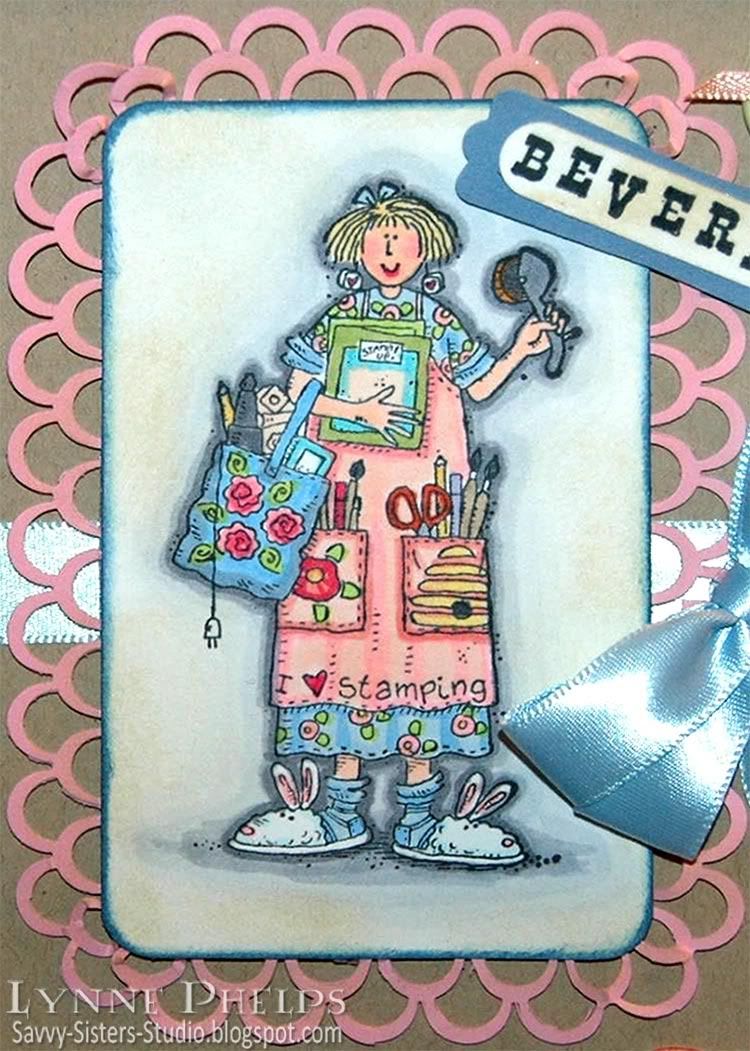
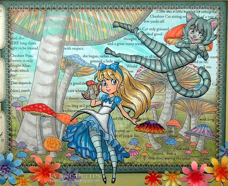
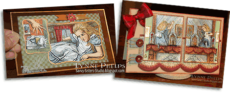
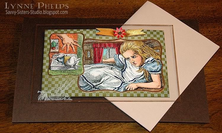
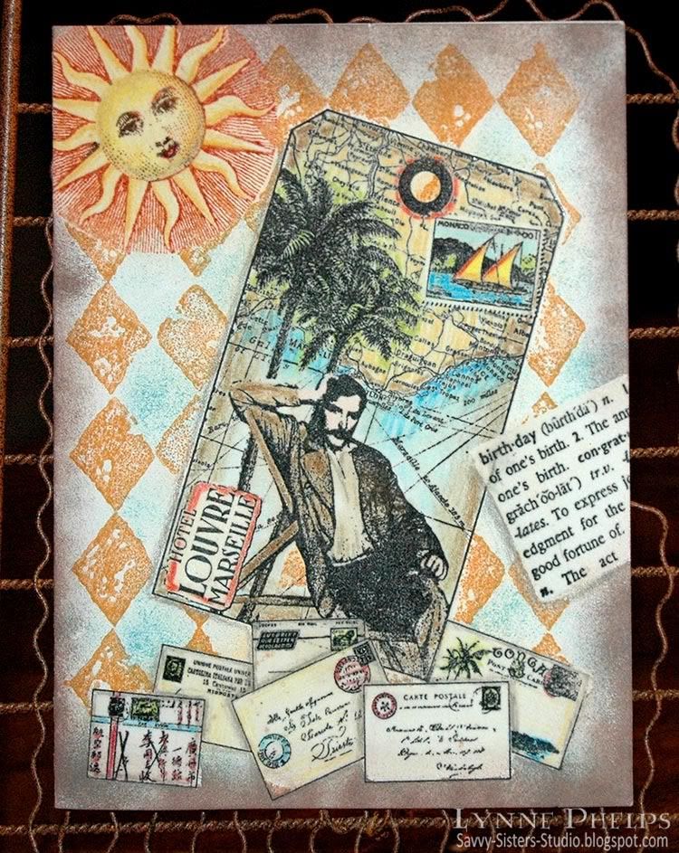
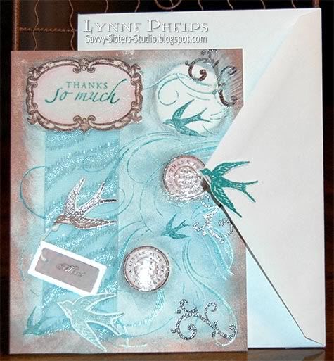
Clear Postcard: Alice has a really bad day!

Photobucket
Click to enlarge

I used a piece of clear packaging that held clear stamps for this one! I edged it with a gold leafing pen and stamped the Herald Rabbit in the corner in white ink.  I printed both images with my B&W laser printer on color laser printer paper, which works really nicely with Copic markers. I die-cut them and edged them with the same gold leafing pen and adhered them to the front.

Photobucket

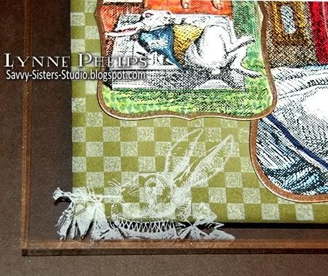
This is a postcard type flat card, no fold. I stamped a checkerboard in white on olive card stock and adhered it to the back of the clear acetate, being very careful to place ahesive where it would be covered by the images on the front side of the plastic.  I cut a couple slots and threaded a ribbon through, then added a small punched flower and stuck a bit of bling in the center!  By having the olive card stock on the back side of my clear postcard, it gives me a place to write a message!

Photobucket
Click to enlarge

This photo is a little sharper, and I laid it on top of some brown and ivory card stock so you could see the clear areas. Fun!

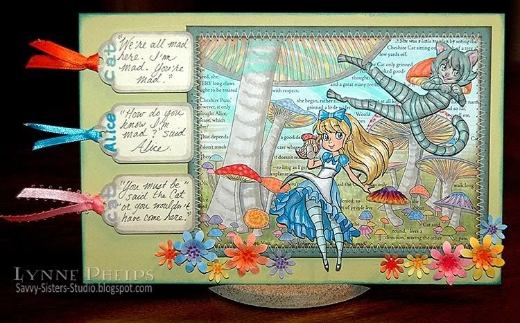
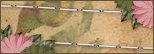
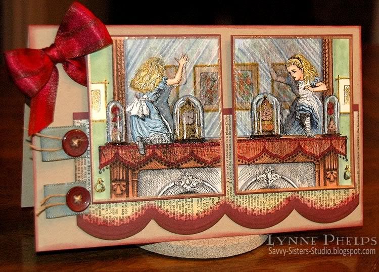
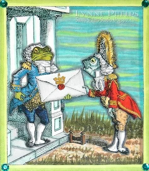
Going Through the Looking Glass

Photobucket
Click to enlarge

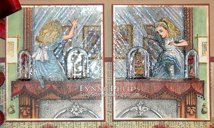
But I also HAD to use the two images of Alice going through the Looking Glass for this challenge!  I printed both with my B&W laser printer on color laser printer paper and colored them with Copic markers.

Then I used a glue pen to follow the reflective streaks across the glass and used an icy blue glitter. I colored over the whole surface of the mirrors with a versamarker and heat embossed with clear detail powder, repeating this step three times. I used detail powder so it would not spread into the areas like her face when it melted.  Next I gave the glass domes over the clock and vase the same treatment but used three or four layers of clear Ultra Thick Embossing Enamel.

Photobucket
Click to enlarge

Sure wish this glorious shiny finish was easier to photograph! Neither photo gives a good feeling for how glassy the finish is and how 3D the glass domes feel!

Remember to go to Oh, Alice! to enter your own creations in our Glass/Clear challenge! Here's some more inspiration from the DT:
I would love to hear your comments, it really makes my day when I hear from you! Everytime a comment pops into my email I get the biggest smile!

Clear Postcard:
Stamps: Free digi images from Lenny's Alice in Wonderland site; Waltzingmouse Stamps - Off Beat Backgrounds; Nature's Blessings - white herald rabbit.
Paper: Stampin' Up! - Old Olive card stock.
Ink: Palette Hybrid Ink: New Canvas (white).
Miscellaneous: Krylon - Pale Gold Leafing Pen; Ribbon.
Tools: EK Success - small daisy punch; Spellbinders - Labels Eight Nestability dies.

Looking Glass Card:
Stamps: Free digi images from Lenny's Alice in Wonderland site.
Paper: Papertrey Ink - kraft; Stampin' Up! - burgundy card stock; Old dictionary page.
Ink: Ranger Distress Ink - Scattered Straw, Aged Mahogany, Walnut Stain.
Miscellaneous: Ribbon; Buttons.
Tools: EK Success - scallop border punches; Bow Easy
    

Wednesday, July 28, 2010

Quick Collage Stamping

One night after dinner at my sister's house, she asked for a quick demo of this emboss/resist technique I kept telling her about. We moved into the craft room and I had fun raiding her stamp stash. Isn't it fun when you get to play with other people's toys? I picked out a background stamp, a focal image tag stamp, a birthday definition, a sun, and an accent image of letters and postcards. I set up near the heat gun, got out the clear detail embossing powder, located a versamarker pen and prismacolors and a few inkpads in my favorite colors. Now we were ready to roll!

Photobucket
Click to enlarge

This is a true one-layer card - this started off as a plain cream card front. There is no patterned paper or pre-colored images. When you stamp with the emboss/resist technique, you stamp the items in front first and move your way to the background. So the order here was:
  1. Envelopes
  2. Birthday dictionary definition
  3. Tag image
  4. Sun
  5. Diamond background
I stamped the envelopes near the bottom of the card front and colored them in with Prismacolor pencils. Notice that I colored in some gray shadows where one envelope overlapped another; this adds a lot of dimension without adding any layers. Then I colored over the whole stamped image with a Versamarker pen, which writes with clear watermark/embossing ink. I sprinkled clear detail embossing powder over the whole colored image and heat embossed. Now this layer of stamping will not be affected by the stamping that will come after it, as the embossing will repel future applications of ink.

Photobucket
Click to enlarge

Points for perfection: This card shows several flaws that happened with the Versamarker step. I was trying to move too fast and should have taken a bit more care. See the bottom corner of the envelope just to the left of middle?  I missed coloring in one little corner with the Versamarker, so the brown sponging that came later was able to stain the unprotected corner.  On several of the other envelopes, my Versamarker coloring went just outside the lines, so the subsequent brown sponging left white gaps where the embossing resisted the ink.  To avoid these problems, color the Versamarker up to the lines but not on or over the lines. It is better to be inside the lines than out of them.

I stamped the birthday dictionary defintion at an angle, colored a rectangular area with a Versamarker to encompass the text and heat embossed with clear detail powder. Next I stamped the tag. Although it is actually stamped on top of the envelopes and birthday definition, the glossy embossing does not accept the ink and easily wiped clean.  I colored in the tag with Prismacolor pencils, covered the entire surface with a Versamarker and heat embossed with clear detail powder.

Then the sun was inked with bright copper, then a dark brown inkpad was dabbed onto the eyes, nose and mouth, then stamped and colored in with Prismacolor pencils.  I colored with a Versamarker on the sun face and yellow rays, but NOT over the copper radient lines. Then I heat embossed the sun with clear detail powder.

Photobucket
Click to enlarge

Last, the diamond background was stamped with ochre ink over the entire surface. The open areas of the pattern were sponged with turquoise blue. Dark brown was sponged all around the edges. Notice how you can see the diamonds through the sun's radient lines but not in the yellow rays.  A slightly damp paper towel was used to wipe all the embossed surfaces clean of ink.  Shadows were added with a gray Prismacolor pencil around some elements to give a more 3D look. Voila!
Once you get used to the steps, this is a really fast technique, without the hassle of making masks out of paper. About 30 minutes for this card, not counting the stash raiding time! ;-)

Photobucket

I am entering this in the Cinema Saturday Creative Challenge #89: Casino Royale. Although this man has a moustache, he reminds me of Bond lounging on the Mediterranean coast while he was happy with his love, before the betrayal. The European locale, the travel implied by the map, it all makes me think of the movie. The envelopes remind me of all the nationalities of the players in the poker game in the beginning. I know I am missing a silhouette, I just couldn't figure out how to work it in!

I hope you'll give the emboss/resist technique a try!  Please leave me a comment, I love to hear from you!

Stamps: Tin Can Mail (Inkadinkado) - tag and envelopes; Hero Arts - birthday definition; A Stamp in the Hand - sun; Stampin' Up! - Print Pattern (background).
Paper: Value Pack - 5 x 6.5 inch ivory card and envelope.
Ink: Marvy Matchables - black, copper, brown, turquoise and ochre; Tsukeniko - Versamarker; Prismacolor - colored pencils.
Miscellaneous: Ranger - clear detail embossing powder; heat gun; sponges.

Saturday, July 24, 2010

Why is a Raven like a Writing Desk? Oh, Alice! CHAPTER 23 Challenge

The Hatter opened his eyes very wide on hearing this; but all he said was, "Why is a raven like a writing-desk?"
"Come, we shall have some fun now!" thought Alice. "I'm glad they've begun asking riddles. — I believe I can guess that," she added aloud.
"Do you mean that you think you can find out the answer to it?" said the March Hare.
"Exactly so," said Alice.
"Then you should say what you mean," the March Hare went on.
"I do," Alice hastily replied; "at least--at least I mean what I say--that's the same thing, you know."
Hello everyone! We are ready to FLY with this week's challenge here at Oh, Alice! This week, we challenge you to use BIRDS on your card or papercrafting project! We may never know the answer to the riddle above, but while we're pondering that and life's little mysteries we may as well make a great card or two in the process, right? Link your creations on the Oh, Alice! challenge blog.

Photobucket
Click to enlarge

Alice in Wonderland has never been out of print since it was published in 1865, and the Mad Hatter's riddle has been one of the most discussed parts of the story ever since. Charles Dodgeson (Lewis Carroll) was a mathmetician and a logician who wrote many wonderful puzzles and riddles! According to Lenny's Alice in Wonderland site, the author had no answer for the riddle at the time of writing, but later said this:
"'Because it can produce a few notes, tho they are very flat; and it is nevar put with the wrong end in front!' This, however, is merely an afterthought; the Riddle as originally invented, had no answer at all."
-- Charles Ludwidge Dodgson (Lewis Carroll)
PhotobucketCertainly the caw of a raven can be said to be flat as it is not a melodic birdsong, and you don't get much flatter than paper!

At the time it was written, a writing desk usually had a sloping top surface, and often referred to what we would think of as a lap desk. It had space inside for paper, pen nibs and pen handles, a compartment for an inkwell and perhaps a "wax jack" to hold a seal and sealing wax.  So Carroll's response is even more clever than it appears, as "nevar" in his response is not a misspelling of never, but rather RAVEN spelled backwards! Because a writing desk always had a sloping top, you would never use it with the back in front!

I love this answer to the riddle written by Clare (found at the Lewis Carroll Society of North America) also referring to the sloping surface:

Eat your supper off a writing desk and you will find,
The experience can be rather UNKIND.
For into your soup you might sink your bread,
And find it is covered in black ink instead!
So if you are RAVENous -
(And rather unstable),
You will find it is best to eat off a table.

The collective noun for a group of ravens is an unkindness: "an unkindness of ravens" (like a pride of lions or a pod of whales). Don't you love collective nouns? When we are hungy, we say we are ravenous, and trying to eat with your soup bowl set on an unstable slope on your lap could result in an unkind (and uncomfortable) experience!

Many others came up with answers to the riddle. A favorite by Loyd is "because Poe wrote on both of them," referring to Poe's poem "The Raven" which was presumably written upon a writing desk! And Lenny's mentions another: "Because there's a B in both and an N in neither". Very tricky to answer a riddle with another riddle! And John DeHaven wrote: "One contains a river that runs forward (Esk) and the other contains a river that runs backwards (Neva)."

Needless to say my card was inspired by all the responses to the riddle.

Photobucket
Click to enlarge

The card base is folded to a 5½ inch square and sponged around the edges with a deeper shade. I glued a dictionary page to a piece of white card stock and punched it with this great card suits border punch! Then I colored red and black squares on a strip of scrap paper and adhered it so the color shows through the punched holes. Love that - my favorite new "Alice" punch!  Then I adhered a strip of "raven black" ribbon parallel to the border.

Photobucket

I thought this stamped image of various pen nibs was perfect to represent the"writing" part of the riddle. I stamped it twice so I could form a band across the middle of the card front. I left the little postmark but trimmed away all the writing underneath that was part of the stamp image, so I was left with only the pen nibs.

Next I stamped this great building! Although it looks more Rococo than Victorian, there certainly would have been buildings like this around during Carroll's lifetime. I enjoyed coloring in the brickwork in warm rose shades. Then I carefully trimmed out the window and door openings using my new favorite fingertip craft knife, which gives you so much more control than a regular Xacto knife handle.

Then I took the page of the dictionary that contained the word "Riddle" and trimmed out pieces to adhere behind the openings. I was careful to position the pieces so the four different definitions of riddle show through the door opening. I am probably easily amused but this little detail makes me really happy!  I used a muted blue-green marker to draw some shadows around the openings and then sponged a gold color in the center to give each window a glow. I liked the golden glow so much that I sponged the punched card suits border with the same.  I positioned it so the building extends above the top of the card front and adhered it with dimensional foam tape.

Photobucket

I stamped the bird, which I think looks like a crow or raven, on a scrap of card stock and colored it in with a gray marker. Then I colored over the whole thing with a clear Versamarker and heat embossed it with clear detail powder, then carefully trimmed it out. I mounted it over the building with foam tape. Then I wrote the word "CAW!" on a scrap and drew a cartoon style speech balloon around it, trimmed and mounted it. This is to serve as a reminder about the "flat notes" produced by the raven!


Click to enlarge

I computer generated the riddle and my multiple choice favorite answers! I sponged each of them with beige to age them and burgundy around the edges. The riddle is on foam mounting tape and the answers are stuck on with glue dots. I ran jute string through the button holes and added the buttons with more glue dots. I positioned it so it appears that the raven is standing on the answer strip.

Here are some samples from the rest of our amazingly Twisted Tea party - enter your own creation at Oh, Alice! to play along with us:
I have to admit this is my favorite card that I've created for Oh, Alice! so far, as all the little details make me really happy! OTT style again (over the top) but I really get into detail. I guess I'll never be a "less is more" person; more = more in my little world! ;-)  Please leave me a comment and let me know what you think about this post; about riddles, about ravens, writing desks or my card! I'd love to hear from you!

Stamps: Stampington (Michelle Ward) - bird; A Stamp in the Hand - building; Limited Edition Rubber Stamps - pen nib collage; sentiments were computer generated.
Paper: Papertrey Ink - Ocean Tides card stock; Beckett - Expression Radience (white); Old dictionary pages.
Ink: Memento - Tuxedo Black; Copic - Multiliner SP, Sketch markers; Ranger Distress Ink - Broken China, Scattered Straw, Antique Linen, Aged Mahogany.
Miscellaneous: Buttons; Ribbon.
Tools: EK Success - Card Suits border punch; Stampin' Up! - Curly Label punch; Fiskars - Fingertip Craft Knife; Bow-Easy; Ranger - Inksentials Ink Blending Tool and foam pads.
  

Thursday, July 22, 2010

Carte Postale Thank You - A One-Layer Card Through the Magic of Emboss/Resist!

As much as I love Copic alcohol markers, I also love other coloring techniques! This card features coloring with Prismacolor pencils and sponging, used with my favorite emboss/resist technique. Other than the little cutout birds, ribbon,  and the vellum tag, this is a one layer card that started out as plain white card stock!

Photobucket

With the emboss/resist technique, you start by stamping the foreground elements first. So the frame was stamped in brown, the sentiment was stamped in teal, then it was colored colored in with a soft pink colored pencil and blended with odorless mineral spirits (sometimes called Gamsol) to smooth it out. You first color with Prismacolor pencils, then you take a paper blending stump and lightly dampen the tip with odorless mineral spirits and rub it over the coloring to smoothly blend. TIP: Remember to work in a ventilated area - odorless does NOT mean vapor-free, so work safe! Then I colored over the entire frame area with a Versacolor marker, being VERY careful not to go outside the outer line. This is the same clear watermark ink as comes in Versamark ink pads. Then I heat embossed the whole thing with clear detail embossing powder. This coats it with a shiny plastic-like finish so it will resist anything that comes later - it will wipe clean with a slightly dampened paper towel. The same thing was done with the two pink circles.

Next I stamped the large flourish and bird background stamp by inking it first with Versamark and next with a teal dye ink. This double-inking technique allows me to heat emboss with any dye ink; I heat embossed the background with clear detail embossing powder. It did not stick to the areas that were previously embossed.

Photobucket

Next the brown flourishes were stamped around the outer edge. It looks like the are behind because they don't stick to the embossed background image.

I punched a circle out of a Post-It note and stuck it on while I sponged brown all around the edges and teal in the center area. The circular Post-It note mask was removed and shadows were added around some elements with Prismacolor pencils. The heat embossed foreground elements were wiped clean with a damp paper towel. My white card was completely gone, and my card was still ONE layer!

I cut two slits for a sparkly ribbon to pass through, along the bottom edge of the frame and another just above the brown sponging along the bottom edge. I stamped the bird twice, once in brown, once in teal, heat embossed and cut them out. I stamped "Merci" in brown ink on a pale pink vellum tag and heat embossed. I taped the end of the knotted string to the back of one of the birds and adhered them with foam tape over the ribbon.
Photobucket

Can't forget the envelope! I added some stamping and sponging to the front left corner. On the back, I adhered a stamped and cutout bird to the tip of the envelope flap.

This card was for my sister, Janet, and she LOVED it! She has a clear acrylic store-type revolving card rack in her craft room and this card occupies a place of pride! I love the emboss/resist technique. To do this the "old" way you would have to stamp and trim out paper masks for everything, and this technique is so much easier and a lot more fun!

What do you think? Ready to try it? Leave me a comment and let me know what you think! :-)

Stamps: Stampin' Up! - Carte Postale set, Finials & Frames set, Sincere Salutations set, Circle of Friendship set, French Flair background.
Paper: Value Pack - white 5-inch x 6.5 inch white card and envelope.
Ink/Coloring: Marvy Matchables dye ink pads; Prismacolor colored pencils.
Miscellaneous: Metal-rimmed vellum tag; ribbon.
Tools: Sponges; Paper blending stump; Odorless mineral spirits.

Saturday, July 17, 2010

Oh, Alice! CHAPTER 22: Dancing under the Sea...

Photobucket
"Will you walk a little faster?" said the whiting to the snail;
"There's a porpoise right behind us and he's treading on my tail!
See how eagerly the lobsters and the turtles all advance!
They are waiting on the shingle, will you come and join the dance?
Will you, won't you, will you, won't you-WILL you join the dance?"
Hello everyone! Greetings from here in Wonderland...or maybe today it's UNDERland? As in Under the Sea, perhaps ;)

So, today's challenge involves all things sea-worthy and we at Oh, Alice!are challenging YOU to create a card or project using sea life! Turtles, whales, dolphins are fabulous as are other sea creatures as in merfolk and those deep, dark creatures you sometimes hear about but seldom see.... the possibilities are as endless as the ocean itself! We also have a FUN prize for you this week! One lucky winner will receive a Sweet Pea Rubber Stamp courtesy of Oh, Alice! These stamps are large and BEAUTIFULLY detailed and we just happened to have one 'swimmin' around!' Will YOU be the lucky winner? ;)

My 1st Undersea Card - Just a Note:

Photobucket
Click to enlarge

As soon as I saw this challenge, I immediately thought of the illustration where the Queen's fishy footman delivers and invitation to the Duchess' frog footman!  I used a free digital image and just went in with an eraser tool and cleaned out the background of trees--I was moving the Duchess' house undersea!  I printed the image on color laser printer paper and had a great time coloring with Copic markers. I just LOVE to color!  I did not have the right color to mat the image (no packs of screaming neon green in the stash, go figure!) so I cut out a white mat and colored it round the edges with YG01 and 03, just where it would show.

Then I glue sticked the fish page of an old dictionary to a piece of white card stock and die-cut and embossed it with my Cuttlebug. While it was still in the die, I sponged it with blue and yellow-green.  Then I drew some wavy, watery lines across with glue and adhered various beads. What a fun look!  While waiting for this to dry, I took a narrow strip of card stock and covered the front with adhesive. I used some repositionable adhesive to stick it down to the table (otherwise you need three hands for this, trust me!) and ruched the neon green satin ribbon going down the length. I also die-cut and embossed a ribbon tag, again sponging it while it was still in the die, then stamped my sentiment on it. Isn't "Just a note" perfect for this image? It actually bows out a ways from the card front - love that extra touch of dimension!  The yellow-green sponging actually matches the bright green ribbon fairly well, but because they are such different textures the camera picks it up differently. It is NOT gold as it appears in the photo.

I ran teal double-faced satin ribbon through the ribbon tag and stuck the ends down. Then I ran a vertical strip down the left side of the card base to ground my neon green ruffles, which were adhered next. I made a teal bow (thank you, Bow-Easy!) and nestled it into the ruffled ribbon with a glue dot. The dictionary panel was adhered with foam mounting tape, and it actually curves up onto the ruched ribbon. The main image panel was added next with foam tape.  It needed something - the ribbon at left was so textured and glossy, and the beads on the central panel were so shiny and colorful. So I added a rhinestone at each corner, and colored it with a teal Copic to match my card. Perfect!

Here is a closeup of the coloring and colored bling and colored mat!

Photobucket


Soooo.... is it TOO much? You know my style is OTT (over the top) and this card may have just gone a bit too far, but it makes me smile every time I look at it! The dressed up fish and frog just make me giggle! Tell me what YOU think! Please leave me a comment, as I'd love to hear your opinion!

My 2nd Undersea Card - You're Looking Good:

Although it doesn't look underwater, this illustration of a lobster primping for the Lobster Quadrille was way too appropriate to pass up! So here I am with minutes before the deadline adding a second card to this post:

Click to enlarge

The process was similar to the first card, just a different color scheme!  Isn't this such a fun image?  The dictionary page scallop panel is popped up on foam mounting tape. I like the way it extends beyond the card base.  Buttons have jute twine run through the holes and they are adhered with glue dots. The orange button was more coral until I hit it with a Copic marker; I also edged the gold double-faced satin ribbon with a Copic marker, love that look!

So dive in and play with us! Be sure to upload your card or creation using the InLinkz on the Oh, Alice! Challenge Blog! You have until Friday, July 23rd at 8pm CST to enter the challenge and have a chance at the prize, so have fun and we'll see you back next week! If you are uploading to a public gallery, be sure to include keyword OAC22.

As always, your comments are what make blogging worthwhile. I'd love to hear from you!

JUST A NOTE
Stamps: Free Alice image from Lenny's Alice in Wonderland site; Flourishes - Taglines (Just a note sentiment).
Paper: HP - Color laser printer paper; Stampin' Up! - Cool Caribbean card stock; Georgia Pacific - white card stock; Old dictionary page.
Ink: Palette - Noir hybrid ink; Ranger Distress Ink - Broken China, Mustard Seed.
Miscellaneous: Beads - microbeads, seed beads, bugle beads; Ribbon - double-faced satin ribbon from Hobby Lobby; Ranger - Glossy Accents glue.
Tools: Spellbinders - Label Eight Nestability die, Ribbon Tag Trio die; Ranger Inksential blending tool and  foam.

YOU'RE LOOKING GOOD!
Stamps: Free Alice image from Lenny's Alice in Wonderland site.
Paper: HP - Color laser printer paper; Papertrey Ink - Ocean Tides card stock; Georgia Pacific - white card stock; Old dictionary page.
Ink: Ranger Distress Ink - Broken China, Scattered Straw, Spiced Marmalade.
Miscellaneous: Ribbon - double-faced satin ribbon from Hobby Lobby; Buttons; May Arts - Jute twine.
Tools: Spellbinders - Label Eight Nestability die; Ranger Inksential blending tool and  foam.
 

Tuesday, July 13, 2010

Your Gift Made Me Very HOPPY!

As a plus sized person who likes Weight Watchers when I can afford it (rarely, too bad) I could not resist this House Mouse stamp I found at Hobby Lobby!  My sister is a lovely and slim WW receptionist, so I thought she would get a kick out of this thank you card!

Photobucket

I stamped it onto color laser printer paper and colored it with Copic markers. I had a cat related mishap when Beignet made the leap onto my table, resulting in a huge blob of ink on the background! What to do? I was still really pleased with how the coloring turned out, especially the effect on the dial of the scale with the spinning needle!  LOVE this image! I had just spent all that time coloring it, so I decided to trim it out close to the image and glue-stick it to white card stock, which I decorated with border and matching corner punches.

After the ink mishap I had lost a lot of energy around this card. The multiple stamping of the thank-you sentiment did not turn out as I had imagined - I had hopped hoped for dark - medium - light and what resulted was dark - light- lighter. I was trying to echo the way I had colored the spinning needle on the scale. Oh well!  I'll do more experimenting next time and I won't try it on the card base that already had the image panel firmly adhered!  Some green organza ribbon and a few score lines finished it off.

Inside I took a white gel pen and drew a bouncing dashed line representing the path of a hopping bunny, which ended in the words "Your gift made me very HOPPY!"

Do you have any stamping disaster stories and creative solutions? Leave me a comment, I'd love to hear about it!

Stamps: House Mouse - bunny image; Stampin' Up! - Sincere Salutations set.
Paper: Stampin' Up! - orchid card stock; Georgia Pacific - white card stock.
Ink: Memento - Rich Cocoa; Copic - alcohol Sketch markers; Marvy Matchables - purple.
Embellishments: Organza ribbon.
Tools: Martha Stewart Crafts - Loops Punch Around the Page border and corner punches.
  

Monday, July 12, 2010

Remember Stella Stamper?

I know many of you are not Alice addicts, so I want to assure you that I have some projects coming that are more varied! To start, I thought I would share an 8 x 8-inch scrapbook layout I made for Beverly, a dear stamping friend!  Another stamping friend, Terrie, had organized a fabulous surprise birthday party, and we were each to bring a written memory or scrapbook page. What fun, and what a memorable gift for Beverly!

Photobucket

Do you remember Stella Stamper? She was a very early stamp set from Stampin' Up!, and look at these great sentiments! I initially tried to use just a few, but  it was way too hard to decide which ones to leave out, so I have used every single stamp in this very large set! 

I started with an 8-inch square of kraft card stock, with edges sponged with dark pink. I stamped all the small sentiments and images with a 1-inch square punch, and sponged each with beige and the edges with dark pink or blue. I trimmed out the larger image and sentiment and sponged them the same way. 

Photobucket
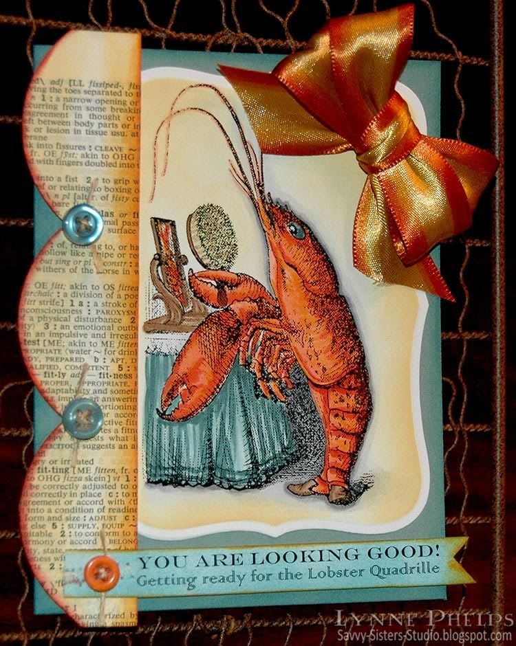
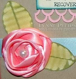
Notice the ribbon flower! This was my first time making a coiled ribbon rose. It was SO EASY! I punched a circle of card stock and covered it completely with my Glue Glider Pro so the entire surface was covered. Then I took some 5/8-inch pink satin ribbon and stuck the smallest possible piece of the end of the ribbon down in the center of the circle to anchor it. Then I twisted the ribbon into a loose coil and tacked it down to the adhesive in a spiral going out from the center. Easy peasy lemon squeezy! It does not show in the photo, but I edged the ribbon with a darker pink Copic marker so it has some variegation in the coils.  The leaves are made with a circle punch and a paper crimper.  I put a large plastic pearl on my paper piercer so I could control where the hole was as I lowered it into a little pool of Diamond Glaze (Crystal Effects) glue.

Photobucket

Then I had a glorious time coloring in Stella Stamper! I gave her Beverly's blonde hair and labeled her with a little alphabet set from the bargain bin at Michaels, and used the same to say it was from me and my sister, Janet. Stella has got it all goin' on, and she is prepared for any stamping emergency!  I greatly admire the coloring of Mary Giezma, and one of the things that makes her style distinctive is the dark shadow outline she puts around things. I have been working on adding shadow outlines to my own colored images, but I have a long way to go before I achieve Mary's artistry! I sponged the white areas remaining with beige and edged with blue.

The punched frame was made with a border punch. I punched a long strip and then trimmed it to leave just over a quarter inch of solid paper. I ran adhesive down the length, and whenever I got to a corner, I clipped the solid paper so I could turn a corner with it. I saw this technique demonstrated by Heartfelt Creations at a show, and you can see it HERE on their blog.  This technique works best on curved shapes, and would have worked better if I had curved the corners more. Live and learn!

I have not done much scrapbooking and that probably shows. My memories with Beverly are all stamping related, so I treated Terrie's "assignment" as an oversized card! Beverly is a Stampin' Up! demo, so I thought this stamp set was extemely appropriate.  All the sentiments took the place of any journaling I might have done.

I hope you have enjoyed this blast from the past! You can often find a Stella Stamper set on eBay, which is where I found mine. Her fashion may be a bit out-dated but the sentiments (and bunny slippers) are timeless, LOL!

Please leave me a comment, I love hearing from you!

Stamps: Stampin' Up! - Stella Stamper.
Paper: Papertrey Ink - kraft card stock; Beckett - Expressions Radience (white); Stampin' Up! - pink and dark periwinkle card stock.
Ink: Memento - Tuxedo Black; Copic - Sketch markers; Ranger Distress Ink - Worn Lipstick, Broken China, Faded Jeans, Antique Linen, Peeled Paint.
Embellishments: Ribbon; buttons; plastic pearl.
Tools: EK Success - 1-inch square and 1¼-inch circle punch; Stampin' Up! - Curly Label, Modern Label and Word Window punches; Martha Stewart - double loops border punch.

Saturday, July 10, 2010

Oh, Alice! CHAPTER 21: Breaking All the Rules...

"At this moment the King, who had been for some time busily writing in his note-book, cackled out `Silence!' and read out from his book, `Rule Forty-two. ALL PERSONS MORE THAN A MILE HIGH TO LEAVE THE COURT.'

Everybody looked at Alice.
`I'M not a mile high,' said Alice.
`You are,' said the King.
`Nearly two miles high,' added the Queen.
`Well, I shan't go, at any rate,' said Alice: `besides, that's not a regular rule: you invented it just now.'
`It's the oldest rule in the book,' said the King.
`Then it ought to be Number One,' said Alice. "
PhotobucketHello everyone! Today we have a fun and rather rebellious challenge for all of you out there in WONDERLAND! We start out with a lovely sketch by Sammi. The catch? You must RE-CREATE this sketch somehow. Switch out a panel or two, flip on its side, upside down, etc. There are no rules except to BREAK them, meaning you can't follow the sketch exactly! Makes no sense right? GOOD. :)

Today we also are thrilled to announce another wonderful sponsorship from SPESCH DESIGNER STAMPS! [Blog | Etsy Store] Thank you so much to Tracey Feeger for allowing the DT to work with your adorable images! Tracey is offering a prize of a VERY generous $10 Gift Certificate to the Spesch Designer Stamps Store! Be sure to check out all of her cute designs and be sure to play along this week for your chance to WIN! Go ahead...BREAK all the rules...you KNOW you want to! Just go to the Oh, Alice! Challenge Blog and link your creation!

Photobucket

I was totally inspired by the new movie - I loved the mushroom landscape and wanted to capture some of the feel of this poster on my card. I also adored the Cheshire Cat and the way he swam through the air. As soon as I saw this adorable cat and saw that it would work well horizontally, I knew exactly what I wanted to do! I traced the mushrooms from the poster, and added the text from chapter six, when this scene takes place.  Then I colored in the scene with Copic markers.


Photobucket

I colored the cat to be similar to the Cheshire Cat in the movie, warm gray with turquoise stripes and eyes! I cut both figures out after coloring and mounted them on thick dimensionals - they actually are raised quite a bit above the background. Then I added some light blue-green swirls to indicate the Cheshire Cat's "swimming" trail -- or maybe I should say the wake left by swimming through the air!  The flowers I made by coloring circles of color on cardstock and then punching them out with two sizes of daisy punches. I curved the petals by hand, which gives them so much dimension!

Photobucket

So how did I break the rules? I ditched the diagonal background, the mat for the focal image goes all the way around, and instead of having my sentiment in the corner, I spread it across the three embellishment spots. I edged three tags with light and medium warm gray, slipped ribbons into the holes, and handwrote the quoted text from chapter six with a Copic Mulitliner SP pen.  To be sure the coversation bounce was clear, I decided to write the name of the speaker across the end of the tag, which added a more graphical element.  They are mounted on the cards with really thick dimensional foam. 

Photobucket

Here are some samples from the rest of our amazingly Twisted Tea party:
Good luck to all you rebels out there, and be sure to link your creation on Oh, Alice before July 16th at 8pm CST to enter to win!

Please leave me a comment and let me know what you think about my movie-inspired card! I love to hear from you.  And be sure to check out all the WONDERful images from Spesch Designer Stamps. Other Wonderland images available include the Rabbit, Mad Hatter, White Queen and Queen of Hearts. They are all great, and I *NEED* them ALL for my collection, LOL!

Stamps: Spesch Designer Stamps - Alice and Cheshire Cat digi stamps. Background by me!
Paper: Papertrey Ink - Spring Moss, Ocean Tides card stock; HP Color Laser Printer paper; Manilla card stock (unknown).
Ink: Copic - Alcohol Sketch markers, Multiliner SP pens.
Embellishments: Ribbon; Marvy Daisy punches - hand colored flowers.
Tools: Janome - Sew Mini sewing machine; Marvy - medium and small Daisy punches; Tag Punch (unknown).


Monday, July 5, 2010

Oh Alice! - I'm on the Permanent Design Team!!!!

Photobucket

PhotobucketMy June Guest Designer spot on the Oh, Alice! challenge blog ended, and I was sad to see it end as I'd had such fun! You can imagine my joy when Jess, our Mad Hatter, asked me to join the real Design Team (or, as we say here in Wonderland, I was offered a seat at the Twisted Tea Party!) I missed our Chapter 20 Challenge to use red, white and blue as I was on vacation, and since Independence Day is over I am going to ignore that requirement and instead showcase the WONDERful sticker set from our sponsor for Chapter 20: EAD Designs! Play along and you could win a generous gift certificate from their store, and you could buy this Alice in Wonderland sticker sheet!

I have never used stickers before and I had a great time with these. The stickers are printed on a textured clear matte vinyl, but you also have the option of an opaque white material. I wanted the images popped up on dimensional pop-dots, so I adhered them to white card stock and trimmed them out. The words were adhered directly to my banner pennants so that the stamped diamond pattern shows through - it was nice to have that clear option! Another feature of the "Stickerz" that I appreciated is that the words are already trimmed out individually, which made it very easy to place each word exactly where I wanted it - I was not restricted to the way they were presented on the sticker sheet.  Nice job, EAD!!

I wanted to do an alphabet banner with pennants spelling out A-L-I-C-E. I was totally inspired by Lynn Steven's entry in the Gingersnaps Mad Hatter Day blog hop! It wasn't even her main entry - just a small picture of an Alice banner. I HAD to make an Alice letter banner!

Photobucket

Each pennant started as an A4 sized piece of white card stock; one fourth of a letter sized sheet. I scored a fold one-half inch from the top. Along the bottom edge, I used a centering ruler to mark off one inch in the center where I knew my circles would be.  Then I trimmed from the foldline in each upper corner to the inch mark on each side. This left a triangle with the bottom tip cut off!  I stamped a stippled harlequin diamond background in a color to coordinate with the stickers for each particular pennant.

Photobucket

For the "L" pennant, I punched a scalloped and plain circle and some clock hands to create a clock background for the rabbit. They are held together with a brad that is hidden by the watch in the rabbit's hand.

Photobucket

I set up a sheet of text on my computer and printed it out on my B&W laser onto color laser printer paper, which I prefer when I will be coloring the printout with Copic markers. I used several fun fonts as I love the jumbled-up font look.

TIP: Laser printers are best for coloring with Copics as the toner is fused onto the paper with heat, and you can color right over the lines with no fears of smudging. You could also print on an inkjet, and then use a B&W or color copy machine, as they are also toner based and fuse with heat.

I crammed everything I could think of on one page. I had the letters next to words beginning with that letter in a clump. These words were used at the top of each pennant. I had also placed all the words separated instead of clumped, as I was not sure how I would want to place them. This turned out to be a good thing as I wanted the large letter by itself for the bottom of each pennant.  You can see how I set the page up at left.

I adhered the different blocks of words with a glue stick to white card stock so it would be stiff enough to mount on dimensionals.

Photobucket

I trimmed out each block of words and notched the ends with a square punch then colored it with Copics. Buttons were stacked and tied together with black twine tied in a bow.

Photobucket

I punched each letter with a one-inch circle punch and colored it with Copics. Then I adhered it to a 1¼ inch black card stock scallop circle punch out.

Photobucket

I punched a strip of black card stock for each side with a scallop border punch. I adhered it behind the pennant so only the open scallops are exposed.


When I had all the pennants created, I cut a long length of hemp twine (found in the jewelry section) and placed it in the fold before adhering the flap down. I preferred the hemp twine for this as it is much smoother than jute twine - the pennants can actually slide along the twine.

Photobucket

I have not decided where to put it, but I draped it on this fun metal-framed mirror and I kind of like it here! The character of the mirror seems to lend itself to Alice, and I like the whole "Looking Glass" connection, a little visual pun that give me pleasure. Besides, I would rather look at my Alice banner and the tagged Alice sign than my own reflection any day!!! ;-)

Remember you can play along with the Oh, Alice! Chapter 21 challenge, which is to use red, white and blue.  If you win, you will get an EAD Designs gift certificate!

Check out the creations from the other members of the Oh, Alice! design team:
Please leave me a comment and let me know what you think about my Alice banner! It is always WONDERful to hear from you!

Stamps: Stampin' Up! - Harlequin diamond background; River City Rubber Works: card suits cube.
Paper: Georgia Pacific - white card stock; Stampin' Up! - black, pink and burgundy card stock.
Ink: Marvy Matchables - various colors for backgrounds.
Embellishments: EAD Designs - Alice in Wonderland Stickerz
Tools: Tim Holtz - Design Ruler; Fiskars - Apron Lace border punch; EK Success - Paper Shaper 1-inch circle and 1¼-inch scallop circle punches, Clock Hands punch; Scor-Pal.
  

Thursday, July 1, 2010

Metal Tooling: Large Chipboard H for Hannah!

I made a large "R" for Rebekah a few months ago, and I really love how it turned out. I thought I would make an "H" for Hannah's birthday! It starts by picking out five to seven words that describe a person or their activities. Once you have the list of words, it is all downhill from there!

Photobucket

Start by tracing the outline of the chipboard letter on a piece of paper. Then draw some bands across, with a line to mark the top and bottom of the band. I like to use curved bands. Then lightly letter a word into each band and see how they fit - you may have to erase and try again. Once you have the word layout, trace around the chipboard letter again, this time on your piece of metal. VERY LIGHTLY on the front, make marks where the bands and letters will go; make the marks as light as possible. Then turn the metal over, and on a padded surface and a ball tip, make raised lines and letters. From the front, on a glass or acrylic mat, refine the area around each letter with a teflon calf's foot tool.

Photobucket

Between each word band, fill in by placing metal over a pattern mold. First use a jumbo blending stump to rub the pattern into the metal, then a rounded teflon tip, finally with a fine point teflon tip.

TIP: PLEASING PATTERN PLACEMENT
A design like this could be pretty chaotic. There are a couple of design primciples at work that make it a very harmonious layout instead!
  1. First, there are repeating elements. The same small scale pattern is used on all four ends. Where patterns do not have an exact match, they have a match that is the same scale and character.
  2. Second, the design is well balanced. The two largest motifs, the stylized floral medallion on the left side and the stylized fleur dis lis on the upper right are diagonally opposite. The small square grid pattern is on both legs of the "H" and the same pattern is used "on point" to create diamonds, also used on both legs. A Moorish tile design on the right is balanced by a Moorish-feeling pattern on the left, so the whole cross bar is covered with similar scale and similar character patterns. The smallest motif, the grid that can be used square or on point was used on and near the ends, including being used as background on the large fleur dis lis
When the design was completely tooled, I covered the surface of the chipboard letter with Scor-Tape. I turned the metal, front side down onto a padded surface, and centered the adhesive covered chipboard letter and pressed it down firmly to the metal. A Tim Holts scissors was used to trim the metal to the edge of the chipboard, then a patterned wheel was run around the edges of the metal to give it a finished look.

 Photobucket

TIP: USE PAINT TO ANTIQUE YOUR METAL TOOLING
Then comes the magic! My shiny tooled aluminum looks like shiny tooled aluminum. Not quite the look I was going for! I dabbed a make-up sponge into black acrylic paint and sponged the chipboard edges and the metal. Paint was sponged on the entire surface, then brushed off the high points with a clean spot on the sponge. Voila - instant pewter! The difference is amazing and it only takes a moment!

I hope you will try making a letter like this! It is fun, quick and easy and is so personal and fun! Leave me a comment, I'd love to hear what you think!

Paper: The Paper Studios - large chipboard letter; Maid O' Metal - aluminum tooling foil
Tools: Ten Seconds Studio - teflon metal tools, molds, pattern wheel, mats, paper blending stump
Miscellaneous: Black acrylic paint, Scor-Tape, Tim Holtz scissors
   
Related Posts with Thumbnails