


Click to enlarge
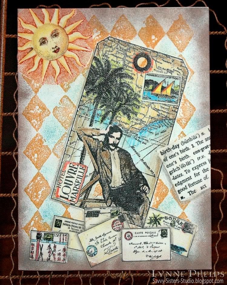
This is a true one-layer card - this started off as a plain cream card front. There is no patterned paper or pre-colored images. When you stamp with the emboss/resist technique, you stamp the items in front first and move your way to the background. So the order here was:
- Envelopes
- Birthday dictionary definition
- Tag image
- Sun
- Diamond background

Click to enlarge
Points for perfection: This card shows several flaws that happened with the Versamarker step. I was trying to move too fast and should have taken a bit more care. See the bottom corner of the envelope just to the left of middle? I missed coloring in one little corner with the Versamarker, so the brown sponging that came later was able to stain the unprotected corner. On several of the other envelopes, my Versamarker coloring went just outside the lines, so the subsequent brown sponging left white gaps where the embossing resisted the ink. To avoid these problems, color the Versamarker up to the lines but not on or over the lines. It is better to be inside the lines than out of them.
I stamped the birthday dictionary defintion at an angle, colored a rectangular area with a Versamarker to encompass the text and heat embossed with clear detail powder. Next I stamped the tag. Although it is actually stamped on top of the envelopes and birthday definition, the glossy embossing does not accept the ink and easily wiped clean. I colored in the tag with Prismacolor pencils, covered the entire surface with a Versamarker and heat embossed with clear detail powder.
Then the sun was inked with bright copper, then a dark brown inkpad was dabbed onto the eyes, nose and mouth, then stamped and colored in with Prismacolor pencils. I colored with a Versamarker on the sun face and yellow rays, but NOT over the copper radient lines. Then I heat embossed the sun with clear detail powder.
Click to enlarge
Last, the diamond background was stamped with ochre ink over the entire surface. The open areas of the pattern were sponged with turquoise blue. Dark brown was sponged all around the edges. Notice how you can see the diamonds through the sun's radient lines but not in the yellow rays. A slightly damp paper towel was used to wipe all the embossed surfaces clean of ink. Shadows were added with a gray Prismacolor pencil around some elements to give a more 3D look. Voila!
Once you get used to the steps, this is a really fast technique, without the hassle of making masks out of paper. About 30 minutes for this card, not counting the stash raiding time! ;-)
I am entering this in the Cinema Saturday Creative Challenge #89: Casino Royale. Although this man has a moustache, he reminds me of Bond lounging on the Mediterranean coast while he was happy with his love, before the betrayal. The European locale, the travel implied by the map, it all makes me think of the movie. The envelopes remind me of all the nationalities of the players in the poker game in the beginning. I know I am missing a silhouette, I just couldn't figure out how to work it in!
I hope you'll give the emboss/resist technique a try! Please leave me a comment, I love to hear from you!
Stamps: Tin Can Mail (Inkadinkado) - tag and envelopes; Hero Arts - birthday definition; A Stamp in the Hand - sun; Stampin' Up! - Print Pattern (background).
Paper: Value Pack - 5 x 6.5 inch ivory card and envelope.
Ink: Marvy Matchables - black, copper, brown, turquoise and ochre; Tsukeniko - Versamarker; Prismacolor - colored pencils.
Miscellaneous: Ranger - clear detail embossing powder; heat gun; sponges.


You always give so much detail on how to make your cards, it's wonderful. I will be popping back later to read again as I am in a rush this morning as popping out with the children. Stunning card for a male, I love all the images and it is so nice to use someone else's stash. Have a great day, Tracy Evans x
ReplyDeleteGorgeous vintage card Lynne! Thanks for sharing the steps! Love all the detail!
ReplyDeleteGreat card! The collage techniques are ones I struggle with, but you have it down!! Thanks for sharing your methods -beautiful!!
ReplyDeleteWonderful card! Love how you pieced everything together (and super colours, too!)
ReplyDeleteYou're so doggone talented. Great stuff.
ReplyDeleteWhat a terrific card Lynne! I love all your images and your total design! super tutorial too!
ReplyDelete