
Tuesday, March 30, 2010

Twilight Birthday Card for My Favorite Twihard!

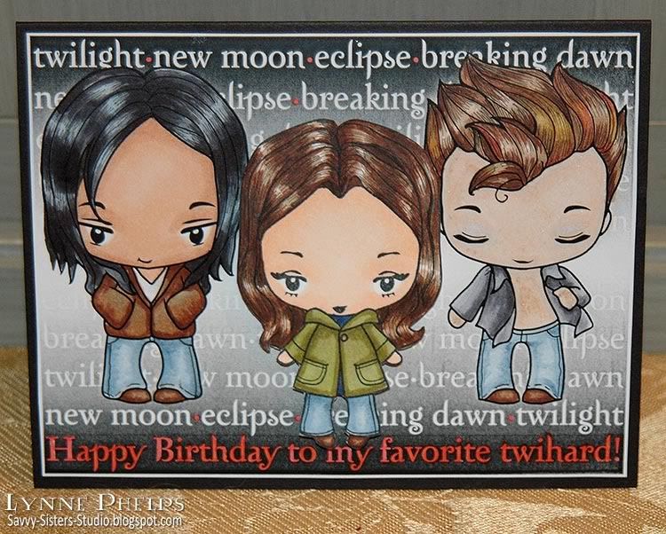
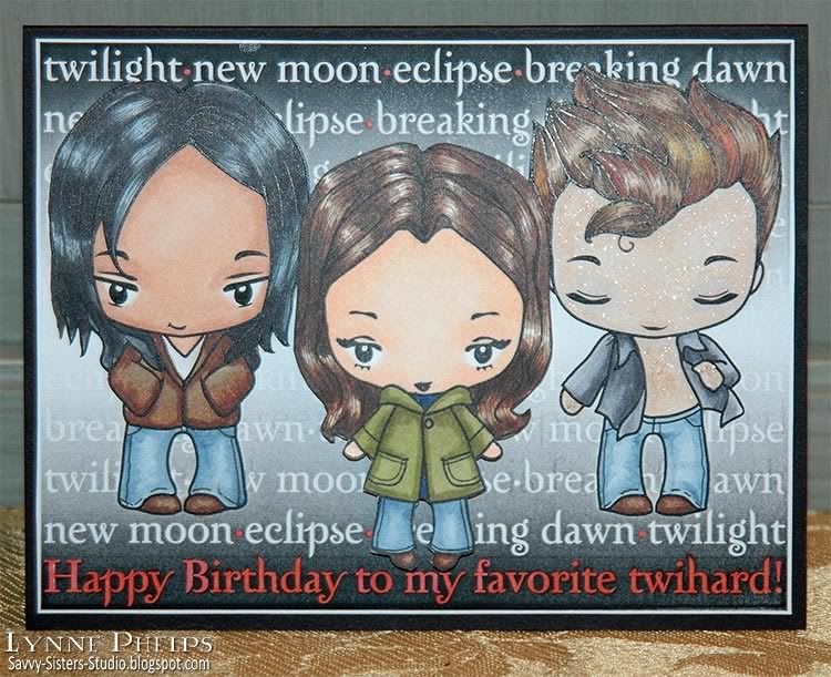
I'm a huge Twilight fan, are you? I had such fun making this birthday card featuring Jacob, Bella, and a sparkly Edward! My niece, Rebekah, is the one who introduced me to the Twilight Saga, so it seemed appropriate to use these cute character images from The Greeting Farm for her Sweet 16 birthday card! Twilight addicts are called twihards (twilight + diehard) or twifans. I prefer to think of myself as a Twihard!

Photobucket

The Greeting Farm sells both digital and rubber stamps, often releasing a character in digital first, then making the rubber version when it proves popular. At that time, the digital version is removed. "Joseph" (Jacob) and "Flirty Edward" are digital stamps, while "Camille" (Bella) is now a rubber stamp; all three are in the Wild Sprouts series. They also have all the other Cullen family members and two other Edwards in casual and dressy versions!

I started my hybrid card in Adobe Illustrator. I made a black to white to black gradient box. Then I created a text block using the Zephyr font, which is the font that was used on the original book covers. I wrote the titles of the four books separated by a bullet symbol; each line started with a different book to stagger the titles. I moved my white text in front of the black gradient. Then I decided to change the last line to my birthday wish--Happy Birthday to my favorite twihard!.  I opened Edward and Jacob in Photoshop and knocked out the backgrounds, so the characters where still filled with white but the background was transparent. I then placed these photoshop files in illustrator and put them on top of the text. Then I printed it out and took it to the craft room! One tip I got from the I Like Markers blog is to use color laser printer paper - the smoother, less porous surface makes it easy to blend the Copics and you do not need to use as much ink.  It is also much easier than running cardstock through the paper bypass tray, as I can just put the color laser paper in the paper tray on top of the regular paper.
Photobucket

I had a blast coloring in Edward and Jacob with Copics. Of course I went over Edward's skin with a Copic Atyou Spica glitter pen in clear!!  Gotta have sparkle!! Then I stamped my rubber Bella on cardstock and colored her with Copics. I used my finest Copic Multiliner to add more detail to the hair. I used a thicker Multiliner to add blue jean seams to Jacob's trousers.  I trimmed out Bella and mounted her to my panel with 1/8 inch thick pop dots.

Photobucket

On the computer, I had also typed my sentiment in Zephyr font: Hope your sweet sixteen is full of sparkle! I trimmed it out, and then used a square punch to notch the two ends. I went around the word "sparkle" with a clear Stardust glitter pen. I used the chisel end of a red Copic marker to add a red edge.  Then I decided the front needed red too, so I carefully dotted red inside the bullet symbols between the book titles, and inside all the white letters of the birthday wish on the bottom line.

I am really happy with how this card turned out, and I think my niece is going to be TOTALLY impressed! It was also my first hybrid project. Having a B&W laser printer made it easy to do the Copic coloring as I didn't need to worry about smearing the ink.  I think I will use digital stamps more for items I'm going to color with Copics. Making my own sentiments on the computer is also a lot of fun!

If you want to see the rest of The Greeting Farm's Twilight-inspired stamps, here is a key to the psuedonyms! Most have dressy and casual versions - be sure to check both the digital stamps and the rubber Wild Sprouts series!
  • Daniel = Dr. Carlyle Cullen
  • Odette = Esme
  • Joyce = Rosalie
  • Jeremy = Emmett
  • Ebony = Alice
  • Hugh = Jasper
  • Joseph = Jacob
  • Michael = Sam Utely?
I've read the books several times, then I got the unabridged audio books, which I highly recommend. The narration is EXCELLENT. I have my Twilight Saga playlist and l listen to the books again and again! In fact, that's what's on my iPod right now.  I downloaded mine from Audible.com - it's a lot cheaper if you are a member of Audible.

Let me know how you like my Twilight card! It was so much FUN to create. Comments anyone? Any other twihards out there?

Saturday, March 27, 2010

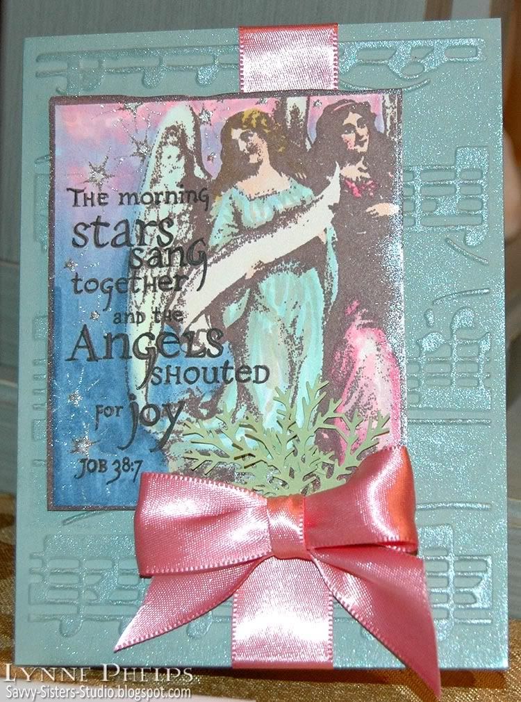
The Angels shouted for Joy - What a difference an ink color can make!

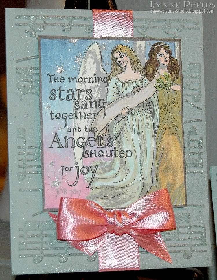
I was invited to dinner by a couple in my Sunday School class and brought these cards as a little hostess gift. I went with a musical theme as my hostess is the choir director at my niece's school. This is my favorite verse from Job, where God is talking about when he made the world. How fun to think about stars singing! I stamped the same image on both cards, first card in dark brown and second in medium gray. What a difference an ink color can make!

Photobucket

The index image on this stamp (Inkadinkado) was really deceptive. It looked like the shading was much lighter. No matter how sheer an ink I stamped with, the shaded areas still closed up. I stamped the first one in brown (Rich Cocoa - Memento) because that is a better pick for faces and skin than black. I used a Copic Multiliner to outline the letters and colored it in with Copic markers. The stars were highlighted with a glitter pen (Clear - Copic Spica). The background (Sage Shadow - Stampin' Up!) was embossed with a musical score (Allegro - Cuttlebug), then I highlighted the raised areas by brushing a shimmering Dazzle pad (Frost - VersaMark) over the top. I love the way this brings out the embossing. I wrapped a pink ribbon around, mounted the angel panel, tied a bow (Bow-Easy) and tucked in some punched foliage (Branch - Martha Stewart).

Photobucket

For the center, I stamped some musical symbols (Stampabilities) in gray and the sentiment (All Year Cheer - Stampin' Up!) in black (Tuxedo Black - Memento).

Photobucket

I decided I was on the right track in adding detail back with a Multiliner, so I went much lighter with the ink on this second try. After stamping with gray (London Fog - Memento), I sketched in line-art detailing throughout the image, especially where the shadows closed up. The gray made the shadowed areas much less distracting, and I am a lot happier with this card. I really want to get Memento Desert Sand - it is a light tan color that would have been even better for the faces.

Photobucket

This is the same as the first, except for the sentiment (Sincere Salutations - Stampin' Up!).

I am going to try lighter inks on a lot of images just to see, how about you? I think it might be particularly effective on florals! Which card do you prefer?

Thursday, March 25, 2010

Dollar Card Set Makeovers

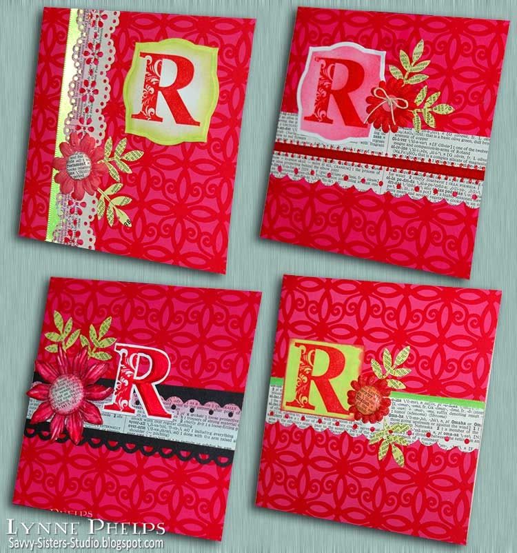
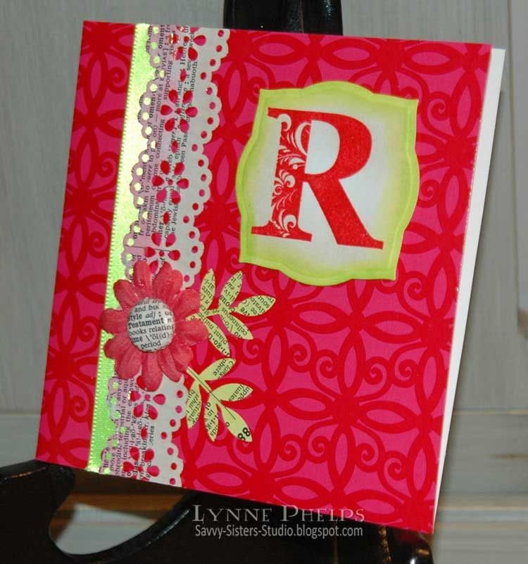
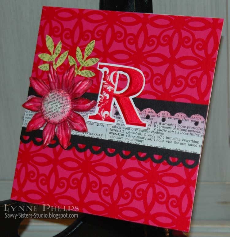
I had no idea how much cool stuff was to be found in the dollar bins at Michaels! I found several sets of eight blank square cards with envelopes and thought they would be great to jazz up into something really special. I also found some neat large flourished letter stamps, so I picked an "R" and made Rebekah this cool set of personalized notecards!

Photobucket

The cards were all in different bold colors and graphical patterns. I chose this $1.00 deep pink and red patterned set of eight, using four so my investment is 50 cents so far! Then I found the flourished "R" stamp (Hampton Arts - Studio G) in a nearby bin - now I'm up to $1.50, LOL! The old dictionary cost 50 cents at the library's old book sale and I think I used one page for all this punching - less than a penny's worth!  All the letters were stamped and embossed on a single sheet of card stock, and I made my own brads with my new i-Top tool. A real budget project!

Photobucket

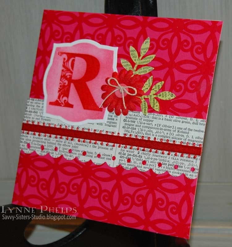
On this card, I used the Label 3 Nestie (Spellbinders) to cut out the initial which was stamped in Crimson Lake (Marvy) and heat embossed in clear. It was then sponged with Bubblegum Pink (Marvy). The border punch is Threading Water (Fiskars) and the leaves are Frond (Martha Stewart).

Photobucket

Same recipe as before, except I used the Doily Lace Trim punch (Martha Stewart). The green sponging on the initial actually matches the bright green ribbon pretty well but the camera changes it. The silk flower center is a brad I covered with dictionary paper using the i-Top tool (Imaginisce) and coated with Diamond Glaze (Judikins) for shine.

Photobucket

Again, the sponging and the ribbon actually match very well, but the matte cardstock and shiny satin ribbon are being picked up differently by the camera! Another home made brad, but I colored the dictionary paper with a copic first. It was covered with Diamond Glaze (Judikins) for shine.

Photobucket

I think this one is my favorite, wish I had tried the black first - although the cards with the bright green are so FUN when you see them in real life. The flower is an off-white Prima paper flower that I colored with Copics, centered with another home made brad. I fussy-cut the initial and shaded it with a Copic marker. The black band is punched with Apron Lace (Fiskars) and the dictionary paper is Threading Water (Fiskars). One of the things I really like about these two punches is the scallop profile is the same, so they are fun to stack!

Rebekah was very pleased, and I was really touched when she told me that she knew the real gift had been to give her a bunch of TIME. And she LOVED the metal tooled letter, totally! That was another budget gift, as the base chipboard letter cost $1.77 at Hobby Lobby, but looked like so much more when done! You'd never guess at its humble beginnings!

I'll have another, much quicker dollar card makeover for you on my next post! What are your favorite crafty gifts to make and give? Please leave a comment and let me know!
Related Posts with Thumbnails