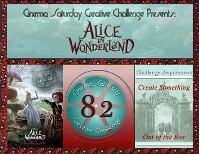
"Alice felt dreadfully puzzled. The Hatter's remark seemed to have no sort of meaning in it, and yet it was certainly English. `I don't quite understand you,' she said, as politely as she could.Greetings friends in Wonderland! Today we have a fun challenge for you based on a lovely inspiration piece that the Mad Hatter herself just might "need" one of these days!
`The Dormouse is asleep again,' said the Hatter, and he poured a little hot tea upon its nose.
The Dormouse shook its head impatiently, and said, without opening its eyes, `Of course, of course; just what I was going to remark myself.'
`Have you guessed the riddle yet?' the Hatter said, turning to Alice again.
`No, I give it up,' Alice replied: `what's the answer?'
`I haven't the slightest idea,' said the Hatter.
`Nor I,' said the March Hare.
Alice sighed wearily. `I think you might do something better with the time,' she said, `than waste it in asking riddles that have no answers.'
`If you knew Time as well as I do,' said the Hatter, `you wouldn't talk about wasting IT. It's HIM.'
`I don't know what you mean,' said Alice.
`Of course you don't!' the Hatter said, tossing his head contemptuously. `I dare say you never even spoke to Time!'"
 But first, a BIG warm WONDERLAND welcome to Tracy Evans, our November/December Guest! Tracy has wow'd us with her projects for a while and we are thrilled to have her here at our Twisted Table.
This week, we have an inspiration piece, again from one of Jess's favorite designers, Tarina Tarantino.It LOOKS like a watch, but in this case, the face of "Father Time" is the Mad Hatter himself. We can just see him, shouting out from this beautiful piece and startling it's owner "YOU HAVEN'T EVEN MET TIME!". Boy, it sure feels like that some days..time simply moves TOO QUICKLY to catch!
My interpretation of the inspiration piece is fairly literal. I wanted to echo the feeling of the carved brown frame around the image on the inspiration piece, so I started by embossing a piece of brown card stock (SU Soft Suede) with this great damask texture plate (SU). I really love the texture plates because they emboss a much larger area than an embossing folder. Because the plate is just on one side of the paper, not two like in an embossing folder, the plates can give a more subtle impression. But I get really deep crisp impressions by misting my paper on both sides with rubbing alcohol before running it through my Cuttlebug; it works MUCH better than misting with water AND the paper dries immediately, so it's a win-win! This allowed me to immediately brush a Versamark Dazzle pad over the high spots, which darkens them and adds a lovely sparkle!
I used two nesties at the same time to make the scalloped oval frame, with an smooth oval nestie inside a larger scalloped nestie. I brushed the Dazzle pad over the open area of the scallops before removing it from the dies. Then I had to wipe the Dazzle off the dies, but it was worth it as I wanted a heavy coating on the scallops.
I printed out the Mad Hatter on color laser printer paper using a black and white laser printer, as this method provides a perfect base for coloring with Copic markers. I glue sticked the whole back of the colored image and stuck it to inexpensive white card stock, then cut the image out with a nestie one step larger that the one used to cut the window in the frame and adhered it to the back of the frame. The frame was adhered to the card base with 1/8 inch thick pop dots. The same technique was used to color, mount and adhere the computer-generated Wonderland label.
To tie in with the beads in the inspiration cuff bracelet, I put a shiny gold brad in each corner and added bling with crystal flourishes. Copic markers were used to color the clear crystal flourishes to match my image and adhered them. Remember that when you are coloring clear items, choose a much darker marker than you would for paper and dab the color on to get more intensity of color.
But I was NOT happy with my card. What was wrong with it, and how to improve it? After some thought, I ripped the card front apart, flipped the embossed panel with its flourishes upsidedown, re-adhered the framed image offset to the left of center and a little lower than before, and made room for my colorful pocket watch! What my card was missing was TIME!

NOW I am happy happy happy with my card, how about you?
Now check out how the rest of our twisted tea party interpreted this inspiration piece!
- Jessica (our MAD HATTER)
- Andi
- Donna
- Emma
- Erin
- Gloria
- Ky
- Lynne (me!)
- Margie
- Peggy
- Randi
- Sammi
- Suzi
- Tasha
- And Traci, our Nov./Dec. Guest Designer
This is also the last day to enter my blog candy drawing for a "Let's Communicate" digi stamp set on THIS post! This is the set I got to design with Amber as a prize for winning the Amber INK challenge a couple months ago!
Please leave a comment on this post before you go - did you like hearing about the changes my card went through?
Stamps: Free digi from Lenny's Alice in Wonderland Website.
Paper: Stampin' Up! - Soft Suede card stock; HP - color laser printer paper
Ink: Tsukeniko - Versamark Dazzle Pad (Champagne)
Miscellaneous: Recollections - crystal flourishes; gold brads.
Tools: Stampin' Up! - Backgrounds 1 Stampin' Up! Texturz Plates, Texturz Impression Pad, Texturz Silicone Rubber mat; Spellbinders - Classic Ovals Large
You can help support this blog in these ways:
• Purchase your Stampin' Up! supplies from my sister. You can purchase or contact through her blog, And She's Still Stamping.
• Purchase other listed supplies using the links above.
Thanks!















Oh Lynn what a lovely card.
ReplyDeleteFantastic shimmer and glimmer. Your coloration is a fest for my eyes. Love it.
Have a lovely weekend my dear.
wowee Lynn this is one of my favourites .. i love the mad hatter and the card is so much fun with the rainbow colours and the pocket watch is stunning
ReplyDeleteHope you are well
Lisa ;)
I love this card. It was a treat to read all your details. How brave you were to rip apart the whole thing. Adding the clock is the perfect touch.
ReplyDeleteThis is fabulous, Lynne! I love how the different colors of bling really pull from the piece and of course, Hatter as the focal point is brilliant. LOVE that spellbinders piece, too-that is the perfect addition to this card! Great take on the inspiration challenge!
ReplyDeleteGreat take on the inspiraion photo Lynne, love the texture in the background along with the added shimmer and the clock matches all the bling perfectly. Great piece. Tracy Evans x x
ReplyDeleteLynne this is out of this world! I love how you tied in all the different colours and the watch is so cool!
ReplyDeletelove tasha xx
Great colors, so shiny and glimmery...is that a word? Hey lynne, like your image....same as mine! You did a fabulous job! Thanks for sharing. I have that fabulous die I love it.
ReplyDeleteLove the dry embossing and all the sparkle and of course those zva crystals look amazing!!!
ReplyDeleteWhat a Gorgeous card Lynne! I have that same embossing plate and Love it too. perfect for Alice!
ReplyDelete