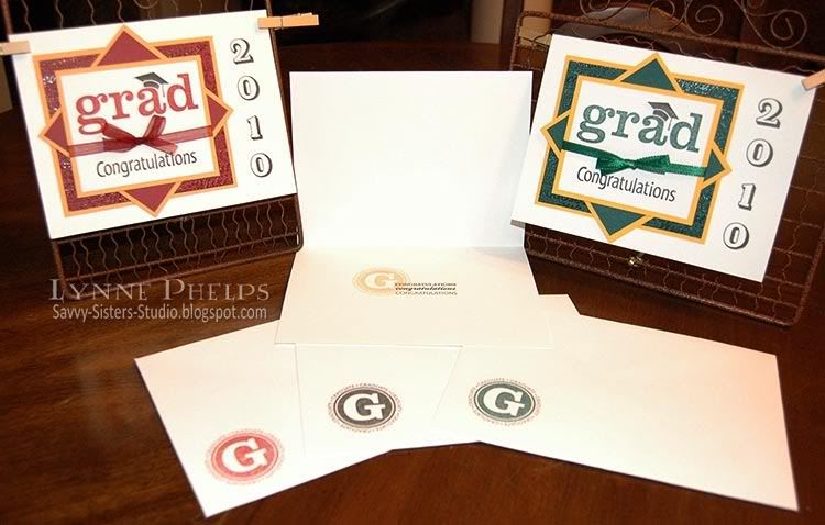
We changed to a rectangular 5 x 6½ inch format as we were using ValuePack cards and envelopes from Michaels. We shifted the stacked medallion to the left, which allowed us to stamp the year vertically along the right, with a Martha Stewart alphabet set. This outline alphabet reminds me of letter jackets, so I thought it was perfect for these cards! A word to the wise - you need to use very light pressure with these MS stamps. I am used to the very high quality clear photopolymer used in Waltzingmouse Stamps and Papertrey Ink. While they have some give, they are nice firm stamps and you can give them some pressure when stamping. Not so with the MS stamps - they are much softer and have a pretty high "squish factor," which resulted in bad impressions if you used too much pressure and incomplete impressions if you were too light on the pressure. Don't ask, just take my advice: stamp on a scrap sheet first to get used to them before you ruin any cards!!! ;-)

Here is a closeup of the stacked medallion. We went with the school colors, which in this case were burgundy and gold. We stamped the "grad" stamp (my favorite in this set) in burgundy to match the paper, then stamped the little mortarboard hat again in black and trimmed it out to paper piece. Notice we did not trim out the tassel, so this was easy trimming! The background burgundy panel was stamped with the neat words stamp that says things like kudos! Bravo, Job well done, etc. with litte laurel leaves and mortarboard hats sprinkled thoughout. We stamped in versamark and clear embossed for a really neat tone-on-one effect.

Inside, we stamped the "G" circle, which repeates the word "Graduate" all the way around in the same ink color we used for the "grad" stamp, and overstamped the 3-line "Congratulations" stamp in black. We used the same round Graduate stamp on the envelope.
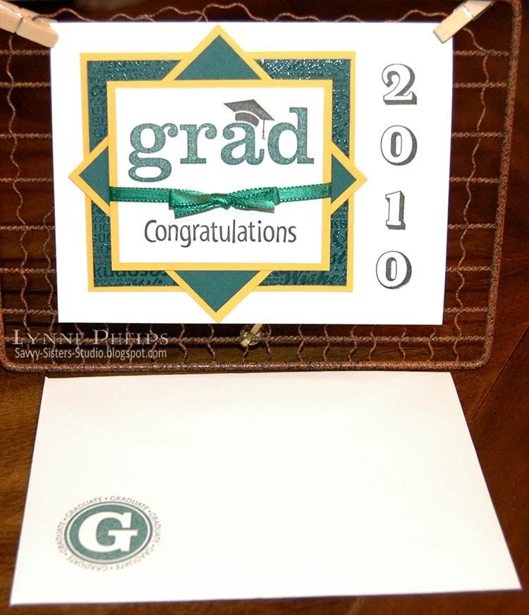
Here is is again with school colors of dark green and bright gold:
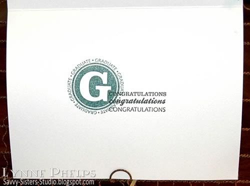
Inside:
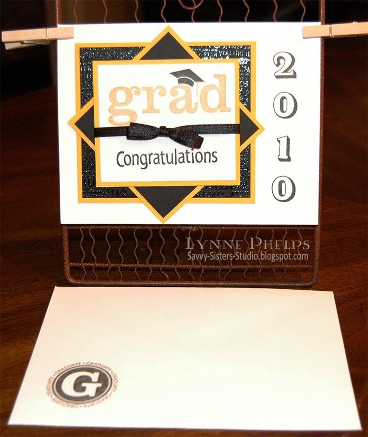
And again in Vanderbilt colors of black and gold:
Inside:

I really like this design because it is has a bit of fun to it with the "grad" image, but it is mature enough for our college and law school graduates as well as high school students. And with the stamped year and use of school colors, the grads receiving these cards will know that a lot of love and care went into the making! Hope that keeps them out of the trash can a bit longer. (Don't you wish you could include a self-addressed stamped envelope with some of your cards, saying "Please return instead of throwing away" or something similar? Or is that just me?)
At least I had a wonderful evening visiting with my sister Janet while we churned out a dozen of these cards. She did all the paper trimming, assembling, and ribbon tying, and I did all the stamping! And Janet appreciated all the
Stamps: Stampin' Up! - Great Grads set, Congratulations from All Year Cheer 1; Martha Stewart - Shadow Typeface
Paper: Stampin' Up! cardstock - burgundy, marigold, Summer Sun, black, dark green; ValuePack - white 5 x 6½ inch card and envelope
Ink: Palette - Black Noir; Stampin' Up! - burgundy, marigold, dark green
Miscellaneous: Ribbon, Clear detail embossing powder
Tools: Stamp-a-ma-jig stamp positioner

















Slave labor eh? At least I feed my slaves well!
ReplyDeleteWe make a good design team I think :-) Janet
These are FABulous!!
ReplyDelete