

Sunday, May 9, 2010

Mother's Day Tulips: Step by Step Brayered Emboss-Resist Technique

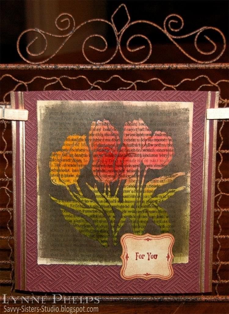
I kept trying to explain to people how I made the card in the last post. They say a picture is worth a thousand words, so I made another card using the same technique and took some photos along the way. These beautiful tulips are for my sister Janet on Mothers' Day; tulips are her favorite flower and she is the mother of my favorite kids!

Photobucket

I started with a page from an old book; I picked up a bunch of them at the library's old book sale. I like to set the stamp I am going to use right next to the page while I sponge on colors. This way I have an idea about where I want to place each color. Be sure the colors you select for sponging are medium tone or lighter - you will need a lot of contrast with the dark color used to cover the background. Remember that the colors will get a lot darker when they are clear embossed!  I like Distress Inks best for sponging - they stay wet a little longer so you don't need as much ink.
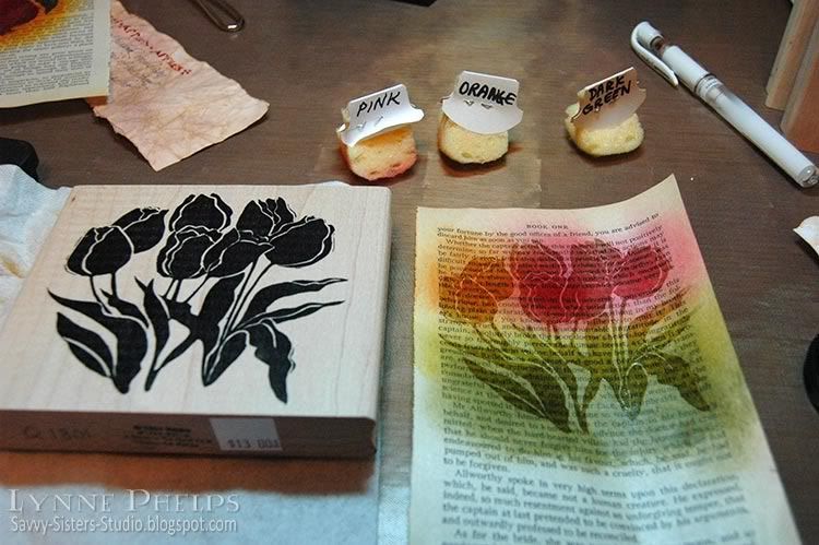
Photobucket

Dry your sponging with a heat tool, then stamp with Versamark and heat emboss with clear detail powder.  If you don't dry the sponging completely before this step, the powder will cling to the page in all the wrong places, which would be a disaster during the next step.  You need stamps with large areas of solid color - silhouette stamps are perfect for this technique. Note: If you were working on plain, unpatterned paper instead of a book page, you could probably get good results with a more detailed stamp, but it would still need bold thick lines.

Next, brayer a dark colored ink over everything - dark enough to cover up all the colors from the previous step. You could sponge it, but the book page may start to tear from the amount of rubbing it would take to put this much ink on with a sponge. If you don't have a brayer, a better alternative would be to swipe your inkpad across the page in a direct to paper technique. 
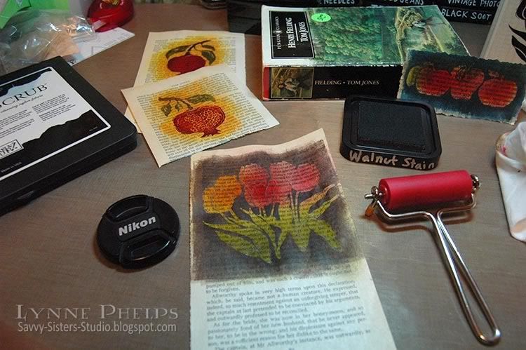
Photobucket

I have a tiny brayer from Ranger that is perfect for this technique, as I like to leave some of the book page un-inked around the edges. I think the irregularly inked edged give it more of a vintage look. The small size brayer is MUCH less expensive than the larger sizes, and you can get a pack of three or four additional rollers for when you are brayering with different colors, so you can switch without having to clean up. The small size roller also takes less ink to cover and is easier to clean up than the larger brayers.

Take a slightly damp paper towel and wipe the ink off the embossed image and watch how it glows out of the dark background! Try to be careful and use your fingertip so as not to get the damp paper towel on the book page. You may want to use your heat tool again to dry the background if you are as impatient as I am!

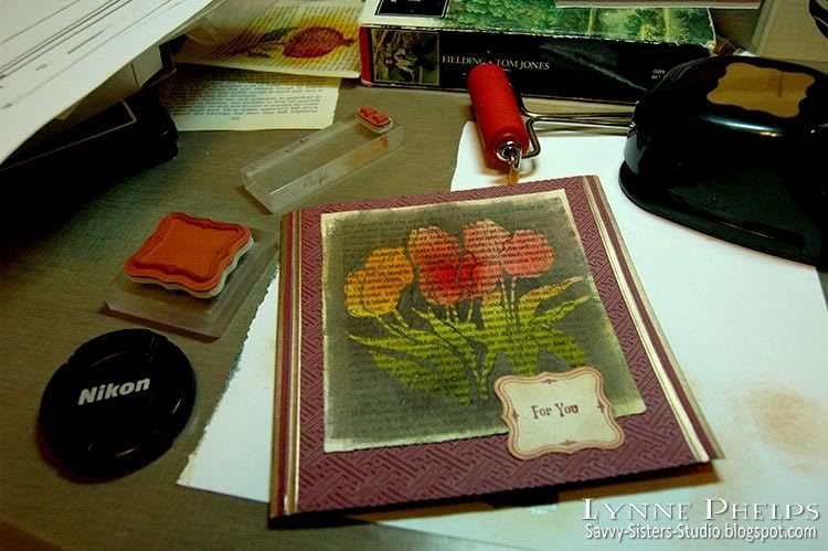
Because I am using paperback book paper, it is very thin and the embossed area is somewhat translucent. To make sure the image stays vivid, I carefully glue the book page to a sheet of white cardstock. This keeps the embossed image bright even when you place it on a dark card.  The paper may also be a bit rippled after being soaked with all that ink, and you can carfully smooth out the ripples without wrinkling if you go slowly as you glue the paper.
Photobucket

Then you make your card! I used an embossing folder from the Cuttlebug Asian set and some scoring and pale gold leafing pen.  I stamped a label frame and sentiment and punched it out, sponging it to give it an aged paper look. On the inside, I inked the edges with gold and scored a square frame border near the edges. No sentiment stamped inside - I left it open to have room to write a little note to my sister. One more closeup look at the finished card:

Photobucket

Did this help you to understand the technique better?  I hope it helped to see it before the dark ink covered it all up.  Let me know if you try this technique, it is a lot of fun!

Ink on my Fingers Sunday Stamper Challenge


I am submitting this card for Hels Sheriden's Ink on My Fingers Sunday Stamper Challenge. The challenge for week 102 is "We are Golden" and I put the gold edges on my card both inside and out with Hels in mind! Not to mention there is some fabby classic Hels candy up for grabs - I love her style!

Stamps: Tulips: A Stamp in the Hand; Sentiment and frame: Stampin' Up! "Vintage Labels"
Paper: Book page; Stampin' Up! - Bravo Burgundy cardstock; Georgia Pacific - white cardstock
Ink: Versamark; Ranger Distress Ink - Peeled Paint, Mustard Seed, Spiced Marmalade, Fired Brick, Worn Lipstick, Antique Linen, Tea Dye, Mahogany; Krylon - Pale Gold Leafing Pen
Tools: Punch: Stampin' Up! - Curly Label punch; Embossing Folder: Cuttlebug - Asian; Score-Pal; Tack Sponges; Ranger Inkssentials Small Inky Roller (Brayer)

Friday, May 7, 2010

Stampers' Sampler Brayered Emboss Resist Technique

ETA: Edited to add that I have some step-by-step photos and instructions in the next post!
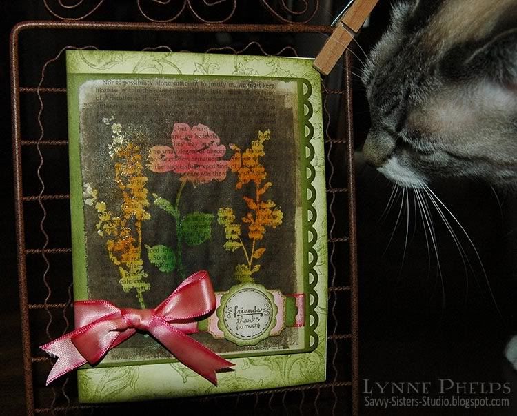
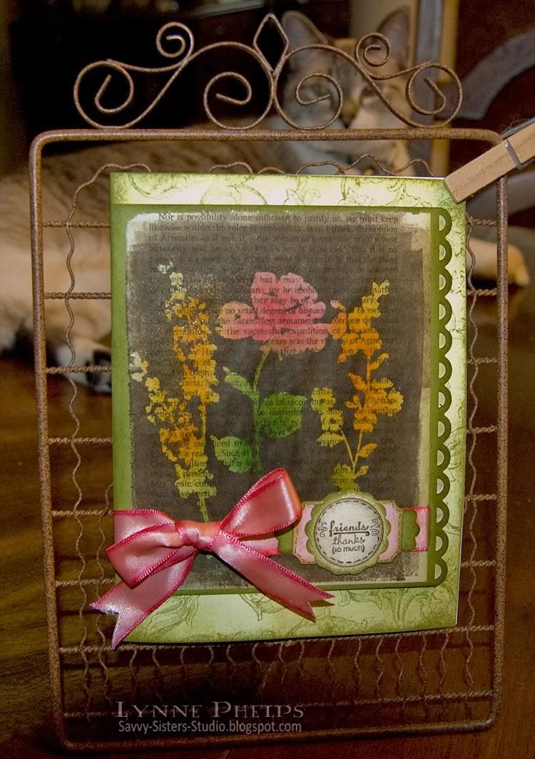
I saw this cool technique in the latest Stampers' Sampler magazine and had to try it for myself! The page of vintage book text was sponged with greens, pinks, and oranges. Then the solid flower silhouettes were stamped with Versamark and clear heat embossed. Then the whole thing was brayered with dark brown ink. Is this a cool effect or WHAT?  I really like this little garden gate easel for displaying cards. Because they can see THROUGH it, my photographer's assistants are willing to stay behind the card instead of in front of it, which means it takes a lot less time to snap a picture! My number one assistant, Beignet, is supervising today's efforts.

Photobucket

As you can see, the areas where I stamped and clear embossed the flowers preserved the colorful sponging as the brown ink would not stick. I rough brayered around the edges to leave some of the original page showing. One change would be to glue the whole book page to a piece of cardstock, as despite drying it with a heat gun, it stayed a little rippled.

Then I mounted that on a green panel with scallops punched down one side. I stamped an old-fashioned flourish design in the background with green and sponged green heavily around the edges and lightlly in the center.

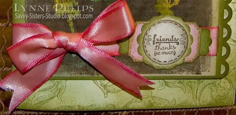
The pink ribbon was edged with a slightly darker pink Copic marker so it would blend with the range of tones in the center flower.  I did not want to try and wrap the ribbon around the scallops, so I cut a slit in the green panel at the edge of the book page to pass the ribbon through. This is a hand tied bow, nice and floppy! I wanted a softer bow and I wanted to actually tie the ribbon around the panel, so I skipped the Bow-Easy this time!

Photobucket

For the sentiment, I used two stamps, "friends" and "thanks (so much)" one above the other. It is on a stack of punched and sponged shapes - a one-inch ivory circle sponged with brown, on a scalloped ivory circle sponged in green, on a pink designer label punch sponged in green, on a green modern label punch sponged in green.  Then I added some doodles with a super fine-line pen to add a little interest.

Here is my photographer's assistant, Beignet, carefully inspecting the styling and making sure the bow is nicely fluffed!

Photobucket

I had a lot of fun trying out this technique from the magazine. Have you tried it yet? I will be using this technique again for sure!  It gives a similar effect to using a reverse-silhouette stamp where the background is inked and the silhouette is open space - lets you stretch your stamping dollars and increases the versatility of the stamps you have!

Stamps: Clearly Inspired by Paper Studios - Brushed Flowers; Stampin' Up - Tiny Tags, Antique Background;
Paper: Page from a book; Stampin' Up! - Old Olive cardstock; Value Pack 5.5 x 6" ivory card
Ink: Ranger Distress Ink - Pine Needles, Peeled Paint, Worn Lipstick, Spiced Marmalade, Walnut Stain (used for brayering over other colors)
Embellishments: Michaels - 5/8" Pink Satin Ribbon
Tools: Fiskars border punch - Apron Lace; Stampin' Up! punches - Modern Label, Designer Label, Scallop Circle; EK Paper Shaper punch - 1" circle; Ranger mini brayer; Tack sponges.

Tuesday, May 4, 2010

FTTC65 - Card with Matching Gift Idea

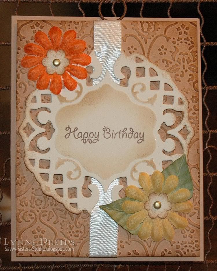
Flourishes Timeless Tuesday Challenge #65 is to make a card with a matching gift idea. Silke Ledlow, the challenge hostess, made a beatiful pillow box and matching card.  I thought what about a card that included a matching gift INSIDE the card? So I came up with this card which has matching earrings hanging inside from a cute hanger:

Photobucket

Do you ever have a card that you are just not happy with? This is a re-make of the card on my last blog post and you can read most of the details there. For this version, I added two leaves to the lower flower and all the sudden everything was in balance! The leaves are super easy, made with my favorite method: punch a circle, fold it in half, and run it through the crimper diagonally. Then trim part of the folded circle away to make a leaf shape.  I sponged a dark olive green ink across the crimped leaves.

I made some earrings in the same colors as my card, and I couldn't find a box, so I decided to include them in the card itself. I am really pleased with the way this earring hanger worked out! My second feline photographer's assistant, Abita, is keeping an eye on things!

Photobucket

The earring hanger base is Mellow Moss cardstock (SU), sponged with Vintage Photo (Distress - Ranger) and punched with the Designer Label Punch (SU). Then the circle was sponged and punched with two small holes to hold the earrings. It is mounted with a really thick 1/8" dimensional to give the earring wires room to hang nicely.

Stamps: Waltzingmouse Stamps - Happy Birthday; Hero Arts - Sentiment.
Paper: Stampin' Up! - Creamy Caramel, Mellow Moss, Natural Confetti.
Ink: Memento - Rich Cocoa; Ranger Distress - Vintage Photo.
Embellishments: Imaginisce - Silk Flowers
Tools: Spellbinders Lattice Pendant; Stampin' Up! Designer Label Punch; All Night Media small flower punch.; Cuttlebug - Textile embossing folder
Earrings: Hobby Lobby - glass beads and copper findings; Blue Moon - antiqued copper double-swirl dangles
Related Posts with Thumbnails