I already created my "
official" entry to our Chapter 4 Challenge on
The Altered Alice, but I love coloring these
Fresh Brewed Designs digital images so much that I've found time to create a couple more projects! Be sure to check out all the amazing design team inspirations on our
Week 1,
Week 2,
Week 3 and
Week 4 posts. There's still time to enter; the theme is TIME and the submissions close on Friday, May 27.
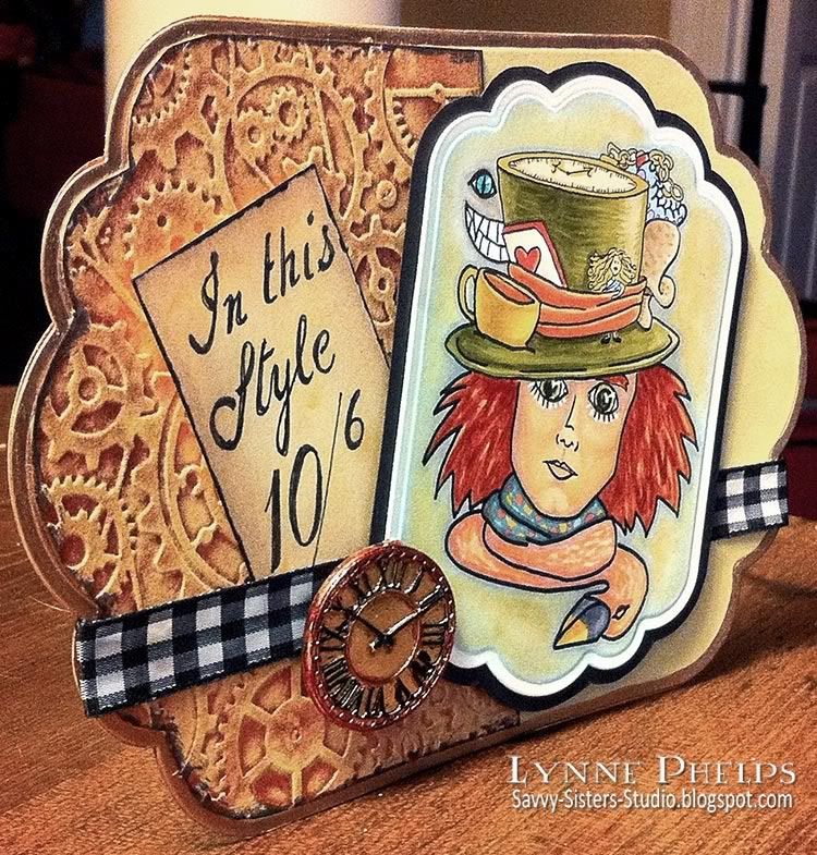
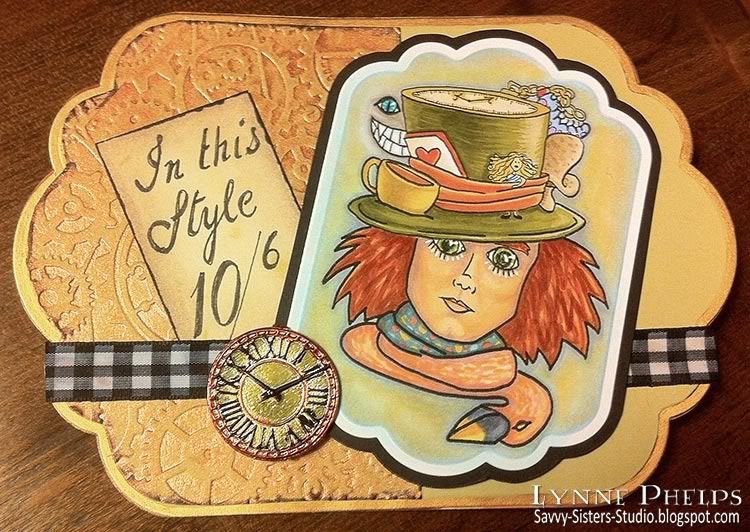
This is a little tabletop piece using the "
Hatter Madness" image from FBD. I LOVED coloring this image. As always it was printed on a B&W laser printer and colored with Copics. I cut it out with a
Label Eleven Nestability
, then I took the same die and traced a pencil line around the outer perimeter of the die onto a piece of black cardstock and cut it out with a scissors. This gives me a perfect eighth inch mat all the way around. I put the side with the pencil marks to the rear, so no need to erase them!
The background paper is River Rock, a wonderful true khaki color from Stampin' Up! - tan with green undertones. I love this color, it is one of my favorite neutrals and I used it on my second project today also! I embossed a piece with the
Cuttlebug Clockworks embossing folder
and sprayed it with
Ranger's Perfect Pearls Mist in Copper
. I kept the embossed piece perfectly flat while I sprayed it so the shimmering fluid collected in recessed areas. It looks INCREDIBLE in real life! I am particularly partial to these Perfect Pearl sprays because all the sprays have the mica shimmer suspended in clear fluid, so they only add the shimmer color without otherwise altering the base paper color. This makes them excellent for misting onto patterned paper as well.
I wish it was not so hard to capture the shimmer in a photograph! I drew the price tag words with a Copic Multiliner pen, then sponged and edged the panel with
Distress Inks
to age it. The clock was a bright silver charm from the jewelry section. I used a wire cutter to snip the loop from the top and colored it with Copics to make the colors suit my vision. I put it all together on a base cut with a
Grand Label Eleven Nestability
and edged the embossed border with a
gold Krylon leafing pen
.
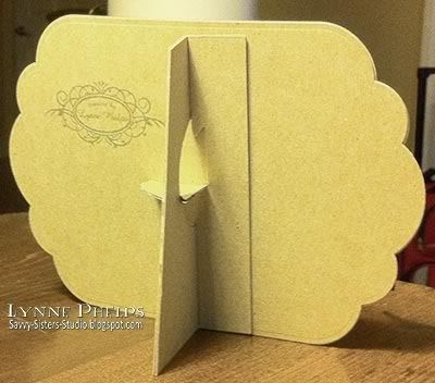
I am so happy that I purchased this
Tim Holtz Easel Back die
! It will cut through thick material. My easel back is two layers of a cracker box, and I backed my project with a single layer of the box for stiffness! I am an incureable pack rat so I need to start using all these bits and pieces I save, LOL!
My next project features two more Fresh Brewed Designs images: "
Wait for Me" and "
Tick Tock, a background image. I took the Tick Tock image, duplicated it and rotated it around for my background paper pattern. I reduced the opacity of the layer so the lines printed gray instead of black and colored it with Copics. This made a great backdrop for the lovely tree image:
I set off the ribbon and patterned paper with score lines. I used my
Scor-Pal 
to first score a very light line from the front where I could see the edges of paper and ribbon, then I flipped it over to make a deep scored channel from the back using the first light scoring as a guide. I love my Scor-Pal so much I got the
Scor-Buddy
and
matching mat
to take along to friends' houses and I am thrilled with it, it is even easier to use. I used the same trick as on the previous piece to create a mat for the focal point image. I cut the mat from white and used a Copic marker to make it the perfect shade to match my image. A fairly traditional card but I really like the simplicity of it, not my usual style at all!
That's it for this week! If I have time I may have one more for you next week; we'll see!
Please leave a comment and let me know what you think of my projects!














Fabulous pieces with the images Lynne, love the depth of colour and the embossed areas too, beautifully embellished. Tracy x
ReplyDeletewow! beautiful magical pieces!how fun:)
ReplyDeleteAll of your projects are delish, Lynne. You say that you love coloring with Copics...well, it shows, because they're all lovely. Just sayin :)
ReplyDeleteAmazing designs, Lynn! Love your coloring!!
ReplyDeleteI meant "Lynne" with an "e" (sorry!)
ReplyDeleteBeautiful projects Lynne! Love the textured background and great job coloring those images!
ReplyDeleteTwo wonderful pieces and very inspiring, love the texture on it.
ReplyDeleteHey hon! thanks a bundle for rescuing my Altered Alice card! Fab piece you've done and I can see coming here may end up costing me a few $$$. That easel die is calling my name. I've never seen it before. WOOHOO! xxD
ReplyDelete