Saturday, May 29, 2010

Oh, Alice! Challenge Blog - I'm Guest Designer for June!

Oh, Alice, a curious little challenge blog

Happy happy joy joy! I have been invited to "walk through Wonderland" for the month of June, where I'll be part of the "twisted tea party" at the Oh, Alice! as their June guest designer! Oh, Alice! is a "curious little challenge blog where nothing is as it seems..."

Each Saturday they post a new challenge related to the Alice in Wonderland and Through the Looking Glass books by Lewis Carroll. You will see my first guest designer challenge entry on the Oh, Alice! blog on June 5th.

It has always been a dream to be on a design team, and as I am a huge Alice in Wonderland fan, I can't think of a better place to start than a month as the guest designer for Oh, Alice!

Here is my winning entry, which you can read about on my last post:

Photobucket


Meet our Twisted Thirteen:
Meet the design team members of the Oh, Alice! Twisted Tea Party:
Thanks so much to all the design team members who voted for my entry! I am thrilled to be in such good company for a month. See you at Oh, Alice! on June 5th!

Tuesday, May 25, 2010

Polka Dot Mad Hatter's Tea Party

Polka dot tea party; that's the week 11 inspiration challenge at the Shabby Tea Room!  You have to make a project that incorporates polka dots or tea party or both. Of course I immediately thought of Alice in Wonderland! I have been a huge fan of all things Alice for many years, and have an enormous collection of Alice in Wonderland stamps in the classical style of the original illustrations. So it seems suitable that I am also using this week's sketch (Chapter 14 challenge) from the Oh Alice blog.

Photobucket
I had a large solid image teapot stamp, and I wanted to put the Mad Hatter's tea party image "inside" it. After all, putting the whole tea party into the teapot seems like a very "Alice" thing to do!!  I stamped the tea party image and colored it in with Copic markers.  Then I inked up the solid teapot stamp with clear Versamark, and used the "rock & roll" technique to add gray ink just around the edges, the top of the lid, and all of the spout. Using a stamp positioner, I centered it over my tea party image, stamped, and heat embossed it with clear detail powder.  I am really happy with how it came out, as I wasn't sure if the idea in my head would work!

I stamped the fan of cards twice in red, and used medium and fine point black pens to add outlines. I stamped the card suits, outlined the red suits with a black pen, and I fussy-cut all of them out.

I stamped the large polka dots on the kraft card base, stamped the medium polka dots on a black panel, and rounded the corners on both with a Corner Chomper. I glued the card suits in the corners, and tucked the fan of cards under each side of the teapot, which was raised on dimensional pop dots.

I am a huge Alice fan, so this challenge was so much fun, getting to incorporate Alice in a sketch and as a tea party inspiration. The prize for this week's challenge is a spot as the June guest designer on the Oh, Alice blog; wouldn't that be a Wonderland kind of dream? And the Shabby Tea Room prize is a wonderful paper and ribbon kit from the Stamp Simply Ribbon Store.

Last, I am sharing it on Gingersnap's Mad Hatter Day post! Since it is sharing and not a challenge, that should be ok!

I hope you like my card!  Any other Alice fans out there?  Please leave a comment, I would LOVE to hear from you!

Stamps: Tea Party - Nature's Blessing; Papertrey Ink - Polka Dots 2; River City Rubber Works - Card Suits Cube; Fan of Cards - unknown; Teapot - Stampin' Up! Tea Time set
Paper: Papertrey Ink - kraft cardstock; Stampin' Up! - black cardstock; Beckett  Expression - Radience (white) cardstock
Ink: Memento - Tuxedo Black, Ladybug Red; Colorbox - pigment white; Copic Sketch Markers and SP Multiliner Pens
Embellishments: Red satin ribbon; Ranger clear detail embossing powder
Tools: We R Memory Keepers - Corner Chomper (¼ and ½ inch rounders); Stamp-a-ma-Jig - stamp positioner

Botanical Resist for Beverly

A dear stamping buddy recently lost her beloved husband. Our stamping group is getting together this Saturday to play with this technique, so I made this "thinking of you" card for Beverly. Hmmm. I wonder if she is a blog subscriber? I guess maybe now I'll find out! ;-)

Photobucket

Patie, the organizer of our band of stampers, saw this technique on a video by Jennifer McGuire. Jennifer is an amazing teacher and you can see a list of all her video blog posts here.  You need a negative image stamp - one where the background is stamped, leaving the focal point image unstamped, like a silhouette stamp in reverse.  I was really anxious to try out the technique and found I had only one stamp set that would work!

I began by stamping the text background, then sponged randomly with a lighter color to add some texture. I stamped the two negative floral images with VersaMark ink and heat embossed them in clear.  I used a Q-tip to apply ink to the open areas of the flowers. Then I sponged more inks on the background to make the flower images pop! It still needed a little something, so I used the colors on the Q-tip to go around the edges of the images, adding a little color.

Photobucket

I sponged around the edges of the cream card base to match the panel. I die-cut a ribbon slide tag from kraft cardstock and layered the "for you" on top with a dimensional. I ran old gold organza ribbon and twine through the slider and wrapped it around the panel. The "Life is a matter of moments" was stamped on kraft, punched and sponged. The hummingbird added the final touch to the pretty flowers!

Can't forget the inside!

Photobucket

I have submitted this card to the "How do you distress" contest on the Tim Holtz blog, as sponging with Distress inks is my favorite distressing technique!

Amazingly, this card is all Stampin' Up! except for the ribbon slide die-cut, ribbon, and twine! The background stamp is perfect, as it is definitions of love and friendship. I hope this card will be a reminder for Beverly of a fun day playing with this same technique, and of how much she is loved by her friends! Life really is a matter of moments and I know she treasures every memory of moments shared with her beloved Bill.  Love you Bev!

Stamps: Stampin' Up! - Botanical Garden, Elements of Style, By Definition
Paper: Cream cardstock; Papertrey Ink - kraft cardstock; ValuePack 5 x 6½ inch cream card and envelope
Ink: Ranger Distress Ink - Vintage Photo, Tea Dye, Old Paper, Walnut Stain; Marvy Matchables - English Red, Yellow, Violet, Lilac, Green, Pine Green, Prussian Blue; Memento - Rich Cocoa
Miscellaneous: Ranger - Clear Detail Embossing Powder; Organza Ribbon; Hemp Twine
Tools: Cuttlebug - Ribbon slider tag die; Stampin' Up! - Modern Label Punch

Saturday, May 22, 2010

Quick Gift - Dollar Card Makeover

I found this set of cards in Michael's dollar bins. I love it that the background looks like kraft; in fact they caught my eye because they have a "stamped" look. I added a quick monogram with my Just Rite stampers and voila - a super quick personalized gift that the recipient really enjoyed!

Photobucket

I used the new small 1 3/16 inch Just Rite stamper with a damask border and punched it out. Then I glued a dictionary page to a piece of white cardstock, used a scallop circle punch and sponged the edges in lavendar. I tied some twine around the card and popped on the monogram with dimensionals.  That's it!

Photobucket

Hope you have a wonderful day!

Thursday, May 20, 2010

Graduation Cards in School Colors

My sister Janet needed a dozen graduation cards, so we got together yesterday evening and came up with a design that we could easily change for each school's colors. We knew we were going to use the Stampin' Up! "Great Grads" set, which I really like because it is not silly! Did you know SplitCoastStampers has galleries for every SU! set ever made? We went straight to the "Great Grads" gallery for inspiration, and decided to CASE (copy and share everything) this card by "stampinat6213," also known as Nancy Riley!

Photobucket

We changed to a rectangular 5 x 6½ inch format as we were using ValuePack cards and envelopes from Michaels. We shifted the stacked medallion to the left, which allowed us to stamp the year vertically along the right, with a Martha Stewart alphabet set. This outline alphabet reminds me of letter jackets, so I thought it was perfect for these cards! A word to the wise - you need to use very light pressure with these MS stamps. I am used to the very high quality clear photopolymer used in Waltzingmouse Stamps and Papertrey Ink. While they have some give, they are nice firm stamps and you can give them some pressure when stamping. Not so with the MS stamps - they are much softer and have a pretty high "squish factor," which resulted in bad impressions if you used too much pressure and incomplete impressions if you were too light on the pressure. Don't ask, just take my advice: stamp on a scrap sheet first to get used to them before you ruin any cards!!!  ;-)

Photobucket

Here is a closeup of the stacked medallion. We went with the school colors, which in this case were burgundy and gold. We stamped the "grad" stamp (my favorite in this set) in burgundy to match the paper, then stamped the little mortarboard hat again in black and trimmed it out to paper piece. Notice we did not trim out the tassel, so this was easy trimming!  The background burgundy panel was stamped with the neat words stamp that says things like kudos! Bravo, Job well done, etc. with litte laurel leaves and mortarboard hats sprinkled thoughout. We stamped in versamark and clear embossed for a really neat tone-on-one effect.

Photobucket

Inside, we stamped the "G" circle, which repeates the word "Graduate" all the way around in the same ink color we used for the "grad" stamp, and overstamped the 3-line "Congratulations" stamp in black.  We used the same round Graduate stamp on the envelope.

Here is is again with school colors of dark green and bright gold:

Photobucket

Inside:
Photobucket

And again in Vanderbilt colors of black and gold:

Photobucket

Inside:
Photobucket

I really like this design because it is has a bit of fun to it with the "grad" image, but it is mature enough for our college and law school graduates as well as high school students. And with the stamped year and use of school colors, the grads receiving these cards will know that a lot of love and care went into the making! Hope that keeps them out of the trash can a bit longer. (Don't you wish you could include a self-addressed stamped envelope with some of your cards, saying "Please return instead of throwing away" or something similar? Or is that just me?)

At least I had a wonderful evening visiting with my sister Janet while we churned out a dozen of these cards. She did all the paper trimming, assembling, and ribbon tying, and I did all the stamping! And Janet appreciated all the slave labor oops, I mean help - I'm getting a free lunch at Leda's out of the deal! ;-) Win-win!

Stamps: Stampin' Up! - Great Grads set, Congratulations from All Year Cheer 1; Martha Stewart - Shadow Typeface
Paper: Stampin' Up! cardstock - burgundy, marigold, Summer Sun, black, dark green; ValuePack - white 5 x 6½ inch card and envelope
Ink: Palette - Black Noir; Stampin' Up! - burgundy, marigold, dark green
Miscellaneous: Ribbon, Clear detail embossing powder
Tools: Stamp-a-ma-jig stamp positioner

Wednesday, May 19, 2010

Tweet! Heard it was your Birthday!

Now that my nieces are home for the summer, we are belatedly celebrating their friend Karlie's birthday. She is so bright and cheerful and animated, and the bright eyed bird in Flourish's "Home Tweet Home" set makes me think of her! I also wanted to enter the Flourishes Timeless Tuesday Challenge FTTC67 which is to use chipboard.

Photobucket

I stamped the branch, bird, and birdhouse with brown ink on the blue cardstock, then I stamped the bird and birdhouse again on white cardstock. I colored in the branch, leaves, and bird's legs with Copic markers. Then I sponged blue around the edges and in the sky area, and green across the bottom.  I colored the bird and birdhouse on the white cardstock and cut them out. Because I had also stamped the images on the blue cardstock, I did not have to worry about trimming around the bird's legs or the spirals at the edge of the birdhouse roof - I trimmed them off when I cut out the images. Much easier!! I adhered them in place on the blue cardstock.  I stamped "tweet!" in black and heat embossed it with clear detail powder.

I save cereal boxes and other packaging, do you?  I especially love it when you find items packaged in white chipboard, and that is what I used for my clouds. Clouds are a very hot trend right now! I drew some clouds on the printed side of the chipboard, then ran it through my Cuttlebug in an embossing folder. Then I cut out the clouds and sponged a little blue around the edges.  I also stamped the "little bird" sentiment on a piece of blue cardstock and trimmed it out, sponging the edges with green.

Photobucket

Now to assemble everything! I cut a slot for ribbon on either side of the birdhouse and ran yellow satin ribbbon around the panel and through the slots, tying it in a square knot.  I rounded the corners, then adhered it to my pale yellow cardbase. I added the sentiment on regular dimensionals, and the clouds on ⅛ inch thick dimensionals to really lift them up! I aligned them all with the edge of the card base, not with the blue panel. I like having elements that break through the boundaries, must be the rebel in me!!

Can't forget the inside!

Photobucket

I stamped the sentiment and heat embossed it with clear detail powder. I cut out a few more clouds, again having some floating off the edge of the paper, and sponged some blue where I planned to put them. I adhered these flat against the cardstock.

I hope Karlie will enjoy receiving this birthday card at dinner tomorrow night. We are having a big meal and cake at my sister's house, gotta love a big family meal!  Happy belated birthday Karlie!


I purchased this stamp set at the Flourishes booth at a scrapbooking & stamping show in Perry, Georgia! I can't tell you how exciting it was to be able to do some stamp shopping in my own town, which is tiny!!  I got to meet two of my blog heroes, Silke Ledlow of My Life, and Dee Jackson of Stampin' Cuz I Luv 2 and made them pose for a picture with me - my sister Janet is behind the camera!  I was so excited as I have subscribed to their blogs for years, and there they were doing Copic coloring make-it-take-its at the show. Of course I recognized Silke immediately because of the picture on her blog, and the minute Dee told me her name, I said "Stampin' Cuz I Luv 2" and then we all squealed and jumped and hugged! It was just like being ten years old again!

Stamps: Flourishes -  bird, branch, birdhouse, tweet from "Home Tweet Home" set; Inkadinkado - little bird sentiment; Waltzingmouse - belated birthday sentiment from "Fancy Phrases" set
Paper: Stampin' Up cardstock - Cool Carribean, pale yellow; Georgia Pacific - white cardstock
Ink: Memento - Rich Cocoa; Ranger Distress - Black Soot; Marvy Matchable - Salvia Blue, Yellow-Green; Copic Markers
Embellishments: Hobby Lobby: Double-faced satin ribbon; Recycled chipboard packaging
Tools: Embossing Folder - Cuttlebug Tiny Bubbles; Corner Chomper (½ inch side); Tack sponges

Monday, May 17, 2010

Waltzingmouse 1st Birthday Blog Waltz!

We don't hop, we waltz our way through the blogs instead - a bit less linear, with some fun dips and twirls along the way! Waltzingmouse Stamps is 1 year old - Happy Birthday!

My order came in just in time for me to make a birthday card, not only for WMS but also for my sister. This card uses the two-stripe plaid stamp from Off Beat Backgrounds, the medium plaid stripe from Pic-Nic Patterns, and a frame and sentiments from Fancy Phrases. The Fancy Phrases fit perfectly into Spellbinders' Fancy Tags dies; mine have not arrived yet so I simply trimmed out the frame with a scissors.

Photobucket

First I stamped the plaid. It is so much fun to do, and you can coordinate it with any color scheme. I went with pink, rose, and soft green for my sister's card.  I took a small paper doily and scored it from point to point all the way around. Then I cut the center out so I could make fan-fold pleats all the way around. I adhered the folded doily to a punched circle to hold it and cover up the inside edges. I saw this idea on the Bits and Pieces blog and ran out and bought a pack of doilies the next day at my local Wal-Mart!

Next, I made some of the spiral cut roses you are seeing a lot out there. Did you know Sizzix actually makes a Bigz die for these now? Not having the die (or the money for one!!), I just drew a spiral on printer paper with a pencil and cut it out with a scalloped scissors. I carefully erased the pencil marks then colored the whole thing with light pink Copic markers and edged it with a deeper rose along the spiral cut. There are a lot of tutorials out there, but what I used is this Sizzix PDF on how to assemble the flower.

Photobucket
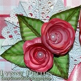
I used a pearl bead in the center of each, isn't that a pretty touch? I wanted to control how the bead hole was oriented, so I put it on a pin, applied a blog of Diamond Glaze glue on one side of the bead, and lowered it into the center of the flower. This allowed me to keep the bead hole horizontal, so the hole does not show from the top.

Remember your crimper? That tool that has been gathering dust since embossing folders were created? Pull it back out as your leaf maker! I punched a 1¼ inch circle, folded it in half and ran it through the crimper at an angle diagonal to the fold. Then, while still folded, I cut the sides down to make a half teardrop shape. Open up the fold and you have a perfect textured leaf. You could stop there, but since when do I know when to stop? So the edges, center fold, and ridges were accented with Copic markers!

For the sentiment, I stamped the medium sized plaid stripe in soft green, then stamped the frame and sentiment on top with rose. I wanted it to stand out more from the base plaid, so I filled in the area between the frame and the edge of the paper with a pink Copic marker and edged it with a rose marker. It is mounted on a ⅛-inch thick dimensional. I also ran the rose Copic along the edge of the ribbon on the front to make it match the plaid a bit better.

Can't forget the inside:

Photobucket

I stamped some of the plaid stripes down the sides and used another Fancy Phrase sentiment, plus one of the little flourishes that comes with the set.  I am not sure what the marks are at the bottom of the card - they are not there IRL (in real life); perhaps I need to clean the lens!!!

To see other entries in the blog waltz, just stop by the Play Room forum at the Waltzingmouse House - everyone has listed their entries in the Play Room! Come on in, registration is free and easy and you get to see a lot of good cards, not to mention chances at some very nice blog candy! The blog waltz will kick off Monday, May 17th at 10 a.m. EDT when the blog waltz forum thread opens and we start adding our links!

I hope you are enjoying Waltzingmouse's 1st birthday! Congratulations Claire!

Stamps: Waltzingmouse Stamps - Fancy Phrases, Off Beat Backgrounds, Pic-Nic Patterns
Paper: Printer paper for plaid, roses; 5 x 6 inch ValuePack white card.
Ink: Memento Dye Ink - Angel Pink, New Sprout, Rose Bud; Copic alcohol markers
Embellishments: Paper Doily, Pearl Beads
Tools: ScorePal; Scalloped Scissors, Bow Easy, Crimper

Thursday, May 13, 2010

Pomegranates - Just Because!

In the photos of my last post of the tulip card, some of you noticed the stamped and sponged pomegranate images on the table next to the tulips project! Here they are again, now part of a "thinking of you" card. I love these images of the whole pomegranate and the opened one with the seeds displayed. Did you know that pomegranates are used as symbols in Christian, Judaic, Greek, Roman, and other world cultures?  Look:

Photobucket

It was so easy to custom color the different bits just by carefully dabbing my ink pads, no markers were used to get this effect! After carefully inking up the stamps with Distress inks I heat embossed them with clear detail powder. I love it that all of the Distress inks, even though they are dye ink pads, can be used for heat embossing as they stay wet long enough to really hold the powder!  I stamped them onto paperback book pages from a Penguin copy of Tom Jones. What a deal, do you know how long that novel is?  I'm glad to be plowing through it in my stamp room instead of trying to read it, LOL!! Then I sponged around the embossed image with yellow and orange shades, and brushed the torn edges of the paper across a black ink pad.

To assemble the card, first I sponged all around the edges of an ivory card to match the warm gold background of the pomegranates. Next, I scored a diamond pattern into a piece of black cardstock - I love the texture that this gives! Then I used an embossing folder on the burgundy cardstock and ran it though my Bug. I took a matching inkpad and brushed it across the raised areas to give the embossing more definition.  I was lucky enough to have some fun striped grosgrain ribbon with colors to perfectly matched this card, so I added a strip to the burgundy panel and used a glue dot to stick on a bow made on the Bow-Easy.

The paperback book paper is really floppy and somewhat translucent as it is very thin. I glued each one to a piece of white cardstock just slightly smaller that the paper, as I wanted to have the torn edges loose. I mounted the panels with dimensionals to give it some depth.

Can't forget the inside! I really love using bits and scraps from making the card front in a little assemblage like this to frame or bracket the sentiment. 

Photobucket

This inside nearly ended in distaster! Remember the reason you can emboss and sponge so sucessfully with Distress inks is that they stay wet for so long???  Well, I stamped the sentiment, and long after a normal dye ink would have been dry, I brushed something across it and completely smeared the whole thing!  Of course I had already adhered the cardfront so securely that I would probably rip it up if I tried to detach it for use on another card.

What to do?  Patch over the whole thing of course!  I took a long look at the front of the card again and decided the inside really needed some of the lighter gold shades carried to the inside, as the text strip had gotten a bit too orangy!  I stamped the sentiment again on a scrap--and IMMEDIATLY heat imbossed with clear powder, so as to avoid smearing--and sponged on the same warm shades I used on the card front!  I actually like this a lot better than what I had before. Don't you love it when your lemons turn to lemonade? ;-)

How often do your stamping mishaps result in better creations?  I'd love to hear some of YOUR stories!!  Please leave a comment, as your comments really make my day!

Stamps: Pomegranates - A Stamp in the Hand; Sentiment - Hero Arts
Paper: Book pages; Stampin' Up! - Bravo Burgundy, Basic Black; ValuePack 5 x 6½ inch ivory card
Ink: Ranger Distress Ink: Mahogany, Fired Brick, Peeled Paint, Walnut Stain, Mustard Seed, Spiced Marmalade, Black Soot
Tools: Embossing Folder - Cuttllebug Textile Pattern; ScorePal

Sunday, May 9, 2010

Mother's Day Tulips: Step by Step Brayered Emboss-Resist Technique

I kept trying to explain to people how I made the card in the last post. They say a picture is worth a thousand words, so I made another card using the same technique and took some photos along the way. These beautiful tulips are for my sister Janet on Mothers' Day; tulips are her favorite flower and she is the mother of my favorite kids!

Photobucket

I started with a page from an old book; I picked up a bunch of them at the library's old book sale. I like to set the stamp I am going to use right next to the page while I sponge on colors. This way I have an idea about where I want to place each color. Be sure the colors you select for sponging are medium tone or lighter - you will need a lot of contrast with the dark color used to cover the background. Remember that the colors will get a lot darker when they are clear embossed!  I like Distress Inks best for sponging - they stay wet a little longer so you don't need as much ink.

Photobucket

Dry your sponging with a heat tool, then stamp with Versamark and heat emboss with clear detail powder.  If you don't dry the sponging completely before this step, the powder will cling to the page in all the wrong places, which would be a disaster during the next step.  You need stamps with large areas of solid color - silhouette stamps are perfect for this technique. Note: If you were working on plain, unpatterned paper instead of a book page, you could probably get good results with a more detailed stamp, but it would still need bold thick lines.

Next, brayer a dark colored ink over everything - dark enough to cover up all the colors from the previous step. You could sponge it, but the book page may start to tear from the amount of rubbing it would take to put this much ink on with a sponge. If you don't have a brayer, a better alternative would be to swipe your inkpad across the page in a direct to paper technique. 

Photobucket

I have a tiny brayer from Ranger that is perfect for this technique, as I like to leave some of the book page un-inked around the edges. I think the irregularly inked edged give it more of a vintage look. The small size brayer is MUCH less expensive than the larger sizes, and you can get a pack of three or four additional rollers for when you are brayering with different colors, so you can switch without having to clean up. The small size roller also takes less ink to cover and is easier to clean up than the larger brayers.

Take a slightly damp paper towel and wipe the ink off the embossed image and watch how it glows out of the dark background! Try to be careful and use your fingertip so as not to get the damp paper towel on the book page. You may want to use your heat tool again to dry the background if you are as impatient as I am!

Because I am using paperback book paper, it is very thin and the embossed area is somewhat translucent. To make sure the image stays vivid, I carefully glue the book page to a sheet of white cardstock. This keeps the embossed image bright even when you place it on a dark card.  The paper may also be a bit rippled after being soaked with all that ink, and you can carfully smooth out the ripples without wrinkling if you go slowly as you glue the paper.

Photobucket

Then you make your card! I used an embossing folder from the Cuttlebug Asian set and some scoring and pale gold leafing pen.  I stamped a label frame and sentiment and punched it out, sponging it to give it an aged paper look. On the inside, I inked the edges with gold and scored a square frame border near the edges. No sentiment stamped inside - I left it open to have room to write a little note to my sister. One more closeup look at the finished card:

Photobucket

Did this help you to understand the technique better?  I hope it helped to see it before the dark ink covered it all up.  Let me know if you try this technique, it is a lot of fun!

Ink on my Fingers Sunday Stamper Challenge


I am submitting this card for Hels Sheriden's Ink on My Fingers Sunday Stamper Challenge. The challenge for week 102 is "We are Golden" and I put the gold edges on my card both inside and out with Hels in mind! Not to mention there is some fabby classic Hels candy up for grabs - I love her style!

Stamps: Tulips: A Stamp in the Hand; Sentiment and frame: Stampin' Up! "Vintage Labels"
Paper: Book page; Stampin' Up! - Bravo Burgundy cardstock; Georgia Pacific - white cardstock
Ink: Versamark; Ranger Distress Ink - Peeled Paint, Mustard Seed, Spiced Marmalade, Fired Brick, Worn Lipstick, Antique Linen, Tea Dye, Mahogany; Krylon - Pale Gold Leafing Pen
Tools: Punch: Stampin' Up! - Curly Label punch; Embossing Folder: Cuttlebug - Asian; Score-Pal; Tack Sponges; Ranger Inkssentials Small Inky Roller (Brayer)

Friday, May 7, 2010

Stampers' Sampler Brayered Emboss Resist Technique

ETA: Edited to add that I have some step-by-step photos and instructions in the next post!
I saw this cool technique in the latest Stampers' Sampler magazine and had to try it for myself! The page of vintage book text was sponged with greens, pinks, and oranges. Then the solid flower silhouettes were stamped with Versamark and clear heat embossed. Then the whole thing was brayered with dark brown ink. Is this a cool effect or WHAT?  I really like this little garden gate easel for displaying cards. Because they can see THROUGH it, my photographer's assistants are willing to stay behind the card instead of in front of it, which means it takes a lot less time to snap a picture! My number one assistant, Beignet, is supervising today's efforts.

Photobucket

As you can see, the areas where I stamped and clear embossed the flowers preserved the colorful sponging as the brown ink would not stick. I rough brayered around the edges to leave some of the original page showing. One change would be to glue the whole book page to a piece of cardstock, as despite drying it with a heat gun, it stayed a little rippled.

Then I mounted that on a green panel with scallops punched down one side. I stamped an old-fashioned flourish design in the background with green and sponged green heavily around the edges and lightlly in the center.

The pink ribbon was edged with a slightly darker pink Copic marker so it would blend with the range of tones in the center flower.  I did not want to try and wrap the ribbon around the scallops, so I cut a slit in the green panel at the edge of the book page to pass the ribbon through. This is a hand tied bow, nice and floppy! I wanted a softer bow and I wanted to actually tie the ribbon around the panel, so I skipped the Bow-Easy this time!

Photobucket

For the sentiment, I used two stamps, "friends" and "thanks (so much)" one above the other. It is on a stack of punched and sponged shapes - a one-inch ivory circle sponged with brown, on a scalloped ivory circle sponged in green, on a pink designer label punch sponged in green, on a green modern label punch sponged in green.  Then I added some doodles with a super fine-line pen to add a little interest.

Here is my photographer's assistant, Beignet, carefully inspecting the styling and making sure the bow is nicely fluffed!

Photobucket

I had a lot of fun trying out this technique from the magazine. Have you tried it yet? I will be using this technique again for sure!  It gives a similar effect to using a reverse-silhouette stamp where the background is inked and the silhouette is open space - lets you stretch your stamping dollars and increases the versatility of the stamps you have!

Stamps: Clearly Inspired by Paper Studios - Brushed Flowers; Stampin' Up - Tiny Tags, Antique Background;
Paper: Page from a book; Stampin' Up! - Old Olive cardstock; Value Pack 5.5 x 6" ivory card
Ink: Ranger Distress Ink - Pine Needles, Peeled Paint, Worn Lipstick, Spiced Marmalade, Walnut Stain (used for brayering over other colors)
Embellishments: Michaels - 5/8" Pink Satin Ribbon
Tools: Fiskars border punch - Apron Lace; Stampin' Up! punches - Modern Label, Designer Label, Scallop Circle; EK Paper Shaper punch - 1" circle; Ranger mini brayer; Tack sponges.

Tuesday, May 4, 2010

FTTC65 - Card with Matching Gift Idea

Flourishes Timeless Tuesday Challenge #65 is to make a card with a matching gift idea. Silke Ledlow, the challenge hostess, made a beatiful pillow box and matching card.  I thought what about a card that included a matching gift INSIDE the card? So I came up with this card which has matching earrings hanging inside from a cute hanger:

Photobucket

Do you ever have a card that you are just not happy with? This is a re-make of the card on my last blog post and you can read most of the details there. For this version, I added two leaves to the lower flower and all the sudden everything was in balance! The leaves are super easy, made with my favorite method: punch a circle, fold it in half, and run it through the crimper diagonally. Then trim part of the folded circle away to make a leaf shape.  I sponged a dark olive green ink across the crimped leaves.

I made some earrings in the same colors as my card, and I couldn't find a box, so I decided to include them in the card itself. I am really pleased with the way this earring hanger worked out! My second feline photographer's assistant, Abita, is keeping an eye on things!

Photobucket

The earring hanger base is Mellow Moss cardstock (SU), sponged with Vintage Photo (Distress - Ranger) and punched with the Designer Label Punch (SU). Then the circle was sponged and punched with two small holes to hold the earrings. It is mounted with a really thick 1/8" dimensional to give the earring wires room to hang nicely.

Stamps: Waltzingmouse Stamps - Happy Birthday; Hero Arts - Sentiment.
Paper: Stampin' Up! - Creamy Caramel, Mellow Moss, Natural Confetti.
Ink: Memento - Rich Cocoa; Ranger Distress - Vintage Photo.
Embellishments: Imaginisce - Silk Flowers
Tools: Spellbinders Lattice Pendant; Stampin' Up! Designer Label Punch; All Night Media small flower punch.; Cuttlebug - Textile embossing folder
Earrings: Hobby Lobby - glass beads and copper findings; Blue Moon - antiqued copper double-swirl dangles
Related Posts with Thumbnails